

What are the differences between the 2018 First Edition Spirit Keeper’s tarot deck and the 2019 forthcoming Vitruvian Edition?
I showed a walk-through of the Vitruvian Edition in a YouTube video here, which also offers direct comparisons to cards redesigned from the First Edition. So be sure to check that out if you want to know exactly which cards in the deck were redesigned.
Also, please note that the First Edition is now out of print. It’s featured in this blog post only as a point of comparison for the Vitruvian Edition, which you can pre-order now until March 20.

You can also check out the Gallery of All Cards to view every single card in the deck, both the First Edition and Vitruvian Edition. However, the exact color tones in the actual printed Vitruvian deck will be significantly more muted than the digital images you see on screen.
I’m also still tweaking the exact color tones, so the Vitruvian images in the Gallery are works in progress. I keep printing and re-printing tweaked test copies of the deck to scrutinize the color tones and every singe time so far, I’ve found issues that I wanted to correct, so bear in mind what’s there is still subject to minor tweaks.

Recently I went on Instagram and turned the question on you folks and asked what you intuit to be the differences between the First Edition and Vitruvian. People had some incredible observations and insights! Now it’s my turn to share how I perceive the differences. =)

I’ve created a free downloadable e-book for the Spirit Keeper’s Tarot that can help you decide whether to buy the Vitruvian Edition.
There are two versions of the free e-book, one keyed to the First Edition and one keyed to the Vitruvian. You’ll see that the content is largely the same across both texts, except for an opening chapter where the First Edition copy will give a chronological overview of the deck’s conception and the Vitruvian Edition will explain the design changes and the spirit of the second printing.
Download a Free Tarot Book
The PDF downloads for both the First and Vitruvian are available for free from the hyperlinked page above, so you can go in to both books to get a sense for yourself what the differences are.
![]()

My mission for the Vitruvian Edition was accessibility, challenging myself to enable general accessibility to an otherwise esoteric tarot deck steeped in occult symbolism with relatively obscure references. I want to download the keys of access directly into your mind through the programming of this Medium White Book.

Whereas for the First Edition– bear in mind I conceived and completed the deck without the intention of releasing it for publication and sale to the public– my mission was personal attainment.
In the First Edition architecture, it was more about me and everything about it had almost nothing whatsoever to do with you. =) That expression of intent can be found in both the redesign of Key 0: The Keeper and Key 4: The Emperor. That’s why specifically in the First Edition Emperor you can see his face and full identity, whereas in the Vitruvian Edition Emperor, he’s fully masked and armored.


The analogy I like is the First Edition is venturing through uncultivated terrain, discovering all that you come across for the very first time, whereas the Vitruvian Edition is the paving of a road through that terrain so others might be able to traverse it as well.
There was a spirit of pioneerism for personal glory in the First. The First Edition deck was the initial undertaking of journeying from the physical to the nonphysical, corporeal to spiritual, to discover new ground. Once that new ground was discovered, I built my inner temple and only after the construction was complete did I decide to let others in as well. It’s like the gathering of new settlers– everybody is still a pioneer at that point.

In another critical juncture point, Key 6: The Lovers, you can see how in the First Edition, the environment is veiled, or obfuscated from view, whereas in the redesigned Vitruvian Edition, now you can see the cleared road.
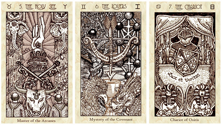
I also like the “middle path” and ambiguity of sepia tones. It’s not the severe “no color added” black and white version, but the exact coloring of the symbols is still ambiguous. If you look at Key 5: The Holy See, we all understand that the radiating background isn’t literally that pinkish-peach-beige tone. It’s some other color but because right now it’s filtered through sepia, it appears to the physical eye as that pinkish-peach-beige. You get what I’m saying? Your physical eye sees one color but because it’s sepia toned, your mind understands it’s an entirely different color in actuality.

Here’s a better close-up view to compare the First Edition Lovers to the Vitruvian Edition Lovers. With Key 6 being one of those critical crossroads cards in the tarot, it’s interesting to see how in the First Edition, the world is veiled to the onlooker while in the Vitruvian, the winding path into the horizon is paved for you.


The First Edition Erudite (Key 9: The Hermit) remains unseen while at least in the Vitruvian, a figure, albeit cloaked, steps forward. There’s also sense of unveiling in the background of Key 10: Wheel of Life.

Even the bars of music in the book are symbolic of the decks’ differences. In the First Edition, those bars of music are from a song I composed for a musical I wrote back in high school. So it’s an original composition. Symbolically to me, those bars of music represent a part of who I am that only the very, very few even know about, a part of my childhood even, though also symbolically, here I’m sharing it with the world through the publication of the First Edition deck.
Whereas in the Vitruvian Edition, those bars of music are from Pachelbel’s Canon in D– a very well-known music composition now in the public domain. Even people who know nothing about classical music can immediately recognize Canon in D when it’s played.
Get it? =) Hehe.


The Virtues, or tarot Knights, were more abstract in the First Edition and required the psychic projection into each Virtue’s respective elemental realm, whereas in the Vitruvian Edition, you’ve got a ride– the winged horse will take you there! =) Or hey, so the aspirational theory goes.
In a previous blog post, “Redesigning Cards in the SKT,” I covered some of my revision thought process.

The Virtuvian Edition’s architecture is, of course, premised on the exact blueprints of the First Edition, with minor yet significant changes in the construction of a second inner temple, a parallel universe to the first, though planted with just enough variations to make all the difference.

The First Edition decks will probably always remain a little less accessible than the Vitruvian Edition. Its handler will have to do the work, and while for sure the path still needs to be walked when it comes to the Vitruvian, at least the road is now opened and paved.
The path for the First Edition deck, I think, will always feel more like makeshift signs tied to certain trees in the forest that may take a veteran hiker to spot.

I guess I’ll address the obvious differences as well. The Vitruvian Edition card images are digitally remastered to monochromatic sepia tones with some analogous secondary coloring.

The First Edition card images were in black and white because they were faithful scans of the original pen and ink line drawings I did. The digital tweaking was minimal. If you want to see what all the original illustrations I did by hand looked like, then that would be the First Edition card images.

Since the First Edition cards were little more than scans of pen and ink drawings, there’s no shade variations except for what’s done in black ink and only appears to be shaded because of optical illusion rendered with the pen.

With the Vitruvian card images, I could select certain symbols and change the color tone entirely so there’s more shade variation. I also digitally altered a lot more in terms of the details in the Vitruvian Edition.

The Five of Swords as depicted in the SKT is so personal and sentimental to me. Every time I look at this card, certain memories come up that very much express the Five of Swords, The Hector, and which had helped me form the design of this card.
I hope that, like me, every time you see the Five of Swords card in this deck, you pick up on a new facet of these characters that the image portrays and find your feelings about these characters shifting and ever changing about who they are, why they are the way they are, and what might be in store for them.

In so many ways, there is an exclusivity to the First Edition. Those who connected immediately to the First Edition decks and just took to it like fish to water are probably by nature pathfinders.
Ah shit. I see a typo I missed in my line-edit rounds… apparently, solar eclipse is spelled “solaar eclipse.” Nice, nice.

So how would I characterize the differences between reading with the First Edition and the Vitruvian Edition?
I tried really hard to put both versions through rigorous reading scenarios (whatever that even means) and the conclusion I reach is I’m too biased and too close to both decks to give you any meaningful conclusions. For starters, I felt like they both read the same. But like I said, that’s probably because I’m too close to the cards already and I’m reading through the images to the other side right from the start, not lingering on the imagery itself. Does that make any sense?
I don’t need to linger on the images because I know the images inside and out. Goddammit I drew them so of course I know them inside and out. So I think I’m already seeing what’s on the other side of all these cards and therefore unable to fully appreciate the nuanced differences on the surface.
My best attempt at objectivity to parse through the differences is maybe the Vitruvian Edition is easier to read with because there’s better depth perception. The differing color tones, even though it’s still monochromatic, helps your physical eye discern what’s what on the cards.
I’m more inclined to reserve the First Edition deck for personal and deeply spiritual-centered divination and ritual magic, whereas for the Vitruvian Edition I’m more inclined to work with that version in public, professional reading settings for others. I’m more inclined to let others handle the cards in my Vitruvian copy than in my First Edition copy.
I think The World card in the Vitruvian Edition is more nurturing, more compassionate, and probably easier for a general populace to connect with. The First Edition World card was definitely way more esoteric in its implications and undertones. The First Edition World maybe has a bit of an Old Testament vibe and the Vitruvian Edition World has comparatively a more New Testament vibe.
I don’t know. I’m talking out of my ass.
Right now I am working on finishing the revised Book of Maps and the 22-week workbook that come in the Premium Package. I’m also at work on outlining the second installment of the video course series to go along with the deck.
The energetic and intellectual differences between the First Edition and Vitruvian Edition will become the most apparent through the two different sets of videos. In the First Edition, which is up on my YouTube channel now for public viewing, really went straight into the woo. I didn’t care if you were coming with me or not. I went there.
With this second video series I’m working on, my focus is more on practical uses with the deck and how magic doesn’t always need to be taken in its full dosage– it can be worked with at varying depths and even at a less intense level, it can still be deeply meaningful and impactful.

Pingback: Pre-Order Spirit Keeper’s Tarot, Vitruvian Ed. – benebell wen
Benebell,
I love my SKT, I have the first edition. I see the differences, but the 1st edition seems to make me reach deeper, it takes more effort. I’m slowly making my way through it. I wish I would have been able to add the Vetruvian edition as well, but by the time my budget would let me, it was gone. Few decks really take me to the depth of introspection SKT does, so thank you. thank you for your effort, your energy, and your vision.
LikeLike
Pingback: 7 Tarot Decks fit for Spring Revelry - Auxiliary Magazine
I have the SKT Revelations Edition and I can’t seem to put these cards down. Beautifully drawn and colored. Amazing. Best deck I have ever set my eyes upon. I wish I would have gotten two. I also wish I could get my hands on the other two editions. Artistry and the time and effort and of course the knowledge that went into making these and the Book of Maps! Mind blown. “Benevolent Bells” , this is a woman of my own heart. I’ll leave it at that.
LikeLike