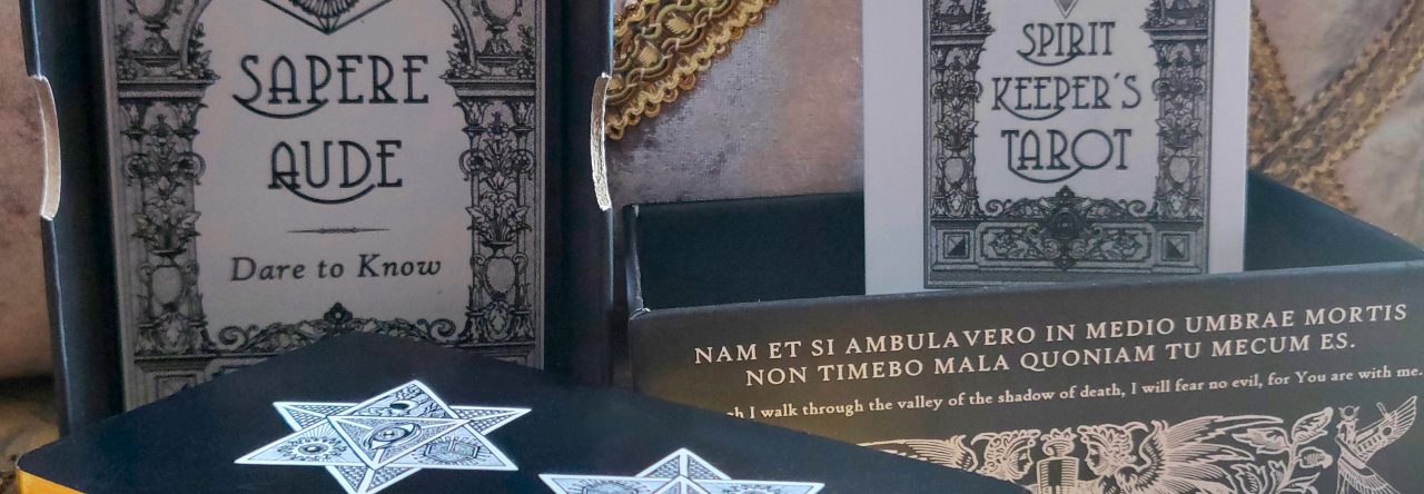
Our printing company in Shenzhen heard our concerns crystal clear and immediately kicked into action to address those concerns. We got new samples printed and they’re great.
I’ve already approved them and production has commenced. We received the physical samples yesterday on the March equinox and production begins today with the new moon in Aries.
Left: RWS-based Key 13 Death card drawing, entirely by hand pen and ink sketch. Right: Etteilla-based Card 17 Death card drawing, mostly digital, including hand-drawing with a digital paintbrush.
The above side by side isn’t a fair comparison, but let’s compare anyway. The left was entirely hand-drawn in pen and ink back in 2018 when I first picked up drawing after not having done anything artsy for over 20 years. Well, I did do technical drawings in fashion design, but like creative artsy art. That I hadn’t done in decades.
The above right began as a thumbnail sketch by hand (I still feel better doing it that way, even after going digital), I scan in the rough sketch and then clean it up digitally. Then the illustration is colored digitally as well.
Gradually, I’m doing less and less by hand analog and more and more digitally in software. For example, even near the tail end of completing SKT Revelation art, I was finalizing almost the entire composition of each card by hand, scanning it in, and then digitally coloring, tweaking, etc.
At this point of the Etteilla project, however, there’s less than 1 hour of drawing by hand analog before everything goes digital and I take it to the finish line in Paint Shop Pro.
I will say, though, notwithstanding the boost you get from tech, my actual line drawing by hand has improved a great deal over the last 5 years. Almost every day for the last 5 years, but for a few exceptions, I’ve been practicing my drawing skills. I keep a sketchbook and make sure I draw something every day.
First, Eugene Vinitski and Elsa Khapatnukovski took us to Venice of Italia with the Golden Venetian Lenormand and now to Spain with the Spanish Lenormand. This is a Petit Lenormand Oracle based on Johann Kaspar Hechtel’s Game of Hope, circa the late 18th century. The deck consists of 36 cards-symbols expressed through brilliant Pyrenean colors and cast with the mystery and magic of Iberian witches–las brujas (Iberia being the Land of Rivers).
What’s most standout about this deck is the art. Note how Vinitski adds a lot of texture to his work, a la the Post-Impressionist painters of continental Europe. You get the sense that the artist is a Romantic at heart. As I go through these illustrations, they call to mind early Modernists such as Marc Chagall (1887 – 1985) and stylistic traces of Jean Metzinger (1883 – 1956).
The Unifying Consciousness Tarot by mystic Lori Lytle and illustrated by Leo Scopacasa is premised on emissions of loving forces to unify collective consciousness. These works of art are intended to “activate the soul of the viewer,” by “achieving resonance with the inherent vibration of love” (notes the guidebook).
Bonus Card: Arcana 22, Activation
This tarot is molded from the conviction that we are all one and we are the eternal. Readings with this deck empower you as a being of Light. The All-Seeing Eye becomes a recurring theme throughout the illustrations and is also the motif on the card back design. The Eye in every iteration you’ll see is crafted to activate your soul memory, wisdom, compassion, memories, and to be securely guided by the unifying consciousness of Love.
The pack of cards is a cosmic crew of otherworldly and divine beings, freeform entities, and universal forces framed into the Waite-Smith Tarot structure, with a total of 79 cards. The extra card in this deck is Arcana 22: Activation. This is the key that attunes your All-Seeing Eye to this deck as the window through which you’ll See.
I’ve decided to change the card back design to the one you see above center. The really ornate one runs a higher risk of looking chaotic after printing. From trial and experience, I learned that the ornate one looks pretty cool on screen digitally, but after printing at standard tarot card size, I dunno why, it just looks too busy…even for me!
That said, I still took a risk with the addition of the gold filigree borders, which is something I had said I wasn’t going to do.
Above right is what I had intended on for this second print run, without the gold filigree border because there’s a risk of uneven cutting, which would result in uneven borders. That was something we experienced with the first print run, and so I had resolved to take out the border.
But the border looks so much better that, in my view, it’s worth the risk. Looking at my first print run, even when the borders came out slightly uneven, it still looks better than the card design without borders.
Above center was the card back design on the certificates of authenticity from the first print run. Above left was the card back design for the Vitruvian SKTs.
Here’s a comparison between the first print run card back design (left, the blue one) and the the one I’ve chosen to go with for this second print run (right, the gold one).
Click on the above image file to download and use freely (but reverently, please). The image file is in 400 dpi and should print okay at 9.5 inches x 9.5 inches. So don’t go much larger than that, but you can go smaller. Actually 11″ x 11″ should still be fine.
All the extra border is to allow for bleed margins.
Second print run certificates (showing 1 of 8 Orders)
Please anticipate more delays to delivery of your pre-ordered decks.
(I feel a bit awful that I’m always leading with that in every status update…)
But I’m gonna be pushing back the estimated delivery dates even further now.
Left: 2021 proofs for the first printing. Right: 2023 proofs for thee second printing.
The physical proofs of the printed cards have arrived. And I have questions.
Like why are these proofs cooler-toned than the previous printing when I used the same 600 dpi digital files for both?
Left: 2021 proofs for the first print run. Right: 2023 proofs for the second print run.
I need to backtrack and assess what I did for the 2021 first print run to get those warmer and brighter tones and why these 2023 proofs look cooler, fuzzier (does it? is it just me or do you see the fuzz too?), and like no seriously what is happening.
David Vine is one of those rare treasures in the tarot community. Combining his academic training, knowledge of the classical languages, medieval literature, and art history with a passion for the tarot, Vine has translated several seminal French-language tarot texts, and Vintage Tarot Texts, Volume 1, is one such treat.
Just a random comment– A beautiful touch in this edition are the captioned historical illustrations throughout, such as this print of an array of ancient sistra and rattles. I so appreciate the added illustrations.
Volume I consists of seminal essays on the tarot by Court de Gebelin and comte de Mellet. The first text to address tarot at length in a symbological context was by comte de Mellet, and thus in one sense, his work is the foundational document for everything we have come to understand about the esoteric tradition of the cards.
This is a look-through of one of the most talked about oracle decks of late 2022, and that’s The Magickal Botanical Oracle: Plants from the Witch’s Garden by Christopher Penczak and illustrated by Maxine Miller.
The aesthetic is reminiscent of a Victorian botanical illustrations. It’s a witchier, grimoire art-esque version of A Curious Herbal (1737) a la Elizabeth Blackwell. This is the plant kingdom as seen through the eyes of the witch– as alive, animate, and willing to commune with us.
I’ve been trying to summon the motivation to resume my reconstructed Etteilla Tarot project. Funny… the card I resume on is the Four of Swords, which perfectly captures how I’ve been feeling.
Here are varying drafts of my illustration for the Etteilla Four of Swords. My art process begins with sketches by hand that I then scan in, clean up, and digitally color. I also separate out each feature in the composition as its own layer, so I can move around the pieces, resize, etc.