
Our printing company in Shenzhen heard our concerns crystal clear and immediately kicked into action to address those concerns. We got new samples printed and they’re great.
I’ve already approved them and production has commenced. We received the physical samples yesterday on the March equinox and production begins today with the new moon in Aries.
These proofs are brighter and warmer in tone than the first print run, actual decks. But it’s still hard to say how the actual decks in the second print run will look, because for the first print run, the the actual decks turned out lighter than the proofs I approved.
Btw, click here to read all past progress diary entries for the SKT, starting back in 2018.

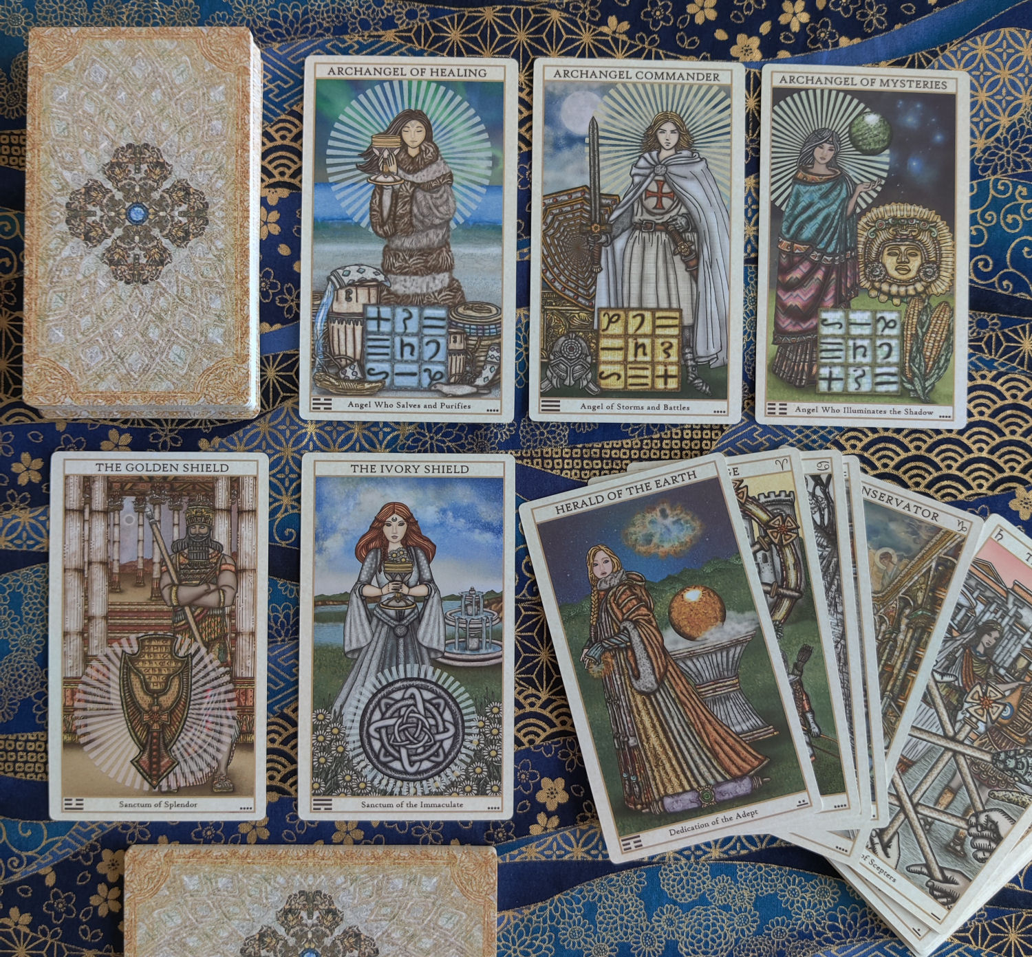
Above left is the actual deck from the first print run. Above right is the physical proofs I just approved for the second print run.
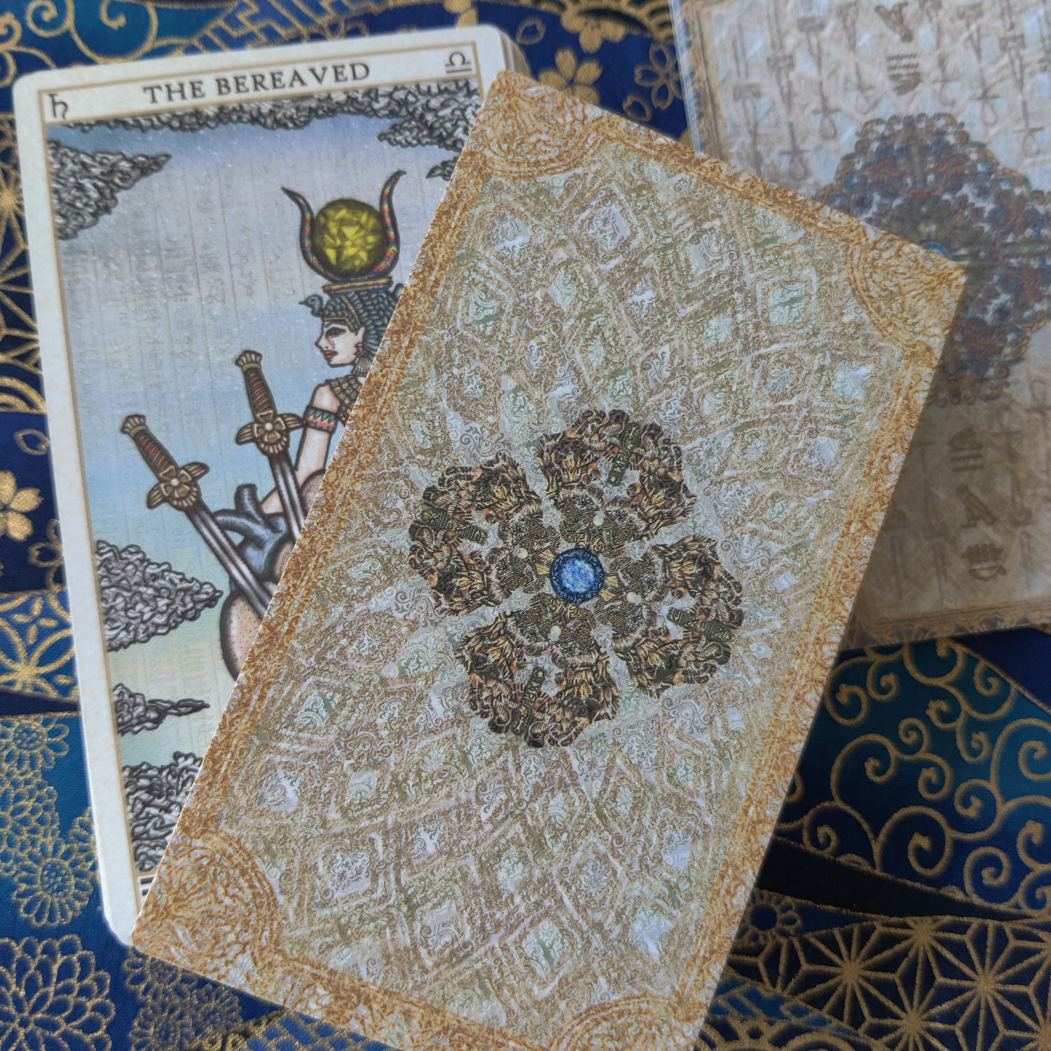
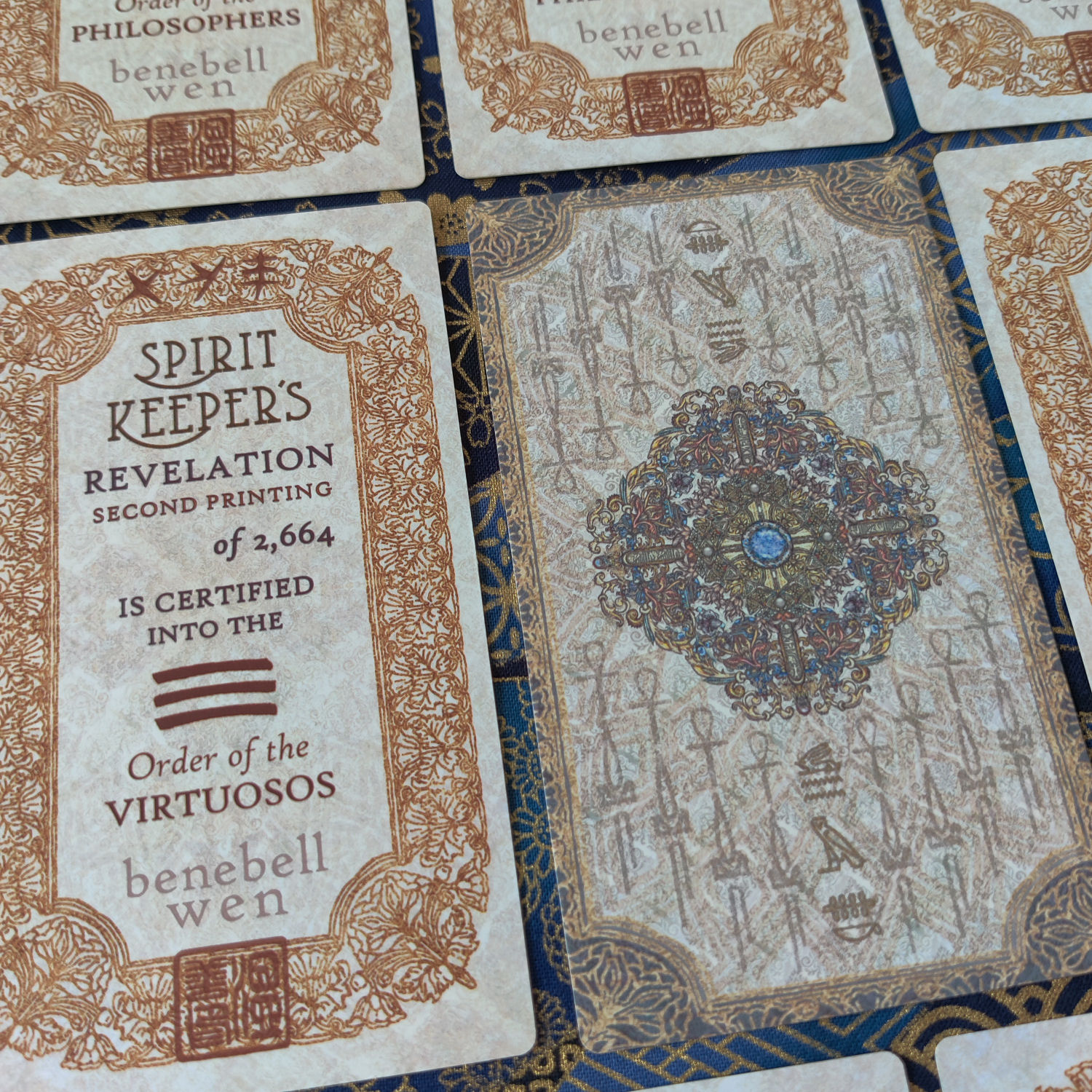
The bluish card back design with the Egyptian hieroglyphs is the card back for the certificates. The yellow-gold and white one is the actual card back design for the second print run decks.

You’ll see that the card back design, in terms of composition, is the same as the first print run. I just changed around the coloring. The border detail also changed.
As I understand it, production commences today. For the first print run in 2021, we approved the physical proofs on June 15 and production commenced soon after. We received word that production completed on July 21 and we remitted balance payment. The decks did not arrive in front of our home until October 6.
But the time frame between proofs approval and shipment for the black and white First edition was August 30 to October 5, 2018, under three months, close to two. For the Virtruvian, it was April 4 to May 18, 2019. The four month interval in 2021 was due to a series of delays on multiple fronts due to the pandemic.
Calculating based on past experience time frames, I’m estimating physical receipt of the decks at our front doorstep by June or July of 2023.

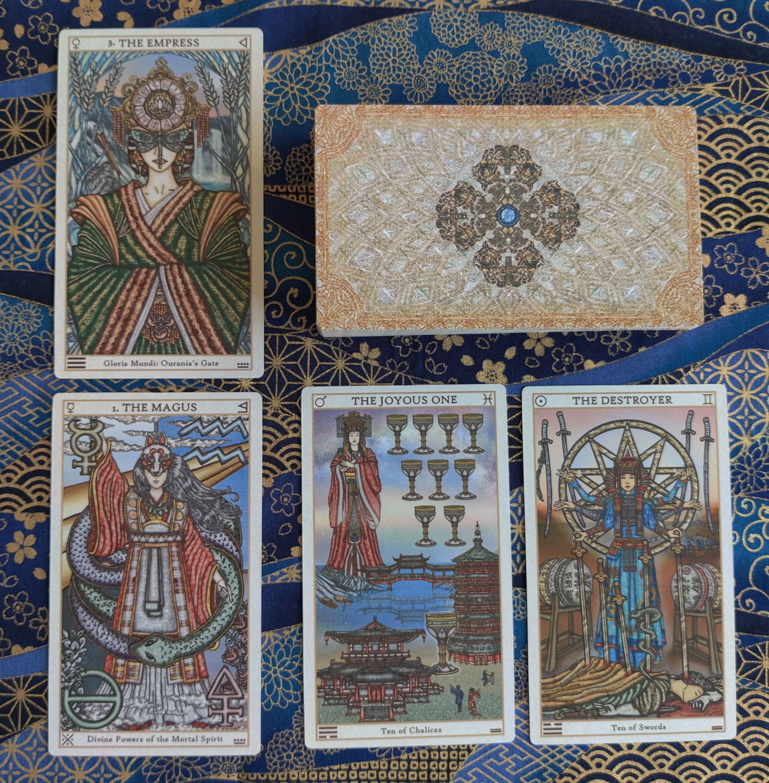
The warmer and richer saturation is most pronounced where there are reds. See above left for the First Print Run actual decks and above right for the proofs approved for the Second Print Run.
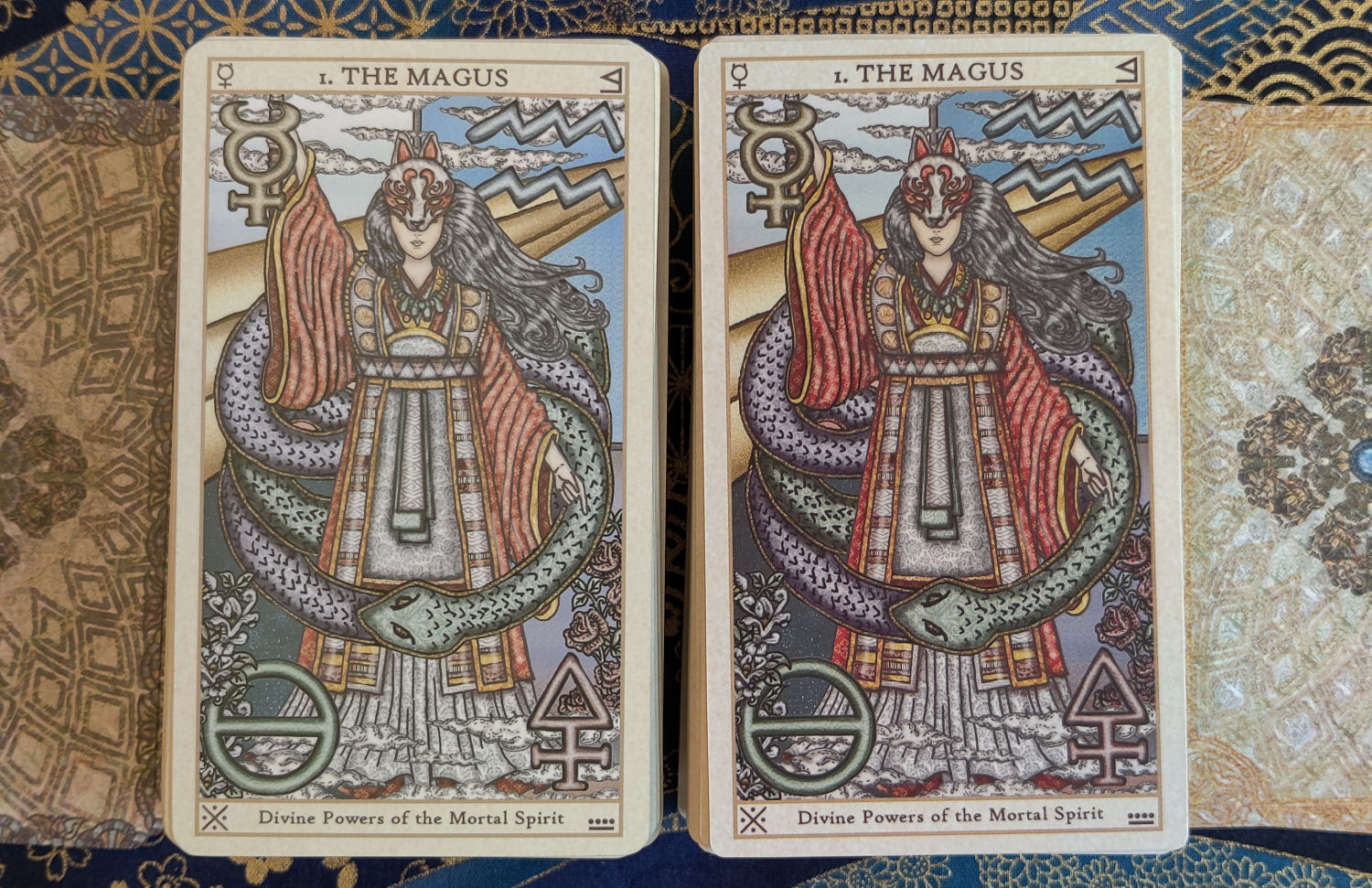
Again, I cannot stress enough that you’re comparing actual first print run decks with just the proofs of the second print run decks. Ideally it should be the same and it’s a fair estimation of color saturation, but life is life. =)

Oh see here in The Emperor card, where there are a lot of reds? According to these proofs, we do have an unintentional richer saturation of color, and warmer in tones.

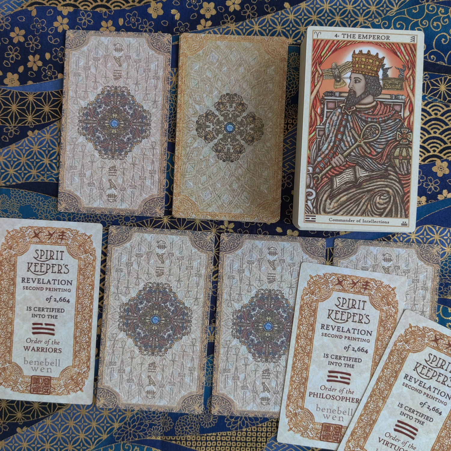
The above photo is of the first print run. Left are the proofs I approved for that first printing and above right is the actual printed card. Those who have a first print run Revelation will know what I’m talking about re: the lighter saturation.

So just keep that in mind as you look through these photos– the above card images to the right are proofs only. And sure, in theory if I approve these proofs, then the actual printed decks should look exactly like the color saturation in these proofs. In reality, per my first print run experience, that didn’t happen. So we shall see. =)
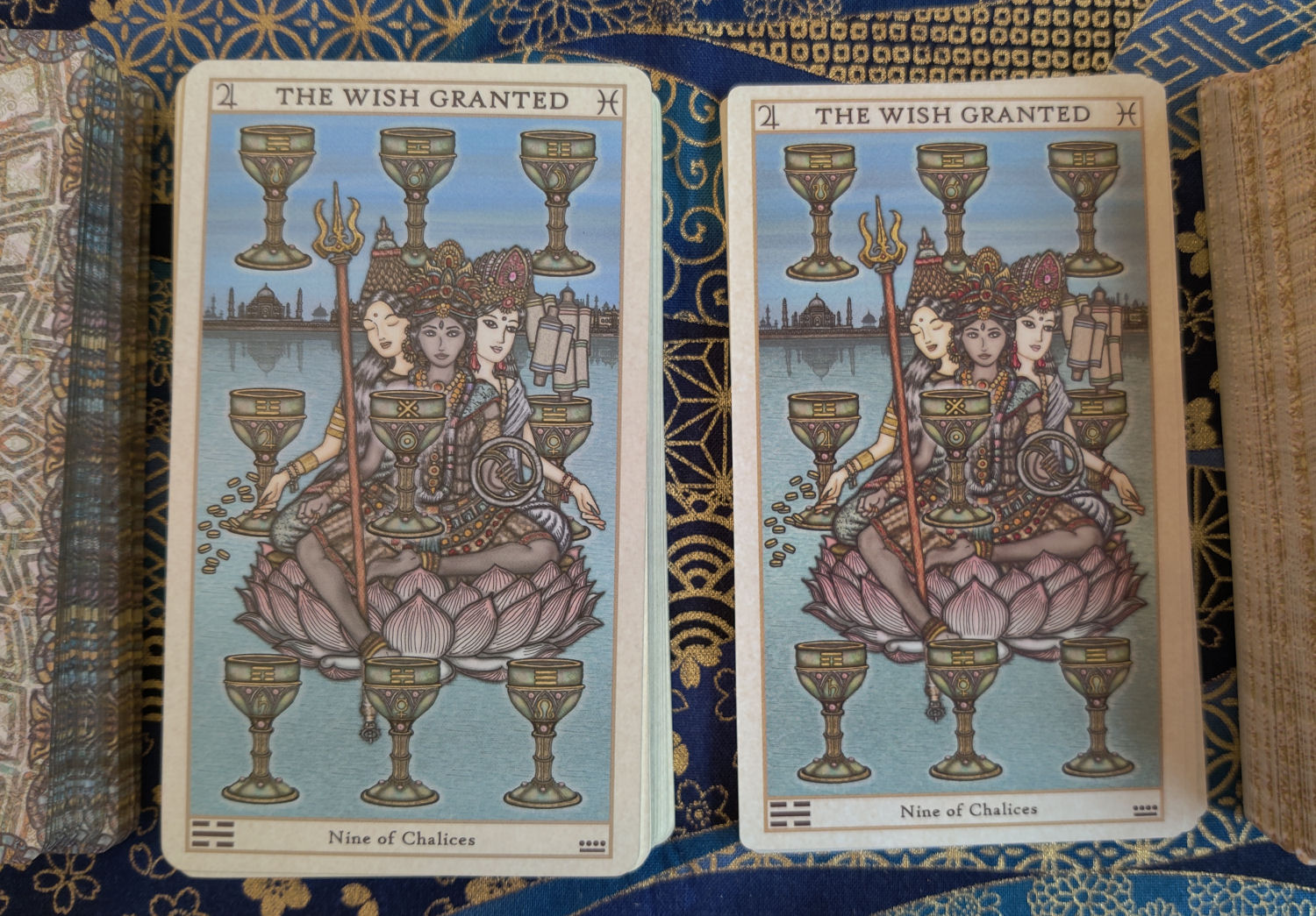
Notice how when there are less reds in the color composition of the card, the saturation difference is less noticeable. Must be something with the red ink. Also, I don’t know how apparent it is in these photographs, but in-person, you can more clearly see that the version to the left is cooler in tones and the version to the right is warmer in tones.
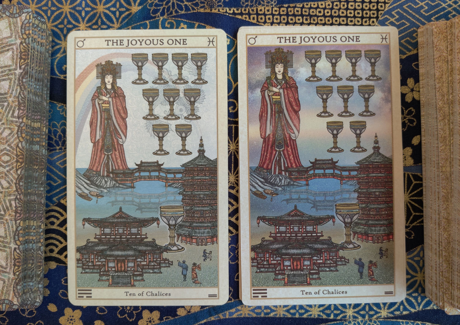
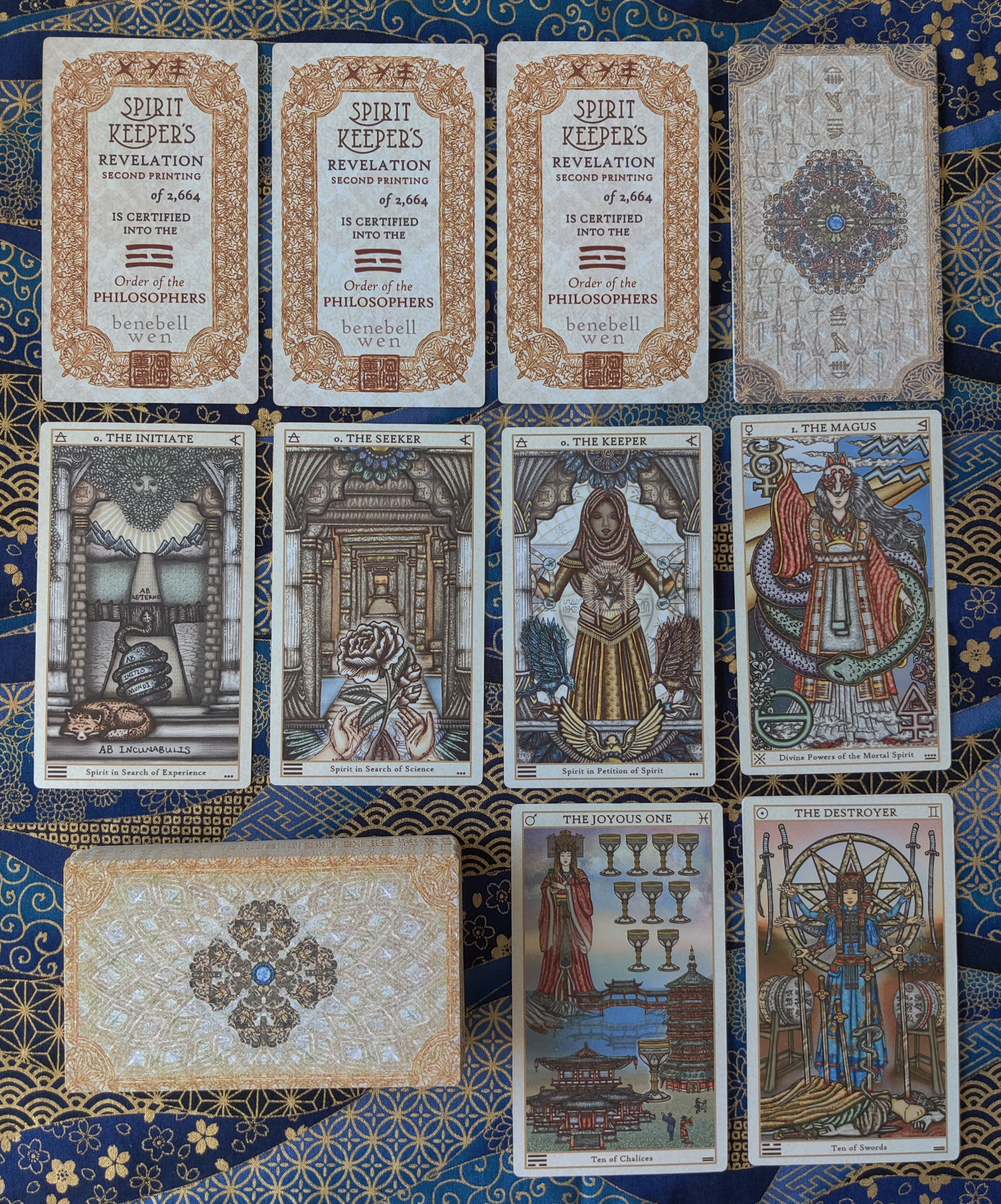
I made very minor edits to the Ten of Chalices, which you can see above.

And minor edits to the Ten of Swords.

I know that not everyone who pre-ordered checks this blog, so I will be sending out an e-mail update soon, especially since we need to readjust our delivery time table.
As always, I’m so grateful for your patience, support, and kindness. I can’t wait to get these decks in your hands! ❤

Hey Ben and Hubby, these new proofs have a vastly improved coloring. Warmer, brighter and much more useful…the spectrum assists my Astral vision when reading. Well done for having a ‘crystal clear” communication with your PRC printing company.
Kindest regards, and much gratitude for your dedicated magickal work and generosity with the community.
Ziggy.
LikeLike
Gorgeous and auspicious!!! XOXO
LikeLike
LOVE the new card backs….that warm golden color is so inviting! And I’m hoping they print it exactly as you requested, as the colors are so beautiful. Many thanks for all your hard work, both developing your art and drawing talents and your magickal talent and information you so generously share. Very excited about having another SKT Revelations deck!
LikeLike
Hi, the cards are soo beautiful and as well the backs ❤️
LikeLike
It’ll be worth the wait! Love your keen eye 😉
LikeLike
Pingback: SKT Revelation 2nd Print Run: Production Begins – spiritual advisor to psychics
Hi Benebell, my new email address is sagalala41@gmail.com mailto:sagalala41@gmail.com thanks Ann Mueller
>
LikeLike
I have ordered this beautiful deck. I already have the first print of the revelation deck out of all my decks which there are many this is always my go to deck. So had to get this addition. My wife loved the deck too. Sadly I lost her on the 18th February this year so it is in her honour that I buy this deck. So when I use it I will also be working with her too.
Many thanks Benebell for sharing you work. Stu
LikeLike
Hi Benbell & James, I had not planned to order this 2nd print run but did and so looking forward to receiving as I was drawn to it. I have the first print run and the previous deck and so much wanted your first but when I saw it you had already sold out – oh damn. I really feel that I will be going on another journey with the 2nd print run and the book of readings so thank you Benbell for hard work and creation. xxx
LikeLiked by 1 person