
Evolving from the pen and ink line drawing you see above to the digitally-remastered in-color version of The Priestess was a journey. As 2021 comes to a close and I send out the final shipment of first print run decks of the Revelation Edition, I’d like to share my reflections on this journey.
Fair warning upfront: This is going to be a looooong blog post. I also share some tips, from direct personal experience, to aspiring indie deck creators.
Completing the Revelation Edition is one of the coolest things I’ve ever achieved, because I leveled up so much in terms of my own art. I did something I didn’t even know I was capable of doing.

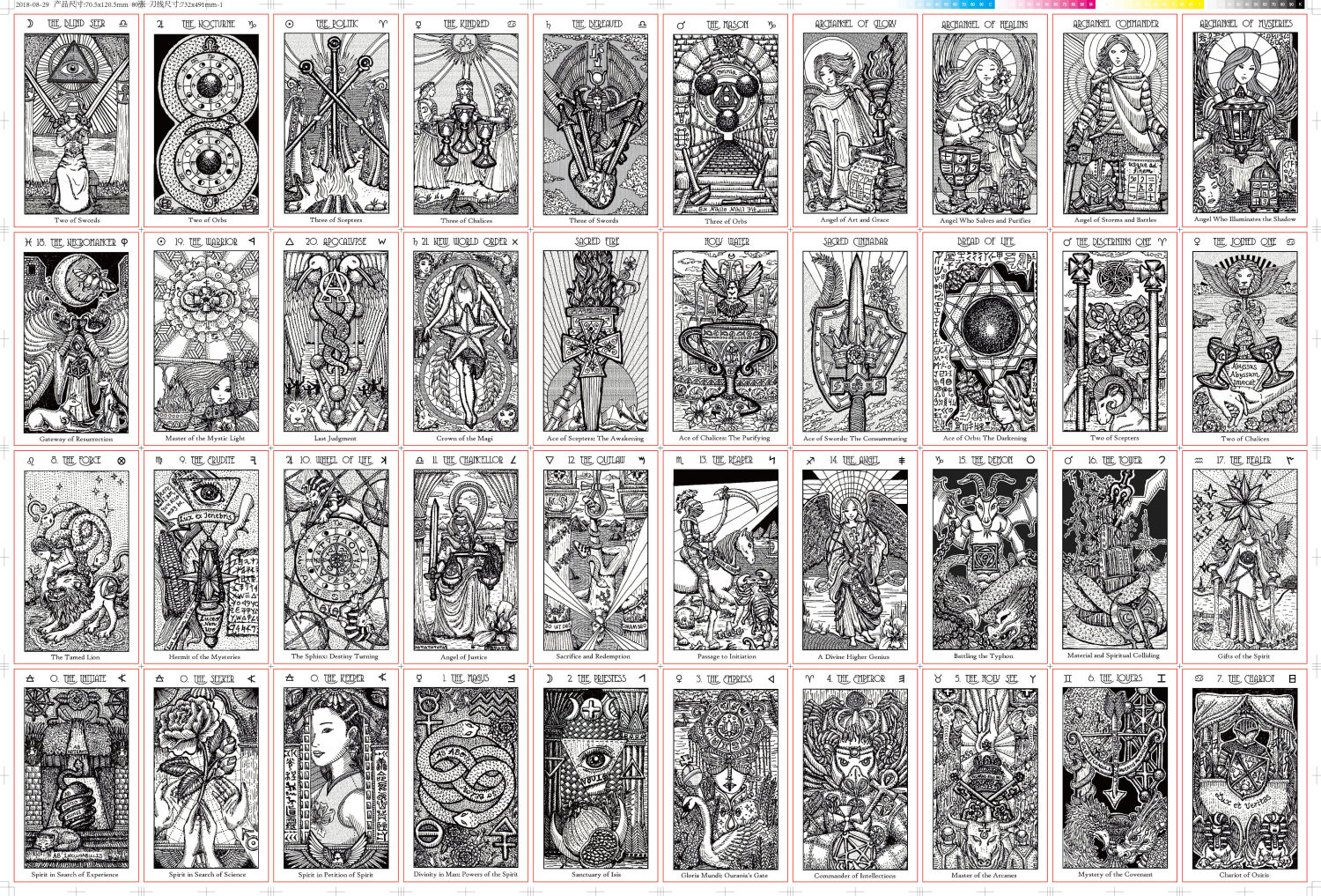
The above were the first completed pen and ink line drawings of the Majors I did back in 2018, before I went back in with stippling, contouring, and hatch lines for values. I wrote in the card captions by hand and drew these three to a sheet on heavy white cardstock.
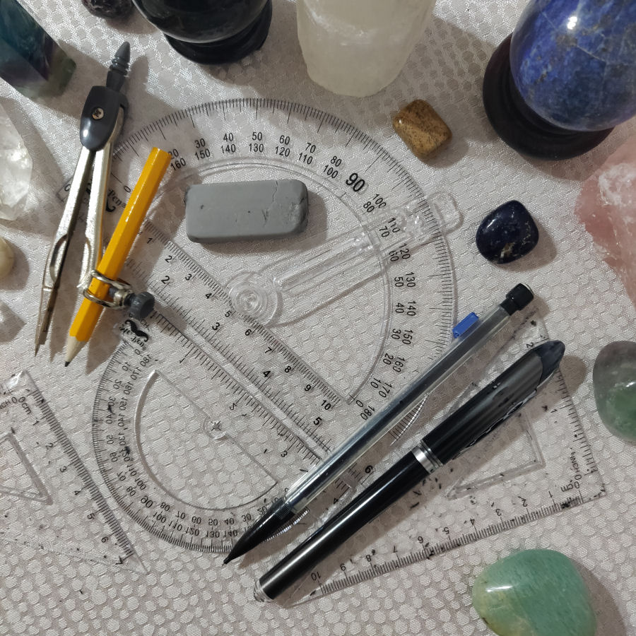
There’s a chronological listing of all PROGRESS DIARY entries linked here documenting my art and deck creator’s independent publishing process. This post will be a recap, or highlights reel. The entire First Edition SKT was drawn with only a few simple tools, and they happen to be the tools of an architect.

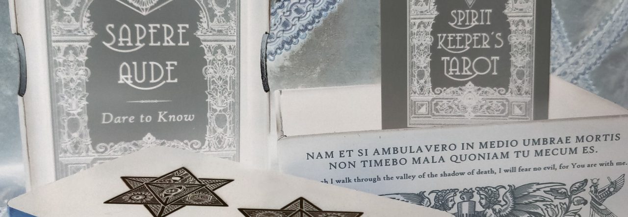
2018 First Edition
My tarot deck was in black and white, because that was all I was capable of doing at the time. Though to be fair, I’m fundamentally a huge fan of black and white decks, case in point one of my early working decks as a tarot reader, Godfrey Dowson’s The Hermetic Tarot.
You may have heard me talk about this in interviews– back in high school I had thought seriously about going into Fine Arts. I wanted to pursue an MFA track, and heck, go specifically to an art school, not a regular college.

My art teachers supported my art school aspirations in every way possible, making sure I had a great showcase for my portfolio (showing my sketches, my paintings, mixed media work, and sculptures), how to take studio-quality photographs of my art, and get them on microfiche slides.

And then that path was just closed off to me. I ended up in law school and became a corporate lawyer. Finally, after achieving a level of professional success that everyone in my life could be proud of, I felt like it was time I did something for me. Here I was, in my late 30s, an artist at heart, but with no art work product to show for myself.

The underlying motivator for completing the SKT First Edition was oft left unspoken– I realized I wasn’t getting any younger and I didn’t want to die without having produced any art work product. I’d say that was my exoteric motivator for completing this tarot deck. The esoteric motivator was pretty ambitious– to see if I could break the barrier of communication between heaven and earth.

As an “artist,” though, my growth and skill level had kinda stunted at high school, because I didn’t develop it at all after age 17. Below is something I did in, well, since I drew my ID card into the composition, I can say pretty definitively it was done in 1998. (I was taking college classes at the local university, so that was my campus ID.)

This is from my junior year, done in pencil. From my critical eye today, I see so many flaws in my work, but I guess for a 16-year-old completing a high school art class assignment, it was all right. The green redactions are to blur out my legal name.

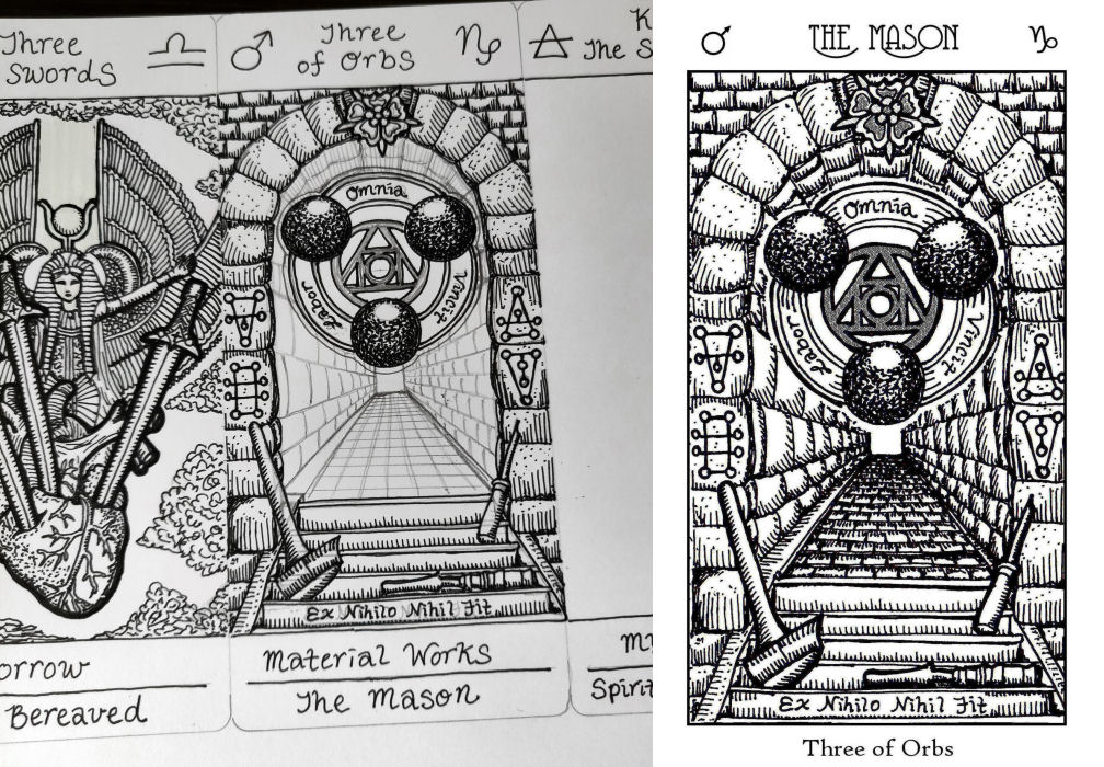
I was reading a lot of 15th through 18th century texts while drawing these cards. Now in retrospect, being able to take into account the approach I took with the full-color Revelation, drawing these first illustrations felt more like architectural design– getting down the blueprints.

In terms of the art, I was inspired by woodcut engravings, though admittedly these turned out nothing in resemblance to actual woodcut engravings. Shucks.

I’ve always struggled with drawing human figures, and having started SKT I with nothing beyond that stunted high school level of skill, you can see that struggle in these pen and ink illustrations.
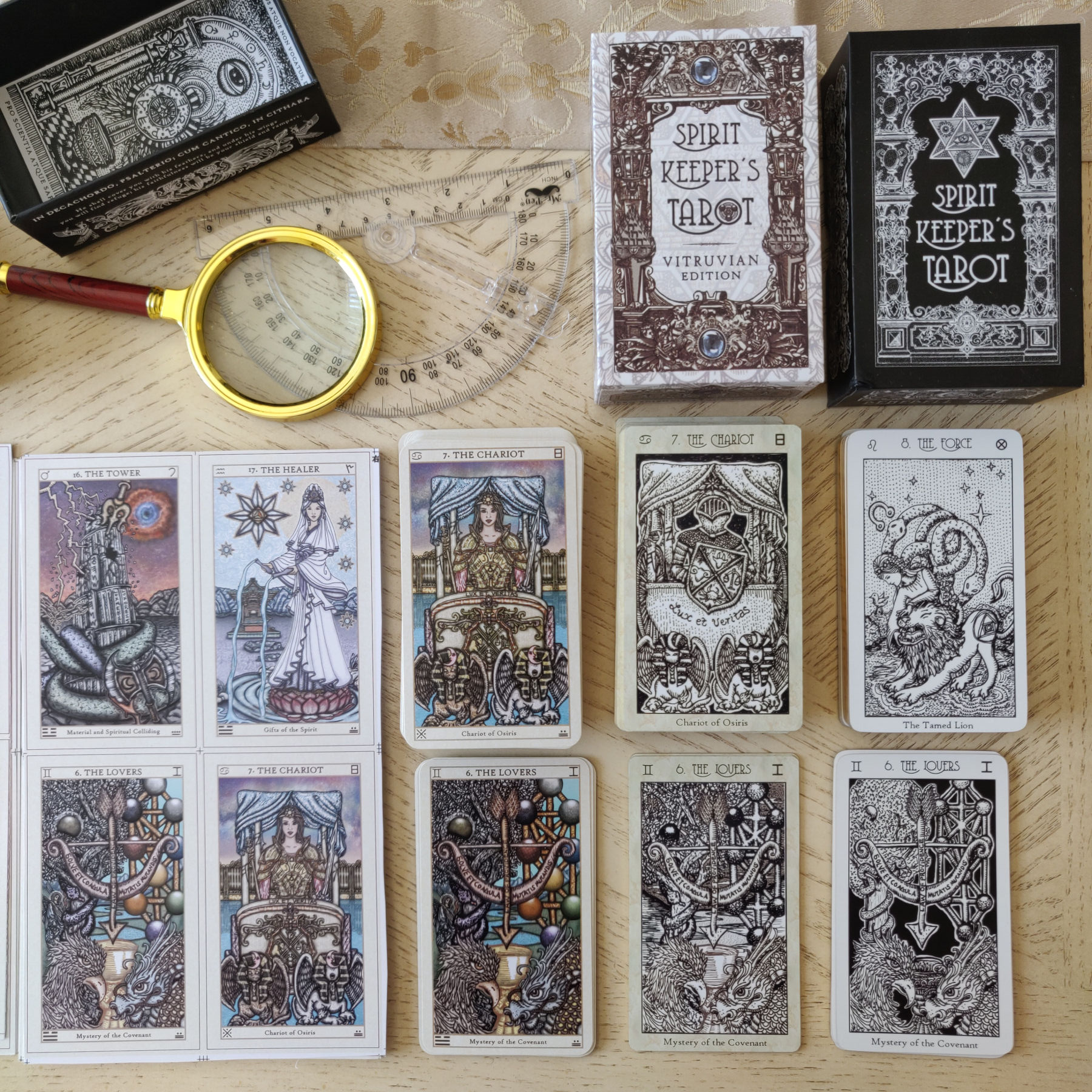
Those are the uncut sheets of your tarot cards you get from the printers for proofing. Those red cut lines are somewhat accurate to rely on, but also not. In about 0.3% of the First Edition decks shipped out, the bottom caption on some of the cards got cut off, which we had to send replacements for. In the subsequent Vitruvian, 0.5% had bottom caption cut-off problems.

Since I anointed myself and anointed my work space every single time I went to work on the SKT drawings, it only made sense to complete the process with anointing of the decks before mailing them out. I make my own anointing oil inspired by the Book of Exodus recipe. It’s Oil of Abramelin-ish.

One of our dens became the anointing room. That makes it sound more badass than it actually was. Basically, this is my job in the assembly line. I take each deck out of the bubble sleeve that the manufacturer sent it in and do quality check. I anoint, package it with the certificate of authenticity and miscellany, take each package shut, and restore it to one of the boxes.

Once one of the boxes is full of my quality-checked, anointed decks, I take it out into the hallway for James.

James was in charge of then packing each of the done decks into the shipping box, printing out mailing labels, and hauling them off to the post office.

The certificates of authenticity are each hand numbered and signed. I think this is an early photo, because eventually I learned that the red stampy thing was a bad idea. It smudged everywhere so I took the red stampy part out of the process.

The assembly line took over most of our house. To reduce margin of error, we tried to keep every step of the process isolated and as separate from the other steps as possible. Meaning we did only one step of this assembly line process in the den, and another in the dining room, and only certain things were stored in certain halls or the front sitting room, etc.

Oh, and we also had to hand-assembly every single shipping box. Unless you’ve personally hand-folded 1,000 shipping boxes in a matter of weeks, there’s just no way to fully appreciate what a labor this was. Piece of advice to any indie deck creators who decide to go this route: Get yourself nitrile gloves. If you don’t, your hands are going to get really cut up and you will literally bleed on the decks.

Here’s my work space in the den. I did a total space clearing and shielding before I started, meaning both mundane house-cleaning of this space and also energy clearing. My preferred approaches for energy clearing a space is always sacred incense smoke, sound (tingsha cymbals and singing bowls), and in the evenings when yin energy is stronger, candlelight. In the daytime, you’ve got the natural yang of the sun to weaken the yin.*
* There’s a whole esoteric Taoist or Taoist ceremonial magic explanation here related to energy shielding, yin, and yang, but that would require its own dedicated discussion.

And here’s James checking inventory in the halls. I don’t do any special additional space clearing here, but I rely on the general routine house-cleaning and energy space clearing/shielding I regularly already do.

J and I now have a joke where we call this intense order fulfillment period our “crabbing season.” Not sure if any of you reading this are fans of that TV show, Deadliest Catch.

Btw, I learned some important design and production lessons from SKT I. For example, don’t go with a solid-black background for your card back design. That scratches up so easily and every little speck of everything is really noticeable. Sigh.

I gotta say, sure, I’m biased, but I really love how the black and white SKT deck looks.

When asked how did manifesting the SKT deck change my life, my response is this: the journey convinced me beyond any reasonable doubt that a God exists. That the concept of angels (…well, maybe not the human form golden wings with halo Hallmark Christmas cards depiction of angels…) really do exist.

I might still love that human form golden wings halo Hallmark Christmas cards depiction, but I also acknowledge that’s all it is– a convenient construct we’re using to represent the otherwise abstract and esoteric concept.

We printed 1,000 of the First Edition decks, which sold out in 7 days. We didn’t advertise, we really didn’t do anything intentional in terms of marketing, except to post a pre-order notice to my newsletter and a couple of tweets.

Chaos ensued. I think we had to refund somewhere like 500 orders that came in after we announced that we had sold out. It was a total headache.

That’s when James said to me, hey, maybe you should think about what a second edition of the SKT might look like. ASAP.

2019 Vitruvian Edition
My main purpose for the sepia-toned Vitruvian Edition was only for it to be a second chance for those who wanted the First Edition deck but couldn’t get it.

However, since it would be a new edition, I wanted to change it up enough so it could be a bona fide second edition and not just a reprint.
I don’t think there are that many monochrome sepia tarot decks out on the market, and since I was feeling inspired by Leonardo da Vinci vibes, I thought this might be a neat idea, and then because of the Vitruvian Triad, which was a foundational design basis I worked with, I called it the Vitruvian Edition.

After drawing 80 illustrations, your linework does improve a bit. So now, with improved linework, I felt like I had to revisit some of the cards I drew initially and redo them. The Progress Diary posts go through why I made each change, card by card.

With the First Edition, I was apprehensive about what the quality of the printed decks might look like, so I didn’t do pre-orders, not technically. I waited until all 1,000 decks were sitting in my living room and we had quality-checked the cards before I opened up for orders.

It became a “pre-order” in the sense that we collected all 1,000 orders, populated them onto an Excel sheet, and then commenced shipping. So as a buyer there was still a little bit of a wait time; just not months and months. More like days or weeks?

Because I wanted the artwork to occupy as much space on the card surface area as possible, I took some design risks with the bottom caption and calculated the spacing really close to the edge, with precision. Unfortunately, the machine that cuts the cards isn’t precise, apparently, and so we had a couple of issues with people receiving cards where the bottom caption got cut off.

That’s a design and production lesson I learned from the Vitruvian. When I was at the production phase for the Revelation, caption spacing and allowing room for imperfect cutting was something I had to take into account.

The First Edition box’s interior walls were solid black because I knew I didn’t know what I was doing, so I wanted to play it safe with the design.

For the Vitruvian, I got fancy. Hence, you see all that linework along the walls.

This time around we ordered 2,000 decks. Here’s what 2,000 decks piled up on your front doorsteps look like. We launched pre-orders before ordering the actual decks, and based on the quantity of pre-orders, went with the 2,000 print run.

Here’s what the boxes of decks look like after James carried them up those steps two by two and brought them inside.

I thought the First Edition was the best I could possibly do. And then I saw the Vitruvian and thought, wow, this is the best I can possibly do. I can’t beat this. This is where I’ve peaked.

Since we did the First Edition and Vitruvian in relatively close proximity to each other, James and I were exhausted. I was convinced I was done with indie deck stuff, for at least a good long while.

Let’s talk a bit about the fulfillment process for SKT II. After our lived experience with the First Edition production run, we came up with little ways to make our process easier, like that dowel rod contraption James came up with for the roll of bubble wrap.

These photos are fun. Above left is Jamesville, because James stacked those shipping boxes. To the right is the Vitruvian Kingdom. That’s my handiwork. ::beams proudly::

I remember what happened here– the shipping boxes (unfolded, like you see above) ended up arriving at the same time the decks arrived, so this meant the fulfillment process for each order took a long time, because of that extra step of having to fold the shipping box.

Later for the Revelation Edition, we got smarter and ordered the unfolded shipping boxes waaaaayyyyyy in advance, folded them all, stacked them and had them at the ready weeks (well, months– there’s a story) before the decks arrived.

That way once the decks arrived, we could fulfill the pre-orders pretty much asap, and there were no delays on account of having to origami those damn shipping boxes.

I had this idea, which seemed good at the time prior to implementation, to name every single Vitruvian deck. So on the certificates of authenticity, instead of numbering them, every deck was assigned a name. That’s 2,000 decks. 2,000 unique names. And yes, I looked up and confirmed the meaning and etymology for every single one of those 2,000 names.

A lot of eerie synchronicities happened with the names. And consider our assembly line process: After I write out the names on the certificate cards, they’re randomized. They are face down as I pack and assemble the decks during anointing. They go into a big box of 40 packed decks in the hallway. And I’m done.

James picks up from there. He grabs the box and packs each deck into white shipping boxes and stacks up the packed shipping boxes that are ready to go. Once he’s got a stack of about 100 packed shipping boxes, he prints out 100 mailing labels and begins sticking the mailing labels onto the packed shipping boxes. No, we do not intentionally try to match a name on a card to the name of a buyer. There’s no way. We don’t have that kind of time or energy.

And yet so many crazy matchy-matchy situations happened, and that’s just accounting for the ones we actually know of!

After both the First Edition and Vitruvian Edition runs, I put up for silent auction the remainder bottles of unused anointing oil. I won’t be able to do that for the Revelation Edition, since I only have one bottle left. Because after three editions of this, I’ve gotten really accurate with my calculations! =)

2021 Revelation Edition
After the Vitruvian decks sold out, I sincerely believed I was done for the foreseeable future. That’s because the next step for the SKT would have been to go into full color, which I did not have the personal capability to do at the start of 2020.

My secret thinking was– I’ll give myself 5 years to learn how to art, and then I can revisit the SKT in 5 years and maybe at that time down the road, go into full color.

Around March of 2020– and I don’t need to remind anyone reading this what happened around that time– I got myself a digital drawing pad, looked up art school syllabuses, and launched full throttle into independent art study, following the coursework in those art school syllabuses.

I kept pushing myself to be better. As soon as I finished a draft that I liked and felt proud of, instead of being satisfied with that, I asked myself, can I do better? Where’s my ceiling? I’m just going to keep going until I plateau.

With all this free time I now had sheltered-in-place during the global pandemic, it wasn’t just about learning the tech for digital art, but I really wanted to improve my line work as well.

Nay, I wanted to improve every aspect of composition and art technique. So I really did some balls to the wall edumacation. In many ways, I had to unlearn and relearn even the simplest aspects of how to draw.

If you didn’t see this before, you can download my art study journal by clicking here. Scroll through my rambling and find the link to the PDF. It’s a pretty fun summary of what I was teaching myself throughout 2020.

I also think “My Self-Taught Art Journey” blog post is worth a read. =P

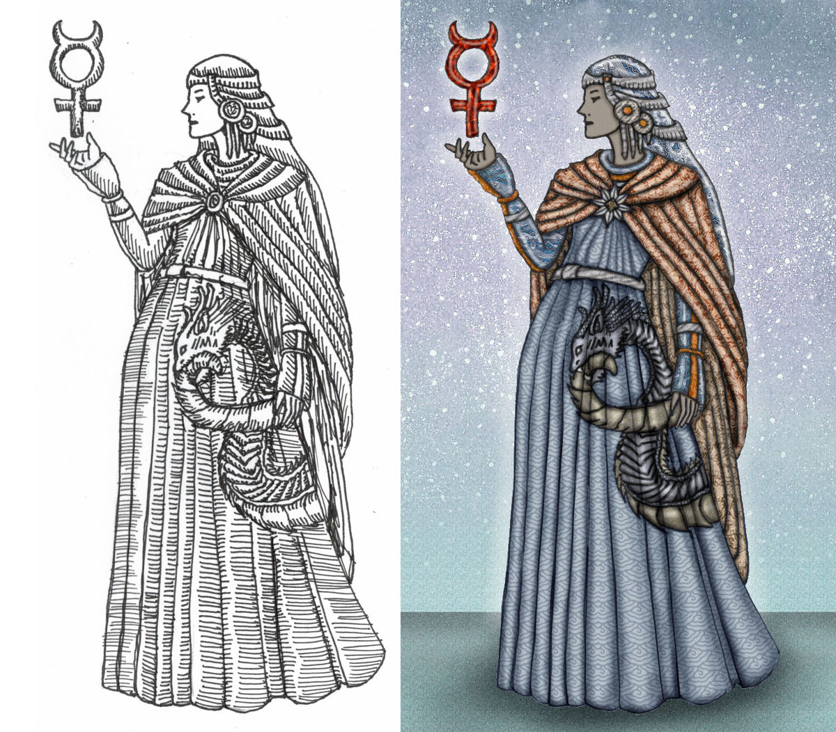
Between 2018 and 2020, my drawing skills improved significantly. I was learning new techniques and correcting mistakes with every card I finished.
I was still doing all the linework by hand, then scanning it in, and then coloring the scanned in linework. I wanted to be able to use the tablet to draw, but the precision I wanted wasn’t there.

The analog pen I use has an ultra-fine needle sharp point to it, which gives me a lot of precision when I put ink to paper. In fact, you might notice from the photos that when I sketch with pencil, I’m using a mechanical pencil. In contrast, the tip of my digital pen is round and bleh. So I still can’t do line work digitally. Maybe that’s something for me to learn in the years to come.
I recall after my hand-drawn 2018 First Edition deck was released, I lurked in forums and online groups, reading what people had to say about my work. And one critique that got to me (ultimately for the better, btw, and it’s what motivated me to improve my technique) was the remark that my artwork wasn’t very good, that it looked amateur.
Well it was amateur. ::pouts:: And of course it got to me only because deep down I already knew that about my technical proficiency. I knew it wasn’t very good.

So I resolved to improve my technique. I put in the hours. I downloaded all the tutorials. I filled up a small hill of sketchbooks. I took notes. I self-critiqued harder than anybody else could have critiqued me. There was no negative comment you could make about my art that I didn’t already make to myself about it.

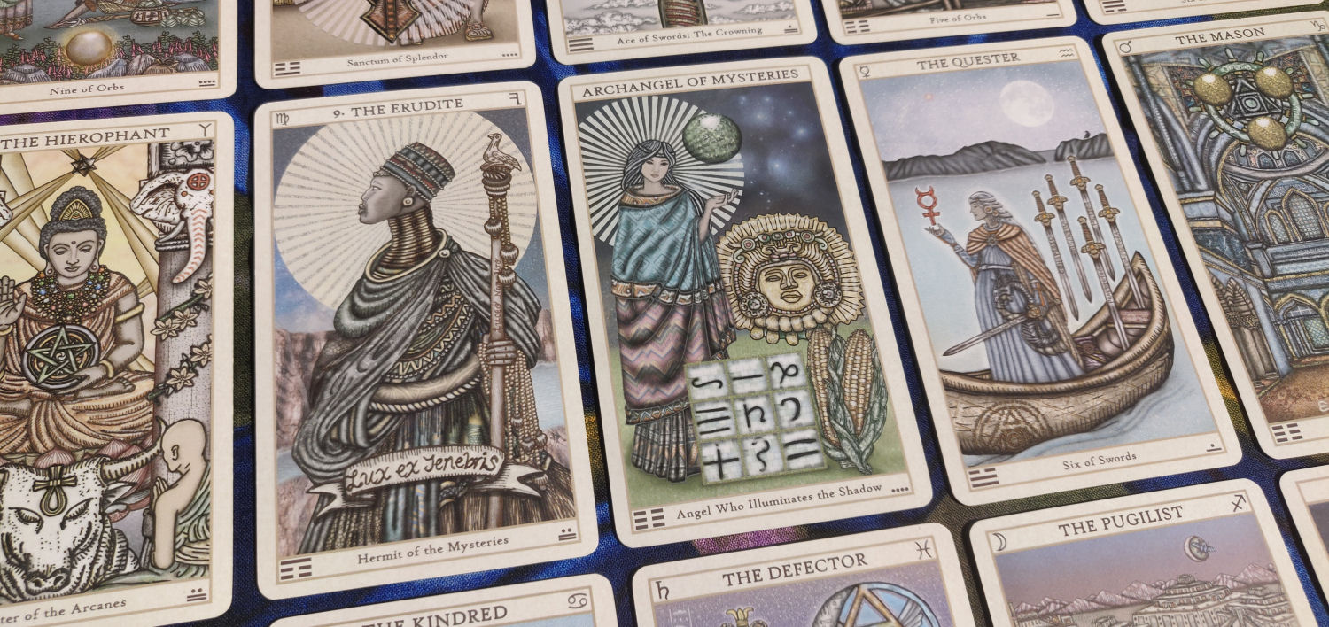
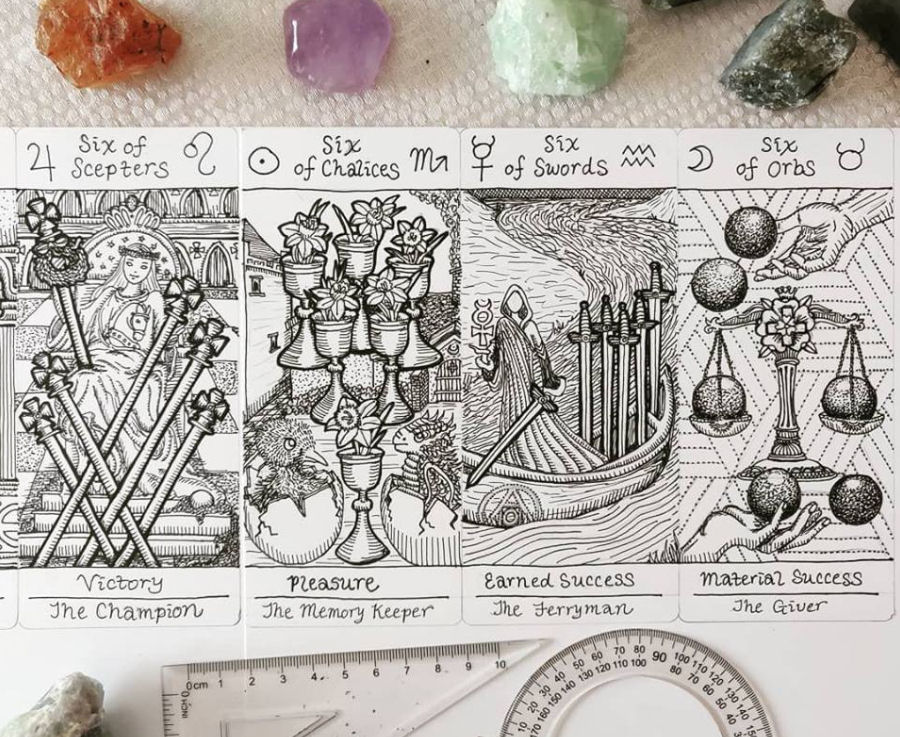
And in two years, I did improve. Scroll back up to see the pen and ink line drawings for the Sixes, compared to the above full-color illustrations of the Sixes.
How do you convey texture. How do you convey depth, so the composition doesn’t feel flat. I had to improve how I drew faces, how I drew hands. Proportion. Foreshortening. Emotional value.

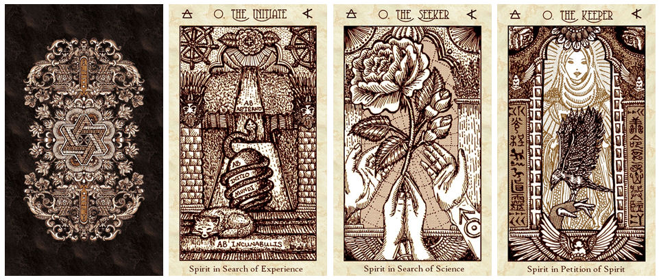
Look at the evolution of The Initiate, The Magus, and The Priestess over the last three years. My gods is that very first Fool card (The Initiate) I drew cringe-inducing. I had this vision of mystical ogdoad wheels all over the fields. My “mystical ogdoad wheels” ended up looking like pizzas.
Also, when I drew those first three cards, I was still deliberating whether to color them in, maybe with colored pencils or art markers. Hence the lack of shading.

Later, after I confirmed I was not going to be coloring these line drawings in, I went back to add values, via cross-hatching, stippling, pointillism, etc.

My process for creating each card in the Revelation was first to connect to the spirit of the card from the First and Vitruvian, then to envision that spirit manifested in a time and place. I built the entire world that would be the spirit’s setting. Then realized the spirit within that culture and point in human history. Then put it all together.

To build the world of each card, of course there was a copious amount of academic research involved. For anything material I was going to assert in the Book of Maps about a particular culture or aspect of history, I made sure I could cite it in a minimum of three different validated sources.
I looked for design inspiration from archaeological relics and museum artifacts.
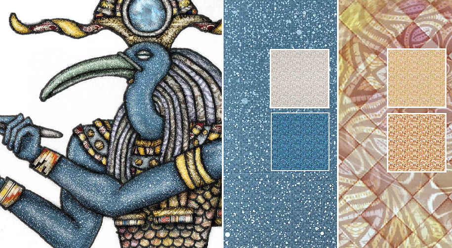
Also, if you zoom in closely, you’ll see that I don’t use solid colors. The shapes and forms of the composition are digitally filled in with seamless mutli-colored tile patterns I created from tiles of colored dots. At the micro-level, the coloring is done via pointillism.

I did that at magnification 500%+, so then when you look at the actual size of the cards, you can’t really tell that it’s done via dots.

To entertain myself, I was also trying out different styles. For The Initiate, I was going for a cut-out puppet theater aesthetic.

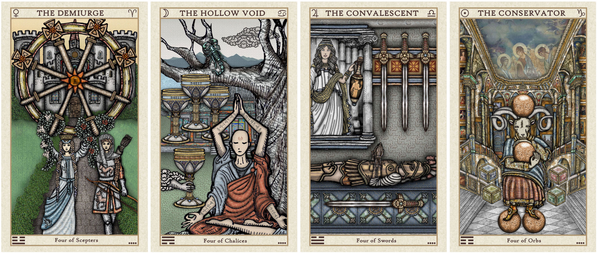
I’ve talked about how for the Four of Orbs (The Conservator), I was inspired by the paintings within a painting concept. It’s the only composition in the deck incorporating not-my-own public domain art, i.e., 18th century Russian paintings that I mount into those gold frames hanging on the walls.

The background in the above photo is a large canvas print of my illustration while in the foreground you see, in size comparison, the Four of Orbs card.
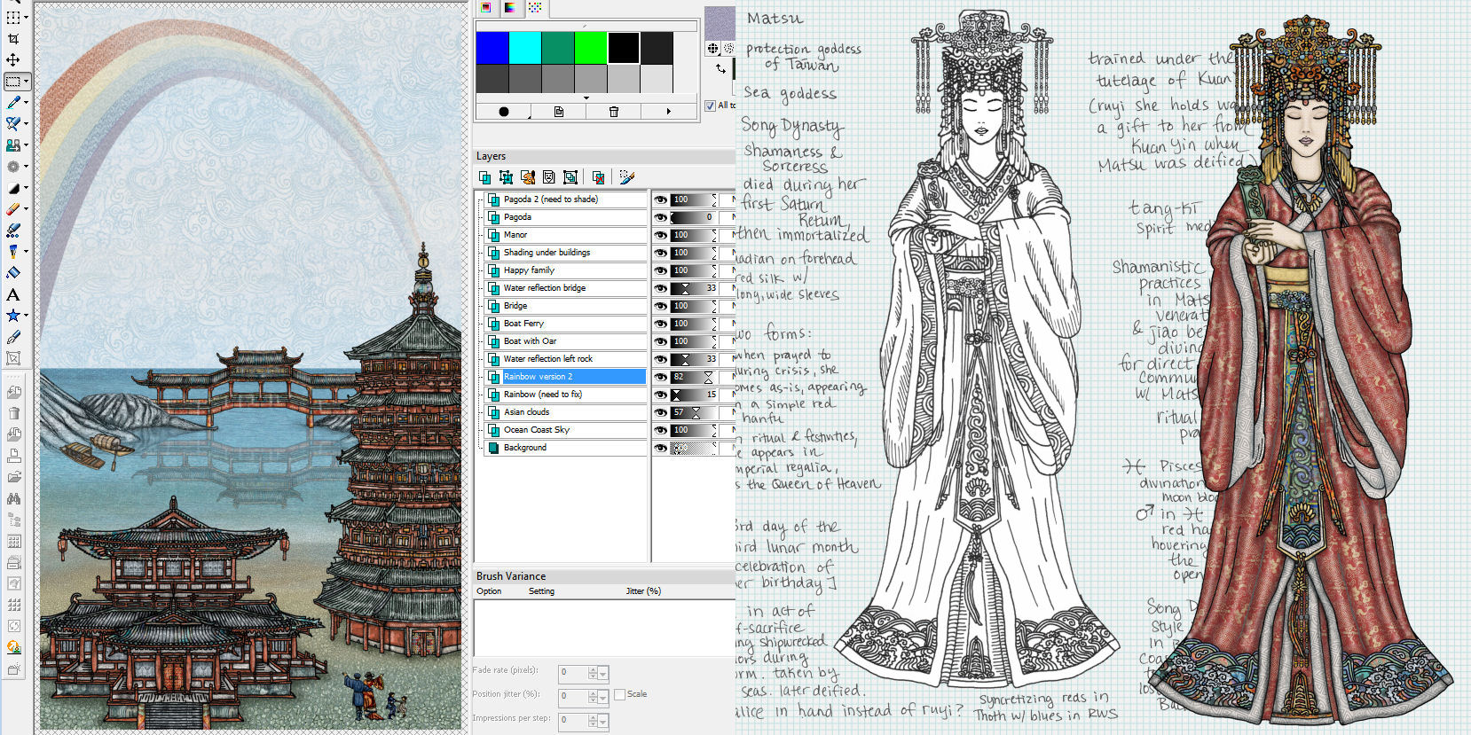
Digitally, each composition is done in layers. It’s here where you really cannot deny that going digital is much easier and much more efficient as a form of illustration than doing the same thing analog. Since each separate subject you see in the composition is its own digital layer, done separately, I can position and reposition as needed.

When I was drawing the First Edition cards, I had to do a lot of quick pencil sketch thumbnails and plan out the entire composition before I started. And then I wasn’t always right. Often the end result was bleh, so I had to start from scratch and do it all over again.

Digitally, it was a lot easier to scrap bad drafts and re-draft. I can reposition subjects in the composition without commitment and keep on tinkering until I get the right balance. Analog, all that has to be done in my mind. Sure, I can do quick thumbnail drafts, but those weren’t always reliable. It would look all right as a thumbnail, but once fully executed, was still bleh.
Working digitally for the Revelation Edition also meant my approach was different. When drawing by hand for the First Edition, I started with the foreground subject, figured out what I wanted to do in terms of the main focus, and then embellished the background with just, you know, whatever came to me for filling in the background space.
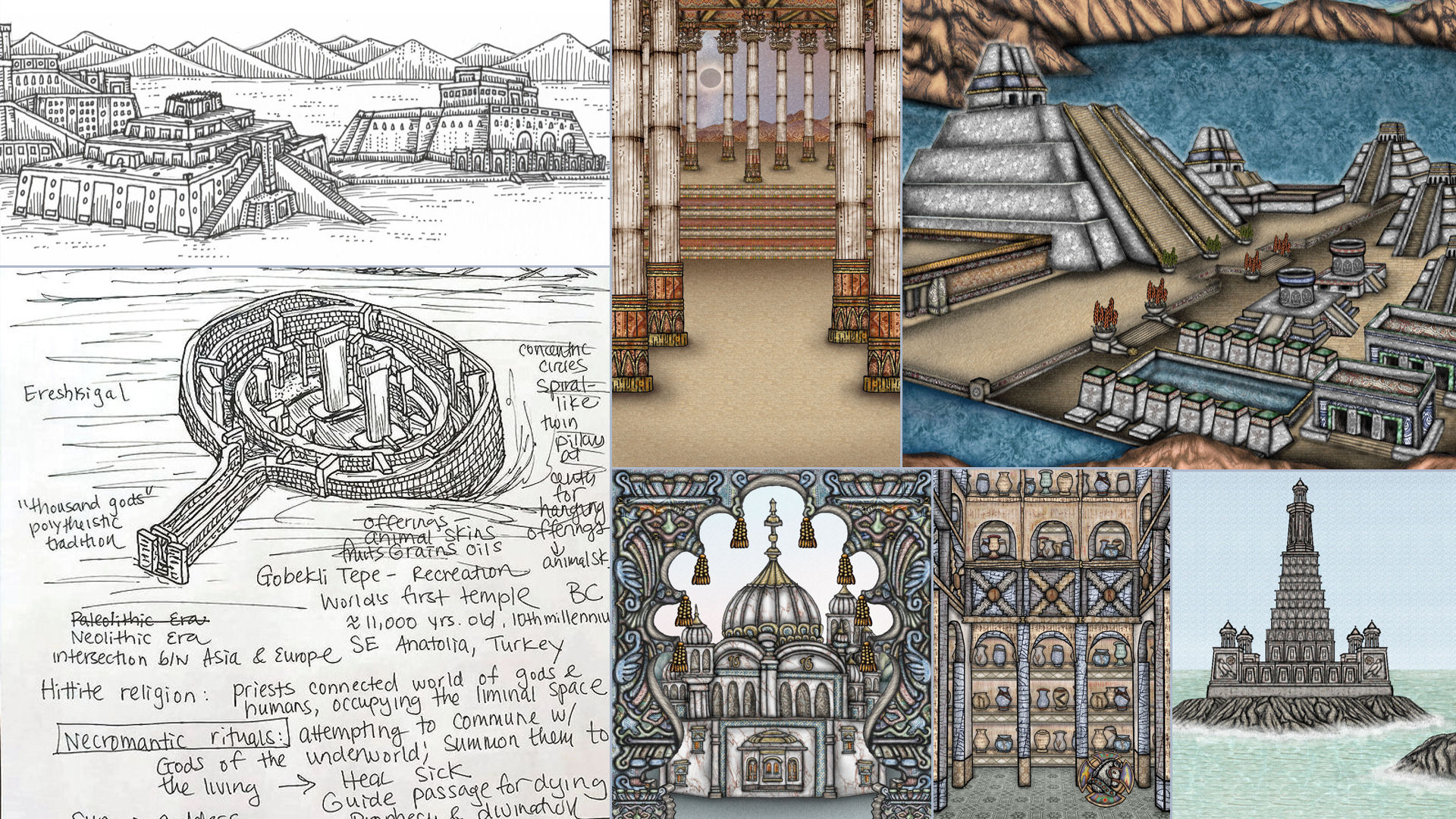
In total contrast, for the Revelation Edition, I always began with the world. To be fair, this is probably because the foreground subject was already done in the First Edition. Nevertheless, I started by building a world. You know all the techniques fantasy fiction writers use for world-building? That’s what I applied to my pictorial world-building.

Confession: For some of the architectural designs, I only hand-drew half of it. There’s one of the conveniences of going digital. Where structures were to be symmetrical, I’d analog only half of it, scan it in, do that copy, paste, mirror reflection thing, and then stitch the two halves together.

Even though it’s fairly evident that my skill has evolved from edition to edition, and you can see growth, I still love the pen and ink analog drawings. I don’t even think my art style has changed all that much from black and white analog to digital full-color.

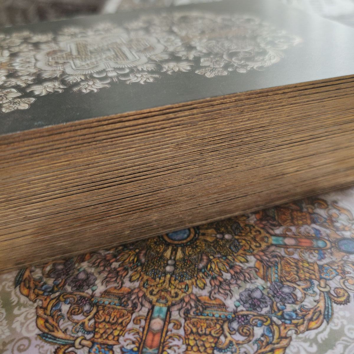
Ooh… compare the full-color SKT Revelation uncut sheets to the earlier black and white uncut sheets.

I don’t know what the experience of multiple runs is like for other indie deck creators, but for me, it didn’t get any easier. Each time I went into production mode, I faced new challenges, and the anxiety never goes away.

Earlier I talked about how you don’t want to use solid black for your card back design, because it scratches easily and every minor damage is super visible. Somehow I lucked out with the Vitruvian card back design and had no issues there. We did have some buyers contact us believing that they’re card back design was smudged or dirty. Nope— that’s part of the intentional design. Alrightey then.

For the Revelation, I thought I had a pretty cool card back design going for me, but again back to the issue of imperfect cutting by the printing machines. A small percentage of the decks had uneven vertical borders, and because of the color contrast I went with, uneven vertical borders were really, really noticeable. SIGH.
I hadn’t intended on changing the card back design for the second print run, but now I have to. At the very least I need to get rid of that blue border frame.

For the First Print Run of the Revelation Edition (this third full-color edition is an open edition, as opposed to the limited editions that were the First and Vitruvian), we ordered 3,500+ decks. And that’s what they look like when they were first delivered.

A huge truck showed up on our street and two guys used the machine vehicle thingie they had in their truck to help us move these crates into our garage, rather than dropping them off on the sidewalk.

Here’s us beginning to move in some of the boxes of decks into the gym. (On a typical day our home gym will have gym equipment stuff everywhere, but we had to clear it all out of the way, push them into closets, etc. to make space for the incoming decks.) You already see a wall of folded shipping boxes in the back. There was an equal size wall of folded shipping boxes stacked upstairs in our living room.

The boxes of decks are being opened, spot-checked for quality assurance, and we’re beginning to stack them in various places to set up our packing and shipping assembly line.

James did the unpacking and sorting downstairs…

… I did the anointing and certificate signing upstairs in the dining room and living room.

Since this was the biggest print run yet, by a lot, the boxes of decks totally took over our house. Instead of each person/job being assigned a separate room, now each person/job was assigned a separate floor.

After James printed out all the mailing labels, his dad was in charge of sticking the labels onto the packed boxes. Oh, and James was in charge of packing the boxes.

:: smugly :: My work spaces are kept so much neater and more organized than Hubby’s and his dad’s! Like Jamesville vs. the Vitruvian Kingdom! Anyway, once I pack the decks into their bubble wrap sleeves, along with the signed certificates, they’re brought downstairs for James to pack into the shipping boxes. He stacks the packed boxes for shipping and his dad sticks the mailing labels onto the boxes.

Here are the packed decks ready for James’s dad to stick mailing labels on. We had to separate out the days we did different order quantities. So for example, Tuesday night would be packing and sticking mailing labels on the two-deck orders only. And then Wednesday night would be packing and sticking mailing labels on the single-deck orders only. Never did we mix and match. That was our strategy for keeping down margin of error.

Yes, there are fulfillment services you can hire to do all the packing and shipping for you. You have your manufacturer ship all the decks to that fulfillment service, you send the list of buyers and their addresses to the fulfillment center, and they handle everything for $2 to $3 per deck, if even that. I think you can even hire an overseas fulfillment center for close to $1 per deck.

I decided not to go the route of a fulfillment service because I wanted to preserve that artisanal feel. Here’s my thought– the market (the target consumer) for a deck at indie price points is different from the market for a mass market deck, and so the buyer’s expectations are different, too.

If I’m going to spend the type of coin you need to spend for an indie deck, then as a buyer I want that artisanal “from the hands and workshop of the artist to mine” vibe. And I can’t replicate that if I use a fulfillment service.
To the Aspiring Deck Creator:
So you’re an aspiring indie deck creator and you want to know what piece of advice I’d give about production? Find an indie deck with the exact or as close to the exact production specs you would want for your own deck.
Research the heck out of that deck creator in advance. Try your best to get to know that deck creator, or at the least, based on that creator’s public information. You want to be familiar with that person’s work. If you don’t already own a copy of that creator’s deck, then you probably shouldn’t query them. Because you want to be able to refer to the production value of their deck when you consult them for advice.

Reach out to that deck creator privately, using the creator’s preferred method of communication. If they say no DMs, then don’t send them a DM with your formal query. E-mail them.
Start by being personal. Make sure you address the creator by name to show this isn’t a thoughtless mass e-mail. Talk about some of the creator’s work that you really admire. Talk about why you admire this particular creator and be specific. Make it obvious this is not (1) mindless, superficial flattery, or (2) generic flattery.
Link to or attach images of your deck and give a quick summary of your deck’s premise. Introduce yourself, though keep it brief and concise. Don’t be braggy. No one cares how amazing you are. Instead, be personal. Because contrary to your insecurities, people actually care about who you are. That’s interesting.
Examples: “I am the most psychic person to have ever lived.” or “I went to Harvard.” Me: Don’t care. Instead: “I’m a single mother of three holding down two jobs but publishing my own tarot deck has always been a dream of mine, so I worked on these cards early in the morning and late at night while the kids were asleep, and finally, I’m ready to start querying manufacturers.” Me: You’ve got my attention. Tell me more.
Be transparent and share as much as you can about who you are. Make sure you provide links to all your online social media accounts, website, and spaces so they can look you up and vet you.

Then ask the deck creator if they would be willing to introduce you to their manufacturer, since you really love the quality of their deck. Also be sure to ask if they’d be willing to share some of their insights and experiences with that manufacturer, and preemptively agree that you will keep everything they say confidential.
If the creator is unresponsive (and you used their preferred contact method and you weren’t being creepy), it’s totally okay to follow up in two weeks. For some context, I get around 250 new e-mails daily in my benebell inbox. If a few days go by where I haven’t had an opportunity to check my e-mail, that piles up and things get lost in the shuffle.

A lot of indie deck creators helped me out when I got started, and continued to offer really great advice throughout my process. There is absolutely no way I could have succeeded the way I did without their help.
This is why I know if you’re sincere and if the way you approach deck creators for advice isn’t creepy, needy, or overly self-interested, you will get feedback and a lot of support.

For those who weren’t able to get a copy of the SKT Revelation First Print Run, I’ll be doing a second printing, currently projected for some time in 2023. This gives me all of 2022 to focus on other projects and also, we’re playing a game of wait-and-see re: global shipping and supply issues. Inflation and labor shortages have had an impact on deck production and OEM manufacturing, so we’re a little hesitant to dive back into that world while it’s still so unstable.

To be the first to get notified, join this email newsletter waitlist.
If you are located in a country that blocks Google Groups, then e-mail me at abelldelivers@gmail.com requesting to be manually added to the waitlist. We’re happy to accommodate.

Will I be creating any more decks in the future? My best guess is yes, of course, because now that I’ve attained these skill sets, it would seem like a waste to not apply them again. However, I won’t rush anything, so it may be a while before any work product of a deck shows up.

Wonderful story of your art journey and creations. I did the same choice of putting my painting aside and becoming a nurse practitioner. It was a good choice for me and used both my heart and my brain. Now that I’m retired I’ve returned to my art. You will return to your art too (again). All my love and best to you and James and your family this season.
LikeLiked by 1 person
I, for one, would like to thank you for your efforts, Benebell. I shall treasure my two copies, and hopefully, learn from them. The new Book of Maps covers so much.
LikeLiked by 1 person
🤣”i am the most psychic person to have ever lived” 🤣🤣🤣🤣🤣 people talk like that? 😂😂😂😂
LikeLike
Indeed, Politicians, car dealers, evangelists…. The list goes on….
LikeLike
Groovin’ with the Revelatory SKT…
LikeLike
Absolutely amazing!
I honor you! The Revelation Edition Deck is stunning! The Book of Maps is beyond exceptional! I’m learning so much!
I don’t think that I will use another deck for a very long time. Every card is so beautiful. Your artwork is precious. Your interpretation sublime and intriguing.
Benebell, you have succeeded in bringing Heaven down to Earth. I’m so grateful that I am blessed with ownership of your sacred and magical creations. Thank you!
LikeLiked by 1 person
I enjoyed re-reading the journey through to the finished SKT Revelations deck. Loved the “villages” you and James constructed. 😀
(I think you’re being a bit hard on your younger self who created SKT 1, though!!)
The Revelations is a beautiful achievement and I was looking forward to owning one but I live in a part of the world where shipping is not happening. So it was good to read there might be another project ready for 2023!! Woo hoo!!
SKT Revelations was one beautiful happening during the past 2 years. :heart:
LikeLike
May I ask, what are some reasons why some creators wouldn’t want to give out who their printer/manufacturer are? I’m planning to create a deck in the future so I’ve been reading and gathering a lot of information and your blog are one of the most helpful ones.
I haven’t been in the tarot community that long when compared to many people, but I’ve always seen deck creators helping to support and promote each other, especially since most of us are small, independent individuals. But when it comes to giving out printer information, a lot of creators doesn’t seem to want to help…? And by giving out information, they are also helping their printer get more customers, so I’m not sure why a lot of creators are keep this a (trade) secret.?
LikeLike
Hi Lucy!
I can only speak for myself. If someone comes across sincere and is transparent with me and privately emails me for a contact to my manufacturer, I’m more than happy to not only give the contact information, but I put them in touch with each other directly. I make the introduction directly.
And I got to know my manufacturer because another deck creator did the same for me. That deck creator put me in direct contact with their manufacturer.
That being said, it is definitely considered a trade secret. I personally have not met any creator who is secretive about who they use however, as long as you are sincere yourself and reach out to them in a way that’s sincere.
B.
LikeLike
Where can I purchase this deck?
LikeLike
Dear Benebell! I am absolutely speechless! It’s scary to imagine what a great job you’ve done! I just can’t put it into words! The deck is beautiful! It’s a pity that I found out about it when it was already sold out(((((
LikeLike