This will be a walk-through of Keys 1 through 11 from the Major Arcana for the forthcoming third edition of the Spirit Keeper’s Tarot. Please note that I don’t anticipate the deck coming out any time sooner than 2021, and don’t be surprised if it doesn’t come out until 2022. I also won’t be doing pre-orders until the whole deck is done.
Learning to Art with a Tablet
Prior to the 2020 quarantine, I didn’t know how to digital art. And I was dragging my feet about it. It looked hard and I didn’t think I’d be interested in learning an entire new way of drawing.
But then the drawing tablet I ended up getting was on sale, so that was an incentive. I downloaded Krita, which is a free open source digital painting program. So far all of this is appealing to frugal-me. As I mentioned in the previous update, Jamie Sawyer of Sawyer’s Path Tarot (and several other decks) gave me private tutoring lessons on how to use digital painting programs to draw.
And all of a sudden, new worlds of possibilities opened themselves up to me. I sound melodramatic, but I’m totally serious. A picture is worth a thousand words, right? So later when you get to the walk-through section of this post, just look at the difference between the pen and ink illustrations that were strictly by hand in 2018 and the 2020 colored in version via tablet and stylus.

Drawing with a tablet and stylus has helped me break new ground. I can’t believe it took my stubborn ass this long before I got on the digital art bandwagon!
The “undo” click on my stylus has been a game-changer.
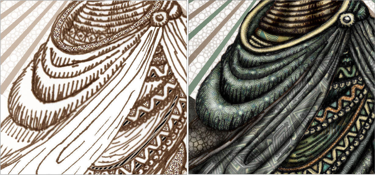
Also, on the digital medium, I can zoom into the image and work with detail at a whole new level that I can’t do with the physical constrictions of a piece of paper and the size limitations of your pen tip.
Here’s an example of what I mean:
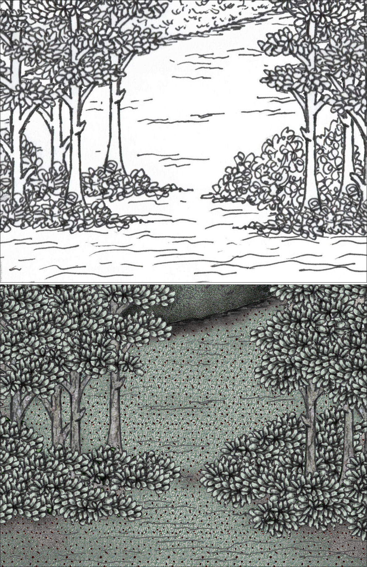
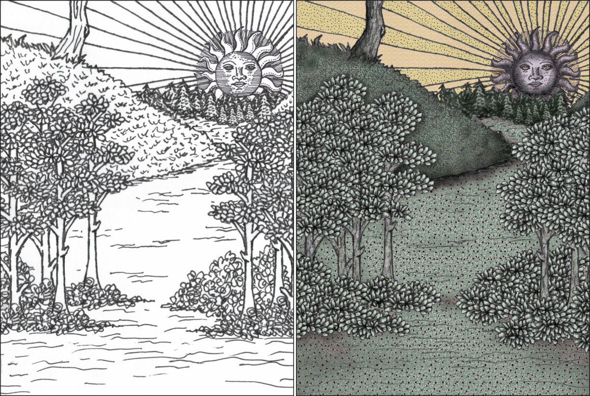
The black and white version is a scan of my hand-drawn illustration with a 0.8 mm tip ink pen. The actual physical width of the scale I was working with when drawing on paper was about 4.0 inches across. With those constraints in mind, take a look at how I doodled/scrawled the bushes underneath the trees.
Now take a look at the colored-in version, which I did on a tablet. I can zoom in and therefore not strain my eyes, then individually draw and color in each leaf.
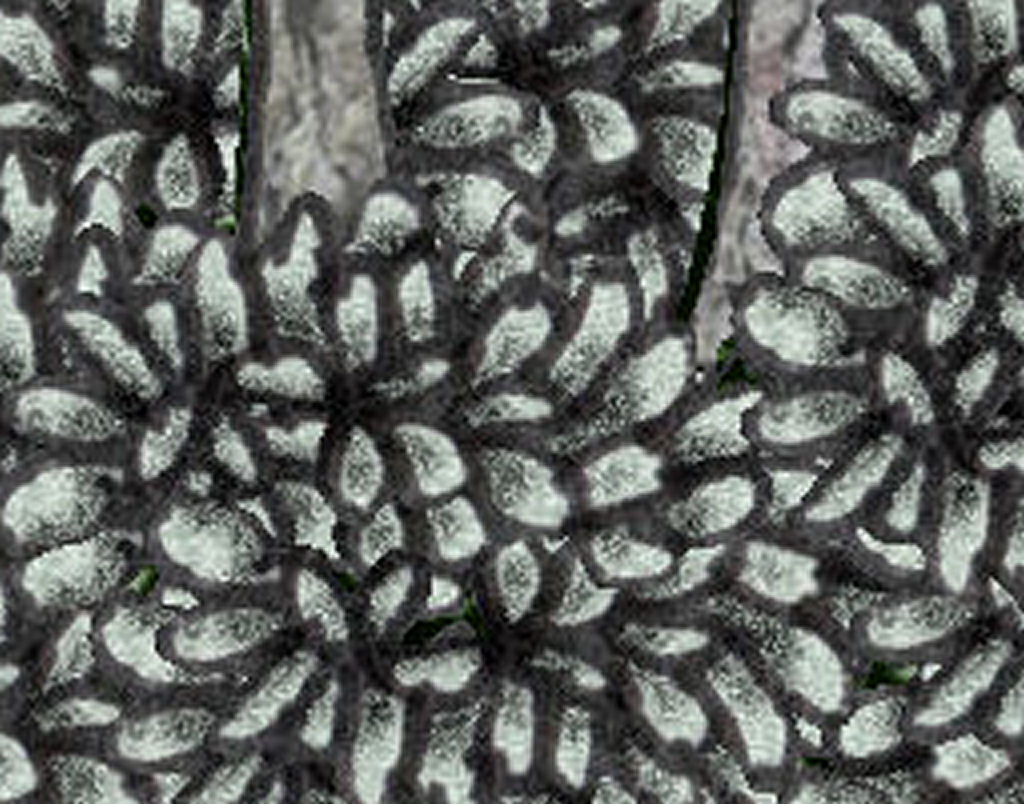
In fact, I don’t even need to draw each leaf. I drew 8 different leaves, colored in those 8 leaves, and then alternated with those 8 different leaves I’d drawn to “cut and paste” and form the bushes, leaf by leaf. While that sounds like a hack, it’s actually more labor-intensive than just drawing each leaf manually. However, the “hack” produces a much more beautiful, consistent, and cleaner aesthetic.

The detailing I could do with the fabrics in the Hermit card was not something I could have practicably done by hand on paper. On a tablet, I can zoom into the image at 500% and draw details in that space as if it was 100% “actual size.” Then I zoom back out and when you look at what you’ve done, it looks amazing! You look like you’ve got incredible talent, but no– you just got something called a zoom-in function!
Shading and rendering depth perception to make your image look more three-dimensional is also easier on a tablet, because you have so, so much more control over how airbrushed color is applied.

This is not to downplay digital media art, however. All of this is labor-intensive. To produce the coloring effect you see in the heart pictured above, I applied several dozen different layers of different shades of color with an airbrush function, constantly adjusting hardness, opacity, and density. Just the coloring itself– the sheer labor of coloring in my Key 9 card took over 20 hours. Yeah, no– it had to be more than 20 hours. It was 2 consecutive days of working, with hardly any sleep and forgetting to eat.
Psst… update: According to J, I grossly underestimated there. I worked on the digital coloring of Key 9 for closer to 35 hours.
But it doesn’t look it, does it. When you glance at the completed card images, I don’t think the untrained eye sees just how much work goes into it.
Another thing I learned: To optimize illustrating with a stylus and digital tablet, the artist who has spent her entire life drawing with a pen in hand will have to unlearn certain drawing habits. Or at least I’ve had to.
See below. To the left is my drawing by hand. I’ve gotten so used to the habit of automatically adding those lines for shading. But see what happens when I try to color in the areas in the image to the right.
That image would look so much better without those hand-drawn “shading” lines.

Above is another example of where I hand-drew those hard shading lines, because habits are hard to break. And then after I scan in the line drawing, I used Krita to digitally paint in with color.
Oops. Well. You live and you learn.
I could have cropped out the shading lines before commencing coloring, but I didn’t think of that. Darn it. Anyway, truly a learning process.
My only concern with going digital is whether I can preserve an Old World feel. After every card I complete, I do an audit and review. Would it be possible to produce the same work with 18th century art materials?
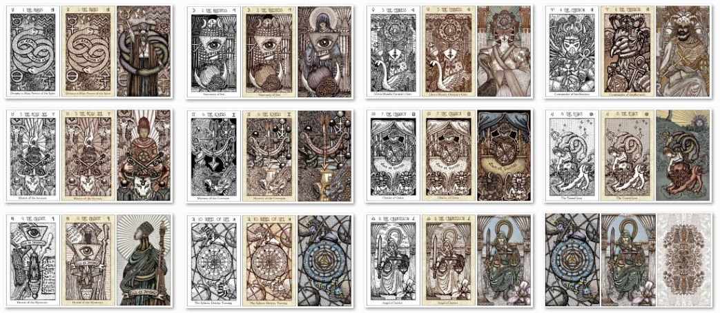
Anyway, I’ve now completed the first half of the Major Arcana cards, Keys 1 through 11.
Before I continue, I’m taking a break. =) My obsession over coloring these cards has meant I am now very, very behind on a lot of other work, so this needs to be set aside while I play catch-up. Also, I haven’t been sleeping. I’m not seeing straight anymore, so forgive me if there are obvious oopsies in these images that I’m sure (I hope) I’ll spot once I’ve had some sleep and can look at these drafts with fresh eyes.
The Walk-Through
The following card images are produced by copying my original high-res art, reducing it down to 72 dpi, taking a screen shot of that image, and cropping that screen shot down to the card size you see below. In other words, the image quality has been deteriorated twice. So if anyone tries to print cards with them, the image quality is going to be quite grainy. However, for viewing in a blog post, the quality will suffice.
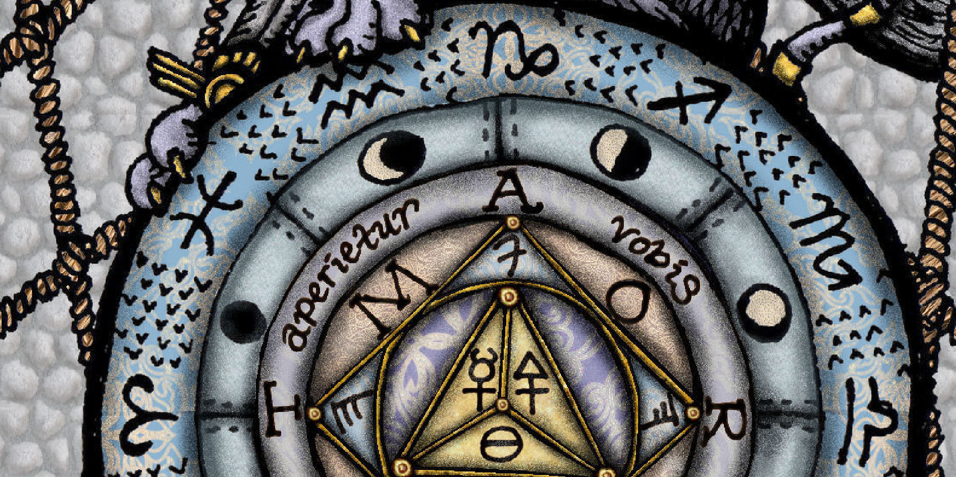
Coloring is done per referencing Crowley’s King Color Scale and Queen Color Scale, in combination.

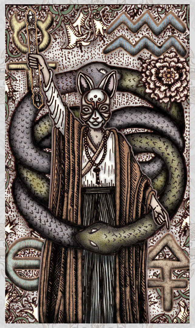
Key 1: The Magus
Shinto priest personifying “As above, so below,” wearing a kitsune fox spirit mask.


Key 2: The Priestess
Sanctum Sophia.
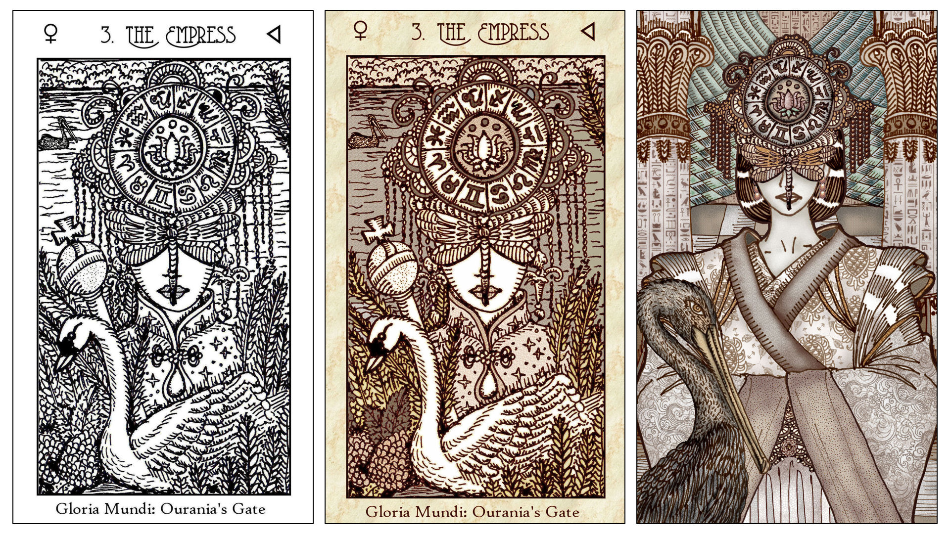

Key 3: The Empress
Inspired by Wu Zetian,a Tang dynasty empress regnant and the only empress of China to have ever ruled as an emperor.
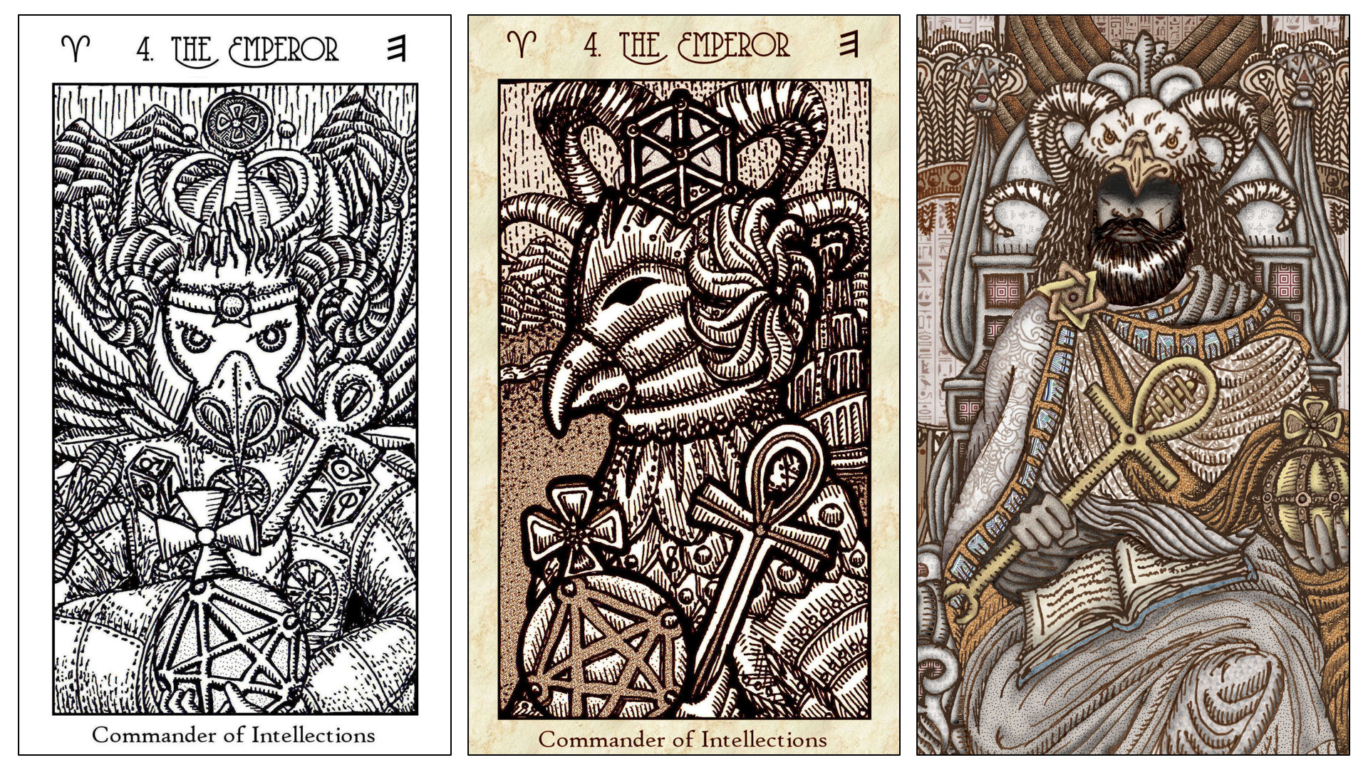

Key 4: The Emperor
Inspired by Menelik I, son of the Biblical King Solomon and the Queen of Sheba. According to legend, his father King Solomon gifted him with the Ark of the Covenant.


Key 5: The Hierophant
The Maitreya bodhisattva.
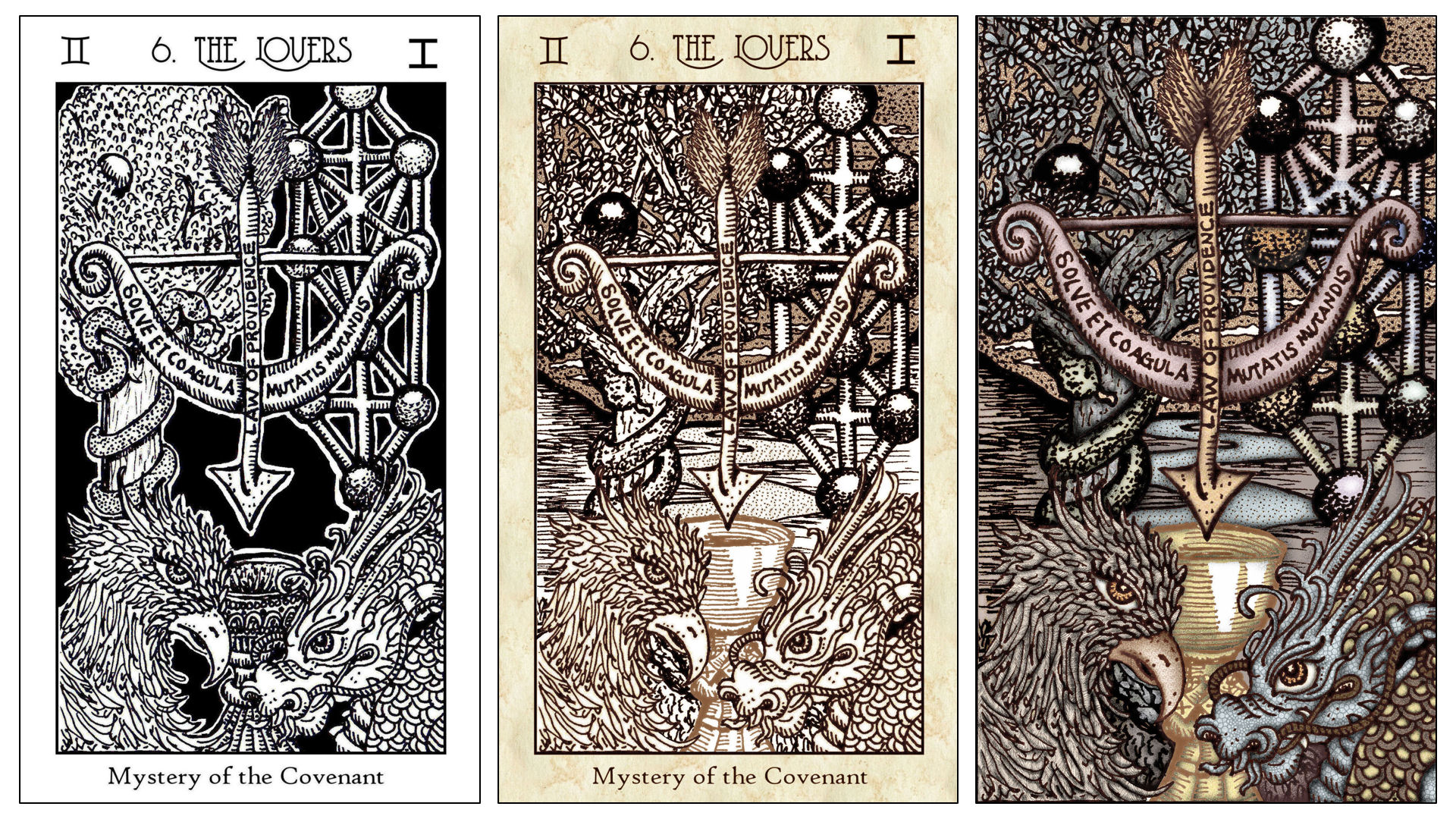
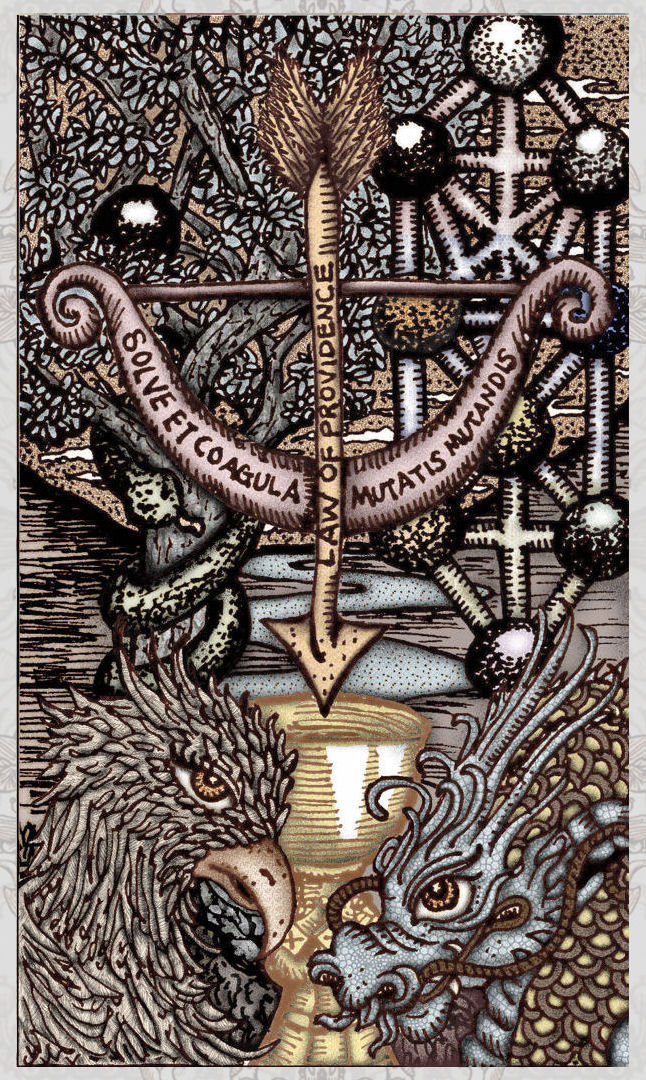
Key 6: The Lovers
No line changes from the previous Vitruvian Edition.

Key 7: The Chariot
No line changes from the previous Vitruvian Edition.


Key 8: The Force
Revised the background, which now features landscape from my hometown in upstate New York, drawn in the style of an alchemical engraving. =)

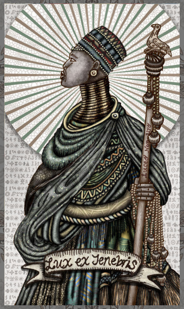
Key 9: The Erudite
The Hermit/Erudite is an ascetic priestess and shamaness, or mbonga, from the Kingdom of Zimbabwe.

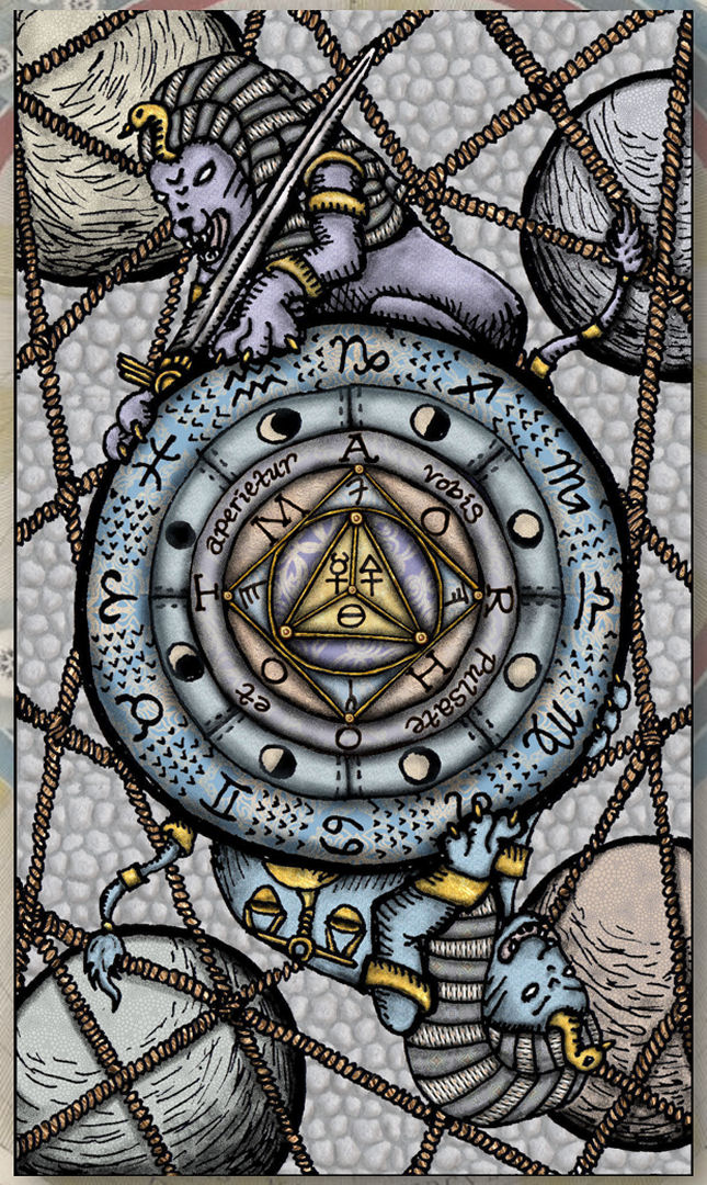
Key 10: Wheel of Life
Center of the Wheel was revised, inspired by Postel’s Key.


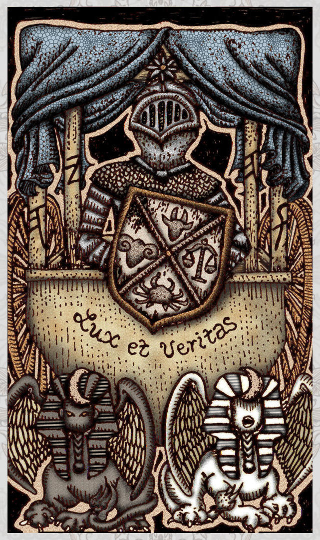
Key 11: The Chancellor
Revised Lady Justice. For the background, added a whirlpool in the stream of consciousness for some Hindu/Buddhist symbolism. =P
![]()

These are still works in progress, so I’ll continue to tweak, edit, and modify them before we get to the finish line for production. But I love sharing with you my passion. Hence this blog post.
The rows of cards showing the evolution from the First Edition to the Vitruvian to my current full-color draft might give the false impression that the third edition will be borderless. No. The third edition will have borders. I just haven’t designed the borders yet.

Absolutely breathtaking ❤️
LikeLiked by 1 person
Thank you! ❤ So glad you like it!
LikeLike
Absolutely marvellous. You are a fountain of creativity! I especially love the kitsune fox mask.
LikeLike
Now THAT is an Emperor. Those hands, strong, direct, sure. Those eyes now expressive of places deep within from the vastness of his experience. I’m going to stop there for now. THIS is an EMPEROR card!
LikeLike
Wow …
LikeLike
I am positively drooling…
LikeLike
Love the color choices, Bell! These images are breathtaking!
LikeLiked by 1 person
I really love how you are sharing your progress, it is all so inspiring. The new cards are so captivating and I look forward to watching this 3rd edition unfold! Magic x
LikeLike
… ah forgot to mention, I love how you resolved the Emperor card, he is fantastic, strong and majestic!
LikeLike
Love love love!!! They are incredibly beautiful cards and full of energy!!
LikeLike
Amazing!! The only thing that bugs me is how dark the Emperor’s beard is…IMHO, it distracts the attention from the card as a whole. But it’s your Emperor, so hey. :c)
LikeLike
There is a luminescence emerging in your images that shines through even on the flat screen representations we’re looking at. It’s thrilling to see your growth as you learn a new medium for creation. Thank you for sharing your work with us.
LikeLike
If I could only purchase one more tarot deck ever…this deck would be it! It is so beautiful and the coloration is breathtaking. I love my other editions, as I love the black and white and sepia tones (I love black and white decks) but the muted color scale you have chosen is perfect! I can not wait for this deck! Bell, you are brilliant and I am so proud to own your decks and your books. You are truly an inspiration and a teacher to so many of us! Thank you, thank you, thank you for all you do for this community! We wouldn’t be as far as we are without YOU!
Nicole Horn
LikeLike
The Emperor’s hat reminds me of the penguin hat in the Mawaru Penguindrum anime which contains a spirit that turns one of the main charaters into the Princess of the Crystal when worn. Another layer of meaning for me.
Seems like the card wants penguin refs no matter how you redo it?
LikeLike
Pingback: SKT 3.0, Second Septenary Walk-Through – benebell wen
I absolutely LOVE the color. Gorgeous.
LikeLike
Hi all, Hi Dear, I need some help since I quite not understand fully English and when I use translator for this text on your web into Spanish, I simply get lost. I do not know when myu delivery is expected or if all the deliveries have finished and there is an incidencia with my shipping, if anyone can kindly helm me and reply to this I would be so greatful.
LikeLike