Yeah, I’m going full-color (sorta– it’ll be a muted palette) for SKT the Third (I’ll be calling it something else, something fancy-shmancy, but for now it’s SKT the Third).
If you click into YouTube to watch the video on that platform, you’ll be able to skip around using the timestamps I’ve provided in the description box.
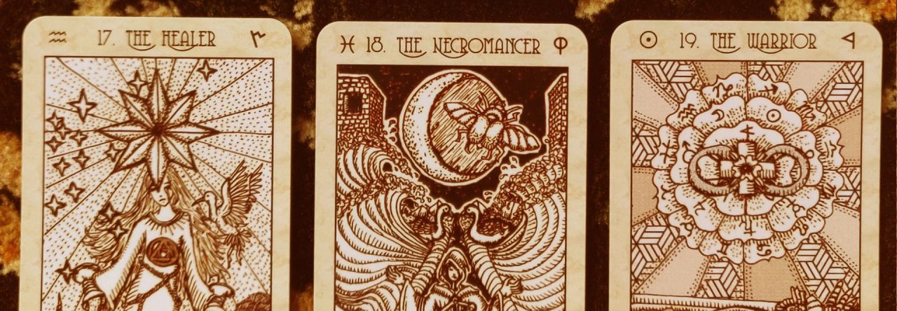
Here’s my inspiration or mood board for coloring SKT 3:

I assembled 16th through 18th century colored alchemical art from illuminated manuscripts. These are kept strictly for study, so I stay within the limited scope of what I can and cannot do with coloring.

I’m sharing the mood board here because it’s part of my process, and I think it’s a good practice to integrate into a design process.

My sister has a mood board for her wedding planning. A friend of mine shared a mood board for her YA novel. So why can’t I, shouldn’t I have a mood board for coloring in my tarot deck?

And now you can keep me in check, too. You can come back later to ascertain whether I’ve stuck to my goals or not.

I like that aged yellowy look and the muted color palette. After reading at length about how illuminated manuscript art was painted, I’m going to try to replicate that process through layering techniques with my drawing pad.
That’s a quick under-2-minutes video showing you how that 17th century illuminated painting technique is transferred over to digital painting software and an electronic drawing pad.

So, clearly, the SKT aesthetic looks very different from these old images, but this is my starting point. I’m studying these images to learn how to do shading and color, not necessarily to replicate to the tee.

Oh, and do you recall my earlier lament over the struggles of trying to express The Emperor?
Here’s what I came up with.

It’s mind-blowing to me how subjective art is.
James does not like my new Emperor card. He won’t stop about it every time he sees that drawing. He doesn’t like the mustache. He doesn’t like the beard. He doesn’t like how the eyes are concealed under shadow. And overall, he just doesn’t feel like I’ve captured the “emperor” vibe.
However, I respectfully disagree. I love this image. I get stirred up positively and I’m invigorated by this Emperor. He is exactly the right counterpart for that Empress, who was inspired by the Chinese Empress Regnant, Wu Zetian. He looks like her equal– If the two of them got into a magical duel, I can’t say for certain who would win.
James doesn’t see what I see. He doesn’t consider the two as a well-matched pair. And I for the life of me can’t see through his eyes to understand why he doesn’t like my Emperor. Except to chalk it up to the subjectivity of art.
For Key IV, I syncretized Menelik I, the first emperor of Ethiopia, descending from King Solomon and the Queen of Sheba, founding father of the Solomonic Dynasty in the Horn of Africa, with the Holy Emperor Charlemagne.

I took the open-book-in-lap idea from the above image.
As you can see from the video, I finished the first draft in color of the First Septenary. I’ll go through many reviews and thus many drafts, so after I’m done, I’ll go back again, scrutinize each image, tweak the coloring, shading, details, etc. Thus, everything you see so far are just works-in-progress.
Now, why have I decided to go full-color for the SKT III?
I’m intimidated by the idea of going in full-color.
When I realized the only reason I didn’t go full-color and with more human figures was fear, I also realized there was now only one path forward: going full-color and drawing more human figures.
In SKT III, you’re going to see many of the cards changed so that they’re no longer expressing the cerebral abstraction, but rather, going for a personification.
Meaning, I have to draw people.
That scares the bees out of me because I’m pretty terrible at drawing human figures.
I’m much better at plants and animals.

Precisely because going full-color and drawing people intimidated me is why the third edition had to be in full-color and had to include drawing (and coloring) people.
I couldn’t avoid drawing and coloring human figures just because I was bad at it, or felt I might not be up to the task.
I saw a connection between tarot deck creators avoiding race and culture in art and spiritualists avoiding the race and culture conversation. The two are related. How can I be a truly empathetic tarot reader if I can’t be an empathetic illustrator?
The more I thought about it, the more I knew for myself: avoiding human figures and full-color would be cowardly.

The above shows some of the new drawings I’ve done, replacing the Three of Swords, the Ten of Swords, The Hermit, and the Nine of Pentacles (Orbs in my deck), left to right. I haven’t applied color yet– these are just the sepia-toned foundation layer.

I’m getting a lot of questions about pre-orders. You guys, I can’t handle that right now. =) Don’t overwhelm me. =) I’m focusing on just the art, and have so many other tasks, projects, and obligations that take priority. We won’t even talk about production, printing, or sales until I’ve finished the art.
At the speed I’m going, which is about 15 hours per card for coloring, and at least a few days extra if I’m redrawing that Key, we’re looking at 2021 or even 2022.
If you want to make sure you get notified about my progress, get on my newsletter (or, more accurately, Google Groups).

I like the overall design of the Emperor but have to agree with James. There is something odd about the beard, perhaps too glosssy? And the eye area looks dark, there is something disconcerting about the shadow over the eyes.
I am really looking forward to the new deck and I love the old alchemical illustrations that have inspired your path.
LikeLiked by 1 person
Haha totally fair point! I don’t know. I blink and blink and try to see what you and James see, but I just can’t. It’s totally weird. It just blows my mind how subjective this kind of stuff is.
Like you, James found the shadow over the eyes disconcerting. But I find it mysterious in all the good sexy ways. Lol. As for the beard, I was trying to replicate how kings and important figures were depicted by that culture via its artifacts and historical paintings. There was always that shiny beard situation, so I dunno. Maybe I overdid it? 🙂 I’ll return to all of these images in a second review anyway and at that time tweak as needed. 🙂
LikeLike
Amazing! The Menelik/Emperor connection is inspired.
LikeLike
These designs are mind blowing
LikeLiked by 1 person
I can relate more to the new Emperor than the Hawkman in I/II (sorry that’s what I superficially see). Perhaps if the beard was a bit more muted then it wouldn’t visually overpower the other parts of the card. And if the figure had a darker outline (like the Empress) then he wouldn’t blend in to the background so much.
Your mention of referencing illuminated manuscripts reminded me of when I found the picture book “Historia Naturalis” by Joyce Irene Whalley which showcases the illuminated initials from Pliny the Elder’s encyclopedia. This was around the time I developed an interest in the thematic classification of knowledge, after reading the book “Worlds of Reference” by Tom McArthur which opened my eyes to other classifications other than Roget’s.
The scenes contained in the illuminated letters also reminded me of transformation decks (pip playing cards with illustrations based around the pip arrangements) which eventually led to the current interest in tarot cards. Then a few weeks ago you mentioned your interest in the Mantegna tarot showing an early view of humanity’s place in the grand scheme of the cosmos, which is reflected in the classification of knowledge.
*Whew* that was a long ramble to say thank you for your creations. I feel much synchronicity pointing to something. Oh and after buying the four Wooden Books series on Quadrivium/Trivium/Sciencia/Designa I found your post on the books. Tick tick tick says the cosmic clock…
LikeLike
Yowza! Love it
LikeLike
Yowza! Love it. I kinda dig his shady gaze.
LikeLike
I love the Emperor! I wonder, though: should his nose be aligned with the beak on his eagle headdress?
LikeLike
Pingback: SKT 3.0, Second Septenary Walk-Through – benebell wen
Pingback: SKT 3.0, Second Septenary Walk-Through – Indie News
Love this mood board. So inspiring.
LikeLike