
Yeah. I needed the title in all-caps. Because I’m screaming at the top of my lungs and yanking at my own hair.
WHY IS DRAWING THE EMPEROR CARD SUCH A STRUGGLE?
For an irrational woo answer to that, I might say maybe it’s because our global collective culture is moving away from dominant-masculinity, and as a feminist I’m certainly not going to cry a river over that shift, but it does mean I’m really, really struggling with tapping in to that masculine energy.
Anyway, let’s walk through my challenging journey with illustrating The Emperor card.
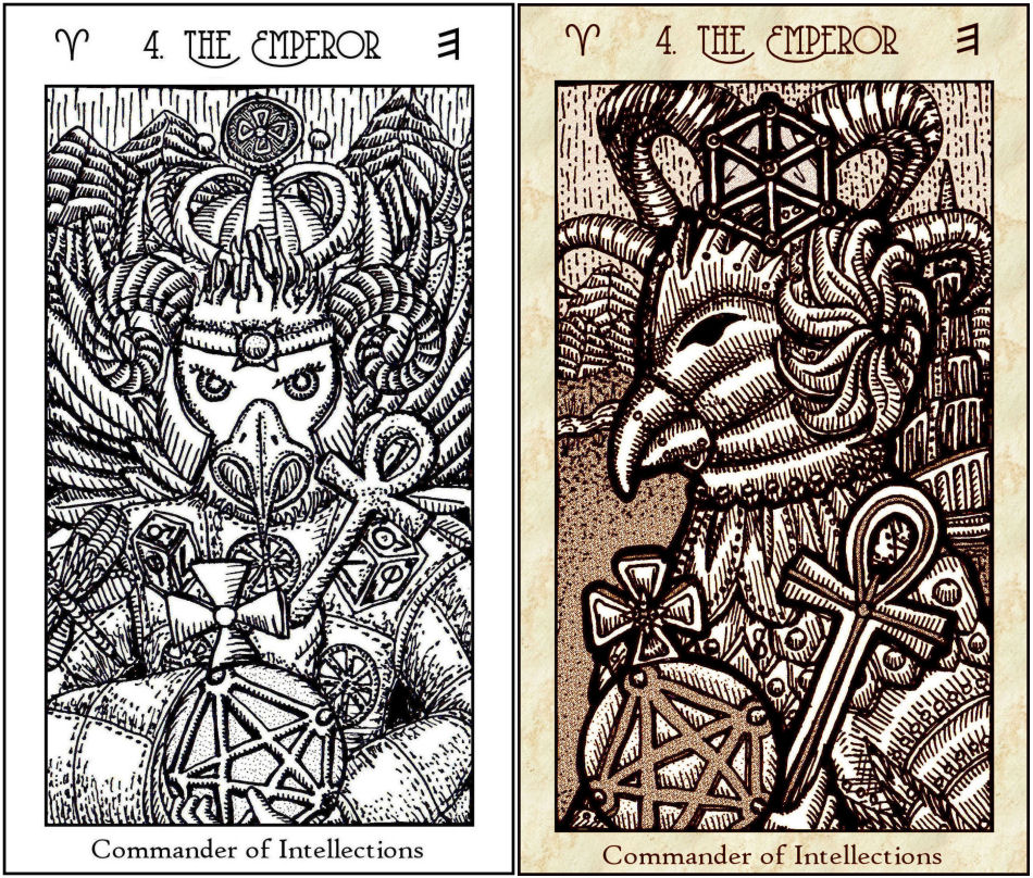
Above left is the 2018 Emperor card in the First Edition deck; on the right is the 2019 Emperor card in the Vitruvian Edition.
Actually, I really like my Vitruvian version of The Emperor.
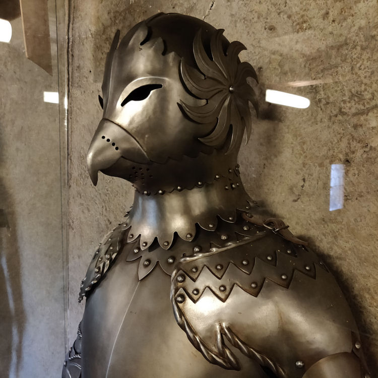
I saw the above while visiting a castle in Prague. I took a photo knowing I wanted to use that armor as inspiration for my SKT Emperor redesign.

In the last progress update, I shared a rejected rendering of Key 4: The Emperor. I was envisioning a bad ass eagle head emperor but ended up with the minor penguin character from Happy Feet the movie. Oops.
So I tried again.
For the new Emperor, I took inspiration from the Ottoman sultan, Suleiman the Magnificent. Suleiman is a variation of the name Solomon, which I thought was particularly poignant, given the Solomonic magical influences in the deck.
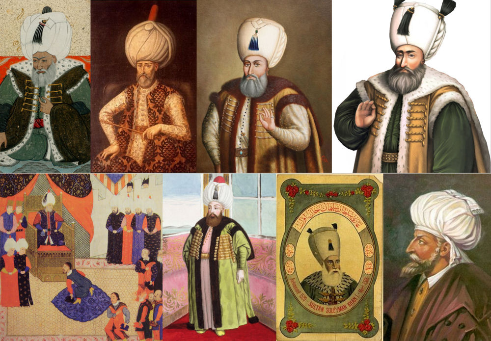
I’ve spent about a week reading as many biographies as I could and watching documentaries on Suleiman. There was even this popular drama series in Turkey on Suleiman, and I watched that, too.

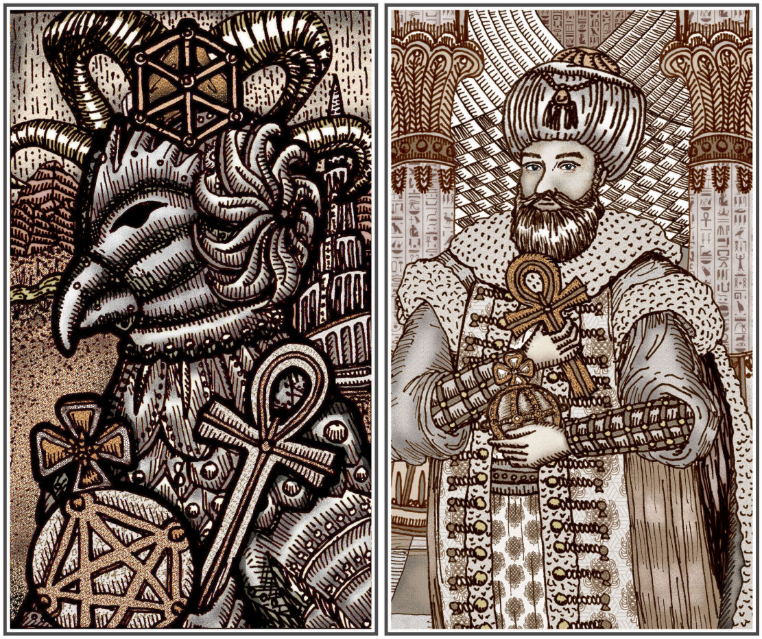
I’m placing my rendering of The Emperor card, inspired by Suleiman the Magnificent, next to my Empress card. I might go back and add a pelican in the foreground of the Empress card, btw. So everything you see in these blog posts are works-in-progress.
James still doesn’t like my Emperor card and I see his point. This version of The Emperor is still missing something. It’s missing oomph. Like, compare the oomph in what’s still just a working draft of The Empress with the lack of oomph in her counterpart, The Emperor.
Compare a work-in-progress of the Vitruvian Emperor (left) with what I just finished drawing (right).
Everyone I’ve asked prefers the left Vitruvian version, though that’s not even to say it’s good. It’s just to say that comparatively speaking, it’s better. The recent doodle on the right is… blah. I mean the good news is it’s no longer the penguin from Happy Feet but at least the penguin from Happy Feet version had personality. Is it the eyes? I think those eyes look dead. Why am I so bad at drawing eyes. Aargh. Or it’s his posture. That’s a very RWS Four of Pentacles posture. Why doesn’t he look… I don’t know… I just know that I’m not there yet.

Here’s the problem with keeping with the old Vitruvian version of The Emperor. He no longer matches my new, updated Empress. See what I mean in the above side by side? These two are not a compatible pairing.
I’m open to hearing any ideas you want to volunteer, by the way.
So I think right now I need more time immersed in The Emperor and I need to work harder at tapping in to and channeling these masculine energies. I have no idea how I’m going to do that… watch all the Die Hard and Rocky movies back to back? I don’t know. I just don’t know.
*cries*
Oh, wait. That’s probably not very manly of me to do, cry. Wait, I can’t say that. Toxic masculinity. Wait. *head to desk*
SEND HELP.

Emperor Penguin.
Distinguished with a twinkle (after all, tobogganing has to be the MOST fun EVER).
Harmonizes with the Empress’ Dragonfly.
You had it all along ❤
=^.^=
LikeLiked by 1 person
I think the Emperor in the newest version of your card should have a penguin looking over his shoulder…
LikeLiked by 3 people
Seriously though, I have to agree that the latest Emperor really does lack energy (power?). If anything, maybe go back to something closer to the original ‘Happy Feet” version – but w/o the happy. Or the feet.
My take is that the earlier Emperor-bird lacks a neck, which is important for the profile of a bird of prey. When I see an image of an eagle, for example, what really strikes me is the strong profile. Maybe try having the head pointing slightly downward instead of upward – the neckless upward facing head seems to project meekness (the antithesis of The Emperor). Perhaps more curvature on the beak too. Anyway, just a thought.
LikeLiked by 2 people
Yes the latest version of the emperor lacks energy and power. I think when you look at a good emperor card, you should be intimidated. and I am just not there. Why can’t I be intimidating???? Lol. Anyway thank you. I’m going to sketch out all of these ideas and try try again. 🙂
LikeLike
Use a throne & symbolism.
LikeLike
Yeah I was actually thinking that. But then something important to me was that the empress and the emperor cards match. I thought it would be weird if the empress was not sitting visibly on a throne, but the emperor was. But I’m going to work with this idea. Thank you!
LikeLike
Maybe it is the gaze and softened facial features that don’t add the punch you wish for. Maybe he needs a more confident, straight on, square and solid stature. I don’t know the history behind this emperor but I love the amount of research you put in. You always amaze me! Good luck and I look forward to seeing the next rendition..
LikeLike
He was a very badass emperor so I really feel terrible that I have not done Suleiman any justice. Yes there will be more versions and drafts of the emperor to come. Such is this struggle. 🙂
LikeLike
For a masculine energy at full power, the head doesn’t lean forward (too fem). He is a judgemental energy, one who takes the wide view but with all the detail to satisfy his need to know the full story. The shoulders are square, the chin up and in, the forehead wide and deep,eyes level with ears, balanced with the nose — see and hear all, sniff out the false, or the judgement is flawed. I’m thinking wedge-tailed eagle, slightly arrogant, assured. Big. Strong.
LikeLiked by 1 person
I’m smiling ear to ear and so happy that I posted this. I’m getting so much good advice and these are things that are very specific that I can work with it. Thank you so much! Now I just need to summon within the ability to do all this! Lol.
LikeLiked by 1 person
May I suggest to watch Vin Diesel in “Pitch Black.” There’s a Sovereign character if there ever was one. What I see in your Emperor that’s not doing it for me is not dead eyes. They’re soft, calm, compassionate, strong and comfortable enough in sovereignty to be able to be gentle. How soft skin complexion, like Oil of Olay Emperor for men. 🙂 As it should be as he’s probably bathed in oils to a wonderfully healthy level, regularly.
It’s the hands. He has feminine hands, a little out of scale and too small, fingers that have never squeezed the life out of something, and somewhat puny forearms, even more so that they look small with braces on. I suggest, look at your Empress. Her eyes transform you like a dragonfly, Her hands? Nowhere to be seen indicating wise discretion and not “playing your hand” so to speak. The Emperor’s hands from a delineation standpoint are just fine, just not for this image. There feel to appear spindly, literally weak in their gesture. I feel the non-verbal of the hands re-gestured and given a grace of powerful strength — step out of your deck and do secret research on Vikings. I wonder if The Emperor’s hands given a grace of powerful strength and a posture that doesn’t feel to just hang there idly waiting to be told what to do… 🙂
The hands and forearms. I gather that re-tooling the hands and fingers and forearm in size and scale and gesture will enliven and spread out to cascade the strength across the whole as it already is. I simply see a void there, regardless that something is drawn there… like you drew a Post-It note that said, “Revisit the hands when the rest is at critical mass.” “How does an Emperor hold something?” is a question I would ask.
All of the above intended Simply as a suggestion. Though, that’s what I feel in what I see in his current iteration. Great and strong process you’ve sailed in to. Keep up the great work.
LikeLiked by 1 person
Oh my gosh I love these suggestions! Thank you so much. This is so specific and so tangible, which actually gives me something to work from. Thank you so much.
Pitch Black… I’ll see if James wants to watch that movie with me. 🙂
LikeLiked by 1 person
It’s an excellent movie. Engaging, entertaining. All the right rights and wrongs and right wrongs and wrong rights, and thick and viscous all the way through.
Thank you! Happy to help. Glad that resonated with you. Things feel as they do. He may connect with his eyes, though with weak hands there’s not going to be much doing anything about that connection In a lasting or sustainable way… like dynastic lineage. Go You!
LikeLike
The Suleiman version is a portrait. The armor version is an embodiment. A portrait is political. An embodiment is powerful. Reimagine the portrait as an embodiment, and the power will return.
LikeLiked by 2 people
Love this. I’m going to have to play with these ideas more. Thank you!
LikeLike
Hi Benebell!
Sorry to see that you are having such a struggle with the Emperor. I would suggest Less is more. Start subtracting, and see what happens.🙂
Cheers,
Jenni Sumi
LikeLike
I like this idea! I think I’m going to work on that. Thanks!
LikeLike
The more I think about (and mentally visualize) it, the more I think a slightly downward-tilted head with the eyes staring straight forward always seem to convey sternness and severity. If that’s what you’re going for.
LikeLiked by 1 person
Yes, that’s what I’m going for! 🙂 haha.
LikeLike
My first impression is if you use the more Ottoman Empire pic that he need to be looking straight forward as Empress and be more in the forefront like her. Then I would put a shield maybe behind him? Instead of fabric (which feels very soft)- And shield for he is supposed to protect. And just one thought with your columns. Maybe his would have that more Middle Eastern architecture. I personally like the Empress (Asian empire) and Middle Eastern Ottoman Empire as representing yin/yang fem/masc power houses. For they were the seats of the beginnings of civilization. In my thought pattern the Hierophant sings a more European influence due to Catholicism/institutionalization (good and bad). Side note: when I got your deck I thought the Emperor image was from Aztec/Inca. Still has that feel though I love that armor.
LikeLike
As others have mentioned, his eyes and facial expression are compassionate and caring, more of a King of Cups vibe than an Emperor. He’s not… mean enough. It might help to eclipse our view of his face somewhat, as you’ve done with the Empress.
The one other thing I’d say is that your choice of an Ottoman costume means there are very few straight edges. His outfit is soft and flowing. There’s nothing hard or sharp about him as he is now. Even just adding more of a square shoulder or a more tailored coat would, I think, bring out the sort of rigidity you’re looking for.
Nonetheless, your artwork is beautiful!
LikeLiked by 1 person
Agreed about the WIP Emperor! Might be time to take a hard left and do a completely unrelated thing! Sometimes all the ideas need a little bit of time to simmer on the backburner. I know when I get SUPER stuck after taking in a lot of info, it just means my brain needs time to subconciously let things steep for a bit. It’ll probably hit you real hard once your brain’s done its magic!!
LikeLike
Agreed about the WIP Emperor! Might be time to take a hard left and do a completely unrelated thing. Sometimes all the ideas need a little bit of time to simmer on the backburner. I know when I get SUPER stuck after taking in a lot of info, it means my brain needs time to subconsciously let things steep. It’ll probably hit you real hard once your brain’s done its thing! Obvs, disregard if you already did this and maybe just war-cry scream on your rooftop for a quick sec and see how you feel 😉
LikeLike
I feel like this Emperor is looking “at” you, but the portraits are looking “through” you. And, as mentioned by others, the stance is a bit timid. There is a bit of a feeling like he has just been startled and is going to drop the items he is holding. The Empress feels like she is taking up more of the frame than he does.
I am very excited about this deck!
LikeLike
I really like the Suleiman idea, but what about Solomon? Is King Solomon ancient King of Israel more fitting given the Kabbalistic correspondences? Perhaps a Greek God? Isn’t Persephone or her Mother the Empress?
LikeLike
How about an Emperor in armour? Someone not to be messed with! It might take out some of those soft lines and provide an opportunity for his hands to do something that takes up more space in the card.
LikeLike
Actually I almost like the new version of the Emperor except for two things: his face is too “polite” and his hands surprisingly small and feminine. Perhaps it is enough to work on these two details…
LikeLike
I agree with comments about the petite, gentle hands. The artwork overall is quite good, sumptuous and intricate and fluid. However,those beautiful pillars belong more with the High Priestess or Hierophant as I see it. Of course, an Emperor can have some compassion and aesthetic interest– the tricky thing is to have him primarily firm and forceful and secondarily humanitarian.
LikeLike
All of the above suggestions are spot on… I too, love the Empress and her very strong Asian Empire feel. That the armor came from an actual photo in Prague is amazing…So perhaps to evoke more of that ‘present and powerful’ feel have the head exposed with a direct stare, and the Emperor holding that fantastic head piece.
LikeLiked by 1 person
I think the above suggestion by “Anonymous” (Anne Ominous?) is excellent!
LikeLike
Why does masculinity have to be toxic? While toxic masculinity is definitely a problem within this culture, there are men who are the embodiment of classic masculine characteristics without being toxic. Do you not know any of these men?
& it stands to reason that there is a corresponding toxic femininity … the trump administration is filled with these women. Is drawing the Empress a problem for you? I really don’t understand this issue. Power in people can be toxic or it can be beneficent.
Also, isn’t the reversed Emperor the toxic version of masculinity? That’s how I’ve always read it. He can be both, depending on how the card is dealt.
LikeLike
Pingback: HALP ME WHY CAN’T I DRAW AN EMPEROR?! – Indie News
Perhaps pull out and present more of the Emperor’s body in a powerful stance . His body cut off as it is looks stodgy . But otherwise love the progress reports .
LikeLike
First of all, I want to say I really love so much about your drawing of the Emperor. And the many suggestions have been excellent. I look forward to how you re-work your drawing.
Facial expressions are fascinating. There is a pen and ink artist on YouTube (Peter Draws) who uses facial expressions to great effect. It may be inspiring. One video that I just watched was “Titanium vs. Zirconium Bolt Action Pens”. I love how his eyebrows go up and down and furrow towards his nose. It’s mesmerizing to watch the dramatic changes in his face. [He often does a monologue first and then goes into a pen-and-ink drawing (that is sped up), but you might enjoy his pen-and-ink drawings, not to emulate his drawing technique but just for pure enjoyment.]
-adding a soft shadow under the hands and arms to give the impression of depth or just thickening the lines on the bottom sides of the hands / arms
-the contour of his nose is like a ski slope, maybe try a slightly more “beak” or outward contour
-adjusting the line of the mouth, and the placement and angle of the eyebrows changes the face
Benebell, you are an inspiration! Thank you!
LikeLike
I’ve always found this card problematic.
LikeLike
First, you’re an excellent draftsperson, so when you create the IV you’re happy with, I’m sure we’re going to love it.
Perhaps you should look to the 3 cards associated with The Emperor for insight: the Lords of Dominion, Established Strength and Perfected Work. To me it tells a story about the creative process: the use of your will to break ground; being at harmony with the world around you to let that process grow and flow; and finally letting love be the driving force to see it through to completion (less labor, more love).
And speaking of love, the 4 of Wands is the sacred marriage between Empress and Emperor. You have created an astounding Empress; who is worthy enough to be her equal?
LikeLiked by 1 person
Just agreeing and nodding aggressively to what everyone just said haha. But yeah, looking at the Emperor it gives me a vibe of a court card and not one of the Majors. Like, he could be the King of Pentacles or Swords easily, it’s lacking that embodiment. I think what I personally love about the Vitruvian Empress and Emperor is that I don’t see their faces. The Empress has a dragonfly covering her eyes, and the Emperor is wearing an armor (which I love because it’s super powerful, ready for battle, good leader, keen eyesight and prepared to shout at his troops and command them forward). The Vitruvian is the Emperor that takes the reins of his army and leads them sword in hand, while the Suleiman one looks more like a diplomatic, not wanting to get his hands dirty or just here for the politics. I say you keep the eagle armor, it’s so much more dramatic.
Oooohhh you could have an Eagle Emperor with a horde of Happy Feet penguins on the back, now wouldn’t that send a message of “men can have a fluffy side too”? XD
Also, can I just say that your last paragraphs I pictured you as an anime character?
Sorry. My best wishes!
LikeLike
I think he looks great and is definitely a better match for The Empress, but I think the way he’s holding the orb and the ankh so close to his body makes him look like he’s afraid they’re going to be taken from him. Also, he seems to be protecting himself with his arms in that position. There’s a meekness, rather than dominance about the posture.
LikeLike
Maybe it is the setting. See how she is supported visually by the two towers on either side? It might help to have your version on the ‘Iron Throne’ or something that creates a feeling of grandness around him. To make him look bigger or more powerful, maybe changing the perspective… But then some other cards would have to match that technique. I do see your situation, but I know you will soon figure it out.
LikeLike
If I could maybe offer a less esoterically centered perspective — in my view, it comes down to the thickness of your lines. In the Virtruvian Emperor — and even in some parts of that Happy Feet version!! – the convergence of strokes on the border of the character design really adds to the personality, boldness, and strikingly masculine feel of the piece. In contrast, the newly designed version has less variation in stroke width (most of them appear uniform/thin), which gives it more of a willowed or thinned out effect, personality-wise. I also wonder if more angular (striking?) lines could help to convey the authority of the Emperor…
This is coming from my personal art background, but…I might look at some shonen manga for inspiration! I don’t think masculinity (or authority) necessarily needs to be conveyed through “traditionally Western, masculine-presenting” features per se; art style certainly helps, and you see that quite often in manga (wherein masculine characters that might be perceived as “soft” in the West can nevertheless be conveyed to be intimidating or strong). And especially because manga is drawn in black and white — that might offer some ideas on ways to convey certain moods with/without colors as well.
Whatever you end up choosing — I’m looking forward to it!
LikeLike
I agree with other commentators that the Emperor should be looking more straight into the seekers eye so to speak… I like the Ottoman Empire inspiration but given the strong Asian influence on your Empress I was wondering if maybe a Chinese like Emperor would not be suitable? Or a Japanese style warlord. Alternatively I was also having the Image of Persian Kings. There is a lot of interesting mythology in Persia that can relate to the embodiment of the Emperor and the kind of energy you are looking for.
LikeLike
I can’t seem to find fault in an Emperor Penguin-like figure – but I’m extremely biased towards cute things, so don’t listen to me! 😂😂😂😂
I think masculinity / divine masculine is definitely becoming redefined and undergoing through a significant shift. I’ve encountered a few decks where the “masculine department” is a little lethargic, and the depiction of the Emperor or the Kings in the 4 suits are just sort of bypassed altogether (like Star Spinner Tarot – the 4 kings from the minor arcana are all replaced with animal figures, whereas their queen counterparts are portrayed as powerful AF) It is probably reflecting on our collective standing…I think we’ve done a good job integrating masculine aspects into the feminine and it is more or less being actively developed and balanced, but the divine masculine still needs a lot of uncovering, a lot of healing and a lot of restructuring.
I’ve been having lots of musings on power lately – e.g. my own relationship with power and authority as well as our culture’s relationship with power. I think true power is when you use it to inspire, to lead and to empower others. I have a cheeky analogy: power is like bread – all of us rise together in the cosmic oven as we bake, and if one part of us becomes diempowered or the distribution is unbalanced, the structure of the bread fails and we can’t bake properly, resulting in deflated bread.
Anyway – not sure if this is entirely related to your struggles to portray the Emperor in your deck xD I’m sure you will figure it out!!! Sending you lots of bread energy!! 🍞🍞🍞 YOU CAN DO ITTTTTT
LikeLike
I like his portrayal, but what feels different for me is the position, I usually get the feeling of a power from above coming out of this card, maybe if he is in a sitting position it can be a little more emperor like
LikeLike
I liked a lot some ideas I’ve read here, like the Emperor with more soft traces and Asian-inspired. I think this can lead you to an Emperor that rules not by force, but because he’s the most suitable person to do it. Power don’t have to be brute and forceful, it can come by many ways. Someone who stares directly throught the person who’s doing the reading eyes, sure have a lot of power!
LikeLike
Pingback: Inspiration and Process for Coloring SKT III; The Emperor Revisited – benebell wen
You might work with perspective. Right now the emperor is on eye-level. But you want him to be in a superior position. He is authority, a ruler. He stands above where you can’t reach him. You need to look up to him. Because it is him who makes the decisions.
LikeLike
Pingback: Inspiration and Process for Coloring SKT III; The Emperor Revisited – Indie News
wow! well, let me just tell you that this has been interesting: i have always been under the impression that your vitruvian emperor was a Rooster, not an eagle! the Cock of the Walk! proudly cock-a-doodle-doing, keeping the flock in order. and i love it; it’s very dude-like and slightly bossy and very plucky. cockfights also come to mind, with the armor.
your current emperor, i think, has a lot of soft roundness going on, i feel like some more spikiness or sharp cheekbones would go a long way.
nice work! ❤
LikeLike
Your site is a worthwhile treasure trove of knowledge and insight! The depth of information you share on subjects like tarot and private increase is virtually inspiring. Reading through your articles is like setting out on a life-changing adventure, led by your genuine enthusiasm and expertise. Thank you for developing such an enriching house for seekers like myself.
LikeLike