SKT Revelation Production Status Update: Short Version
We’ve sent the down payment to our printing company and commenced the production process, but–
First we’re doing a test print for the final confirmation of color, the packaging, and also to see how the coloring looks with the selected cardstock and finish, which we estimate to take about 2 weeks to complete, and–
After hundreds of drafts and flip flopping between different options, I’ve finally selected a card back design.
SKT Revelation Production Status Update: Long Rambling Version
Let’s talk about what a Journey (*dies*) creating the card back design for this third edition deck was!
Crowley’s Book of Thoth assigns zodiacal domains to the Kings (Thoth Knights), Queens, and Knights (Thoth Princes). Each rulership begins at 21° and ends at 20°.
So, for example, the Queen of Swords begins her reign at 21° Virgo and ends at 20° Libra. At 21° Libra, the Knight (Thoth Prince) rules until 20° Scorpio.
It’ll be fun to superimpose this over your birth chart to see which court cards rule over your natal planets and personal sensitive points.
Eeks. RGB to CMYK conversion was not the issue. In my previous post on this matter, I showed you the digital files I converted from the RGB to CMYK. This is now the test print of what the conversion to CMYK looks like.
Fun tip: since I’m ordering this deck to check color, I tried to optimize my resources and time by printing lots of different versions for the card back options I was entertaining. This way in one fell swoop, I can determine which design, which color saturation, values, brightness, etc. to go with.
In the above photo, you can see how I printed out many variations of that double vajra bluish card back design, at different color saturation and brightness levels to see which one I would like best.
Just a quick update on SKT: The Revelation edition. I’ve now gone through two test prints of the deck to check color issues. We haven’t even gotten to the test runs for checking cardstock, finish, etc. We’re still on color.
Nonetheless, the pre-order newsletter e-mail will be sent out on the morning of March 20, 2021. One way to check whether the pre-order e-mail has been sent is to check the newsletter archives, linked here.
Even though the photograph of the cards is unfiltered and as-is, I think something about the way it’s translating digitally masks the problem that is all too glaring in real life: the color values are just a smidge on the dark side, and there isn’t enough contrast, so you end up with very slightly blurred images.
In June of 2020, I got myself the XP-Pen Artist 12 drawing tablet and resolved to take art study seriously. Eight months later, I’d like to reflect on the journey so far and memorialize what my approach was to self-study.
I’ve been getting my ass handed back to me every time I try to draft a card back. The above three are the most recent attempts. Left and center ones are way too busy, even for busy-body me, and although the right one above isn’t quite there yet, it’s promising. I can probably work out the details.
In the above snapshots of design elements, for each, I hand-drew a quarter of what you’re seeing as the image. After drawing in that quarter, I create a mirror image of it and attach it to its side to create a half. Then I create a flipped image of that half to create the whole.
It’s so satisfying to me to watch it blossom into the final ornate image. =) Because the quarter that you actually draw is– ehh– I mean, it’s lovely, but nothing crazy, right? And then you mirror, flip, and suddenly, whoa!
“Before” pics — first draft of the coloring/revision process from 2020
After completing the first draft of coloring in the SKT, my technique improved to such a point where the First Septenary, i.e., the very first cards I started the coloring on, paled in comparison.
Literally. As in, like, I didn’t have enough color. I wasn’t going to redo all of the Majors. But the First Septenary (Keys 1 through 7), definitely.
Above, the top row shows the Magician, Priestess, Empress, and Emperor cards I first colored in at the onset of this third edition undertaking. This was around spring of 2020.
The bottom row shows the same four cards as I’ve re-done them just now, about half a year later, after completing the first draft of coloring for all 78 cards (well, 80 in my deck).
I’ve finished the first draft of all 80 cards, but that doesn’t mean much because I’m returning to the Majors to fix up Keys 1 through 7, at the very least, and maybe whatever else I see that needs fixing.
The substance of the court cards will remain the same, but they, too, need fixing. This one’s arm looks awkward; that one’s nose is, like, what is that, that’s not even a nose; and then when you line up the same court card from the four suits, I want there to be some cohesion, so where there are glaring inconsistencies, I’ll need to fix that up, too.
By the time I got to the pip cards, I finally got the hang of digital painting, so I don’t think much substantive revision will be necessary. Wait, no. That Five of Swords, though… I think it could use a little more tinkering, perhaps even a significant reconsideration of what should go in that background.
Going in the order of the cards I’ve presented here, I’m ending 2020 and beginning 2021 on the Ten of Swords. Hmm. Yah I’m not going to read into that. =) Moving on.
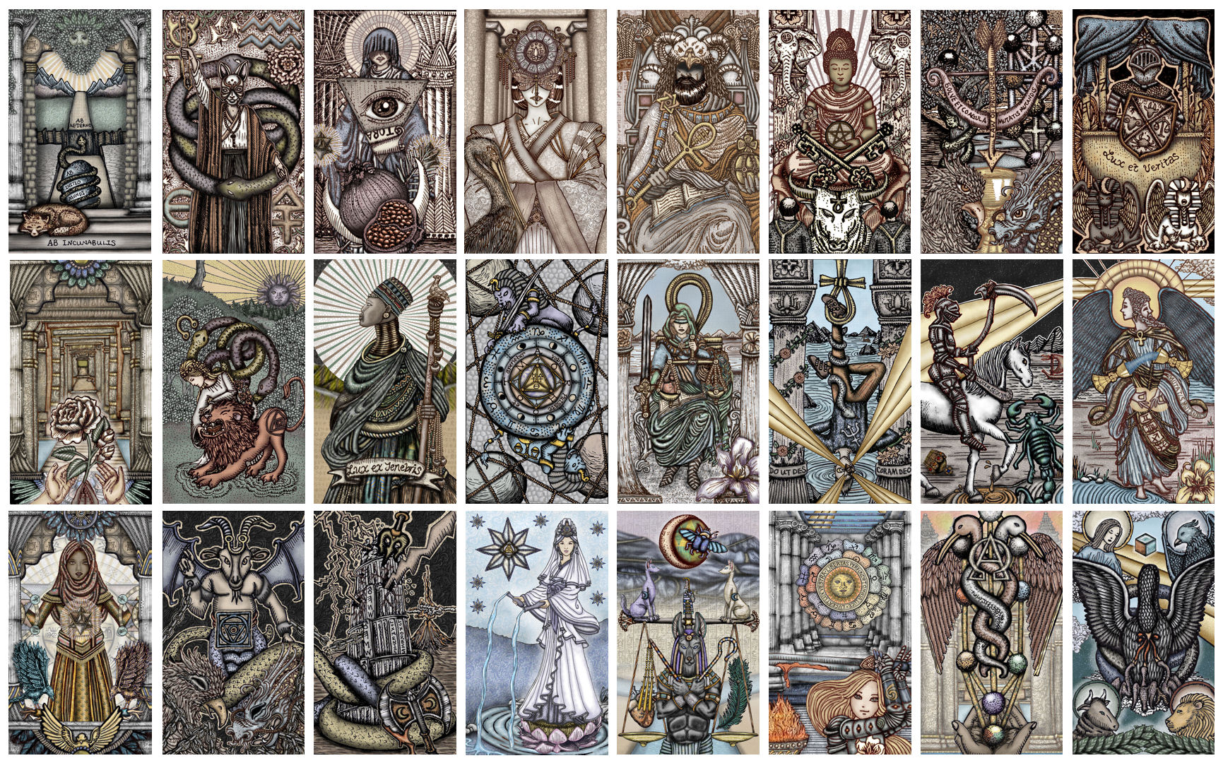
While the style and approach for the earlier editions asked of you to journey inward, this third edition, which I’m calling The Revelation, asks of you to journey outward. If my earlier editions were about depth, then this third edition is about expanse.
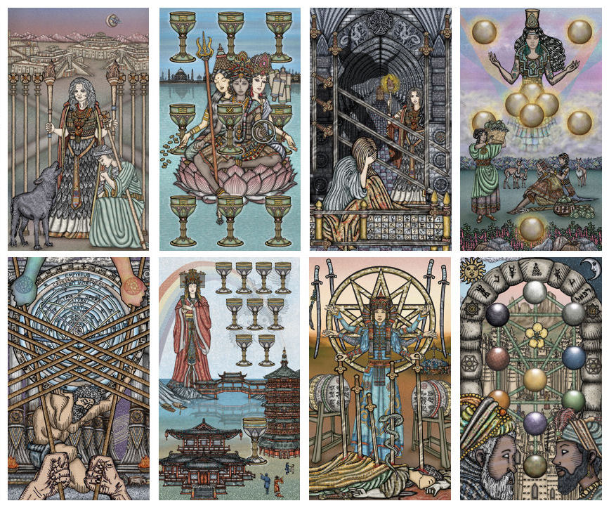
Realm of Sevens
The Revelation Edition can be treated as an entirely different deck from the First and Vitruvian Editions. It’s within the SKT family, hence the deck name remains the same. And while it shares the same DNA, SKT III has really evolved to solidify its own unconnected identity.
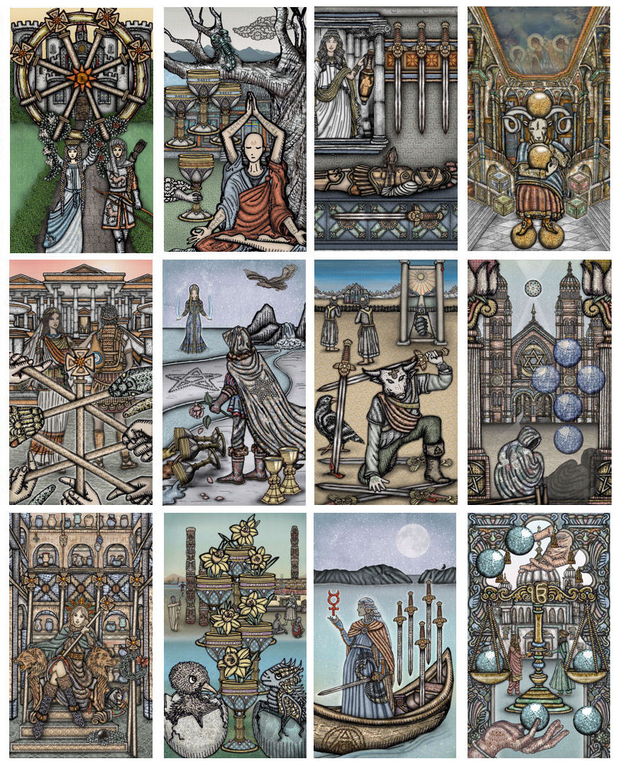
Realm of Eights
I cannot wait to share with you the companion guidebook. It’s basically a new Book of Maps, because it had to be. I go into detail explaining the who, what, where, when, and why for each card illustration, and then for interpreting it, the how.
These images are provided to the public for free download and under a Creative Commons Attribution license, which means the following:
You can share the images. You are free to copy and redistribute the illustrations in any medium or format.
You can adapt the images. You are free to transform, build upon, redesign, edit, revise, and in any way remix the illustrations for any purpose, including commercial purposes. Yes, you are free to profit financially from your adapted images of the SKT Vitruvian Majors, Aces, and Archangels.
Attribution or credit notes. My preference is that you make it very clear what part of the image or adapted image is attributed to my original work and what part is attributed to your creative additions. In other words, if you color in one of these black & white images and then sell your colored in SKT image, please make it clear in your product description that I am the artist for the black & white image while you are the artist for the coloring application. If you have traced part of my original art and then redesigned it, transforming it from the original, please include a note about what parts were my original and what parts you’ve redesigned and transformed. I say “my preference” because if you unintentionally forget to do that, I’m not going to be mad at you. =) But just please try not to forget.
While this license is free, if you do commercialize your SKT-based work, I’d be beyond thrilled to receive some merch! =) Send to the below address.
Benebell Wen
P. O. Box 20021
Castro Valley, CA 94546