
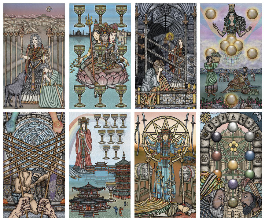
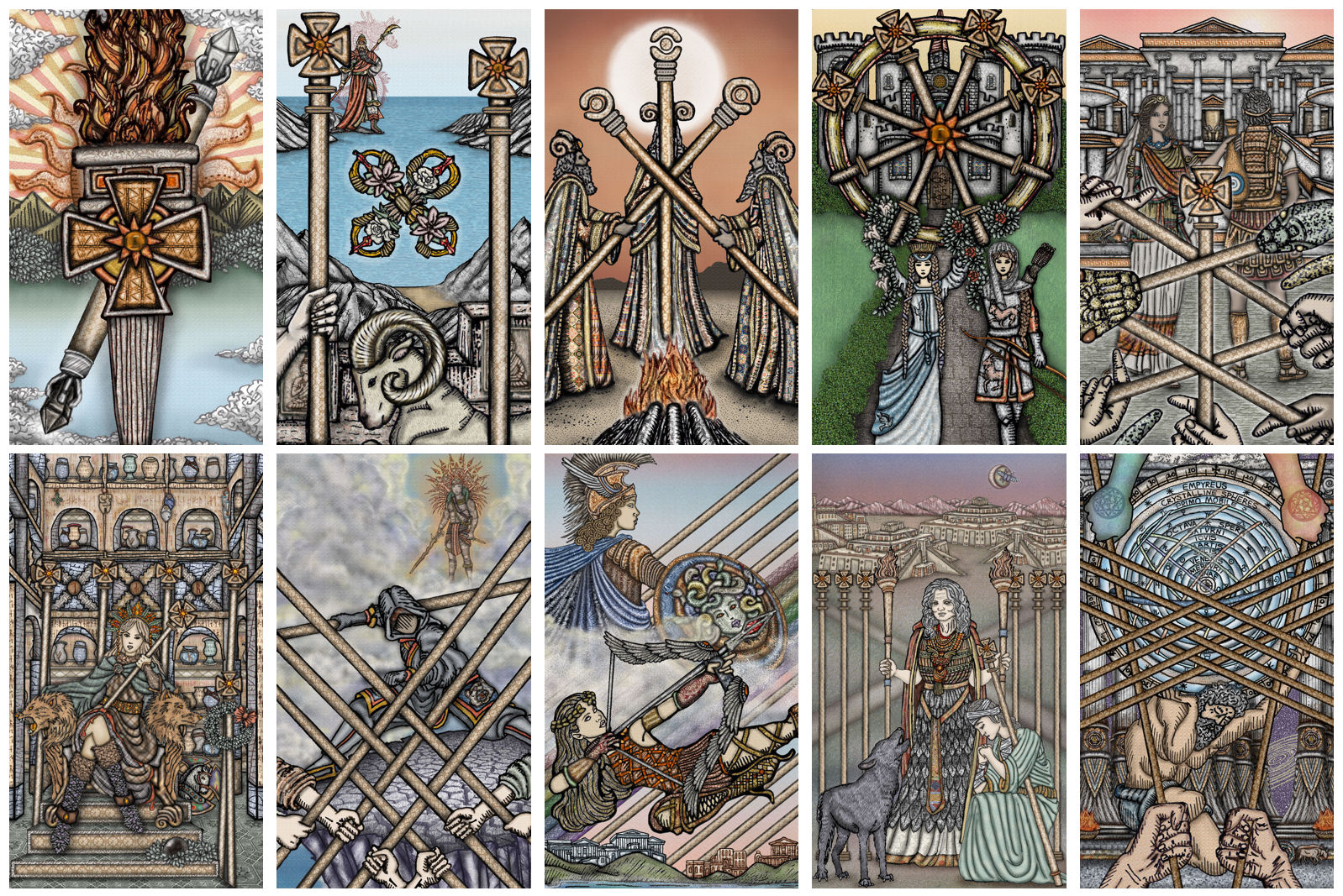
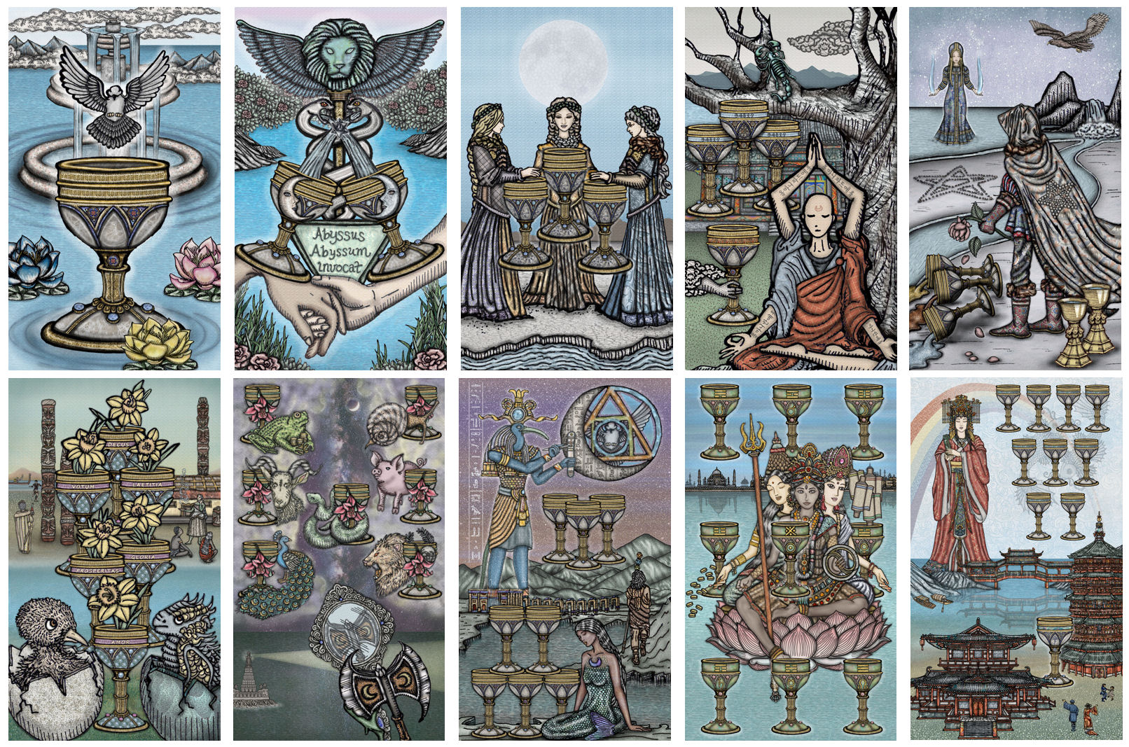
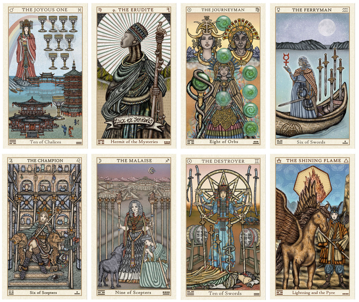
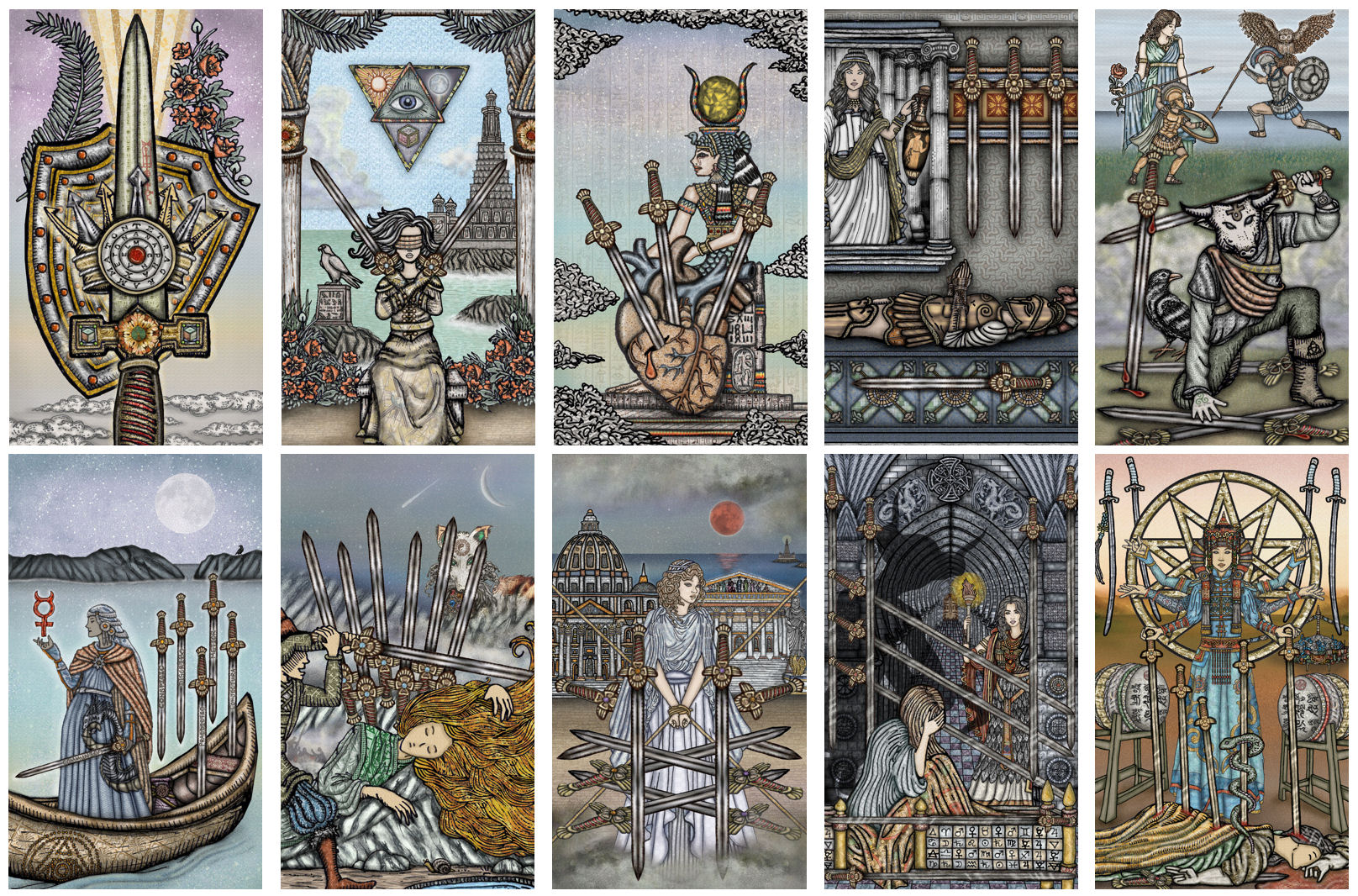
I’ve finished the first draft of all 80 cards, but that doesn’t mean much because I’m returning to the Majors to fix up Keys 1 through 7, at the very least, and maybe whatever else I see that needs fixing.
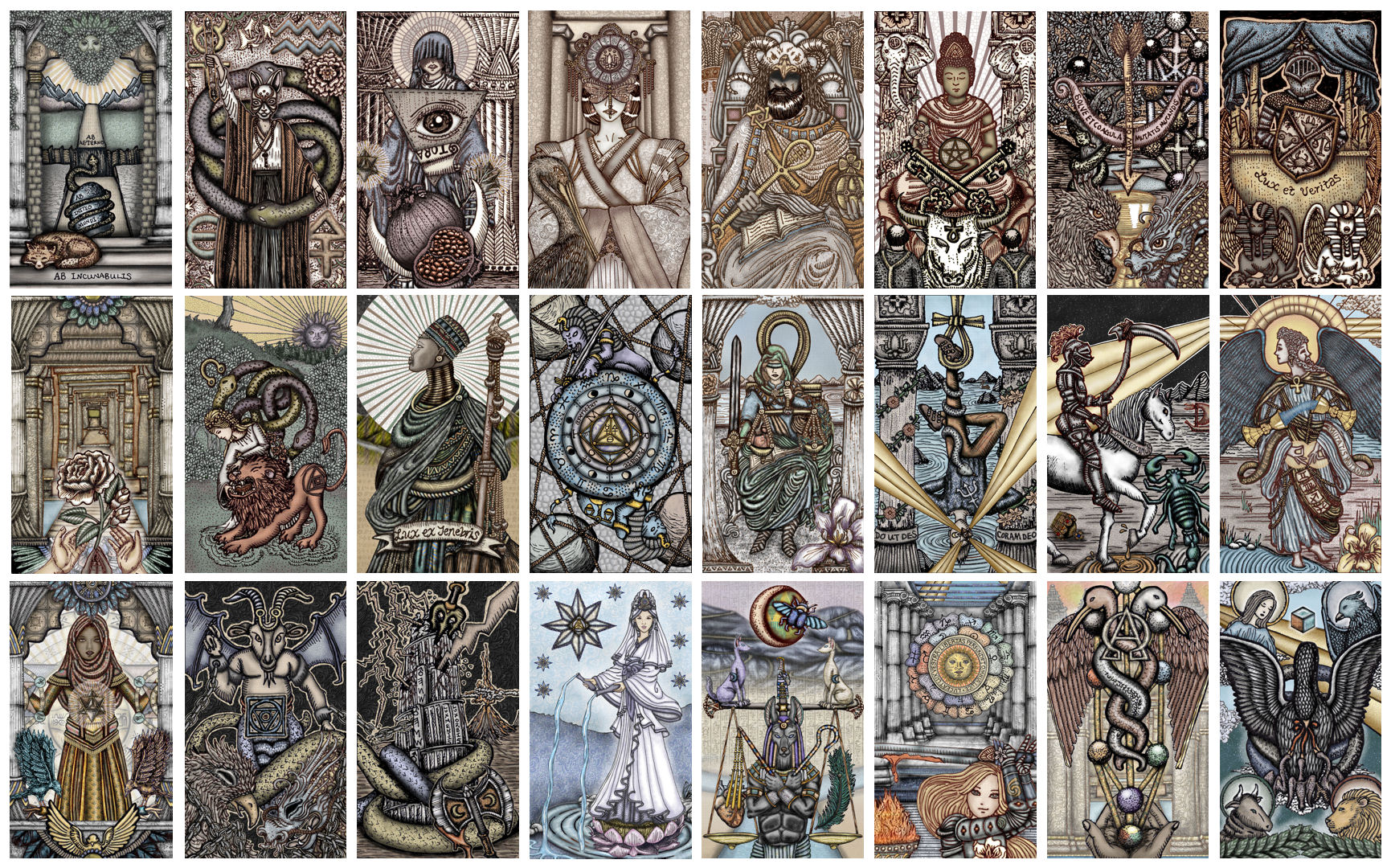
The substance of the court cards will remain the same, but they, too, need fixing. This one’s arm looks awkward; that one’s nose is, like, what is that, that’s not even a nose; and then when you line up the same court card from the four suits, I want there to be some cohesion, so where there are glaring inconsistencies, I’ll need to fix that up, too.
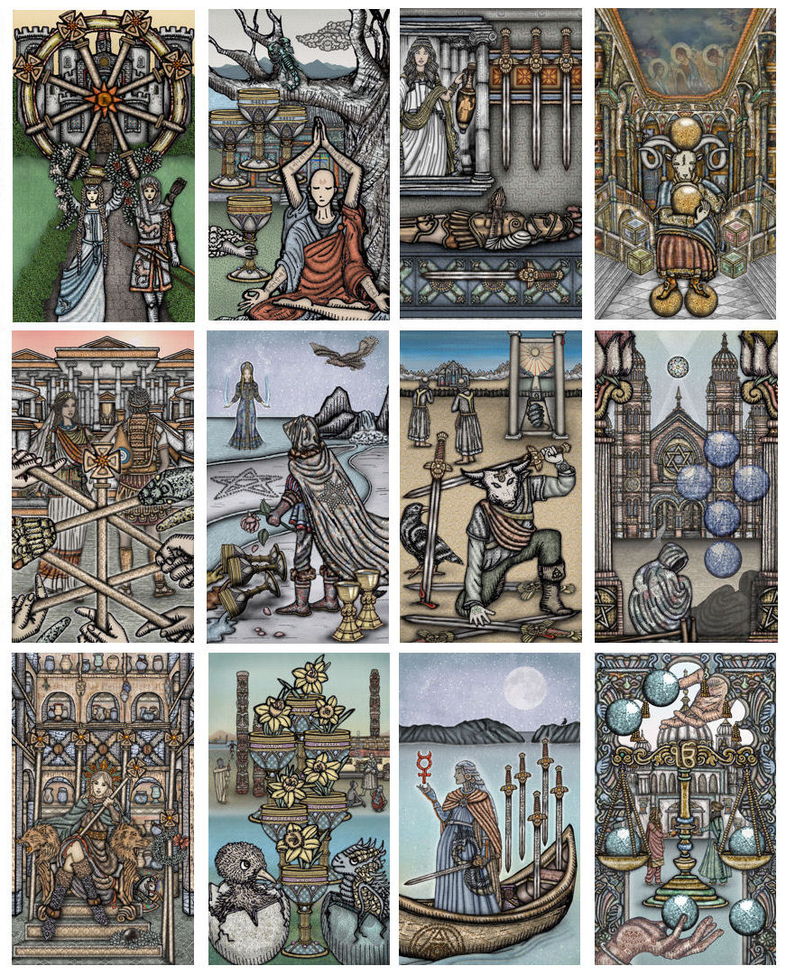
By the time I got to the pip cards, I finally got the hang of digital painting, so I don’t think much substantive revision will be necessary. Wait, no. That Five of Swords, though… I think it could use a little more tinkering, perhaps even a significant reconsideration of what should go in that background.
I am now at work on the card back design, the box design, layout of the cards, setting them into their borders/frames, and finishing up the Book of Maps guidebook. Oh, and the Little White Book.
The LWB is proving to be the hardest part of this endeavor. I’ve got a limited number of pages and a whole ton of information that requires nuance, and I don’t quite know how to reconcile the two. The cultural and historic background for the world each card portrays is important. So are the card meanings and the practical interpretations of the cards in readings. How the heck do I cherry-pick what to include and what to exclude?
The Book of Maps is so much easier, because I don’t feel any pressure when it comes to page limit. I just write what I need to write, put it in book format, and if Lulu’s price quote is in your budget, you print out a hard copy; if it’s not, you work with the PDF e-book. =)
The above is a general mock-up of the card layout design. The borders will be a papyrus-colored parchment and the illustrations and captions are going to be enclosed by rope-like borders.
My next big hurdle is print quality. How will the muted color saturation and values look in print, in actual tarot card size, which is 70 mm x 120 mm? When I did test runs for the art prints, color values that looked okay on my computer screened didn’t look quite right once printed, and the texture of the paper I was printing on had a noticeable impact on how the color looked, so then I had to account for paper quality, too.
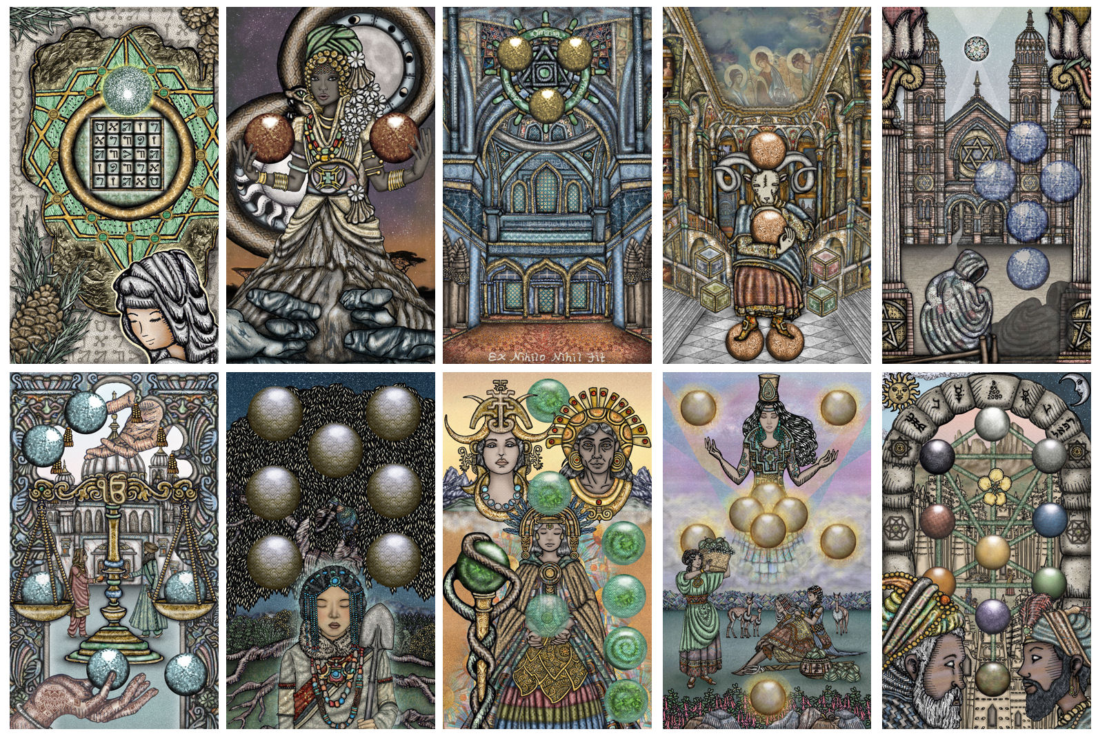
In my last SKT update of 2020, I talked about the considerations for color that had to harmonize and come together, and why that was giving me anxiety attacks. I wanted to share some more on that point.
This may sound nuts, but there were internal existential meltdowns because I couldn’t answer the question, “What is the color orange?” when the color correspondence I needed to represent was orange.
Like, at what point is the hue red and at what point is it yellow? Light is electromagnetic radiation, which creates a metaphysical force of either attraction or repulsion, and so how do I tap into what our collective unconscious attributes to the color orange, vs. red, vs. yellow? What wavelength do I want each card’s illustration to ride on? And come to think of it, why orange? Why do I want to work with orange for this feature again? Can I justify my use of orange here, beyond “this is what somebody else did”?
And if I’m airbrushing the space with blues and browns to give some depth to that orange, is it still orange? Does that energetically dilute the purity of the vibrational orange correspondence? Pondering these questions about orange would cause me to go inert for days.
The square tile you see here in these Paint Shop screenshots is my “paint color.” If I’m painting something orange-yellow-esque, I don’t click on a solid color that’s around orange-yellow. Instead. I create a pattern, like what you see above, that includes all the colors in the range of red-orange-yellow I want, then “paint” in the space with that pattern I’ve created. But it’s at such a magnified level that when you look at the actual tarot card, what you see above right now is not what you’ll end up seeing. You’ll end up seeing just orange.
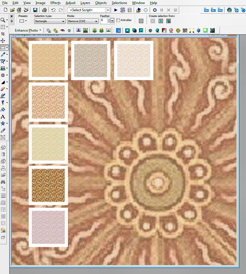
Even that pattern tiled– if you magnify just the tiny tile up 500%, you’ll see that the pattern itself does not consist of solid colors, but more tiles that I created, these being monotone tiles made up of lots and lots (and lots) of dots.
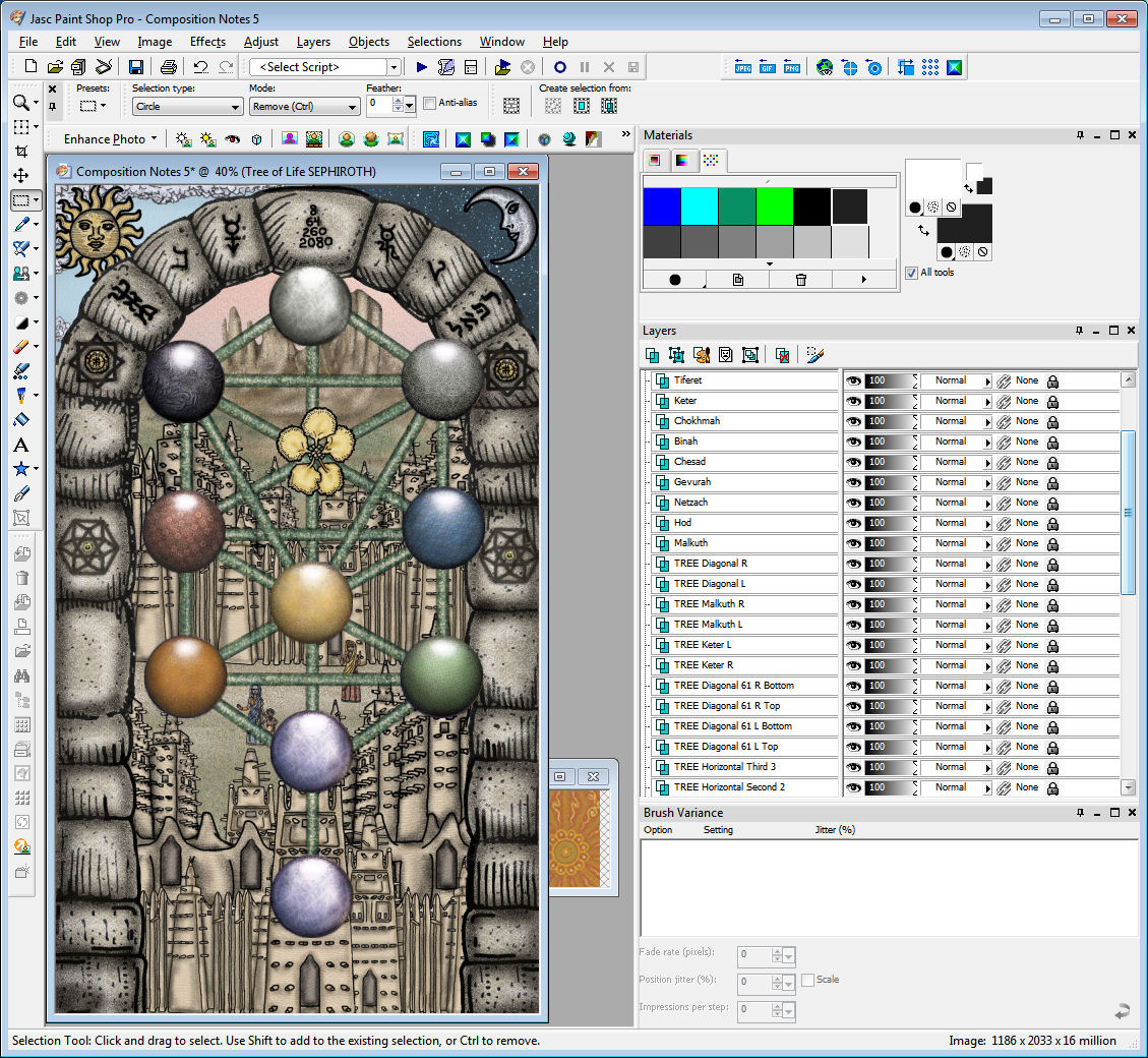
The end result is the orange you see for the sefirah Hod above (bottom rung of two–the orange on the left side, across from the green orb).
At actual size, it just looks orange, but if you could magnify it up to 500%, you’d see that it’s actually the orange-y pattern I’ve been tinkering with in all the previous pattern tile screenshots. Then if you magnify that orange-y pattern up another 500%, you’d see t hat it’s actually made up of a set palette of colored pointilist tiles.
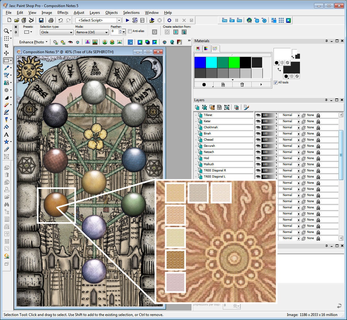
Also in the above work-in-progress, you can see that Yesod and Malkuth (bottom two orbs) are still uncolored. I only got up to Hod (the orange orb we’ve been discussing). This gives you a glimpse into the process.
The purpley-gray pearly whatever-that-color-is you currently see for Yesod and Malkuth is the under-painting. Just like traditional art, I work in layers. When I airbrush the actual color pattern I want over the under-painting, you’ll end up with a more luminescent look. If you don’t work with an under-painting first, the end result will be flat. It won’t look as, well, luminescent. It won’t have that… je ne sais quoi. =)
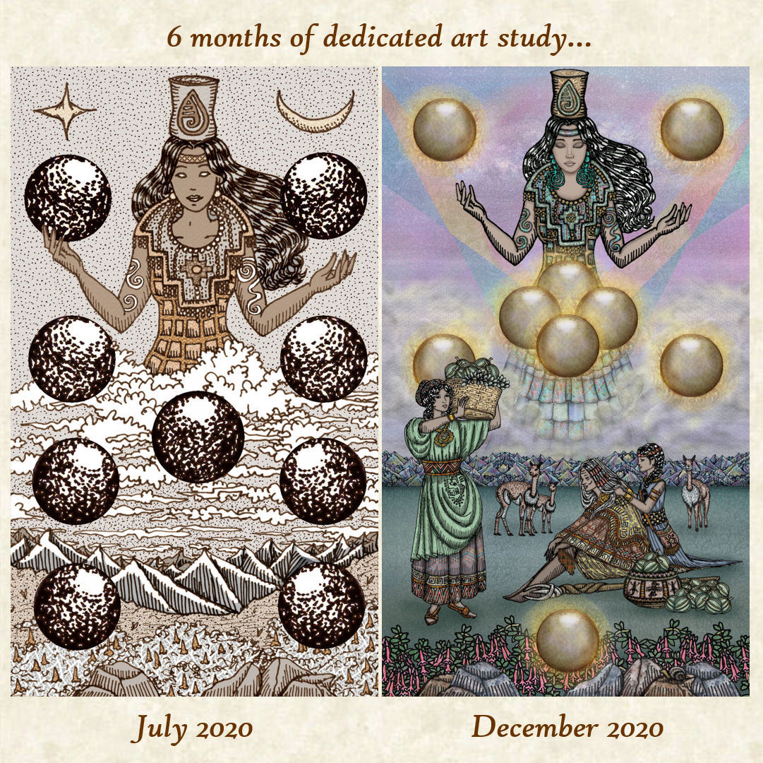
Something James remarked about the above, which I don’t know whether to consider good or bad– he doesn’t think the right one “after” is better than the left one “before.” He just sees them as two really different styles, and it’s a matter of which style you prefer. (In other words, in spite of six months of effort, he sees no change.)
Me, I see observable improvement in technique. It isn’t just about the addition of color. It’s even the hand-drawn linework. It’s the composition. And then, yes, it’s the informed, studied use of color.
I’ll be taking a short hiatus from working on this deck, in part to prep for StaarCon 2021. Hope you’ve heard of it! It’s a teleconference, so you can join in from anywhere in the world. Check it out! Hope I’ll see you there! ❤
As for the SKT, a guestimate for when pre-orders will open up is February. The first place I’ll post the announcement is my newsletter, so if you want to stay in the loop, subscribe here.

My only suggestion with the LWB is… do NOT go for the Lo Scarabeo standard of including 457 different languages (including ancient Sumerian, Esperanto, Ladino and Semaphore).
Seriously though, with the Book of Maps at one’s fingertips, a very minimal LWB should be quite sufficient.
btw – so far these cards look MAGNIFICENT!
LikeLiked by 1 person
I like the previous approach of a basic LWB, a MWB for additional clarity on meanings in readings, and the BoM for the whole shebang. 🙂 I currently refer to both the MWB and BoM, because they contain information at different….levels, for lack of a better term.
LikeLike
Pingback: And… another SKT III status update… – Indie News
Regards to your 9 of orbs cards, I personally prefer the left version aesthetically however I can see the improvement of your art techniques in the right version. But to choose between the two, which do I think is better? It depends on what the emphasis is in the question. What do *I* think is better, or what do I think is *better*? And what constitutes as “better”? They really are different styles. And to say that I like the left one a bit more than the right doesn’t mean that your efforts were wasted, or there was no change. Despite all that, I really can’t wait until you release the deck because I love it anyway.
I love your little internal meltdown about the colour orange. Reminds me of stuff I process whenever it comes to answering questions or just generally overthinking seemingly innocuous crap. “Sure it doesn’t matter to other people but it matters to me! I notice it!!!”
LikeLike
the level of effort and care is very much appreciated.
& I totally understand having an existential crisis about the color orange!
LikeLike
Continuing on with a comment about the “9 of Orbs” Card – left vs. right version – I have to say I definitely prefer the newer one on the right. Not only because the technique is indeed better, but I find that the ‘3-dimensionality’ of this version gives it a warmth and intensity that is only hinted at in the earlier iteration. Just my 2 cents…
LikeLike