
SKT Revelation Production Status Update: Short Version
- We’ve sent the down payment to our printing company and commenced the production process, but–
- First we’re doing a test print for the final confirmation of color, the packaging, and also to see how the coloring looks with the selected cardstock and finish, which we estimate to take about 2 weeks to complete, and–
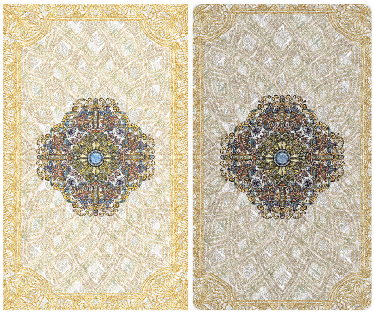
- After hundreds of drafts and flip flopping between different options, I’ve finally selected a card back design.
![]()
SKT Revelation Production Status Update: Long Rambling Version
Let’s talk about what a Journey (*dies*) creating the card back design for this third edition deck was!

For my First Edition, there was no struggle with the card back design. I mean, not at all. I sat down, thought about it, envisioned it, doodled it, scanned it in, doubled it with a mirror image to make the design reversible, paint-canned solid black to the background, and done.

With the black and white deck, I didn’t account for aesthetics; it just wasn’t on my mind, not in any prioritized way. It was a straight-shooting process of getting my ideas down in pictorial form.

When I sat down to conceive of a card back design for the Vitruvian, there was a little bit of struggle. For starters, working with the underlying themes of Vitruvius and Leonardo da Vinci, there was a particular aesthetic I was going for.
But ultimately it was a smooth, naturally flowing process, too.

And then, two years later, we get to the card back design for the Revelation Edition. On an Instagram post I had mentioned that I’ve done 108 different drafts for the card back. Yeah, no– it’s now up to 136.

I think a good chunk of the struggle can be attributed to the simple condition of me not knowing what I wanted.
Did I want it to be blue-toned? Amber and gold? Pearlescent and gold? Fresh greens? Or really colorful? No color? Monochromatic? Repeating tile pattern throughout [think any of the early editions of RWS, and also most Marseille decks]? Something ornate in the center? Ornate frame border? No framing? Floral? Geometric? I mean, I tried a little bit of all of the above.
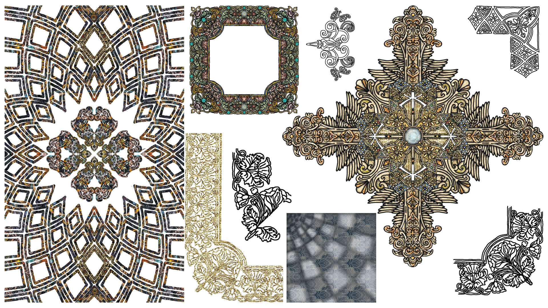
I wrote about my third edition card back design woes a while back, here. I had drawn a couple of different ornamental pieces, and then just tinkered with them to create different geometric patterns.

Let’s switch gears for a moment for an update on the color check test prints.

I’ve finished color check test printing. This is quite fascinating, at least it is to me. =) See above, left to right, 1 – 5.
- That’s what the digital image file looked like to print 2
- The actual color values and saturation of the physically printed card, scanned in, if you print the digital image file 1.
- Most recent test print. This is what I want. This is a scan of the successful printed card. (Yay!)
- The digital image file that prints 3. See how it looks way too light? But it prints just right.
- Digital image file of the exact color values and saturation I wanted. See how 3 comes real close to 5?

I keep cycling through the cards for typo checks, too. A few of you caught some for me. Phew! Thank you! And I caught one myself– I had to triple-check the Mayan numeral assignments.

Cards were color-checked and adjusted one by one. I couldn’t apply the same brightness and contrast adjustment to all the cards. Each one had to be custom-tweaked. It was brutal. But worth it. See above? The center one is the scan of the latest test print. Right-most one is the digital image file of exactly what I wanted.

Ooh, here’s an example where I missed the mark just slightly. Above center is the actual printed card. Notice how it’s just slightly darker and less saturated than the right-most digital image file that I compare-contrast to see how close I’ve arrived at my established standard.

See The Emperor card? If I want a card to look like what you see on the right-most edge, then I need to kick up the brightness and contrast to the exact levels you see in the image that’s the second from the right.
If I naively rely on what I see on my computer screen (the right-most established standard) and try to print that as-is, the actual printed card will always come out too dark, with not enough saturation (second one from the left above).

Before, I was just test printing to check color, so I was printing these decks using a print-on-demand site. The test print decks were not printed on the cardstock that I plan on using, or with the matte finish, or the same core quality inside the cardstock.
But now our next phase is to do just that– print the adjusted coloring on the actual cardstock I ordered and with the finish specifications. We’ve also wired the down payment on the purchase order and I’ve submitted everything to the printers. Production has started, except it hasn’t, because we need to do the final formal sampling.
Returning to my card back ramble…

I thought I wanted something pearlescent white with gold accents. A lot of that, though, was probably because I spent so much effort layering so many different designs I did to create that pearlescent effect and I was super proud of myself. =) And wanted to use it. So I kept not wanting to let it go. =)
I wanted the design to have an ethereal quality, elegant, with sacred geometry implied.
As for how yellowy the gold coloring looks in the images, I’m currently doing the color scale in a way that compensates for it printing darker and more muted. For reference, let’s revisit the SKT Vitruvian.

Above left is the digital image file I submitted to the printers for the SKT Vitruvian. (This is the same printing company who will be doing SKT The Revelation.)
Above right is an as-is scan of the actual printed card. By referring back to this compare-contrast, I can project what I need the digital image files to look like for it to actually print the color levels I am hoping for.

Here’s another example to anchor your sense of reference. Left is the digital image file, formatted with the 3 mm bleed margins, submitted for printing. Right is a scan of the actual printed card from my personal working copy of the Vitruvian deck.
Given the established trend, this is my projection for what the actual printed card will look like (below right) vs. the digital image file (below left):
So even though on your screen it’s probably going to look very yellow-gold, based on experiences so far, it’s going to look more like the darker, muted tones you see above right.
Anyway, that’s all for naught because I opted to go in a different direction for color palette.

Instead of pearly white and gold, I’m going with pale blue tones, for a more calming and also more neutral, even-tempered effect.

Just some more random card back designs I completed then passed on. Second one from the left looks sorta like what I ended up going with, but if you lean in close to scrutinize the cross pattern, you’ll see it’s a little different.

If left up to my own devices, I think the left one above is pretty swell! James’s feedback: “What, is your target market 90-year-olds?”
On a more valid note, he pointed out that these designs were too similar to the Vitruvian. It’s basically the Vitruvian card back in color. My Vitruvian card back had stylistic nods to the First Edition, but went in its own direction. Likewise, my Revelation card back should have stylistic nods to both the Vitruvian and the First, but should go off in its own direction. Yes. Valid. I agree.

Just some more shares of what I was working on. At a certain point I was trying too hard and overthinking the whole ordeal.
You can almost feel the frenetic desperation in some of these drafts. =D

Interesting tarot-philosophy question: Does the card back design on a tarot deck matter?
As a professional tarot reader, a consumer of tarot decks, and deck collector, the card back has never been a deal breaker for me. I mean, I’ve got some decks with wild card backs that make no sense and I’ve never had a problem working with them. When a card back is meh— also fine with that.

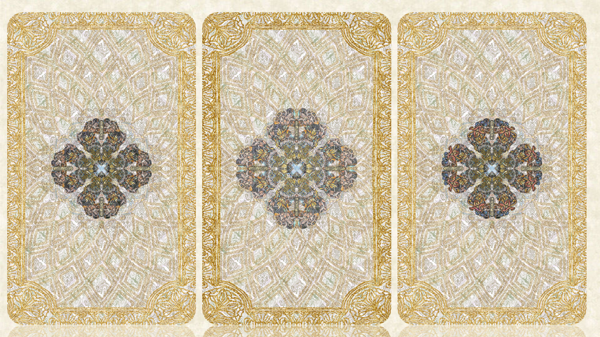
Left to right: the card back for the First Edition black and white, then for the sepia-toned Vitruvian Edition, and my final decision for the Revelation Edition. I’m really happy with my choice. Something about that imagery grounds and centers me, putting me exactly in the state I want to be in before starting a reading.

Printed at actual card size, you won’t be able to see any of that intricate detailing, but that’s okay. I like the feeling of knowing that it’s there, that it was done, that I’m using ornamental design to tell the story of Creation, nods to Genesis in Revelation.

Congratulations!
LikeLike
nailed it!
LikeLike
As far as the philosophical question posed, I prefer reversible card backs because they aren’t distracting from the cohesiveness of the deck design; I think that’s a pretty standard preference. That said, I have never been a fan of the repeating tile pattern and have always disliked that plaid RWS back (although I’m definitely a RWS girl). It’s…boring, and adds nothing to the deck as a whole. Your chosen design complements the SKT Revelation cards perfectly!
LikeLike
Fantastic work! Congrats on your decision! It’s absolutely beautiful and powerful, gentle and inviting without being over-bearing. Very in keeping with what seems to be the spirit of the deck. I love it!
LikeLike
The new card backs have totally grown on me! I think it’s a great design decision….and you better believe I’m going to have a magnifying glass going over it to enjoy ALL THE LITTLE DETAILS!! The center design reminds me of the most exquisite butterfly wings and I love the very rare faceted gemstone in the center. I think it’ll be a good pre-reading meditation device to settle down my thoughts…I could stare at this for a long time without fatigue! Kudos on a laborious process to choose so wisely!!
LikeLike
The thought occurred to me re intricate card backs … this will be one of those times when I’m actually glad to be so nearsighted. I can take my glasses off and get up real close to the images, and see all the magnificent detail!
LikeLike