

Here’s the box design for the second print run of the Revelation deck that I’ve decided to go with. Thank you, everyone, for your input in the previous post and on Facebook!

I posted the poll on here yesterday at 3 pm and closed it to count the results this morning at 6:30 am. There were only 74 votes total. Option B (the new one, with no SKT or brand identifiers on the box) won with 56.75% of the votes (total of 42) while Option A, which is this one you see here, received 43.25% of the votes (total 32), so very, very close!

I was going to go with the majority vote, but J raised a good point. The total number of input is too low compared to the total number of people who pre-ordered the second printing, so it’s not actually going to be an accurate gauge of what the pre-order people want.
Also, said J, the people who would be able to jump in and vote in less than 24 hours on a blog post I didn’t even publicize or my Friends-only Facebook share are people who already have a copy of the deck and who are already really used to my Stuff, so they don’t need brand identifiers on a box cover.
But, he said, since he’s the one doing intake of all pre-orders, he knows that most of the second print run pre-orders are new people. So it wouldn’t be fair to totally change the box design from the first printing when the whole point of the second printing is for people who didn’t get the first to still snag a copy.
Meanwhile, most of the people voting (according to him) are names he recognizes as people who’ve ordered other stuff from us. They can’t speak for the people who have never even heard of me and are buying the SKT for the first time.
And then I was like, dang. Good point.

This blog post is going to be a walk-through of the box design. Since I took out the Book of Maps chapter on the card back and box design, I’m going to put that info here on the blog and point people here in the delivery e-mail you’ll be receiving.

Much of it remains the same, keeping continuity through the black and white First Edition, sepia-toned Vitruvian, and the first print run of the full-color Revelation. All of them feature this invocation from the Book of the Dead (or Book of Rising Light).
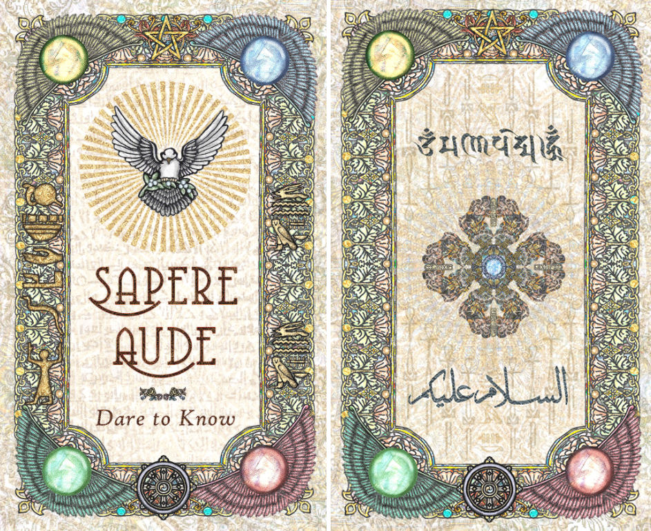
We’ve still got the “Sapere Aude” in the interior of the top lid of the box, and now on the other lid’s interior, you’ll see Aum Mani Padme Hom, an invocation found across and uniting many different Buddhist traditions, connected to Kuan Yin, the bodhisattva of mercy, but it’s a lot more than that.

It’s a mantra that brings peace of mind, invites love into your life, fills you with beneficent Light and wisdom. As a kid I was taught that when we recited Aum Mani Padme Hom in meditation, we were to pray for clarity of thought, balance in our emotions, divine reminders to always be kind, and divine guidance to stay on the right Path. Below it, “May Peace be upon you.”

The other interior panel remains the same from the first printing, though I switched out the Eye of God for the dove.
The meaning of “Sapere Aude” is to possess the courage to assert your understanding—trust in your worthiness of knowing, and trust in that knowing once attained.

The hieroglyphs along the left border of the back design (to the left of the invocation) designates the dwelling and physical presence of Divinity.

The first two hieroglyphs depict the sun over a field. (For reference, it’s pictured along the very right edge of the above image file.)
The third is a palm, the fourth a hand, and together indicate hands in worship. The fifth is of a serpent and the final hieroglyph is a human figure giving praise. The final figure is also emblematic of ascension toward heaven.
This is Divine Glory manifested in material nature, Divinity in our created world.

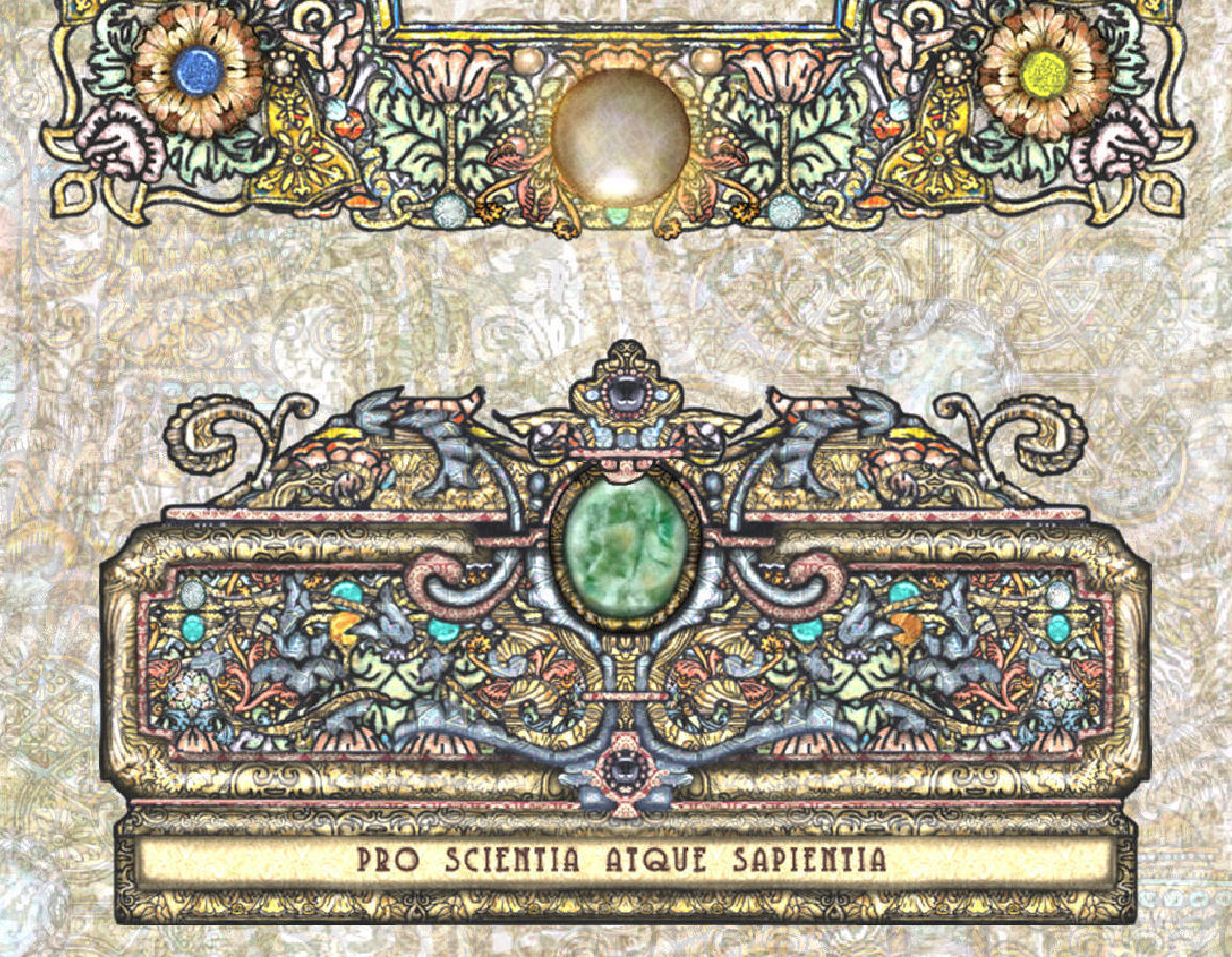
Along the four corners of the back lid design are Paracelsus zodiac seals for Taurus, Leo, Scorpio, and Aquarius, the four fixed stars.

They invoke the four primary elements, earth, fire, water, and air, enlivening the deck with protection from the spirits of these elements, per Paracelsus’s philosophy.
The Latin inscriptions featured around the box walls are translated as follows:
- Pro scientia atque sapientia. For knowledge and wisdom.
- Deos fortioribus adesse. The gods are on the side of the stronger.
- Mens agitat molem. Mind moves matter.
- Clavis aure summus. We are the Golden Key.
- Vocatus atque non vocatus deus aderit. Whether you call upon Him or not, God is present. (Inscribed over the front entrance of Carl Jung’s home, and his tombstone.)
- Vi veri veniversvm vivus vici. By the power of truth, I, while living, have conquered the universe.
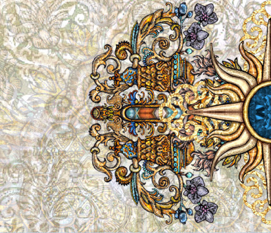
The ornamental designs along the short walls are a nod back to the First Edition. Btw, these images I’m posting are a bit grainy because I reduced the DPI resolution from 500 dpi to 72 dpi so I could show these online. In doing so, a lot of the vibrancy and quality gets lost.
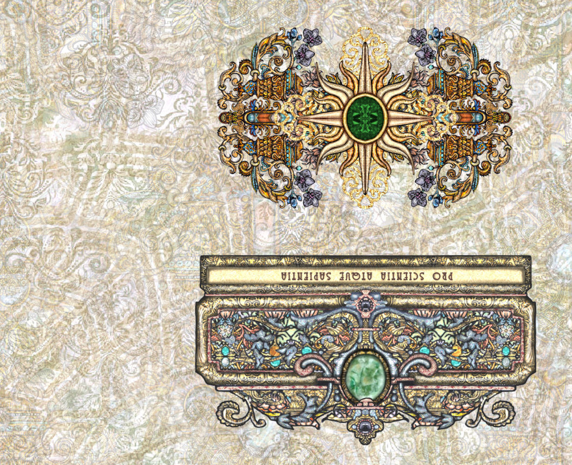
Likened to a crown of jewels, each stone is symbolic, intentional, and (at least to me) meaningful. Nothing is arbitrary, and nothing happens without serious thought given to the why.

Nevertheless, you can click on any of these images for a zoomed in close-up view of the details. Just keep in mind that the resolution has been drastically reduced, and in that conversion process, a lot of the sharpness gets lost.
I’ve finalized all design files on my end and will be submitting them to the printers tonight after day job work. =) Will continue to keep you posted of the progress.

Yay! Super excited. I love this box design because it feels more magical to me.
LikeLike
Yes! James! Such good points.
LikeLike
Very cool. Well considered. It’s beautiful, and as I said earlier: I don’t really care if it’s A or B. Either would be beautiful. XO
LikeLiked by 1 person
True also lol! Just happy to get my paws on one ☺️
LikeLike
Is it ossicle to still order the deck and book? X
LikeLike
He’s right. All of it 🙂 I’m one of the new people who don’t have a previous version and thought of some of those after I replied but assumed y’all know what you’re doing and clearly, you do.
LikeLike
Excellent points, James…..and I’m more than happy with this box. New buyers will love this box as much as I love the first run box!!
LikeLike
Good thinking, James!
LikeLike
Makes sense to me, new buyer, but I would have rolled with it either way. Didn’t get to vote as I didn’t stalk the blog yesterday lol
LikeLike
I have to say, having completely missed the poll and being a first time purchaser of the SKT, I am very happy you went with this iteration of the design. It is the option I would have voted for. They’re both beautiful of course, but I’m happy with your decision. Thanks, James!
Also, I love the meticulous thought and eye-to-detail that goes into every part of your creations!
LikeLike