
If you pre-ordered the 2nd printing of the Spirit Keeper’s Tarot: Revelation, then your input is requested. And… so sorry… I need it, like, in the next 24 hours because I’m about to submit to the factory and start the production process.
UPDATE: Visit here to see the final proofs for the second print run box design.
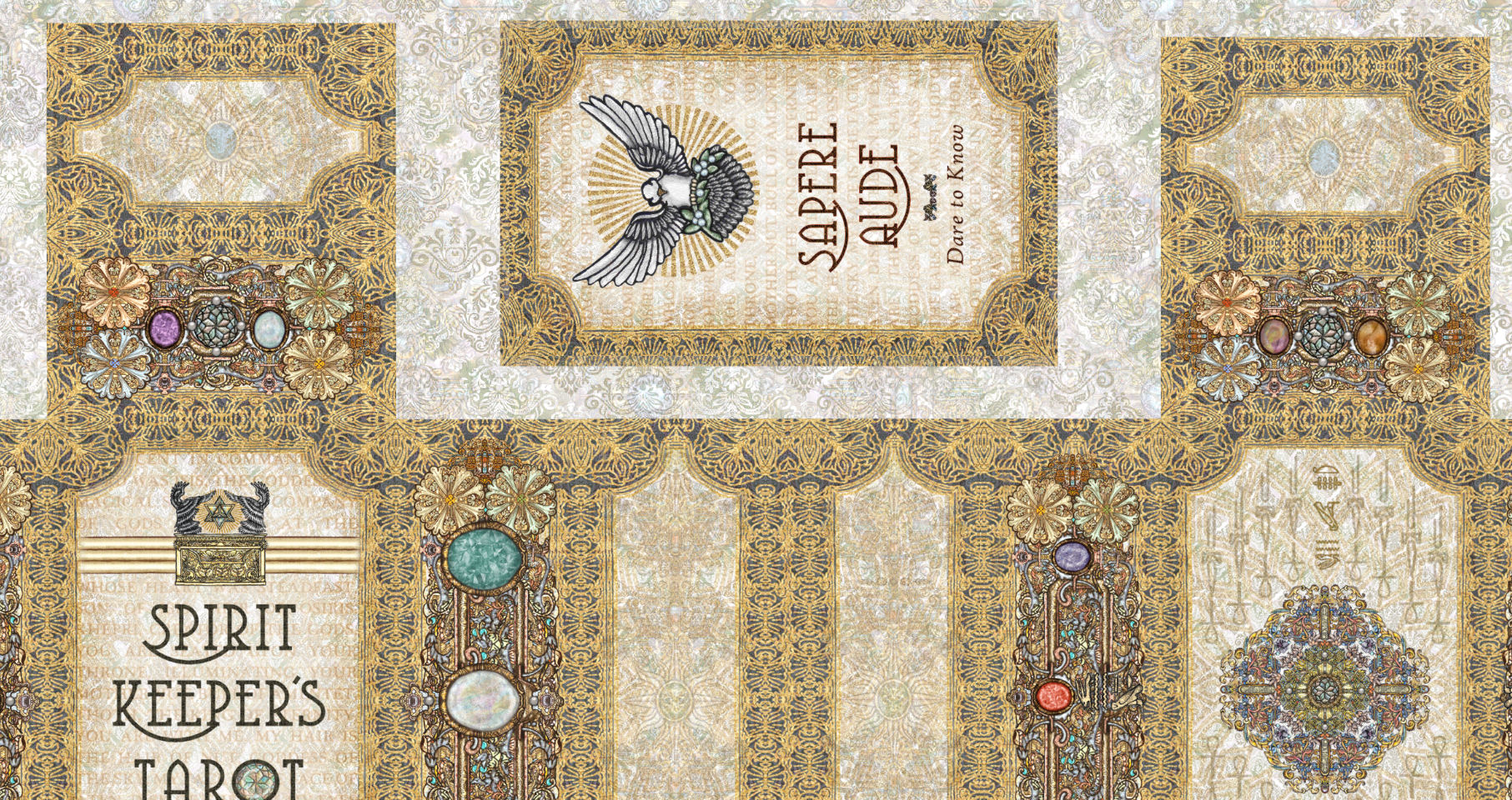
Option A
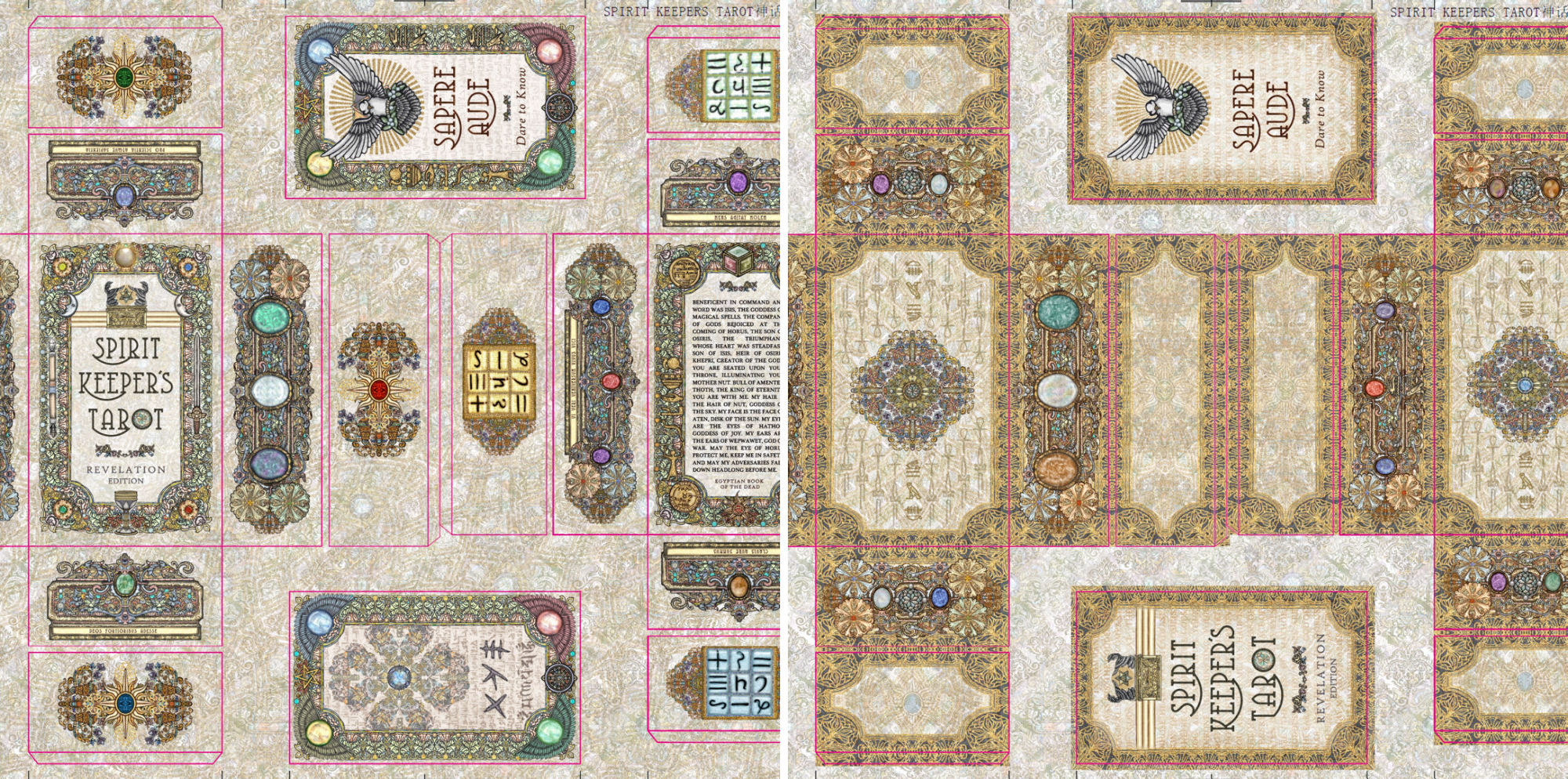
The above layout design for the box was what you’ve probably already seen. It’s what was on the pre-order sales page. And it’s what I had planned for the second print run of the Revelation box.
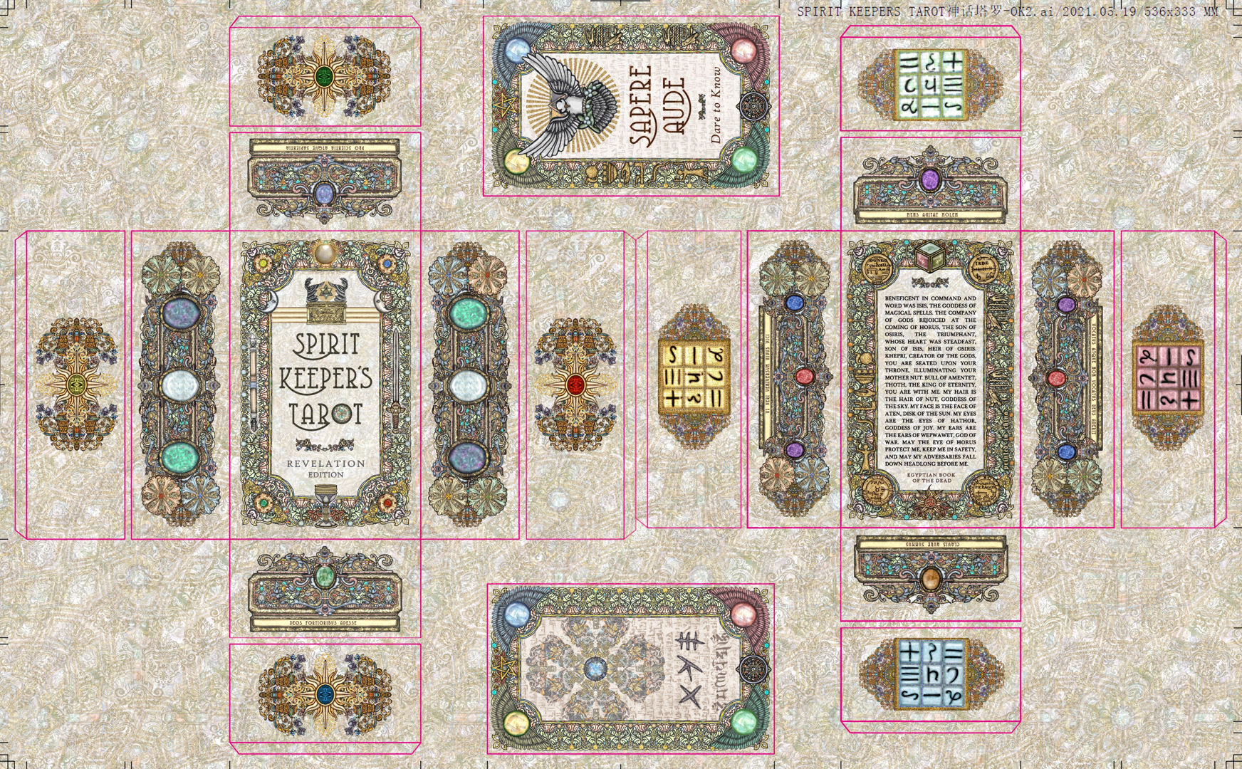
Hopefully you can visualize how this would look as an actual box. (Top and bottom lids, exterior and interior designs.)

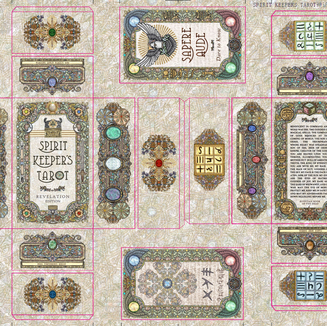
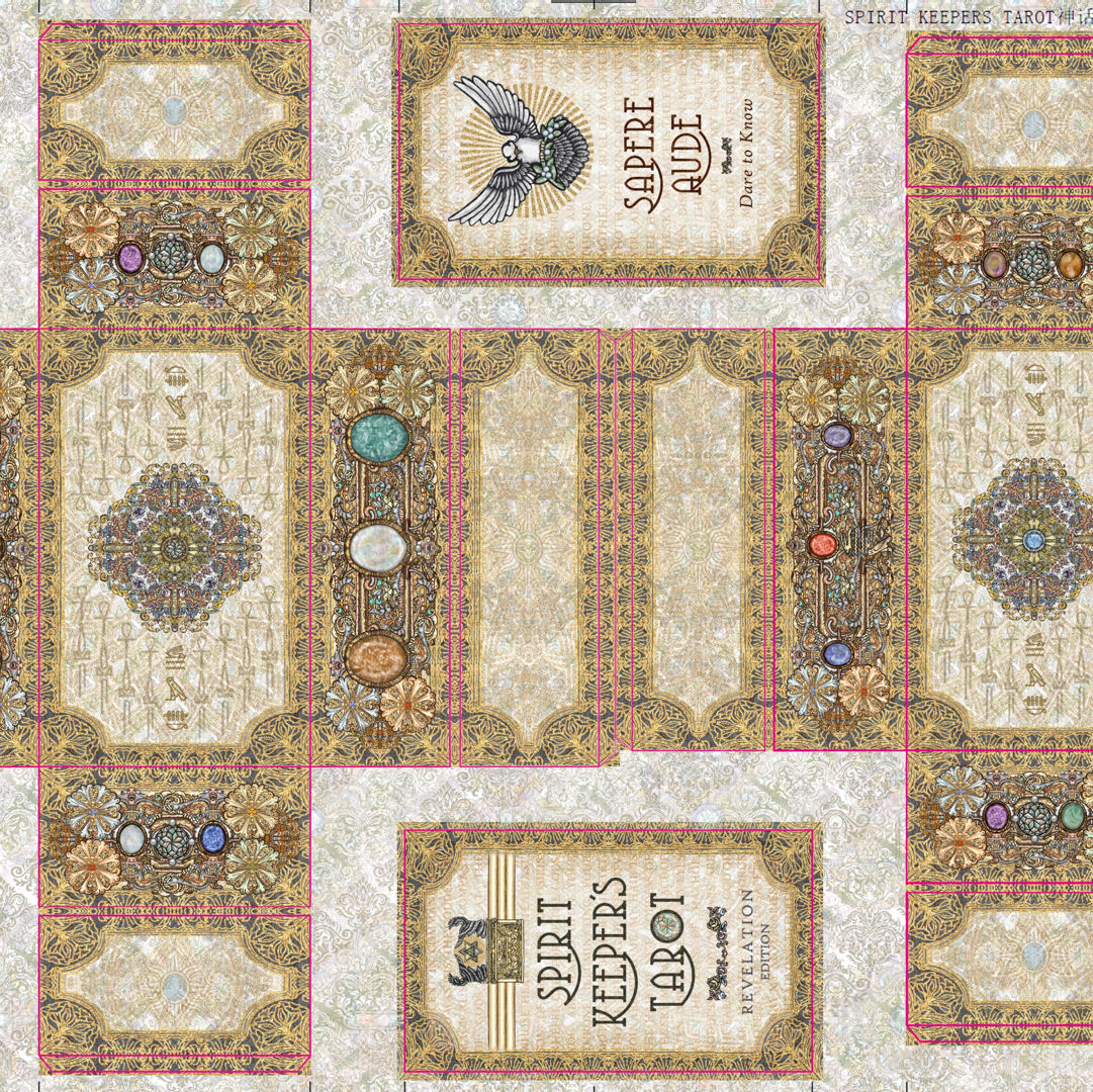
But then last minute I was looking at the card back design for the certificate of authenticity, and thinking how it would look good as part of the box design, too…
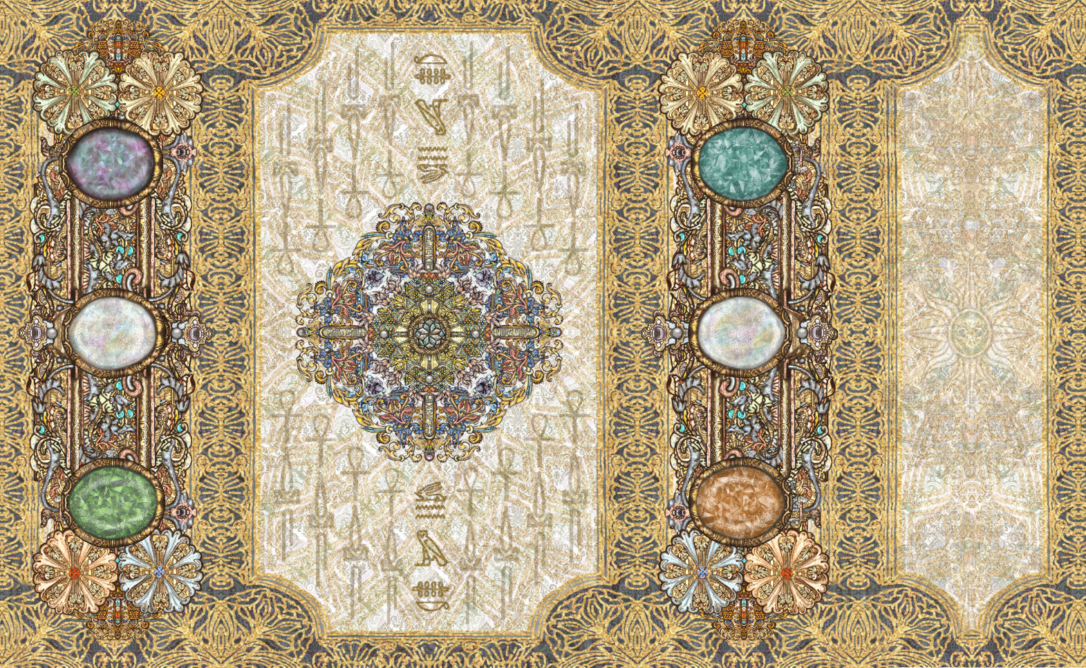
Option B
And then this happened. See above and below second option for a box design.
Please note Option B is still a bit rough, and I hope you’ll treat these more as thumbnails. If the majority vote is to go with Option B, then I’m going to revisit the design and clean it up.

Option A is basically the same as the box design for the first print run, with only the most minor tweaks that only I would know, or if you were on a mission to look for differences with a magnifying glass. =) So most of you reading this already know the design elements for Option A.
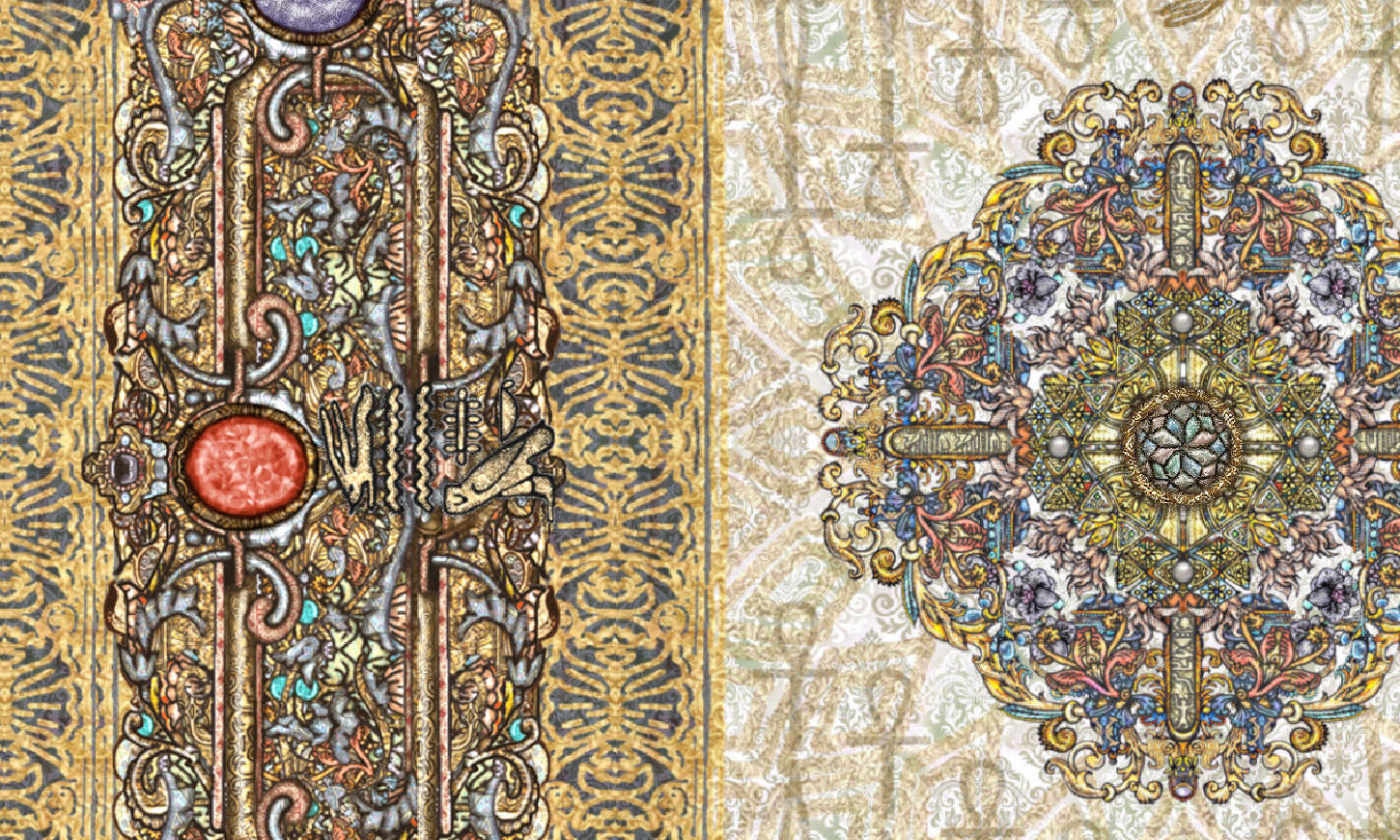
Here are some close-up viewings of the tentative Option B.
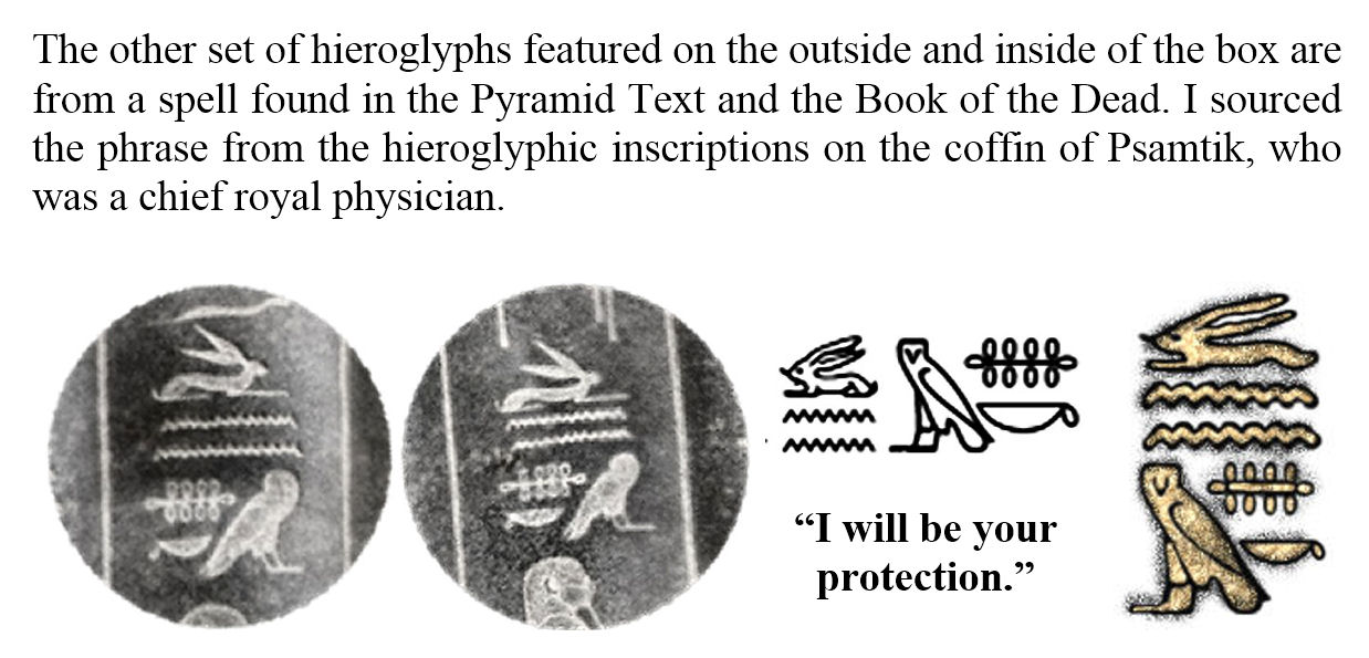
The repeating lines read, “Life/Immortality, Prosperity, and Health/Wellness” (the ankh, the wedja, and the seneb), found on the Rosetta stone, and oft found appearing alongside the names of pharaohs.

The center vertical reads, “I will be your protection.”

Like the previous box design, I really zoomed in when working on the details of each design element.
Above (though it appears sideways in the image file) is that blessing again, “I will be your protection.”
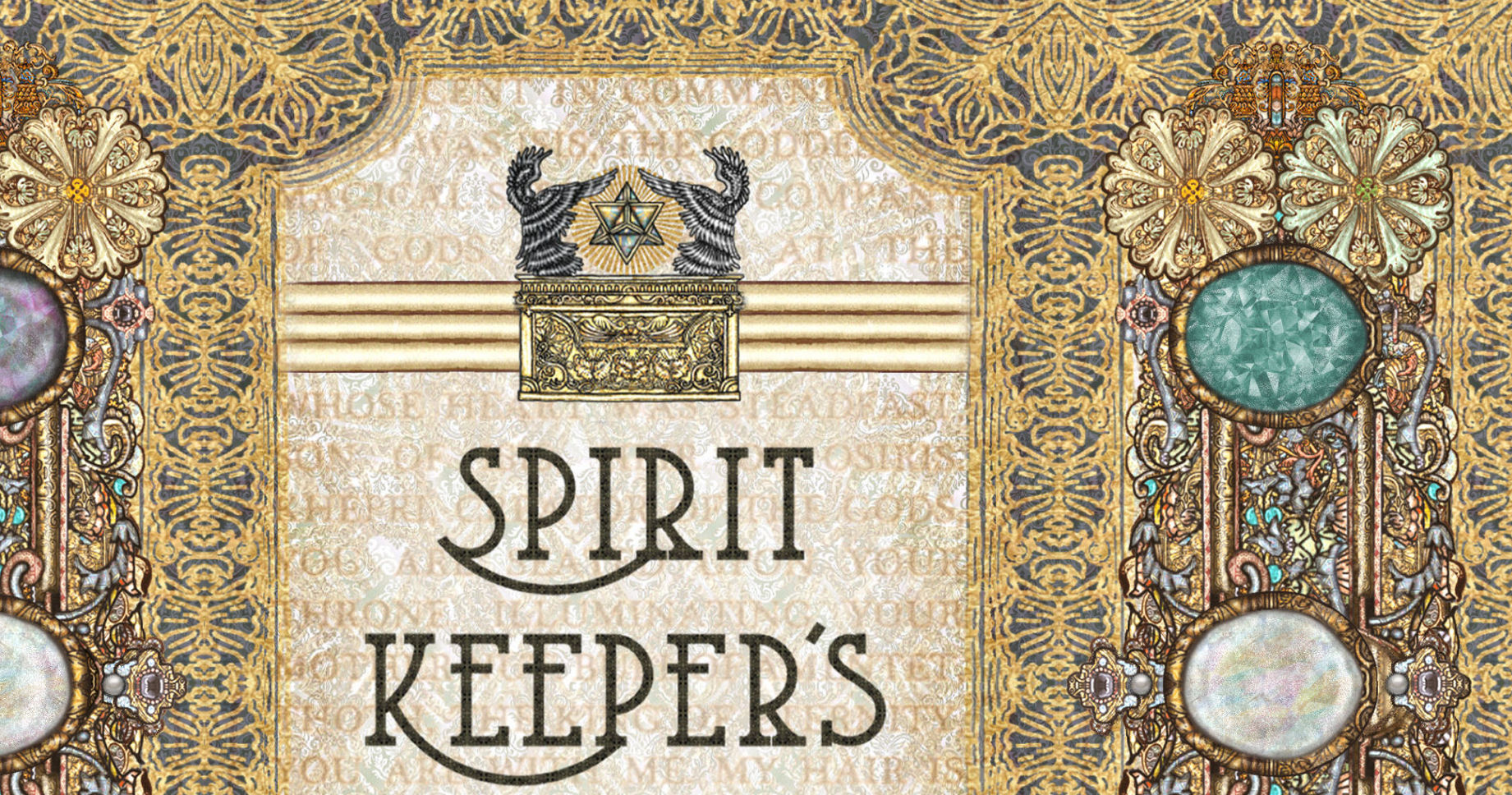
The passage from the Egyptian Book of the Dead (or alternatively, Book of Rising Light) still appears on the box, but not as readable as it was before. =) In Option A, it’s on the back cover and you can read it (with a magnifying glass…). Here in Option B, it’s embedded into the background wallpaper.
I also thought about maybe keeping the SKT deck name on the front of the box, same as I did for all previous editions–

Ooh… that’s quite pretty. But no. Above image just for funsies. Not part of the voting.
UPDATE: Visit here to see the final proofs for the second print run box design.
Please comment below with your vote: Option A or Option B.
Option A is only a slight revision from the first print run box design.
Note how Option B has no SKT logo, deck name, or identifiers on the outer face of the box lids. It’ll basically look like an unassuming ornamental trinket box.

I vote for option A. It looks beautiful!
LikeLike
Option A thank you.
From Shelly Nakagawa
LikeLike
B
LikeLike
Option A
LikeLike