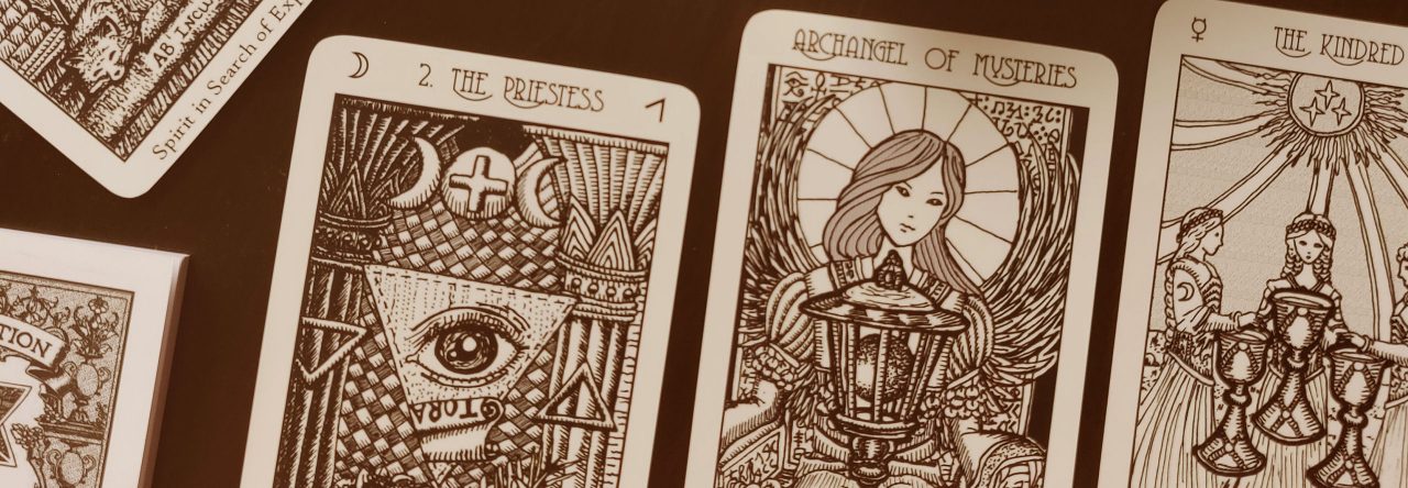
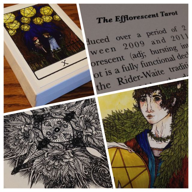
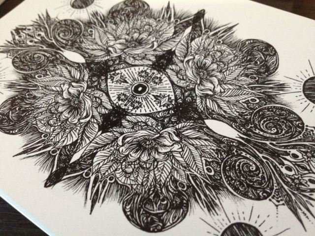
The Efflorescent Tarot is a self-published deck by artist Katie Rose Pipkin that you can order through Etsy. It comes in two options, colored as shown in this deck review or black and white. View all card images, in both black and white and color at Pipkin’s website here. The deck name could not be more appropriate, because the artwork here truly represents the efflorescence of Pipkin’s extraordinary artistic talent. I have a particular weakness for ink-drawn decks and the Efflorescent Tarot is an incredible demonstration of the medium.

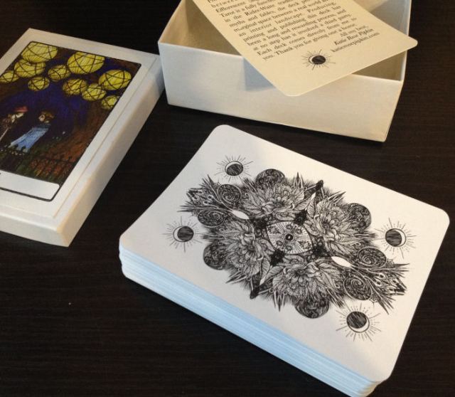
The deck comes in a white box made of thick cardstock, which is relatively sturdy but not indestructible– by the time my order reached me, there were already a few minor dents in the box. A full-color reproduction of the Ten of Pentacles appears on the lid. I love Pipkin’s rendering of the Ten of Pentacles here.
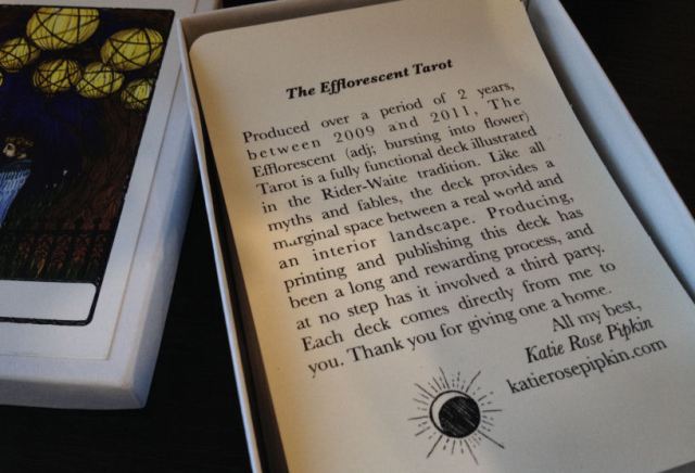
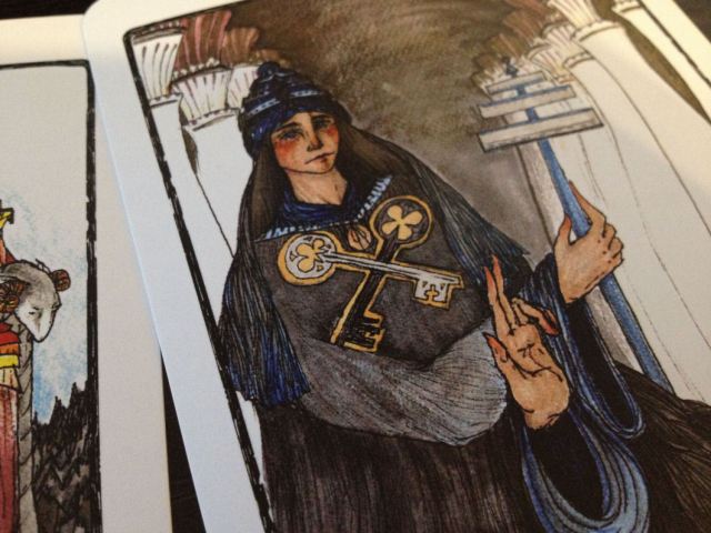
There is no little white booklet and the only introductory material that accompanies the deck is that single card you see in the above and below photos. That’s all you need, really. The Efflorescent Tarot is a Rider-Waite-Smith-based deck and if you’re familiar with RWS, you’ll read just fine with this deck, no explanations needed.
I would not call the deck a clone, however, because Pipkin does deviate from traditional RWS imagery in a few of the cards to give her own interpretive spin, like the Ten of Pentacles on the lid that you see above and also in a few other cards, which I’ll mention later. All card images are available for your viewing pleasure on Pipkin’s website here.
The backs are reversible and I absolutely love the detailing on the backs. I love how the imagery is evocative of efflorescence.
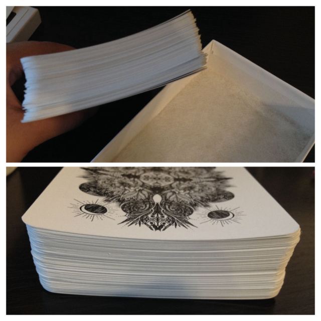
When the deck arrived, the cards were bent a bit into that curve, as you see in the above photographs. I tried to curve the cards the other way to straighten them out a bit, but it may take a bit more tinkering before I succeed. They’re also a bit difficult to shuffle, so for me, I have to shuffle slowly. The deck is large for a standard tarot deck– at 3.5″ x 5.0″, the size of most contemporary oracle decks.
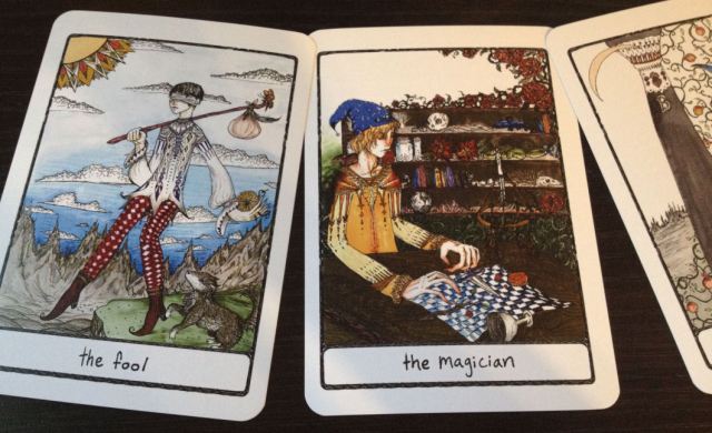

The artwork is just beautiful, and again, this isn’t an RWS clone. It’s RWS-based, but Pipkin has added her own interpretations to each card. In The Fool, for example, instead of having his chin up in the air, eyes half shut as if he isn’t paying attention to where he’s going, in the Efflorescent Tarot, the Fool is blindfolded. In traditional RWS imagery, the Fool still has both feet planted safely on solid ground, and is just walking dangerously close to the edge of the cliff. Here, the Fool has one leg in mid-air, off the edge already. For me, I also like to utilize the traditional RWS white sun imagery in The Fool, as it symbolizes power, potential, and portends changes and revolution.
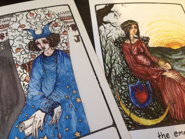
I found it interesting that the RWS pomegranates were kept in the background of the High Priestess, but then were taken out of The Empress. Whereas the water-by-her-feet-and-crescent-moon imagery is traditionally prominent in the High Priestess, that imagery has moved over to the Empress. For me, now there’s more mystery and intrigue in the Efflorescent Empress than there was in the original RWS Empress.
The one thing about the artwork on this deck, though, is that all the figures have forlorn expressions on their faces. The High Priestess, the Empress, the Hierophant, everybody looks melancholic. Some of the cards, like the Wheel of Fortune, deviated from RWS and went farther back in time to some of the older pre-RWS decks.

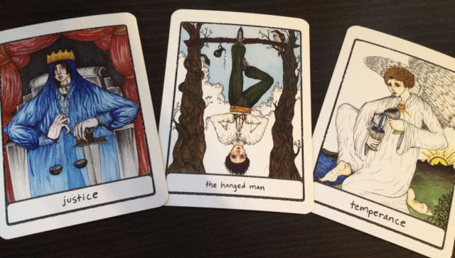
Seemingly minor but significant changes in the imagery make the Efflorescent Tarot unique. In The Hanged Man, for example, though this is a self-professed RWS-based deck, here the hanged man has his hands in prayer in front of him, and not hidden behind him. That notable detail, as with the snake coiled around one of the tree trunks, would change the way I relate intuitively to the card. The halo, too, is noticeably missing.

The Queen of Wands in the Efflorescent Tarot is one of my favorites. I love that card. The Four of Wands, though, conveys more melancholy than your standard RWS Four of Wands. I love the Ace of Cups, love the androgyny of the two figures in the Two of Cups, but is that figure in the Four of Cups looking up and reaching out for the offering? That’s a significant deviation from RWS tradition.


The Efflorescent Eight of Pentacles, too, I love. For me, the Eight of Pentacles is the card that often appears in readings for artists and writers, or those who are diligently at work on a particular artistic craft, and so the imagery of the Efflorescent Eight of Pentacles couldn’t be more perfect. I also love that the pentacles in the Efflorescent Nine of Pentacles are embedded into her dress, rather than appearing around her in her estate like the traditional RWS.

I thought the inclusion of a green backdrop in the Three of Swords was an interesting choice, since RWS readers often associate the Three of Swords with gray storms. You do see the storm clouds edging close here, but the addition of the green would add a more optimistic end note to the interpretation of the card.

I like the inclusion of rose bushes in the Queen of Swords. I don’t think I’ve ever seen that interpretive approach before. The RWS Ten of Swords is normally jarring enough, but the Efflorescent Ten of Swords has managed to outdo the RWS Ten of Swords in… well, jarring-ness. The RWS Ten of Swords has this “you’ve been backstabbed” energy to it, whereas here in the Efflorescent Ten of Swords, not as much– woman is front-stabbed, and straight through the throat several times, quite maliciously! Her enemies here are going straight for the jugular. No “et tu, Brute” about this Ten of Swords.

The deck is a seamless blend of traditional and timeless imagery with elements that are slightly more modern, like the buildings in the backdrop of the Chariot or the Five of Pentacles, and there’s something wholly modern to me about the shirt that the Page of Wands is wearing.

I shuffled the deck thoroughly and pulled three cards for a simple reading. Though the cards were well-shuffled, all three cards were IVs. Hunh. When three IVs appear in a spread, there’s said to be abundance resulting from hard work, diligence, and a strong work ethic. Although I would say this deck is easy to read for the RWS reader, I confess when I drew that Four of Pentacles on the right, I wasn’t quite sure at first glance which card that was. I kind of scratched my head, but then noticed the four red pentacles in his right hand and went, “Oh! Right.” The curling edges of the cards bother me during readings and cause the cards to not stay put on the table when drawn into spreads. This could be nothing more than a matter of breaking in the cards and over time, I’m sure the curl will flatten out, but for now, it is a bit of a bother. I wish the printers would do a better job with the production quality. I debated whether or not to trim the edges, but noticed that if I did so, the trimming would cut into the artwork on the cardbacks, which I definitely don’t want to do. Overall, a great RWS-based deck to work with and a must for any avid tarot deck collector.

I just bought this deck, too. There’s something quit appealing about the coloring of the cards and art … but I find the elongated fingers somewhat creepy!
LikeLiked by 1 person
Ha ha, oh my gosh, yes! You’re totally right! I do love the deck very much, though.
LikeLike
I haven’t purchased this deck, yet……I love the self-published decks, and make that my focus. I’ve just purchased the Prisma Tarot, the Pagan Lenormond and( Beautiful Creatures to show my 5 year old granddaughter),. As art is a form of expression and the prima materia can take on innumerable forms, the elongated fingers just add to the fun and mystery – it is unexpected, and will take you by surprise, and I like that:-)
LikeLike
I’ve been eyeing the Beautiful Creators deck!
LikeLike
*Creatures. Autocorrect.
LikeLike
This is a very detailed review, thanks so much!
LikeLiked by 1 person
Thank you!
LikeLike
Thank you for another great review! There are so many great self-published decks out there as of late, that actually one my goals this year is to be extremely picky when it comes to deck buying or else I’ll go broke! Lol
But this is one of the decks I decided to skip out on, only because everyone looks SO sad I don’t think I could sit through a whole reading of that… That’s just me though. ;P
Oh, I wanted to also thank you for the great webinar you hosted the other day! I hope I can apply those lessons and get my creative mojo going again. 🙂
LikeLiked by 1 person
There ARE so many great self-published decks and you’re absolutely right– I’m shelling out so much dough on them! I do love supporting these amazing independent artists, though.
Thank you for your kind words about the webinar! Good luck with your creative works!
LikeLike
Wow, such beautiful artwork! I am loving this deck… have you reviewed the Paulina Tarot yet? It’s my favorite deck. 🙂
-Lipstick Witch
LikeLike
I love it, too! No, I haven’t reviewed the Paulina Tarot and haven’t gotten my hands on it yet! =) I probably should, huh.
LikeLike
Yay! I am so glad the deck got to you and you’re enjoying it!
LikeLiked by 1 person
Omigosh I LOVE the Efflorescent tarot and a lot of fellow professional tarot readers who see me tinkering with the deck all loved it upon first sight and went out to get their own copies!
LikeLike
Thanks for reviewing this one, I’ve had my eye on it for some time. I absolutely love the style but the one thing holding me back is the sad faces on everyone! How do you deal with that? Do you find it distracting or kind of “biased”?
Also, how do you trim your decks? Do you do it yourself or take them to a print shop? I have a bunch of decks I want to trim but I’m afraid to do it myself. One time I took a deck I wasn’t super attached to to a print shop and asked them to cut off the borders, and they did mostly but they left a small inner border. I’m wondering if I should have been a lot more explicit with them but the person who was authorized to run the actual machine wasn’t there to talk to when I dropped it off. And now I’m scared to take in a deck that I am more attached to in case something similar happens again.
LikeLike
Though the coloured version is lovely, I would still prefer getting the black and white one.
Somehow that version is calling for me since I first discovered it and I just decided I will order it when I get paid next week.
LikeLike
I am a little late to the party, but wow! The ink drawings and bold colors are gorgeous. Once again, this in depth review has inched me further toward my credit card. Ummmmm, thanks? Like some other posters I am reluctant only because of the sadness on the faces of the people… I wonder about that. It is a bit off-putting, but other than that I love this deck — even the long fingers!
LikeLike
Do you know did the artist of this deck change names, or??? The site you link to doesn’t seem to have anything to do with this tarot deck, and the Etsy for this deck says the artist is named “Peony Archer.” Just a little confused. Also, what made you pick color over black and white? 🙂
LikeLike
Alaina, I don’the know about the Etsy website, but I can tell you that I have the colored in version of this deck, and it is gorgeous! Stunningly gorgeous! As a bead artist I am always looking for new color combinations and color stories. This gal knows what she’s doing. I did see a black and white deck and it paled in comparison. Now, I will say that the faces on the people are almost all quite sad, which is odd in an otherwise uplifting and superb deck. I still love it, though. Easy to read.
LikeLiked by 1 person
Thanks for your input 🙂
LikeLike
Pingback: Heart & Hands Tarot by Liz Blackbird (US Games 2021) – benebell wen
No longer available on Etsy… hope it comes out again!
LikeLike
Where can I find the creator on Instagram I need this deck
LikeLike
Pingback: Vlog Septembre-Octobre 2025, Quoi de neuf dans nos cheminements cartomantiques ? – Sur le Seuil