

There is a tarot deck that has become a prop in my front sitting room. I leave it out on an end table and most of the time, a guest will reach for it and flip through the cards. I always know when that has happened, even if I am in a different room, because immediately thereafter I hear the squeal. “Oh my god! What is this deck? It’s gorgeous!” Then there’s a range of follow-up commentary, from those recognizing the art of Sandro Botticelli, to those who are either “Now this is the most fascinating deck of playing cards I’ve ever seen” to “So is this like a tarot deck, like the psychic fortune-telling cards you use?”

That deck is the Golden Botticelli Tarot designed by A. A. Atanassov and published by Lo Scarabeo. I love the reversible card backs and the ornate design that, to me, captures the Florentine Renaissance.
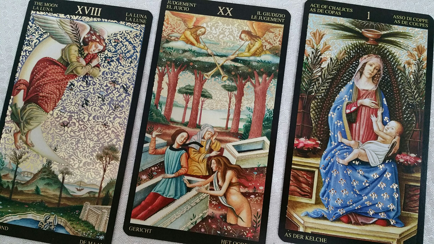
The cards are a mosaic of imagery from Botticelli paintings piecemealed together digitally. And it’s done with such seamless mastery that you almost can’t tell.
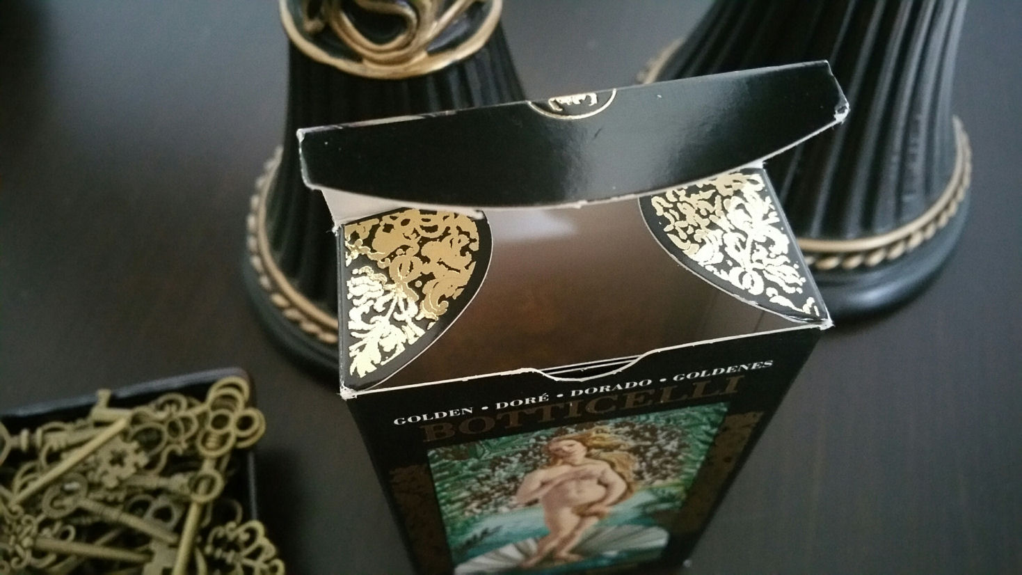
Even the gold leaf detailing on the box is beautiful.

This is one of those decks I recommend getting if you’re a deck collector.

For professional tarot readings, I think this deck might raise more questions than you’d like. Many of the cards feature famous Botticelli paintings, so if a client recognizes the art and starts making remarks like, “I didn’t know Botticelli created a tarot deck!” you may end up immersed in a tarot history conversation you hadn’t intended on getting into.

So for me, this is primarily a collector’s deck. Almost all the card images I love, except for that Key 0: Fool. They couldn’t have put together a more disturbing Fool card, in my opinion. I don’t know. Something about that Fool just doesn’t sit right with me.
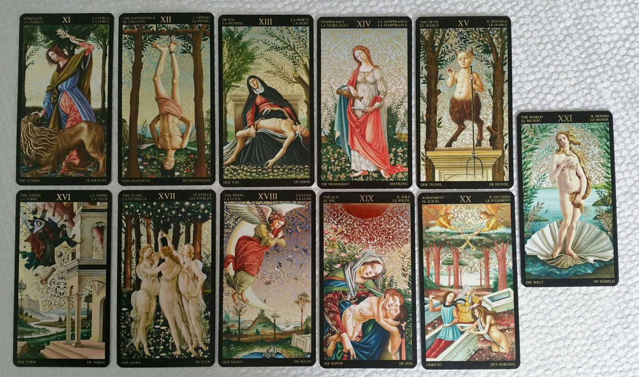
The workmanship here is exemplary. I love the choice of imagery, too, like a patch from Primavera for The Stars that’s Key 17. The Birth of Venus, of course, had to be The World card.

The above features the Wands suit. The deck is a clever reproduction of the RWS system using Botticelli art. It’s readable, has the iconic card titles in four different languages that Lo Scarabeo cards often feature, and the black border here works with the art.

I don’t think the photos will pick up on the gold leaf, but every card features ornamental gold leaf designs. The detailing is perfection and the gold is really very shiny. It’s quite the classed up tarot deck. I am so impressed with Lo Scarabeo here.
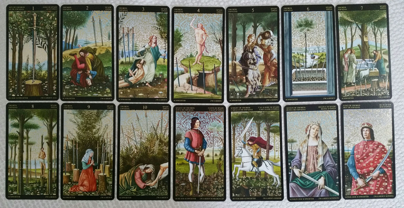
I can’t get over how beautiful and yet also how readable the deck is, especially for an RWS reader. Of course it seems to be Marseille-based, as you may have noticed earlier from Key 8 being Justice and Key 11 being Strength in this deck. Although I’m personally just not one to read with a themed deck in a professional setting (and I would consider this a themed deck, or an art deck), the card imagery is rich with symbolism that I don’t doubt the deck’s dependability in a professional reading setting.
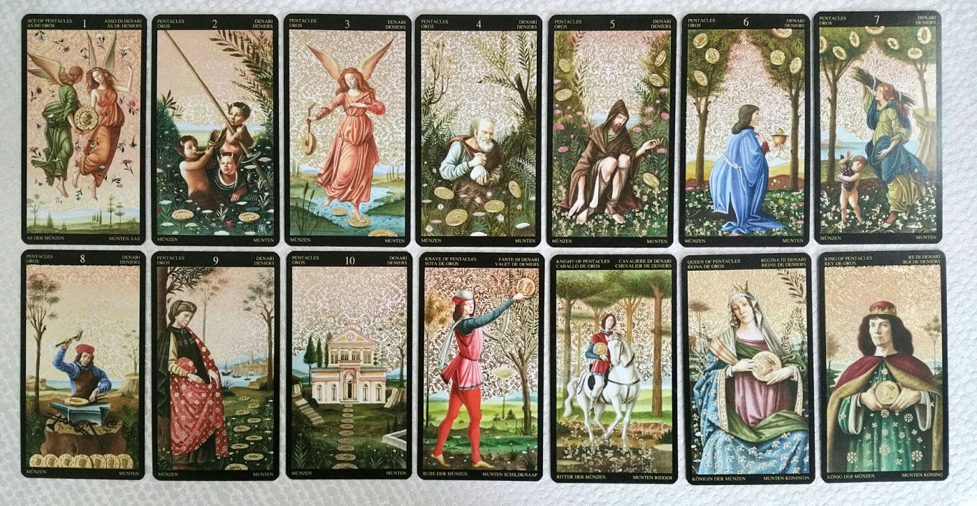
I love the Suit of Pentacles or Coins here, like that Ace of Coins and that Ten of Coins.

Up close, you start to see what I meant by the incredible detailing and ornamentation.

Everyone, everyone will ooh and ahh at this tarot deck. To me, it’s one of those must-haves in a collection.
I also have Lo Scarabeo’s Golden Tarot of Klimt, which you can see here. It’s hard to say which I like better or which you’ll like better. I suppose if you’re more Art Nouveau, then go for the Klimt, and if you’re more into the Italian Renaissance, then Botticelli is your guy.

Beautiful!
LikeLike
Thank you for your review of this beautiful deck. It’s spot on and I hope it will revive interest in the Golden Botticelli. The whole Golden series by Lo Scarabeo is beautiful, and I love every deck A.Atanassov ever did. I’d just like to add one detail. The Klimt is tougher.
From what I can see, this beautiful deck was created the traditional way by Atanassov (like all his decks). It’s not a digital collage but a new creation. He didn’t use tempera on wood as Botticelli did, I think he used coloured crayons on paper. The compositions are taken from different Botticelli paintings, and they’re so seamless because they’re not digital. This is at least what I see when I look at my Atanassov decks including the Botticelli through a magnifying glass.
Your blog is a joy, your book is a joy, and your reviews are intelligent and seductive 😉 I’ve found myself more often than once buying on your recommendation and never regretted it.
LikeLike
What a gorgeous deck!! Right now I’m still using my Rider-Waite tarot, but I’d love to branch out to some more sometime soon!
LikeLike
Pingback: Beginning – Lipstick and Tarot