
Please anticipate more delays to delivery of your pre-ordered decks.
(I feel a bit awful that I’m always leading with that in every status update…)
But I’m gonna be pushing back the estimated delivery dates even further now.

The physical proofs of the printed cards have arrived. And I have questions.
Like why are these proofs cooler-toned than the previous printing when I used the same 600 dpi digital files for both?

I need to backtrack and assess what I did for the 2021 first print run to get those warmer and brighter tones and why these 2023 proofs look cooler, fuzzier (does it? is it just me or do you see the fuzz too?), and like no seriously what is happening.

We have the printed proofs from the first print run to compare with this second print run. I’m also going to share the actual first run cards so you can compare proofs vs. actual printing (they came out differently for that earlier first print run, no idea why; in theory they should have looked exactly the same…).

One thing I do prefer in the latest proofs (2023, right side of all the scans in this blog post) is the smaller border margins. Even that minor difference is going to make a significant impact (I believe).
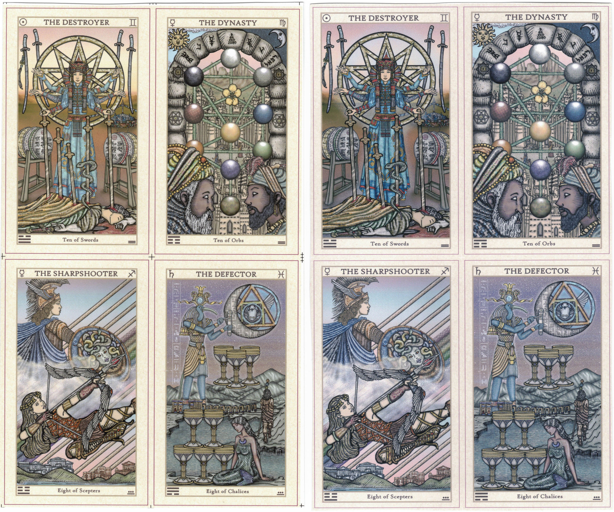
So, for instance, sure, I made slight edits to the Ten of Swords (The Destroyer) between the two print runs. The version to the left above had an unrealistically thin waist and the dress was a paler blue; the version to the right with my edits is a little more realistic in terms of body proportions and I brightened up the dress hue.
But I made no changes at all to the background, yet look how different the hues are between the pink skies in the left and right versions. In the Eight of Scepters (The Sharpshooter), compare the reds on Artemis vs. the one on the right. Look at the Eight of Chalices, where the dullness of the color tones is a lot more pronounced. The 2021 version was brighter and seems to be more crisp.

The latest proofs I received on the right is like dim and fuzzy or something, I dunno…
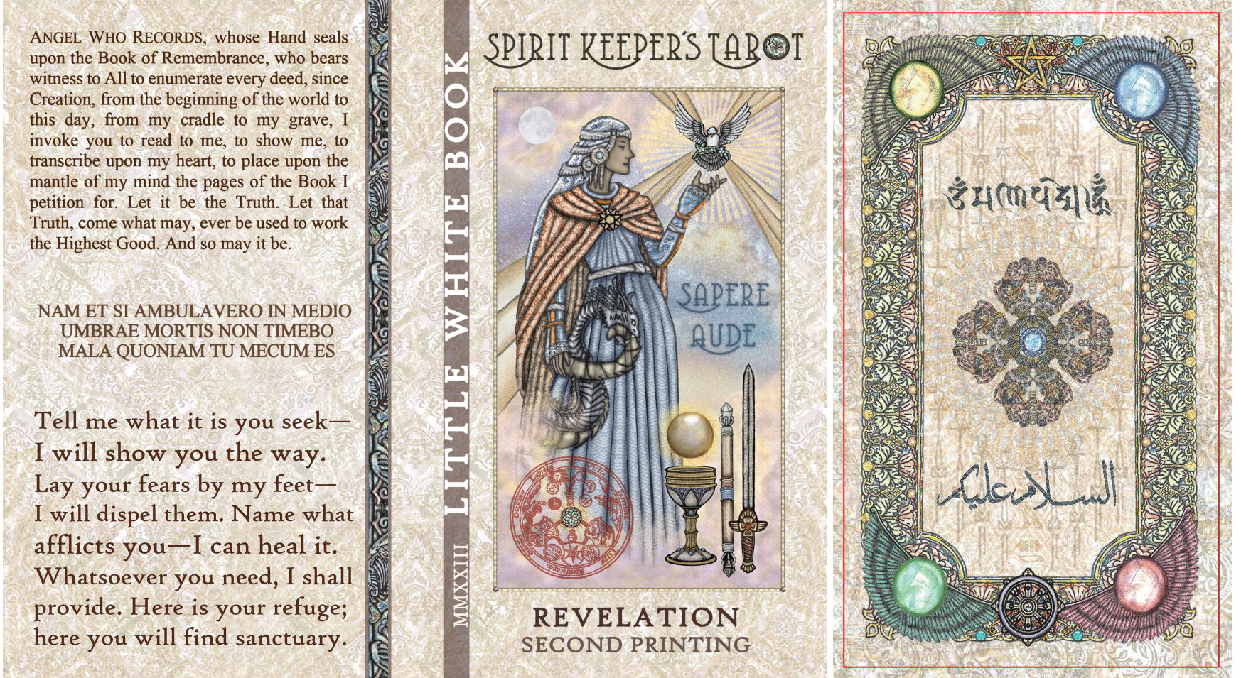
Compare the printed proofs we just received of the LWB front and back cover art, and one of the panels inside the box lid with the digital proofs. Wowsers. What the heck happened!?
Take a look at the scanned in proofs of card backs:

I used the same exact digital image file for that center card back design and the one on the right. So why is the one on the right bluish and cool-toned? And blurrier?!? It’s blurrier, right? You see that, too?
Also, I used the same exact gold filigree pattern thingie for the background design, so why is it lighter, warmer, and brighter in the center version (from the 2021 certificate) and duller and coller in the right version (the proofs that just came in)?
I’m calm. You’re calm. Everybody’s calm. Everything’s going to be fine.
Look at the differences between the various printings of The Magus card:

Above left was the 2021 printed proofs we received, which I had approved. That was the coloring I really liked. The above center is a scan of the actual printed tarot cards. See the color difference between the printed proofs we approved and the actual cards produced?
Above right is the most recent set of proofs that just came (2023) for the second print run. Now this card I made no changes to. So in theory it should look exactly the same as before. But see how it’s like…almost got purple-ish tones? The colors are cooler, whereas in the preceding versions the colors are warmer.
Now between the two proofs (not the center actual card), notice how the outer border margin is thicker in the earlier left 2021 version than it is in the current right 2023 version? But how and why? Forget them being the same exact specs; they’re the same exact digital image file I submitted.
This is all to say that color tones tend to be a gamble when you’re producing tarot decks. If you’re not picky about the minor fluctuations in undertones, then cool. But if it matters a lot to you, then that’s when it’s really tough.
Below — First row: printed proofs for the first print run, 2021. Second row: scan of the actual cards for the first print run. Third row: printed proofs for the second print run, 2023.

You may recall how the actual printed cards for the 2021 first print run came out a lot lighter than the proofs I approved. You can see that in the above, between the first and second rows.
The third row shows the proofs that I just received for the slated second print run, and for these particular cards, I kinda prefer these almost-more-purple or jewel-berry tones? Does my descriptive make any sense?
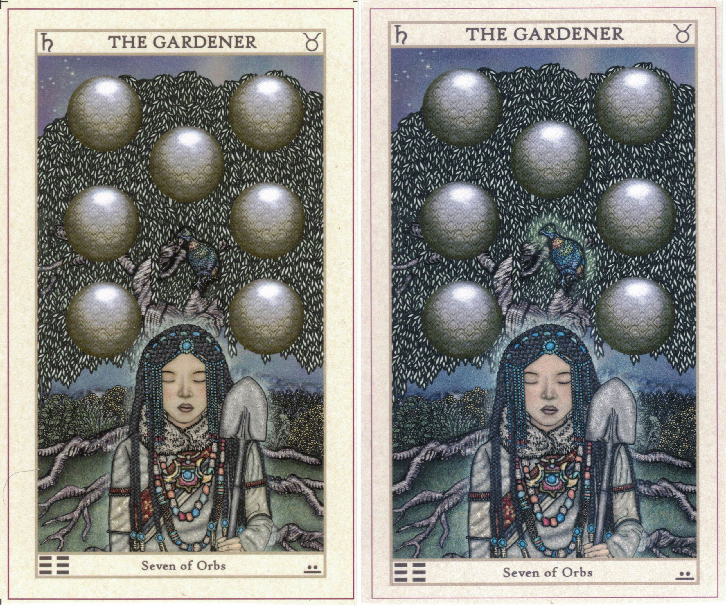
I made a revision to the Himalayan monal or pheasant bird in the Seven of Orbs (which was its own separate layer in the digital image file).

I did also click on the auto “Clarify” function in Jasc Paint Shop Pro for brightness and contrast, set at only 1 degree, however.

The “Clarify” function should render the image even more crisp and focused, adding greater depth and clarity to the image, so why and how did it in fact come out hazier?
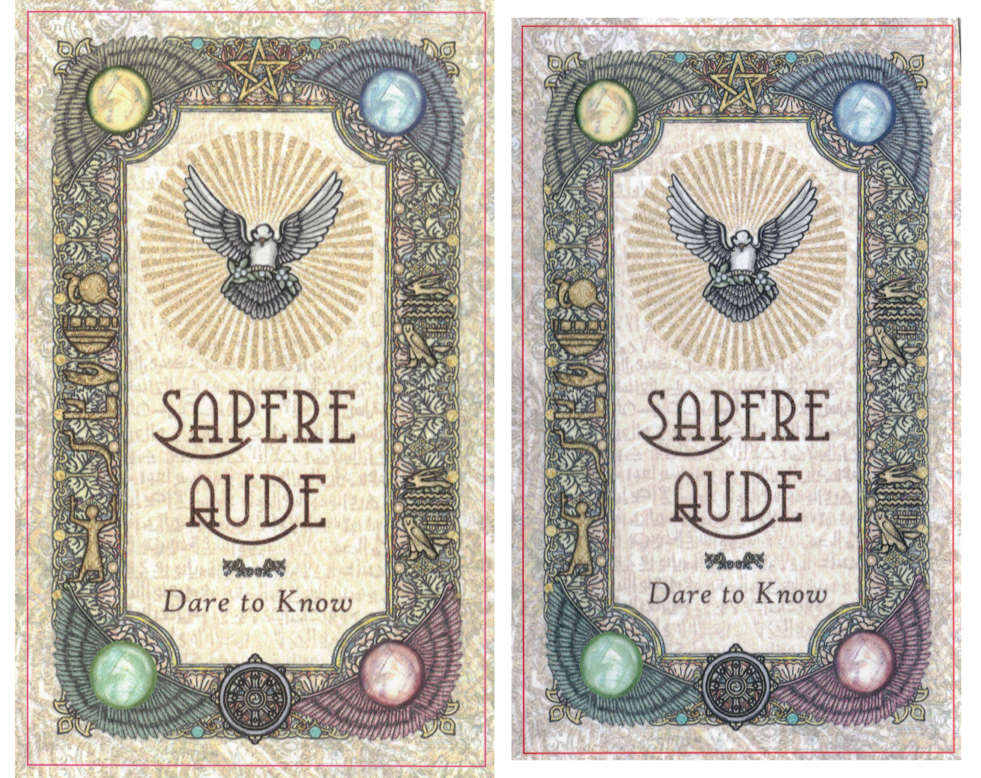
For the card back design, see the huge difference between the digital image file I submitted (above left) vs. a scan of the printed proofs I just received, of that image file (above right).
Needless to say we need to cooperate with the printers and troubleshoot what happened. I’m not certain how long it’ll take to get this right. If all goes well in the very next round, then we might still make our target timeline (since I gave myself a bit of buffer). But if not, then… dunno what to tell ya. =)
Thank you so much for your continued patience and understanding. ❤
Bell

I do see what you mean by the new ones looking a bit more hazy. I will say in most cases I like the cooler tones but in some cases the details get lost in them and the warmer tones seem to help with this. I’m sorry things are being difficult! I hope they smooth out for you guys. No rush here. I’d rather it be late and how you want than rushed and not how you want.
LikeLiked by 3 people
agreed! cooler tone is preferable to me BUT i can see that some of the details don’t “pop” as much as original golden undertone coloring…. frustrating! but all versions are actually beautiful and you shall prevail with your vision, i do believe !
LikeLike
Better done right than in a hurry. ( I actually like the original warmer tones much better.). Just do what you need to do Benebell, no hurry here. 😄
LikeLike
I would say it’s the printers.
1) There’s color settings that get embedded in an image file that choose how to interpret the color of each pixel. The viewer/printer can override these settings making the image look different on different computers, or different software. Printing off of computer A could look different than printing off of computer B because of different default settings. Same thing with different software. A lot of times printers use Adobe Acrobat to print, so I’d check how things look in there using default settings.
2) The printers need calibration. Each. Printer. Printing on printer A could look completely different than printer B even if they’re the same exact model. They need to be calibrated. Regularly.
LikeLike
Oh oh! I looooovvvvvveee the cooler tone! But I trust your eye and your intentions. Take all the time you need.
LikeLike
Do what you feel is right Benebell. I trust your judgment completely and am happy to wait until you are willing to sign off on the completed deck.
LikeLike
Hi Bell, I see exactly what you are saying. I like the decisions you are making with the adjustments. Take all the time needed until it feels right.
LikeLike
For what it’s worth, it’s not just you seeing the fuzzy/hazy/blurry in the new proofs. It’s like the details got mushy. Take your time and adjust until you’re happy — as a first-time customer, I’m happy to wait until you’ve got a product you’re satisfied with!
LikeLike
I do like the cooler tones. It is kind of like with toner on blond hair, tones down the brass. I like the cooler borders but I don’t care as much for the cooler backs. Maybe half way? I see the blurry in the backs but I don’t with the images but it could be my phone or my eyes. Fix the blurry. I am sure any color variations will be fine in the end. Jewel-berry. I like the term and I like the look.
LikeLike
Wow, those color balances really are very different. And some of the new proofs do seem a bit more blurry. I think I prefer the original 1st run proofs the best for overall color and saturation.
LikeLike
I actually like the blue tones, it’s very pretty. That said, I’m happy to wait and trust the final product will be amazing— whatever you choose. ❤️
LikeLike
Actually I like the cooler tones, myself. But then again I treated myself to your reprint, I have been wanting a deck of your for awhile now, and beggars can’t be choosers. I am not seeing the fuzziness you speak of, but then again, you have the eye for how you want your cards to look like. That, and I am on my phone. But I am looking forward to more updates and I hope this can be resolved soon!!!
LikeLike
I can definitely see the haziness: I don’t know what settings they are using to print, but it looks as if it added a blue tone/filter to everything. Additionally, the cooler tones and use of (I think) a cool toned black to line things resulted in everything essentially blending together visually. The 2021 run is warmer, so a cool toned black line is more obvious even with how thin the line art is. But, because EVERYTHING is cooler toned in the latest run, those same subtle lines sorta disappear because there’s not enough tonal difference to visually distinguish the line art from the coloring. It’s like how you can more easily see a thin cool black line if it’s on dark turquoise but that same line is impossible to spot on something dark navy: both are blue colors, but that green element to teal adds just enough warmth to make that line more obvious.
I guess, if you had to, you could replace the line art with a warmer black but I doubt that would solve other issues.
Which, this just reminded me: did you use photoshop to paint? If I remember right, there were issues with pantone shades and the need to pay additionally for that. It’s a bit of an issue since, if colors you used to paint don’t match those pantone shades, how it looks printed could look differently. If you DID make sure the colors you used link up with pantone shades, the issue could actually be the printer somehow not sticking to pantone shades – dunno though. This could also be an issue if your photoshop files potentially didn’t convert things to certain pantone shades/tones during a conversion process. Printing is surprisingly complicated far as colors go! If it helps, Stuart Semple does have Freetone to use if this is some strange color conflict issue coming from Adobe’s recent pantone decision: https://www.culturehustleusa.com/products/freetone
LikeLike
hi 🙂
i like the almost purpley jewel berry tones too!!!!
fair warning though….. my go to deck for a while has been zekes 😂, so clearly i’m a fan of color saturation.
also impossible, for me at least, to know what’s going to be best color wise. i usually don’t know until something’s all done and in my hands.
you do what you do!!! i’m all good waiting until you’re super happy with what you’re putting out. i’m sure i’m going to love it no matter what.
and, delays give me more time to go through the book that was delivered today!!! woohoo!!
🤗
LikeLike
Hi Benebell,
Most cards I like the first version but one or two cards, I like the bluer/purple version like the 10 of swords and the surrounding green on the birds on The Gardener. I hope the print will eventually go back to the warmer colors as before.
And thank you so much for the Kuan Yin print file and the several you tube Kuan Yin chant.
I tried to order the mugs print it only came out like when you order a photo mug. How do you do the whole print on the mug or where did you order it?
Thank you so much again for everything you do.
From
Shelly
LikeLike
When I view them in comparison, I see that the ‘darker’ cards appear to have more blue in them and less yellow – which being complementary colors makes sense.
Preferentially, using these images as a reference I might like the darker cards a bit more. Their cooler quality to me is more matter of fact, less emotional, clear and direct – but who can say what gets translated as you transfer them back to a digital space.
Thanks for sharing the process
Zed
LikeLike