

Just another blog post update on the progress of my Etteilla deck. This is the Ace, Two, and Three of Cups.
Please continue to treat what you see in these progress posts as works-in-progress. Everything is subject to change. Keywords are temporary placeholders. And I still don’t know about the final layout design.
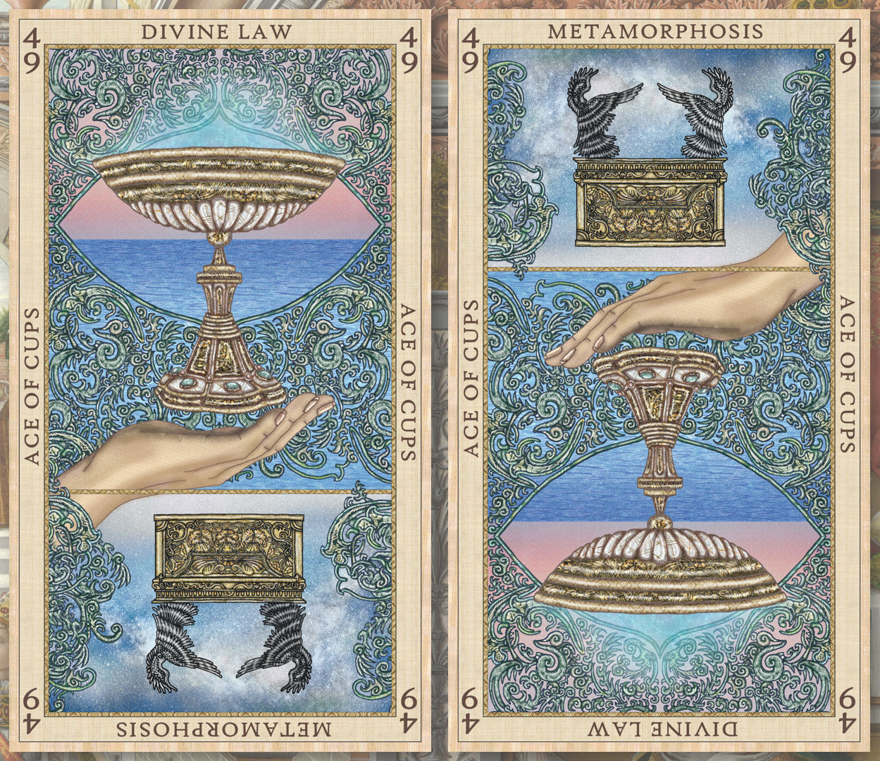
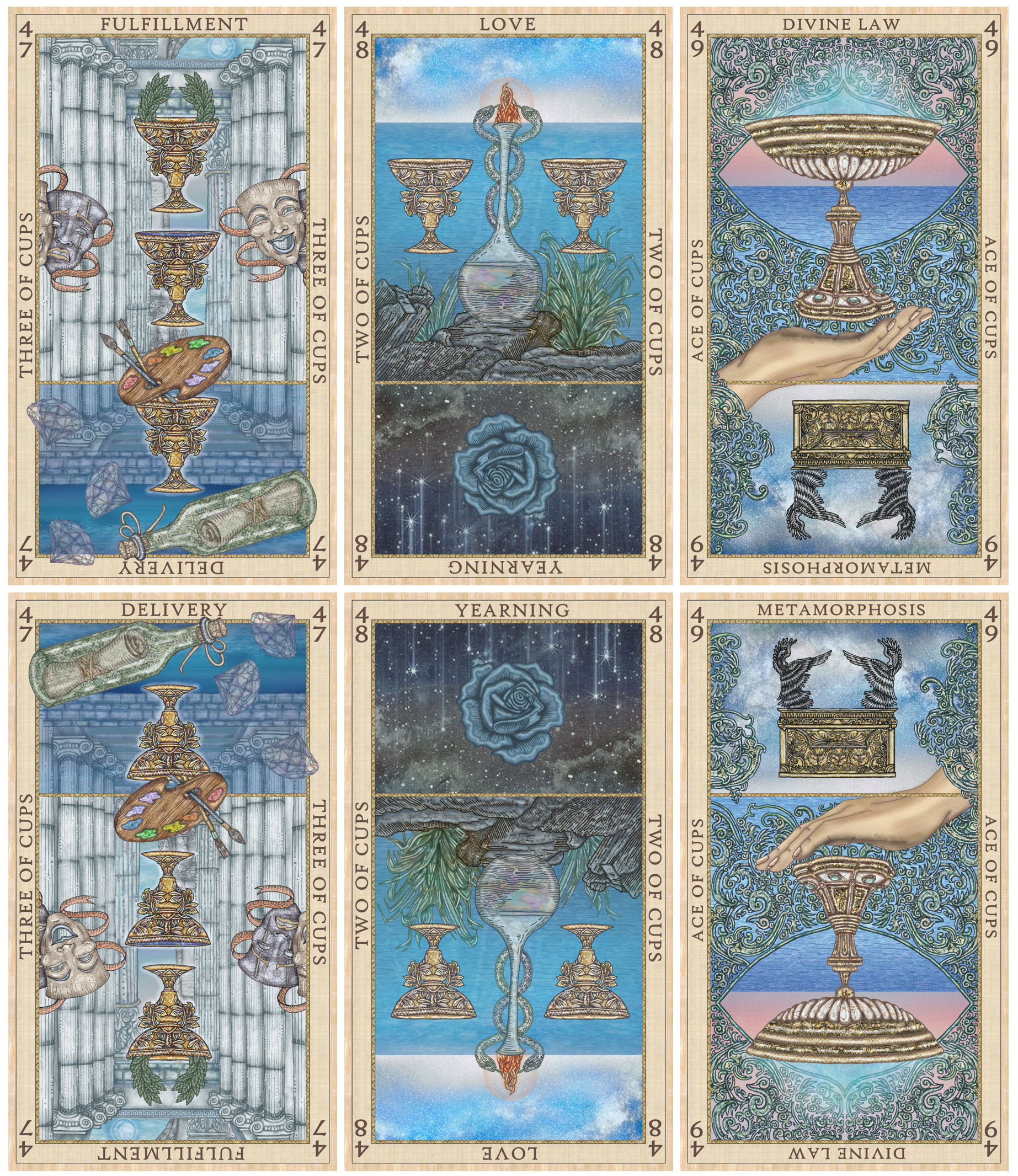
Ace of Cups

My last Etteilla tarot deck project update left off with an incomplete Ace of Cups. I’m back from my hiatus, but due to a lot going on in my life right now, the pace at which I’ll be creating these cards will be significantly slower than what I could do for the SKT.
For the suit name I decided on Cups instead of Chalices because this isn’t an occulty esoteric deck like the SKT. I want the Etteilla deck to feel more mundane and versatile.
Etteilla associated the Ace of Cups card with the Ten Commandments, so in the reversed position, I feature the Ark of the Covenant, which houses the tablets.
The Ark is depicted on the Ace of Cups reversed as a divinatory omen that a profound change has already occurred in the querent, a complete change to your essence that results from reconciliation between Divine Will and personal will.
There’s also another fun connection. In theosophic numerology, the Ace of Cups corresponds with the number 4. Note here in Etteilla’s numbering, card 49 = 4 (4 + 9 = 13, 1 + 3 = 4). And that Ark image I’m using is the same one from SKT’s Key 4: The Emperor. =)
Two of Cups

You’ll note how I stuck really, really close to Etteilla’s Two of Cups. For the SKT, I was of course inspired by the Waite-Smith and Crowley-Harris decks, but you also saw a lot of my own point of view coming through. And that was the point of that deck.
In contrast, for this Etteilla deck, I’m trying to keep it as close to the original system as possible, referring to the different versions produced between 1750 and 1870.
Trying to stay close to the keywords has been tougher, because there are so many instances where the keyword on the card totally does not match the card’s meaning per the Orsini or Lemarchand texts… like at all. You have to do triple takes to make sure you’re on the right page.
The Orsini text includes a section listing out keywords for every card, and the lists basically range to include everything and the kitchen sink. “This card means happiness but it can also mean sadness, it could mean joy, or victory, grief, sickness, a new relationship, or unexpected news in business.” That’s a made-up quote but the scope of meanings it covers is totally a real thing. So many of the card entries read like that.

Hubby says if you look at the SKT artwork and these Etteilla cards, you can tell it was all done by the same person. He wondered whether the two decks were looking too samesies.
Personally, I don’t think so? For starters, I can really see how my linework has improved. Something super subtle, like learning not to use solid #000000 black for the lines, and instead go with gray tones, or dark blue, dark green, maroon, etc. You can see the difference that makes between the SKT Two of Chalices and the Etteilla Two of Cups above.
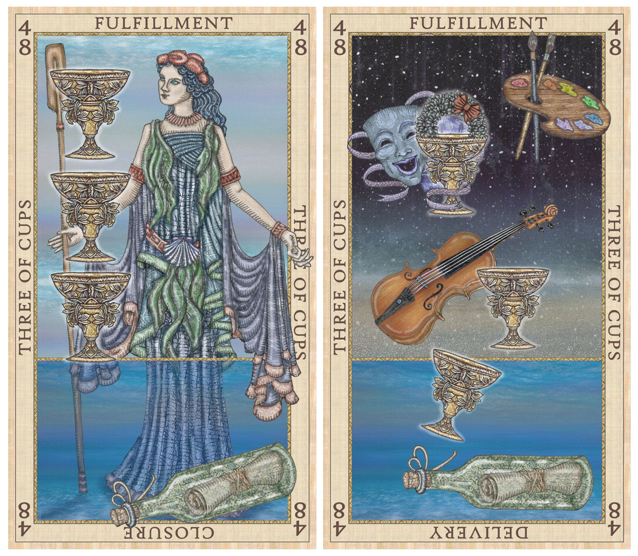
Three of Cups
The composition for this one was a challenge and continues to challenge me. Maybe you can help me out.

As soon as I started thinking about the Three of Cups, Thalassa, the Greek Titaness of the seas came to mind. Intuitively I feel the connection between Thalassa and the Three of Cups, but logically I can’t rationalize it, in terms of the card meaning.
So I cannot eloquently explain to you why Thalassa appears here. But it just feels…right.
Or maybe it doesn’t. I dunno. I’m totally second-guessing myself.
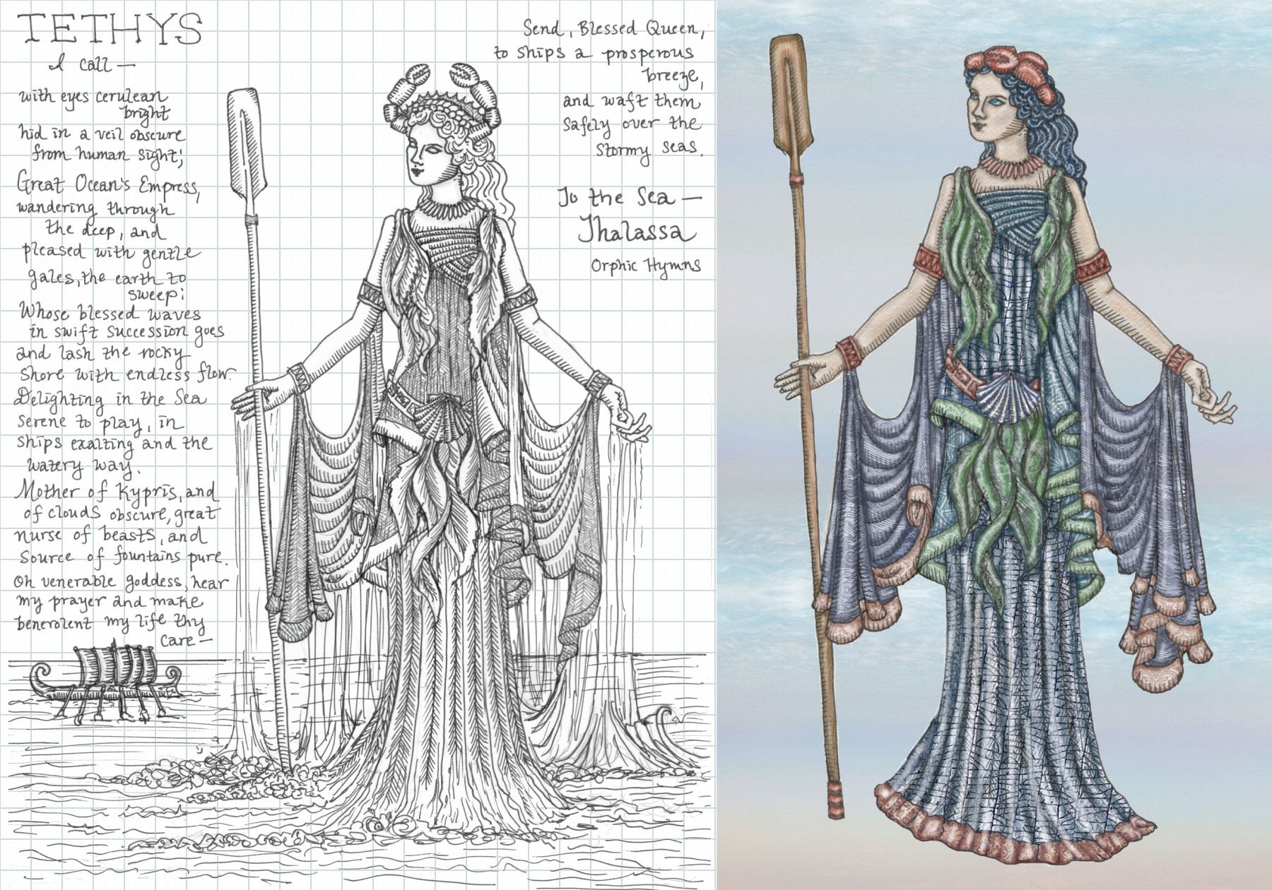
Above left is the drawing done by hand in ink, then scanned in. I digitally added the blue grid lines in the background just to pretty up the image for this post. Above right is the digital coloring of my line drawing. You can also see where I’ve digitally tweaked the illustration.

However, once the drawing of Thalassa was done, I couldn’t get it to look right on the Three of Cups. And was I trying too hard to make the meanings fit? Does it even make sense to feature Thalassa on the Three of Cups?

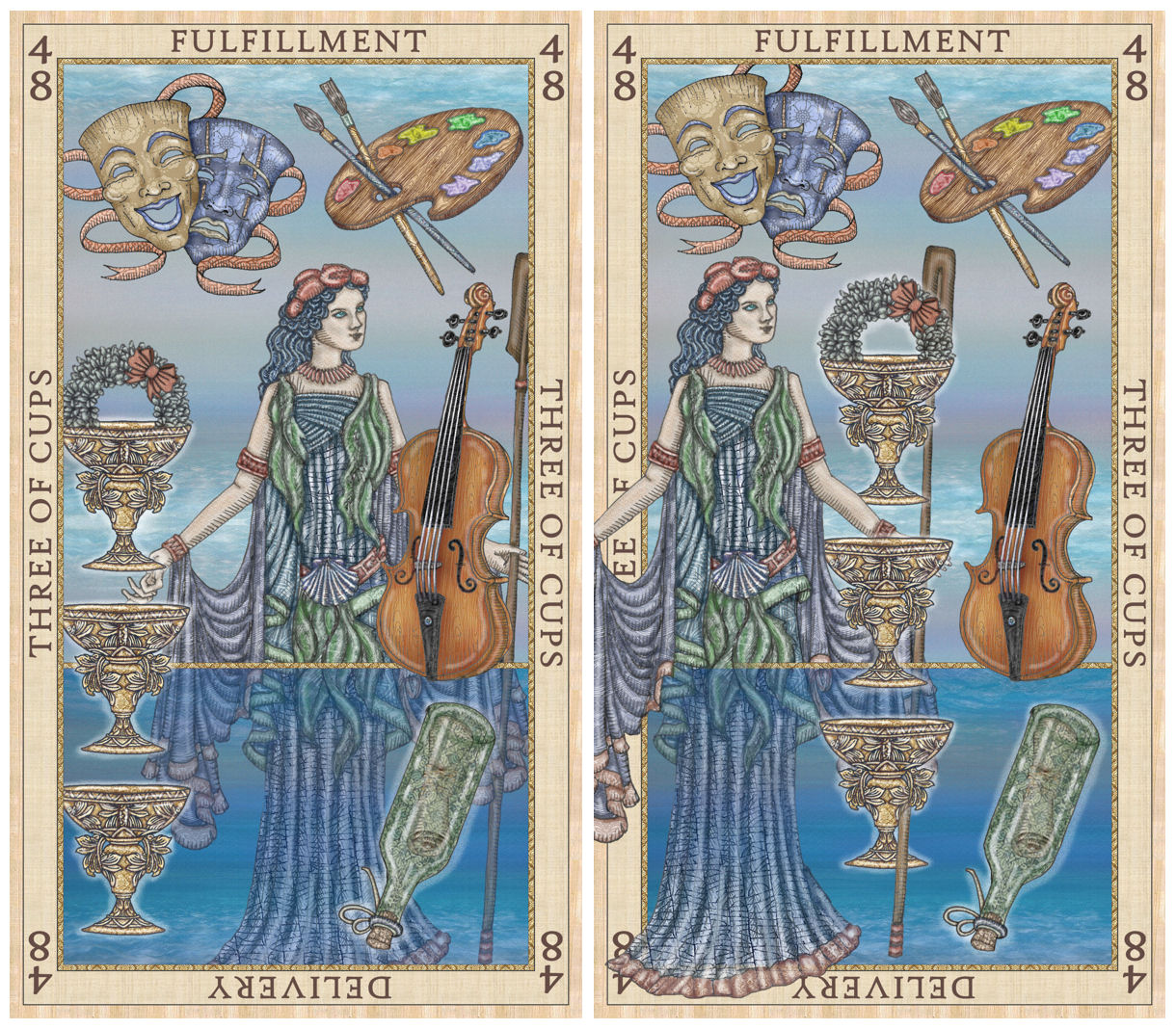
Key themes for Etteilla’s Three of Cups, per the Orsini and Lemarchand texts, are success and achievement in the creative arts. There are references to theater, actors and actresses, the entertainment industry, and a performance that garners high acclaim. So I drew some pictorial representations of the arts. The “message in a bottle” symbolism was for the reversed position.
You can see the side by side comparisons of the hand-drawn ink sketch I scanned in and the digital coloring of the image.
Except…
Oops. Too much? =)
These drafts I’m reluctantly sharing are cringey. But when I’m following an artist’s work-in-progress, I personally like to see their bloopers. It gives context to the the evolution of the artist’s project. So maybe you’re the same way. In that case, here you go. Proof of my struggle with the Three of Cups.
I’m being greedy and kinda want All The Things to remain in the composition, but I just can’t get it to work. And if you’re wondering why I didn’t go with the Muses if I’m already going with all these symbols for the arts, it’s because I’m saving the Muses for a way-in-the-future Mantegna deck. Or at least leaving that door open if I ever decide to pursue such a project. =)
(Also, to all my RWS readers who are losing their minds right now over these “card meanings”… yeah. Hold on to your knickers. They get even crazier.)
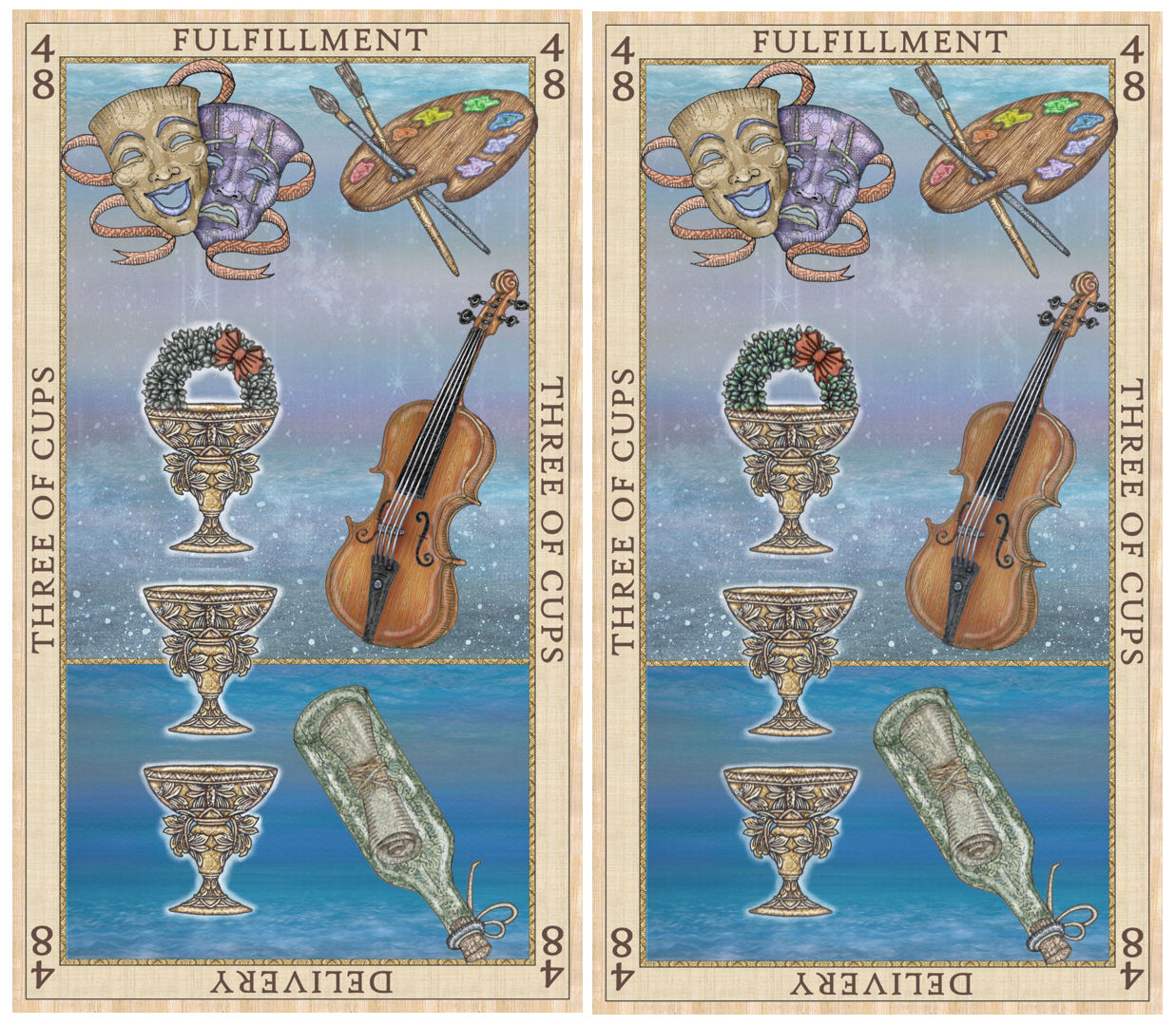
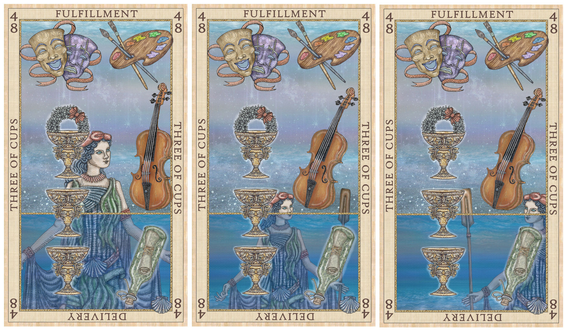
The two drafts above look the same, but there are slight variations in the color saturation. When it’s just the various symbols, the composition looks a lot cleaner, but also looks like it’s missing something. Maybe my background choice is too simple? If I go in this direction, I’d have to fix some of the spacing, too. You see how the arrangement is just a smidge off balance?

As of this writing, my Three of Cups remains unfinished. My strategy right now is probability.
I’m just going to keep rearranging the bits and create like a hundred versions, whatever it takes, and at some point probability will prevail and one of these iterations will look good. Yep I think that’s a solid plan…
Three of Cups Update
Okay, I think I have a “final rough draft” (whatever that means) for my Three of Cups. The Etteilla pips are fairly people-less, so I think I’ll try to comply with that set tradition. The Coins suit was an exception because Etteilla talked about their correspondences with the astrological planets and, by extension, the gods and goddesses that were their namesakes.

You’re trying too hard with the 3 of cups–trying to force it to be something it doesn’t want to be. It’s too busy and lack focus. The other cards are great!
LikeLike
Love, love, love the 2! As for the 3…I am missing the original crab claw headdress; not a fan of the claw circlet. I personally prefer the versions without the comedy/tragedy masks, the violin, and the palette…too many tings at once. Maybe those things could each be depicted as a design on each of the cups? Love the wreath and the bottle. I can’t wait to work with the finished deck!!
LikeLiked by 1 person
Stunning as always, Bell!
LikeLike
I just love what you do. Wish one day you will make a French version of the this deck and the SKT Revelations.
LikeLike
What if the water fell off of her robes into the three cups at her feet? I don’t think you need the other various symbols. Unless they could be incorporated as symbology on her robes.
LikeLike
Benebell I have studied in the past any tarot cards I could get and then I found the real tarot -however I was interested in your bone divination and lulu.com shows its not sold-only some other items of yours?
LikeLike
Incredible!
LikeLike
Wow, you have been busy. They are beautiful. I think it’s what speaks to you Benebell, they are all beautiful and speak.
LikeLike
Dear Benelli are you creating another Decy and if you are can you let me know if I. An order some of the Ettella.
Thank you
Mary Hodzen
LikeLike
Dear Benelli,. Hi this is Mary Hodzen and I would like to be put on the waiting Like for the Ettella Cups, and if you can always keep up to date whenever you come out with a New Deck. I Love Art Work for you are so intelligent.
Sincerely, Mary Hodzen
LikeLike
Hi Bennie! It is SO great to see you here again, back in the saddle as it were. You seemed kind of down in your last missive – I hope things are working themselves out in one fashion or another (and hoping I am not being too presumptuous with my remarks as well).
Anyway, my only suggestion would be to trust your own instincts with this project. As with the others, you will ultimately be your own best guide. But I admit I had a chuckle over your various versions for the 2 of Cups – especially the sequence where Thalassa appears to be progressively drowning!
LikeLike
Hi Bell,
nice art work, as ever. 🙂 Well, it’s true that one can see that the artist of SKT and this Etteilla is the same. But that’s not a bad thing. It’s just your signature style. And it’s also true that line-work improved a lot.
As for the 3 of cups: If Thalassa feels right, then why not include her? I’d say, go for it. But I personally don’t like the comedy/tragedy masks too much. How about putting one symbol (like the violin) into each cup? They don’t need to dominate the picture. That’s the job for the cups themselves. I like the simple background best (especially the colors). And I like the message in a bottle – best arrangement for it like in those pictures beneath the sketch of violin etc.
Best wishes!
LikeLike
Uh, erf, I meant 3 of Cups.
LikeLike
Why not have Thalassa playing the violin?
LikeLike