
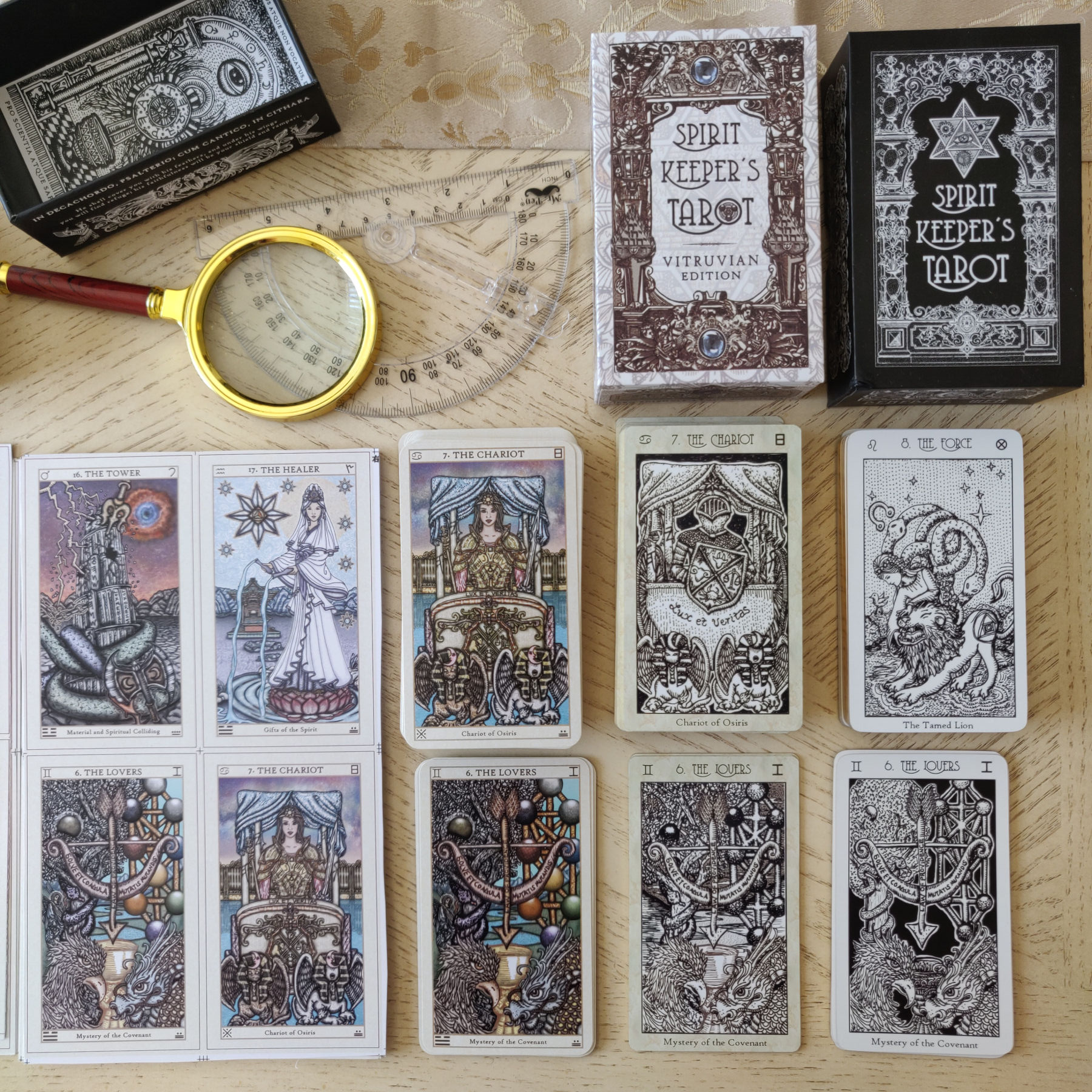
Above, bottom row of cards right to left: The Lovers card from the black & white First Edition, the Vitruvian Edition, one of the earlier test prints (see how it came out too dark?), skip over The Chariot, and way on the left-most side bottom row is The Lovers card from the latest printed color proofs (in sheets).

Here are the color proofs of the cards in uncut sheets. Top row: Justice, Hanged Man, Death. Bottom row: Magician, High Priestess, Empress. (Using standard tarot titles for your convenience of reference, rather than referring to them by their SKT titles.)

You can click on any of the image files for an enlarged close-up view. These uncut sheets are to check the color quality. I’m trying to go for a muted color palette, hoping that will express a lighter, more ethereal quality to the cards.

I’m still in talks with the printers about those margins. They assured me multiple times it’d be the exact millimeters in measurement I want. But then they keep coming out 0.4 mm thicker than I asked for. My guess is the factory isn’t taking my request very seriously, because to them, a 0.4 mm difference isn’t a big deal, whereas to me, yah, uh yes, yes it is! Argh!


As for the card back design alignment and where it gets cut, it was off by 0.5 mm. In terms of communicating with the manufacturer, I find that it’s more helpful to all parties involved when you communicate what you want via images. So to those who are self-publishing their decks, whenever you can communicate what you want with an illustrated reference, do it, rather than try to type out paragraphs of instructions.
We are about 1-2 weeks away from pulling the trigger on full production, full speed ahead. That means by then we will have fixed the exact number of decks in the First Print Run.

We placed the purchase order and made a down payment based on a tentative print run of 3,456 decks, with the option of increasing the quantity at the back end and adjusting the balance payment accordingly. James is continuing to do all the maths and by the end of next week, give or take, he’ll have concluded exactly what our print run will be. If that means I need to do a final edit on that Certificate of Authenticity, that’s what’ll happen before I submit it to the printers.
Here’s a fun photo:

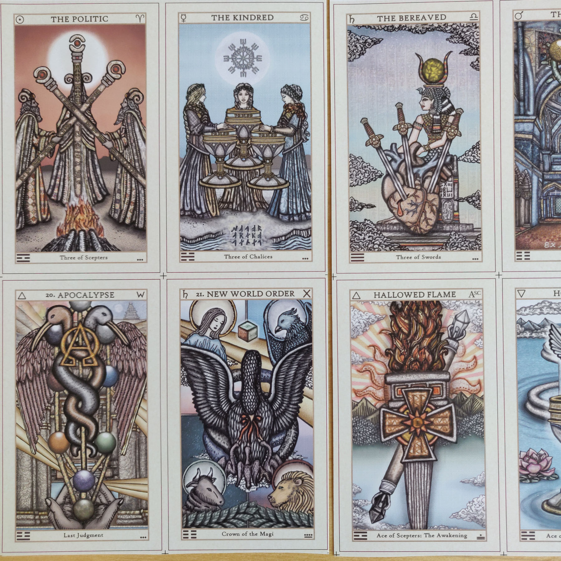
The column to the right is what Keys 8 and 9 from the Majors looked like in the black and white First Edition. Those are both hand-drawn, analogue, on sheets of heavyweight paper, then scanned in and formatted into tarot cards. The center column are the sepia-toned Vitruvian Edition. And to the left are the full-color reworkings I did last year.

Yes, I did have to make that judgment call of reducing the size of the text and captions so that I could slightly increase the size of the artwork.

Initially I wanted to go with a blue colored or blue-dominant box design for SKT III, but I couldn’t get it to look good. The above is a cut-out of the top lid, exterior. The red lines you see there are just for my reference, so I know where everything folds. It’s not going to appear on the actual printed boxes.
The designs are maybe too close to the edges, and are giving me a bit of anxiety, so I may have to go back and readjust the sizing, ever so slightly.
One frustrating point was I had wanted these uncut sheet proofs to be on exactly the kind of cardstock that the final cards and the final box would be printed on. Based on my own printing experiences at home so far, the type of paper/cardstock matters. A lot. With the same color printer, if I print my art on different types of paper, the coloring looks different. I mean, not crazy different, but different enough for me to notice.

And so seeing the designs printed as-is on the actual materials I selected for production was important. I don’t know what the heck got lost in translation. I thought I made myself clear. But here we are. Sigh.

At least as of this writing, we are on schedule for delivery to you in August/September later this year (whether it’s August or it’s September for you will depend on when you placed your pre-order). However, if you’ve been following these blog post updates, then you may have observed that my response is constantly fluctuating. One week I say we’re on schedule; the next week I say we’re behind schedule. =) These things are really hard to pin down when there are so many steps and so many factors. Sigh.
However, I’ll continue to check in with you via these blog posts approximately once every week or so. That way you’ll always be clued in on where I’m at in production.
As for the Book of Maps and SKT tarot journal e-delivery, there was a slight delay in that because I had law work that came out of nowhere all of a sudden, so had to set aside editing the BoM for a week. But I am aiming to get that e-mail out to the Premium Package orders late next week.

Breathe! They look wonderful, and I’m sure you’ll get the nits straightened out to your satisfaction. So looking forward to working with them!
LikeLiked by 2 people
Thank you! ❤️
LikeLiked by 1 person
They look amazing Benebell!!! Your a perfectionist and that shows and you care. Sadly these qualities are on the wane!!! Like some else said lol, breathe.
Abs again Wow!!!
LikeLike
Lol, sorry the joys of predictive text that wasn’t meant to say “Abs again”. It was and again, Wow!! Lol
Stu
LikeLike
lol and thank you! So glad you’re liking the output! ❤
LikeLike
Nice deck! It would be nice like the Black Monolith; a fully custom deck of poker playing cards with holographic foil on front and back of all the cards. It Transits Tarot possible?
LikeLike
Is it too late to order a deck?
LikeLike
Not at all! Order any time this year! Although at the moment we are away from our office desks and on the road, so won’t be able to respond to any inquiries or process orders until after the 13th of May. ❤
LikeLike
Thank you
LikeLike
Beryllium thin film with a touch of lithium is higher tech but a bit lofty at best (protophobic is my preferred communication method) downstream particle manifestation is possible.
LikeLike
Respectfully, I enjoy your art and watching how it has developed over time. I’m a little disappointed the muted colors look washed out. I was excited the third edition was going to be in color. Why are you afraid of color? I’m slightly regretting my purchase. Can’t there be a compromise between muted and actually having color?
LikeLike
Pingback: SKT Deliveries Begin First Week of October – benebell wen