

While I’m waiting on production of the first print run, I want to share some of my reflections on my design process and the personal experience of creating and illustrating this deck.
Plus, everyone keeps asking me about it. Admittedly I thought I covered this ground, but guess not, given how often I get asked the same question. So let’s talk about my design process. How was Spirit Keeper’s Tarot created, or at least the technical side of things?
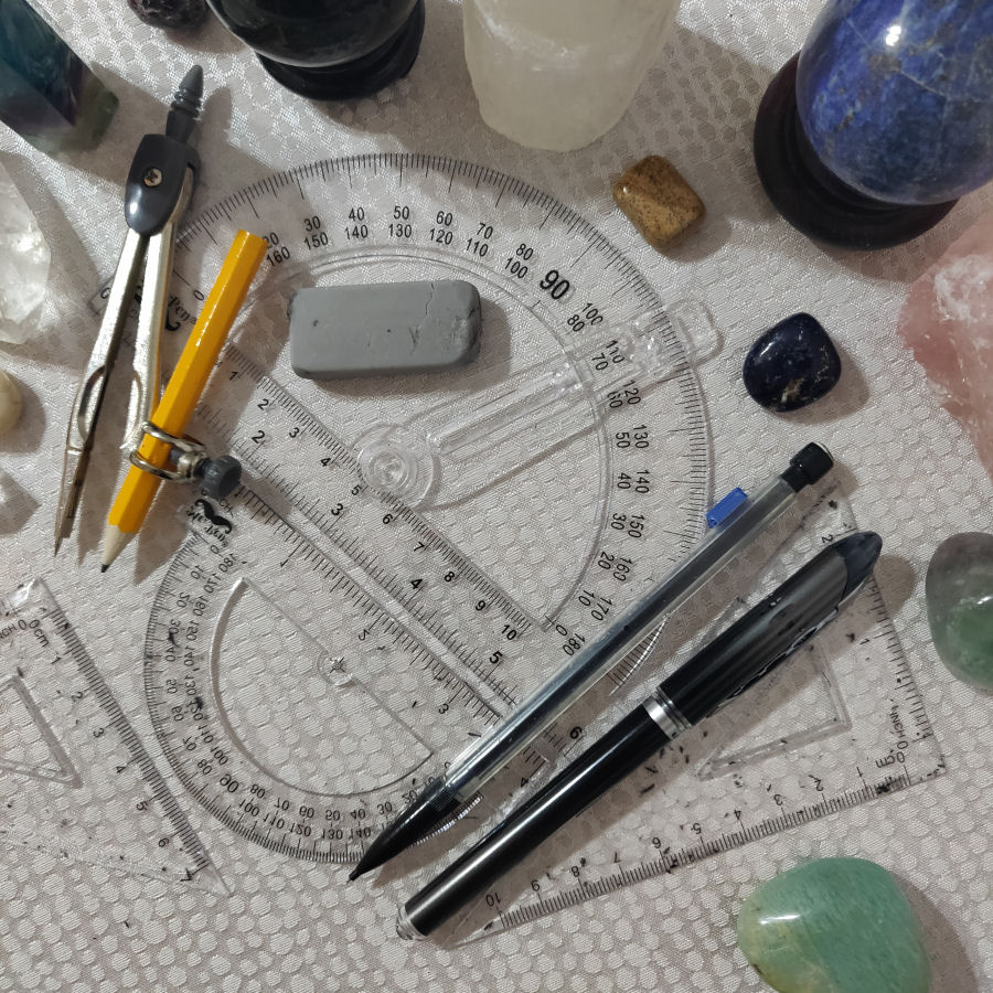
In the above photograph you’ll find my tools of trade. I sketch with a mechanical pencil using HB graphite lead (for those who do pencil drawings, this can matter, since most of us have that whole metal tray set of graphite pencils at different softness and hardness levels….), erase frequently, then go in with a superfine tip black pen. I always have straight edges, a protractor, and compass on hand, because that’s how I manage those lines, or angles, or circles you see in the card illustrations.
Without getting too much into the ritual aspect here in this casual blog post, I will mention that I anoint my wrists, my chest, and my forehead, just over the third eye with holy anointing oil before I start drawing. This happens always, without exception.
I make my own anointing oil, by a hot infusion process that starts with the whole resins and dried herbs, not commercial-bought essential oils. For anything religious, ritualistic, or spirituality-based, I would never use– gee, what’s that shit pyramid scheme essential oil company that admitted in a sworn deposition that they use chemicals and aren’t actually organic even though they market themselves as organic called– I can’t remember the name but yeah, shit like that I would never use in anything that mattered to me. Like. Just ew. I’m going to use my department store perfume as a freakin’ anointing oil before I use anything made by companies like that.
Yeah that hostility just came out of nowhere. =) Let’s move on and stay on topic.

I pencil in the main imagery for the illustration first, as lightly as possible so I won’t have too much trouble later on erasing the pencil lines.
Normally, if I were doing a pencil drawing, I don’t like mechanical pencils and will use the wooden graphite ones that you have to sharpen the old school way, which, just FYI, the best pencil sharpener ever is the free one you get when you buy Christian Dior eyeliner. Just… a tip. Seriously though. Best artist’s pencil sharpener ever: the Dior one for eyeliner.
But when I’m only using the pencil to sketch a rough outline that’s going to be erased later anyway, then I’ll go with the mechanical.

In the original cards I drew, there were no borders along the long edges, and rather fat, thick borders for captions along the top and bottom. Along the bottom, the first row was the Golden Dawn keyword attribution and the second row was the name of the spirit resident in the card as revealed to me over the course of rendering the envisioned art.
Between the preceding two photos, you can see what I draw in directly with pen. Usually, detailing I do by pen, without any rough pencil sketches, which got me into trouble a couple of times. Not outlining in pencil first is also why so many of the captions are not centered, like what you see above for “The Joined One.”

Oh, and also, only because if I don’t point it out to you, it’ll bother me, because I dislike the initial rendering that much, I digitally edited some key imagery in the Two of Scepters (Two of Wands).
Like most artists, I work off references. I might like how a lion head looks here in this old painting, and a caduceus depicted over there, and this particular goblet here, this lake, etc. Then I use those references to render my own drawings. I tended to work off historic paintings, frontispieces from medieval alchemical texts, or, rather simply, the symbolic images from the Rider-Waite-Smith deck or the Thoth.

When I’ve completed or am pretty close to completing the card, I open the guidebook manuscript and write about the card entry. I’m usually the asshole who gets very skeptical when people say “I channeled it” and I think to myself, yeah, really, you “channeled” it, huh? So it’s just karma if you do the same to me when I tell you I channeled a lot of the design process for this tarot deck.
Rationally, maybe a better way to phrase it is I left a lot of what ended up in the guidebook unfiltered. I did not apply critical thinking or try to decide whether what I was writing fit any “brand” of mine or anything of that sort. Whatever came bubbling out came bubbling out and I just left it, even when a little bit of the rational side of me started to pipe up and warn, “oh… you know that’s not going to go over very well… you shouldn’t…” I just ignored that rational voice and indulged in my impulses.
My design intention for Spirit Keeper was for it to be a specialized deck. Although I absolutely believe that you can use it as an all-purpose deck and encourage it, that’s not exactly what it was designed for. I didn’t want to create a Wal-Mart tarot deck. So although it can be used all-purpose, it may not be the best tarot deck option for that. There are certain decks out there great for fortune-telling or for psychological inner reflection. Spirit Keeper is designed for divination and communion with Divinity, and yes, I observe a distinct difference between fortune-telling and divination.
More specifically, Spirit Keeper defines rather unapologetically who you are speaking with, who is on the “other line,” sending you the messages when you read with this deck. So my design process included great lengths to craft a tarot deck that would stay within the parameters I had set. This deck works exclusively with beneficents, though admittedly, my definition of “beneficent immortal” may be different from yours.
I think I spent as much time casting circles, lighting candles, burning incense, anointing stuff, reciting prayers and mantras, meditation and pathworking to connect with divinities as I did actual pen to paper. So a lot of religious ritual was folded in to my design process.
Sidebar: Although it’s more common to cast a circle where you’re in the circle during ritual or what not, and that’s even how I would recommend it to be done, that’s not what I did. =) In my particularized design process, I cast the closed circle of protection around the round table you see me working on above in the first photograph. So the circle of protection is the circumference of that table. Technically, I’m outside of it, except my hands and forearms, which are anointed prior to work. There are about a dozen reasons why I chose to do it this way, but that would take up the same word count as this post, so we won’t get into it. However, that entire room itself is warded and then of course there’s the altar (or, err… altar-like thing) behind me. =) The talismanic cloth I’m sitting on, in my chair, is also significant.

The above is the unfiltered original scan of the completed card, or the extent of the card art done entirely by hand, in pen and ink, without digital alteration.
After I scan it in, I then go in to touch up the illustration digitally, but the digital touch-ups are minimal.

Above, the first image to the very left is the original completed art scanned in. Then I changed my mind and added in some different weights of pen lines to give the illustration more depth. Compare the lion’s head between the first and second images to see what I’m referring to.
The third (going left to right) is after I render every scanned card image into uniform dimensions. Since I drew the cards manually, the result is not every card is going to be precisely the same dimensions. Close enough, but always off by a couple pixels here and there. After scanning, I have to modify the dimensions so that each one is uniform. If for some reason you care, those dimensions are 1096 px x 1906 px in 400 dpi, with an 8 px black border all around. You’ll see I also darken the images digitally, to -36 brightness and 99 contrast from the original scan.
Then I insert the bordered image (cropped out from the original handwritten captions you saw in the earlier photos) into the set template from the manufacturer for the 70 mm x 120 mm tarot card size and add the top and bottom captions. You’ll see how in the final card designs, I changed around the caption positions. For the final produced cards, the top caption is the name of the spirit with the astrological decan rulership and the bottom is the standard tarot card name.
At this stage, I also touch up the illustration digitally, now mimicking pen and ink, to add more depth perception to the art, since it’s a black and white deck. With a black and white deck, if I don’t go in to add different textures to give the illusion of depth, the card art will look too flat.

But all textured patterns and tiling are still hand-drawn by me. So, for example, see above. To the right, you see two different seamless tiles, which are hand-drawn patterns (I mean, just a bunch of dots) that I did, then scanned in. After scanning them in, I tweaked the tiles with a function in Jasc Paint Shop Pro to ensure they’re seamless tiles. Then I use the paint can function to color in the blank spaces with the tiles I drew, such as the skies in the Two of Chalices.

I got into my conception process in a Design Statement posted earlier. By the way, I have no clue why, but the above depiction of the archer in my Eight of Scepters (Wands) reminds me of Ethony. Is that just me? Or you, too? And it’s not even like the drawing physically resembles Ethony. It’s beyond that. The vibe or something. Ya know? I dunno.
After missing the boat in high school for attending an elite art and design college, in regular university I had ceased all serious illustration work. There were the caricatures of my professors I did in my notebook during lecture to amuse my friends or becoming the one to go to for drawing promotional posters and rush flyers for my sorority, but that’s it. Even in terms of electives, I never chose to take any art courses. I think maybe on some level, it would have been too painful for me. (If you’re like, what is she talking about, I got into it a bit in this video here.)

I keep thinking back to an elder in our community, and an artist by profession, who told me about the emotional impact that getting arthritis had on her. Losing fine motor abilities in her fingers, and even her eyesight, when she still had so much Work to produce, so much art left in her, was hard-hitting. I think about how much regret I would have experienced if I ever got to the point of arthritis and not having produced any sincere art of my own.
Reflecting back on the completion of these drawings is bittersweet. It’s sweet in the pride that swells within for having completed this undertaking, but bitter because– if this makes any sense– it’s so good and yet disappointingly not good enough that I’m thrust into a place of resentment, regret, and wondering how much better the illustrations in this deck could have been had I pursued a formal education in art, or had I simply kept up my art, even on my own. The work is good enough to validate that real potential is there, but not good enough, and because it wasn’t good enough, its deficiencies confirmed that my potential wasn’t reached. Nothing stings more than that. You almost wish it was just flat-out incontestable shit.
Illustration and design isn’t just creative. It’s technical. It requires mastery over techniques, which are nothing more than skills that rote practice will get you proficient at. How to look at something three-dimensional or in a photograph and transform it into a two-dimensional drawing with perspective isn’t creativity; it’s a technique you have to master. It’s training yourself to see the world in a certain way so that you’re able to make that pictorial translation. Getting proportions and scale just right is technique. These were techniques that I was below par at. I could see what it had to look like, but my drawing skills just weren’t there, weren’t able to make it happen. It was frustrating, because I knew to my core that making it happen wasn’t beyond my capability; it was just beyond my capability at this moment because I haven’t had adequate training and experience.

When I sat down to draw my very first tarot card for this project, I drew what you see above to the left, my initial draft for The Fool card. After an intense 38 days of dedicated, obsessive work at drawing, I improved my technique pretty much in real time and you can see it. I returned to draw The Fool card again and on the final day, when I completed the 80 cards, I drew what you see above to the right. (Both images above are as-is unaltered, untouched scans of the hand-drawn illustrations.)
It doesn’t matter whether you like the illustrations or not. You can’t deny the measurable improvement in skill. And that’s just from 38 days of dedicated work. What if I had chosen to devote my life to art?

The first image, above left, for Key 2: The High Priestess is the earliest completed draft of the card, way back in June. Mid-stream, I returned to the High Priestess card and added some more technical detailing to balance out the illustration. In my final review of all card images near completion of the deck project, I did a final edit of the card and you get what you see above right. All three images here are hand-drawn only, as-is scans, with no digital touch-ups. Here, you can see how the noticeable upgrade has nothing to do with creativity, and everything to do with improvement of technique. Had I gone the route of the professional artist instead of law, what would my High Priestess card look like today? My thoughts can’t help but to go there.
I’ve heard every tarot artist say this and I myself experienced the same: the entire deck seems to have come from beyond you. It got downloaded into your head by some fluke of fate and you get tasked to produce it into tangible form. When you’re done, you feel as if you’re waking up from a dream state, and you don’t know exactly what just happened. The actual design process becomes hazy.
That truly is what creating a tarot deck is like.

Just to say you did great illustrating these! they are totally 16v old book script feel!XD Perfect just the way you make it bc that’s how it was meant to happen! Like you say every deck/art arrive from place of inspiration you are just channeling!:) i have no doubt it’ll serve it’s purpose knowing how much heart & soul & hard work hours you pull i it!:D
& you have a great talent! just keep practicing & who knows maybe there is more art waiting for you to create & share with world than you know it!:D
LikeLike
Excellent job lady!
LikeLike
I am interested in purchasing your tarot deck, how do I go about that? please e-mail me at daradoolitle@outlook.com
LikeLiked by 1 person
You art is amazing. And think of all the great things your law degree has brought you. Would you really want to trade that away?
LikeLike
I love it. I’m not super skilled at art, however, I rock the old school way of doing architectural drafting. So, T-square, protractor, compass, and such are friends of mine. I adore the black and white aspect. I may for fun, go on a colouring spree and upload for everyone’s use. I’ve been doing colourwork as part of readings for the last week, and honestly, it’s been intriguing as the subtle shades truly made a difference.
I’m so glad you did this post, Benebell. I’m a third through Holistic Tarot and I’m loving it on so many levels. I think it’s why I’m appreciating these cards. It rings out in a tone that’s different, yet clearly recognisable on some level. As for mistakes, I find them more as author quirks. We meant to do them like that to see if anyone notices, lol
LikeLike
Your illustrations are amazing. If I could draw (which I can’t), I have no artistic creativity and low proficiency with illustrator. my mind’s eye is effectively blind. But I do understand the inner dissatisfaction that can be felt gazing upon the result of your efforts. I wish I could create something of aesthetic value however I’m just a mere wordsmith, whose eloquence means shit in today’s deafening cacophony. I am quite curious about uncovering a bit (a lot) more about your inspir(it)ation implied in your last paragraph.
LikeLike
how long would it take a complete beginner at drawing (NOT at Tarot) to be able to get to the level where they could design a tarot deck?
LikeLike