

I’ve gotten a bit undisciplined, or at the very least haphazard with the order I’m drawing these cards. I hop and skip around the deck, arbitrarily picking what to draw next based on my whims.
So here we are at the Wheel of Fortune.
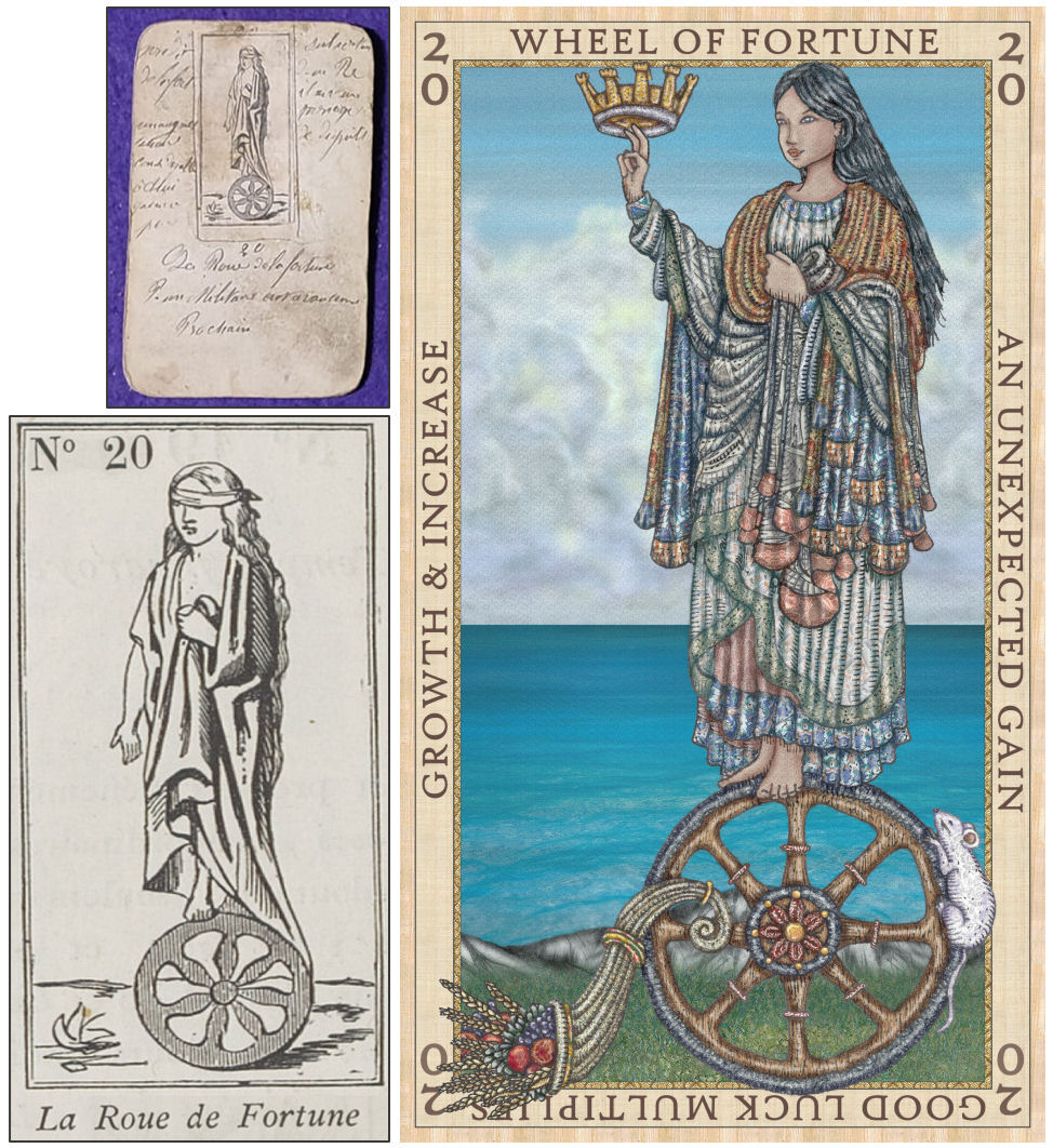
I went with the 1870 Jeu de l’Oracle des Dames version of Card 20 for reference. The monkey king with a cape and sword situation didn’t really vibe with me.

Lady Fortuna as depicted in the illustration is a syncretizing of Haudenosaunee traditional indigenous patterns draped in a Greco-Roman style. (Update: I digitally fixed her left sleeve so it wouldn’t be so wonky looking.)

For each card entry, I translate both the Lemarchand and Orsini texts from French to English, then use those texts as reference as I write my own card entry. Although the guidebook is keyed to my illustrations, one of my objectives is for it to also work as a standalone book on reading Etteilla decks.
So, for instance, even though my illustration for the Wheel of Fortune doesn’t feature the monkey with a crown and sword, I still talk about its significance in the guidebook, and show the Etteilla editions that have that feature.

And of course there’s also the LWB. The big guidebook is an optional add-on for anyone who wants to deep-dive into a study of the Etteilla system. But the little white booklet that comes with the deck in the box should suffice.

After completing Card 20, Wheel of Fortune, I hopped over to the Three of Cups. Why? Because I can. Nothing deeper than that, sorry to report. And after the Three of Cups, the Three of Wands.

And here are my final first drafts. Funny enough both feature full moons. In the Three of Cups, it’s to represent the theme of the card. In the Three of Wands, it’s to memorialize the day I finished that illustration– it just so happened it was the eve of a full moon. =P

The above screenshot of the guidebook includes my original sketch of Venice. I’ve been enjoying studies of renowned art and illustrations, meaning you essentially copy a master’s work. By copying that master’s work, you refine your skills. Doing studies have really really helped take my drawing to the next level. This illustration of Venice, for instance, is a study of an illustration of the same from Liber Chronicarum (1493).
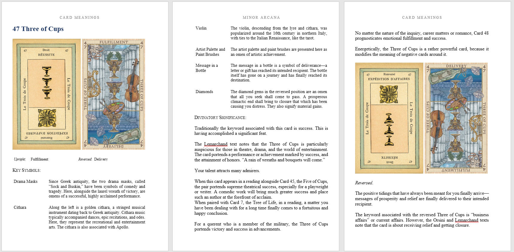
The above screenshot is just a sampling of the layout for the card entries. I think having that side by side comparison of the Etteilla II and my version is helpful. In many of the entries, images from the other Etteillas are also provided. The featured version is the Lismon Etteilla II only because it’s the one I have high-res image files of.

I’m currently working on the Four of Wands. The left-most two above are from Etteilla I, then the center is Etteilla II, and the right-most two are Etteilla III.

You’re about to see a bunch of different versions, with minor variations, of my Four of Wands work-in-progress. Still tinkering around to figure out exactly what I want.
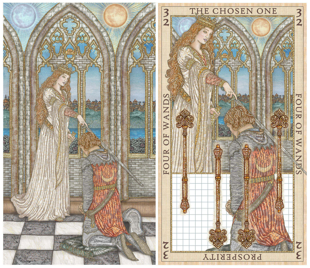
This is a study of The Accolade (1901) by Edmund Blair Leighton. Per the Orsini card meanings, “Accolade” is one the listed keywords for Card 32. I used the grid system to draw it, so it’s not exactly freehand. Pro artists say that using the grid system is cheating. Eh, it probably is. =)
But for me as one who is still learning and honing my skill set, it’s been one of the most effective training techniques for improving freehand. Draw with the grid system a few times, then draw freehand– suddenly your freehand sketches have leveled up.

[For those who aren’t familiar with the term, “grid system” is a drawing technique where you plot a Cartesian grid over the work of art you’re trying to replicate, then reproduce that same grid proportion on blank canvas. You isolate study of each cell in that grid and copy what’s in that cell on the work of art onto your blank equivalent cell.]
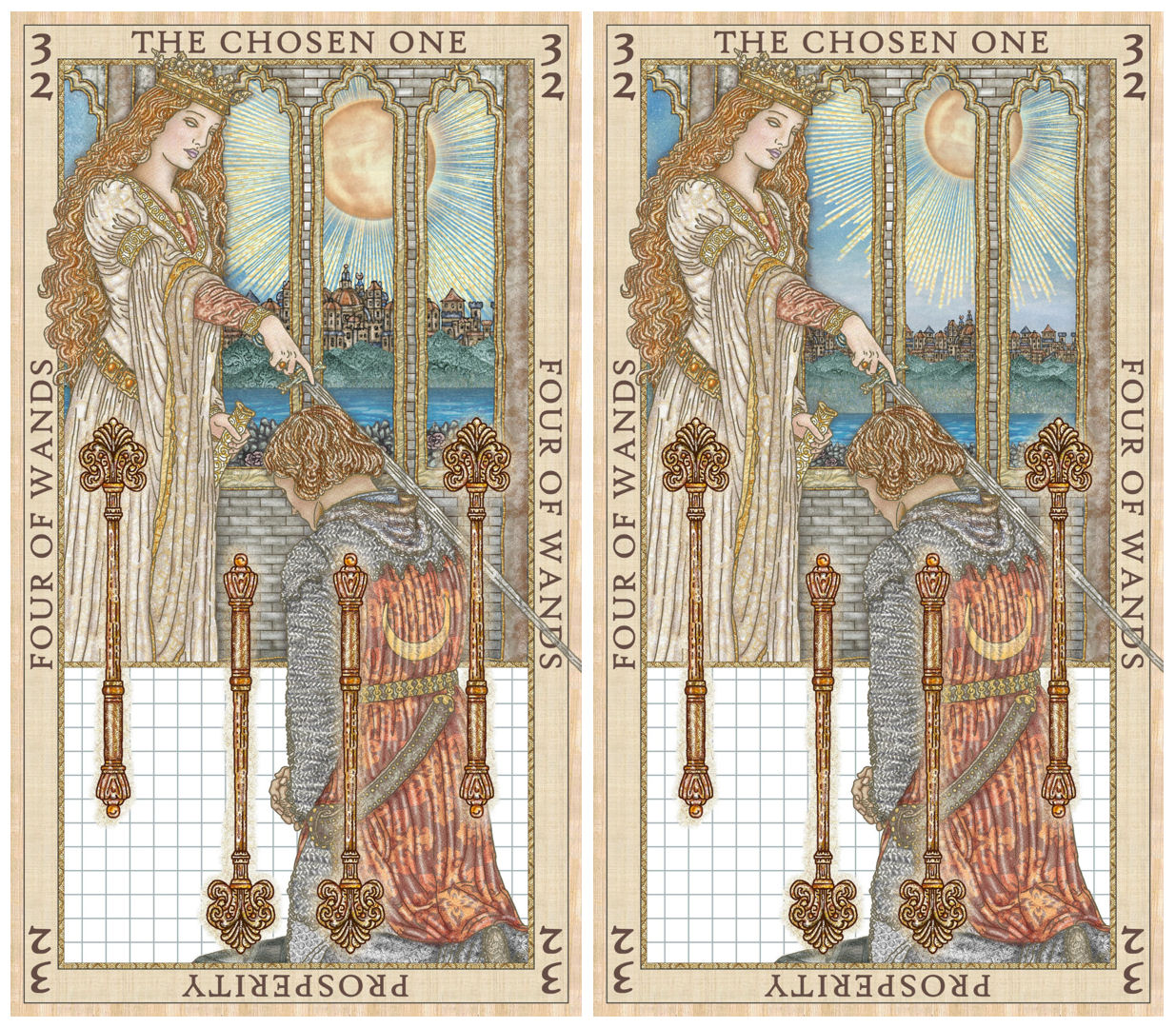
The blank part in the lower third that’s just grid paper is what I’m currently working on. Given how I placed the knight, how am I going to make the reversed illustration work? Yah I dunno yet.
As for which version to go with for the upright illustration, I think right now I like the prominent placement of the sun in the above left version, for symbolism reasons, but the more distant city horizon line, the way you see in the above left.
Welp, there’s the cliffhanger. =) Stay tuned for the next update on how the Four of Wands turns out. =)
UPDATE: Here’s what I went with + bonus Fortitude (Strength) card feature.


Love this! I love how your illustrations really bring the Etielle system to life. I love the 3 of Cups and 3 of Wands. The Wheel of Fortune is stunning in its complexity and when you consider how complex luck, growth, increase, and fortune can be- it makes sense. These are looking fabulous. As for “cheating”, those artists can just sit down. Everyone, even they cheat in some manner to make their art as beautiful and easy as they can. Ask them about how they do perspective. They do lines– which is cheating. But in the world of architectural drawing- it’s absolutely necessary to have those lines. It’s all on your perception.
LikeLiked by 1 person
Thank you so much for the reassurance! 🙂
LikeLike
Loving these process posts, Benebell! The Wheel of Fortune/ Fortuna has been following me around (it’s my tarot card of the year as well), she came out in one of my pulls for the Pillar of Earth (working through your Four Pillars course right now) last night. A few hours later I was doing some bibliomancy with your Book of Maps and guess what page I turned to? Key 10: Wheel of Life, of course! So grateful for all you do for our tarot community ❤
LikeLiked by 1 person
Hi Benebell–I’ve always been curious about your choice to include or omit irises and pupils from some of your characters, for example, here in the Wheel of Fortune. I’ve noticed this within the SKT as well. At first I thought perhaps god/goddess/divine figures received no irises or pupils, but with a more in-depth look at the cards and the Book of Maps I’m doubting myself. I’d love to know your reasoning behind this choice if you’d be willing to share. Also, thank you for all you do and provide on different occult subjects, and I can’t wait to read your I-Ching book! 🙂
LikeLiked by 1 person
I guess for me it’s about the aspect of the figure’s personality I want to present. When I include the iris and pupil, it’s to show an earthiness, a closer connection to the material (irrespective of whether they’re divine or human), whereas without irises and pupils, it’s depicting someone more ethereal, a closer connection to the immaterial.
LikeLike