
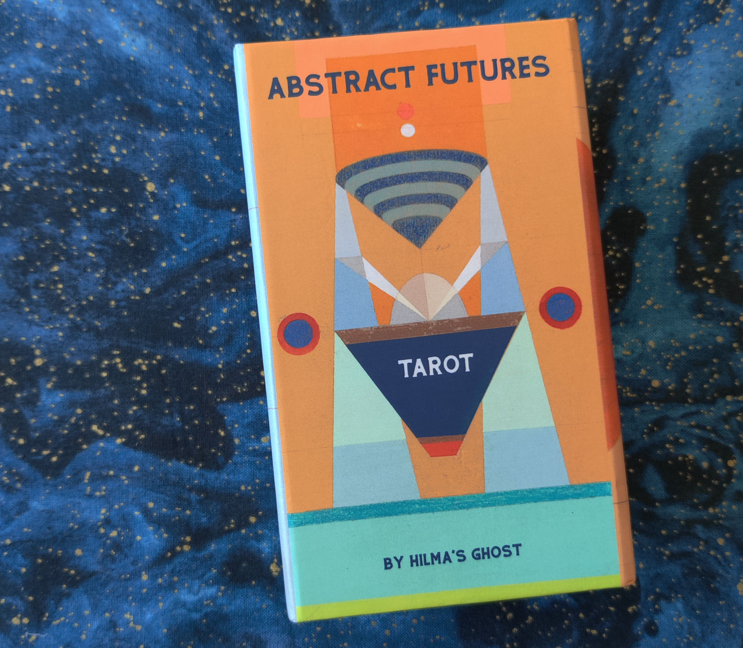
I was gifted this deck by the creatrix while at the Omega Institute Masters of the Tarot Conference and thought it might be fun to write up a first impressions walk-through. This is the Abstract Futures Tarot, illustrated by Dannielle Tegeder and Sharmistha Ray who together, make up Hilma’s Ghost. Tegeder and Ray are both Brooklyn-based avant-garde artists.

Hilma’s Ghost produces art that is conducting “experimental pedagogy, transcultural dialogue, and collectivity through the lens of feminism and spirituality to build community and reckon with patriarchal art histories that have excluded women, trans, and nonbinary practitioners.”

Abstract Futures Tarot is the product of 78 drawings that were first exhibited in 2021 at The Armory Show and shortlisted in the New York Times as one of the exhibitions to see.
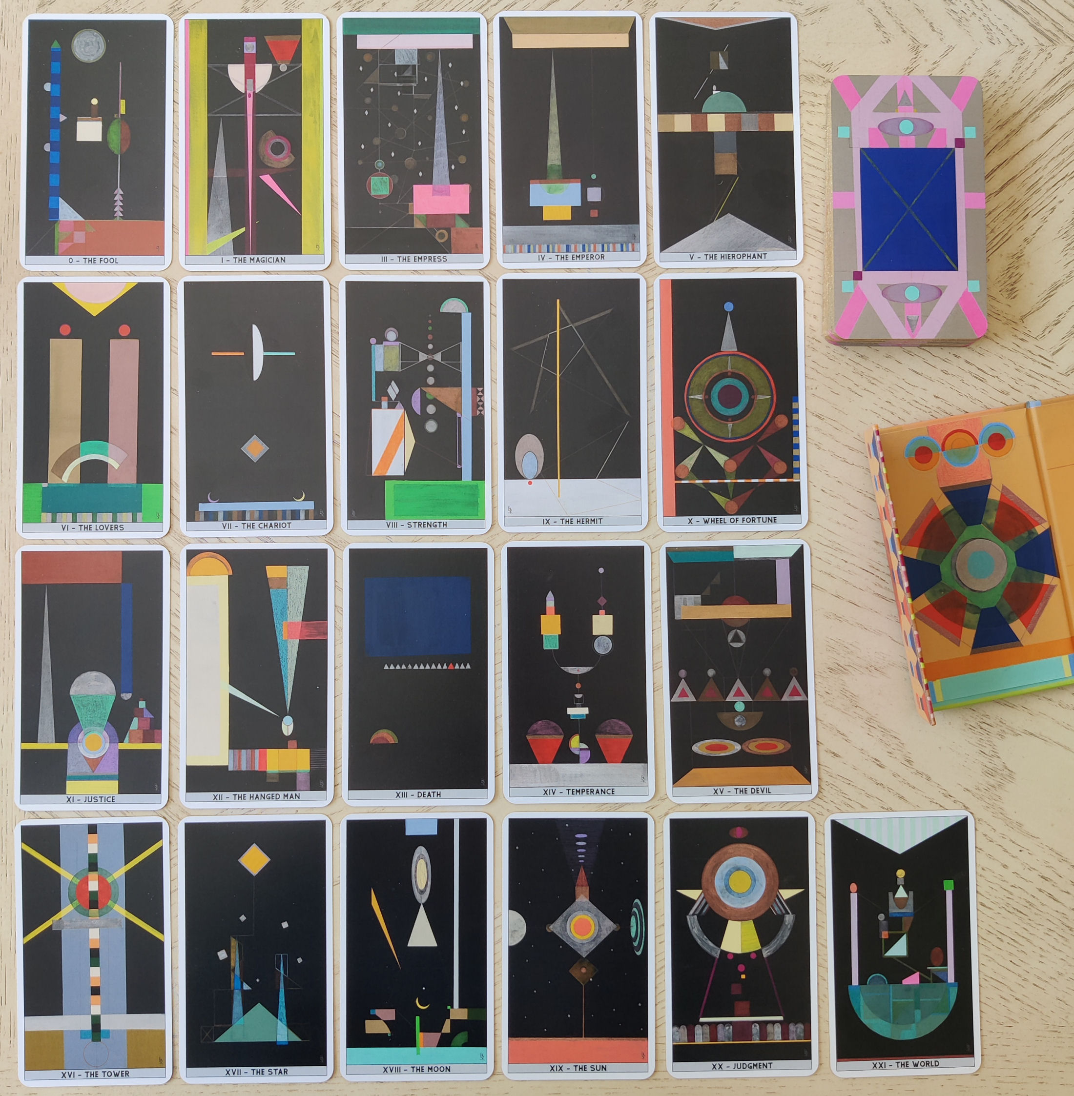
The deck is rebellious, highly indiosyncratic, and created in response to the original Rider-Waite-Smith, generated through an abstract lens. Each composition is a color field, with geometric hard edges. The works were first rendered in gouache, ink, and colored pencil.

The deck has a QR code printed on the box, which you can scan to access a glossary of card meanings. And the card meanings are actually quite good! Pithy, cuts right to the point, practical yet prophetic, and in terms of doing readings for yourself by looking up the card meanings with the QR code, fairly accurate!
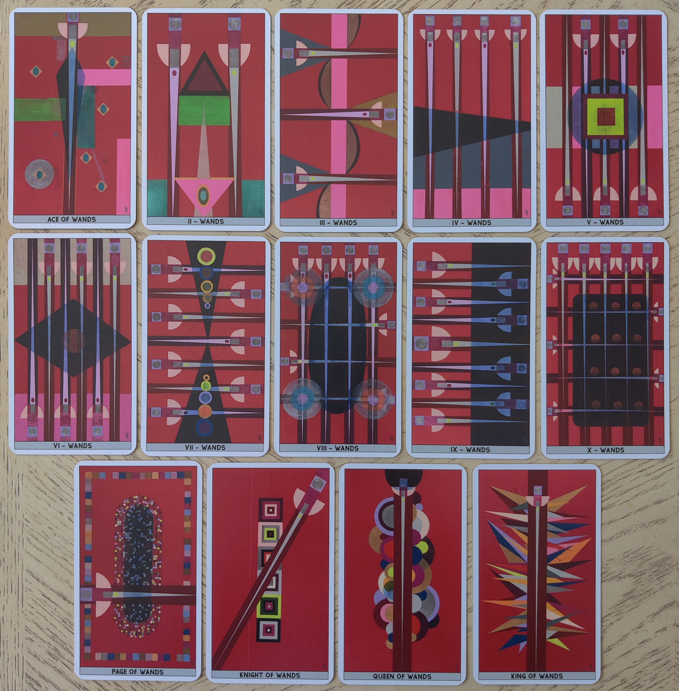
The suits are color-coded, whereas the Majors were predominantly black, the suit of Wands is predominantly red. There’s almost a Marseille-adjacent essence to these Minors. If you like Rothko and Vassily Kandinsky paintings or the Barnett Newman crowd New York City arts scene, then you’re going to love the Abstract Futures Tarot.

The suit of Cups is color-coded orange. The shapes and geometric formations are consistent and reminiscent of the original suit symbols, so here you can see the red and blue silhouettes in the configuration of chalices.

There’s a lot more color diversity in the suit of Swords, though there’s still the core theme of it being color-coded gray.
I love the consistency of the silhouettes across the four suits’ Pages, Knights, Queens, and Kings. The pages have that– please forgive my amateur descriptions– spotted pill for the Page, the homage to Joseph Albers’s squares within a square motif in the Knights, the concentric semicircles stacked in the four Queens, and the spiky multi-colored deconstructed Christmas tree in the Kings. (I did warn you that my descriptions would be amateur…)

The suit of Pentacles presents midnight blue tones with the contrasting secondary color blocked disks. I almost feel like Lady Freida Harris would have loved this deck. And of the four suits, I find the Pentacles to be most atmospheric, and for that reason it’s my favorite.

Is it a difficult tarot deck to read with? Well, it’s like staring deep into your unconscious mind and looking at color-coded imaging of neurotransmissions. The artwork is beautiful, mystical, and feels eerily prescient.

Abstract expressionism first splashed onto the scene as a cultural reaction to World War II. The artwork in Abstract Futures Tarot was first exhibited in 2021, and feels a bit like an intuitive response to what we went through in 2020, similar to the conditions that first birthed abstract expressionism during the post-war era.
These compositions feel channeled, as if an other-worldly being took over the artists’ hands and what came through are these highly interpretive color fields for your projective interpretation. The art almost feels mathematical, like algorithms.

Packaging wise, the deck comes in a magnetic clasp box, beautifully designed. You can purchase one of these limited edition decks via the artists here: HILMA’S GHOST.
If you enjoy abstract expressionist art, in particular cosmic geometry, you’re going to love the Abstract Futures Tarot. After tinkering with the deck and loving the artwork, I went to go look up the co-founding artists behind Hilma’s Ghost, and I highly recommend that you go down that rabbit hole, too! There’s a lot of incredible panel discussions on art that they’ve participated in, and you can view their other works as well. What an important fine arts contribution to the world of tarot!

That is VERY different, wow! In a good way; I like abstract but it’s not going to be for everyone is it? The beauty of art and with Tarot you get 78 or more!
LikeLike
Fascinating. A tarot deck inspired by the art of Hilma af Klint is incredible. You can learn about Hilma’s artwork in this video.
LikeLiked by 2 people
Wow thanks so much for linking this fascinating video ❤️
LikeLike
I assume they mean Hilma as in Hilma af Klimt. Beyond the Visible is an excellent documentary about her work (which was channeled) and the debate that she is in fact the first abstract artist. It is on my bucket list to see an exhibition of her work.
LikeLike
Looking forward to the publication of your translational version of Yi Jing Oracle!
I’ve been consulting since 1980 or so !
LikeLike
I love this comment: “ These compositions feel channeled, as if an other-worldly being took over the artists’ hands and what came through are these highly interpretive color fields for your projective interpretation.” The tarot artists are riffing off this very true piece of art history, paying homage to spiritualist and visual channel, Hilma af Klint. I’m looking forward to seeing her work at the Tate very soon.
LikeLike
Pingback: Abstract Futures Tarot by Hilma’s Ghost – benebell wen – FanFare Holistic
Pingback: 希爾瑪幽靈的抽象未來塔羅牌 – benebell wen – FanFare Holistic Blog
Pingback: Hilma af Klint and Pamela Colman Smith – Present Day Tarot Blog
Sadly can’t buy this deck if you’re from Ukraine, the shop page doesn’t open without vpn and Ukrainian cards are not accepted. I’ve been looking for a really abstract deck for quite a while, and this one looks like the one, but alas. Maybe one day…
LikeLike
I recommend going to the artists’ website, finding a contact e-mail, and reaching out to them directly with your interest. They might be able to accommodate your situation! ❤
LikeLike
Yeah, I’ve sent a message to the gallery that handles the sales, maybe it will help. But you’re right that I could also try to reach out to the artists directly. Thank you. Cheers!
LikeLiked by 1 person
So I’ve managed to secure the deck. I found somebody on YouTube who didn’t get the same deck in time, but said the problem was resolved after they contacted the gallery. I did the same after some days passed without response to my order. After some back and forth my deck was on the way and was eventually delivered successfully.
The whole idea is great. I feel like abstract images can be really powerful and I immediately started using the deck with great results. But I very soon encountered a couple of caveats regarding its practical application, that I feel like you could probably mention too.
First, the glitter from rims just keeps sticking to your hands and tablecloth.
Second, the cards are rather thin and bendy and feel flimsy in your hand.
Third, after some reshuffling and doing daily spreads for a week or two, lamination on the cards gets scratched from them scratching each other during shuffling (?) and the color gets scratched away with it, leaving thin bright discolored white or gray “hairline” scratches on the images and the backs. It’s especially visible on cards with a lot of dark color.
I understand that cards, like all things, wear out with time, but I think I expected something a bit more sturdy, especially for the price. Like, US Games decks seem to be better made, you know. I’m no stranger to expensive and fragile wine glasses, and I’ll make sure to pay much more attention to how carefully I handle the deck, but still.
Anyhow, thank you for bringing it to our attention!
LikeLiked by 1 person
I’m so happy you were able to get the deck and your perseverance is inspiring. Thanks for the caveats as well 🙏
LikeLike
Thank you, it certainly took a bit of perseverance and worry.
But now I must inform you that I strongly do not recommend buying this deck.
Its wear and tear is just terrible. I stopped using it because the scratches keep appearing on the cards with each new shuffle.
Oh, and I forgot to mention it has quite an unpleasant chemical smell that doesn’t seem to go away with time. “Printed in China” does that to things I guess.
Also putting a card in a scanner revealed that the print quality is not even 300 dpi, it’s worse. If you compare the original paintings with what’s printed on the cards, the cards are muddy and many details of the textures are lost. Even small thin signatures of artists on the cards are printed fuzzily.
What an experience for no less than a benjamin… The quality of this deck doesn’t do the artists any justice.
LikeLike