

I’ll be taking a several-month hiatus from working on the Etteilla deck project because I have a book manuscript to complete. But before I take that hiatus, I want to “leave off” on a happy card.

And the last card of the Second Septenary in the Etteilla– The Devil– isn’t quite the happy card I’m thinking of. =)
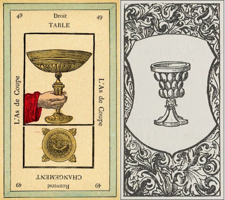
So I’ve started the Ace of Cups, and am intentionally leaving it incomplete. That way it’s the prolonging energies in my space until I return. More about that. Keep reading.
POLL #1: Should I call the suit Chalices or Cups? I think technically for this deck, it’s supposed to be Chalices, right? But Cups just flows off the tongue better than Chalices, and much easier to verbalize. Let me know what you think.
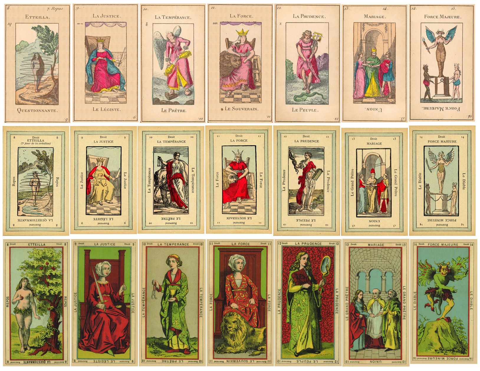
Above you’ll see a side by side comparison of Etteilla I (top, first row), Etteilla II (middle row), and Etteilla III (bottom, third row), for Cards 8 through 14. Click on the image for a slightly more enlarged view.

Oops, the coloring of the archway in Prudence (Card 12) doesn’t match the archways in The High Priest (13) and The Devil (14). Sigh. The things we miss, eh? To be fair, I’m spending 95% of my drawing time looking at the images you see here at 500% magnified zoom. Which… I believe there’s a popular saying that captures my little oversight? =)
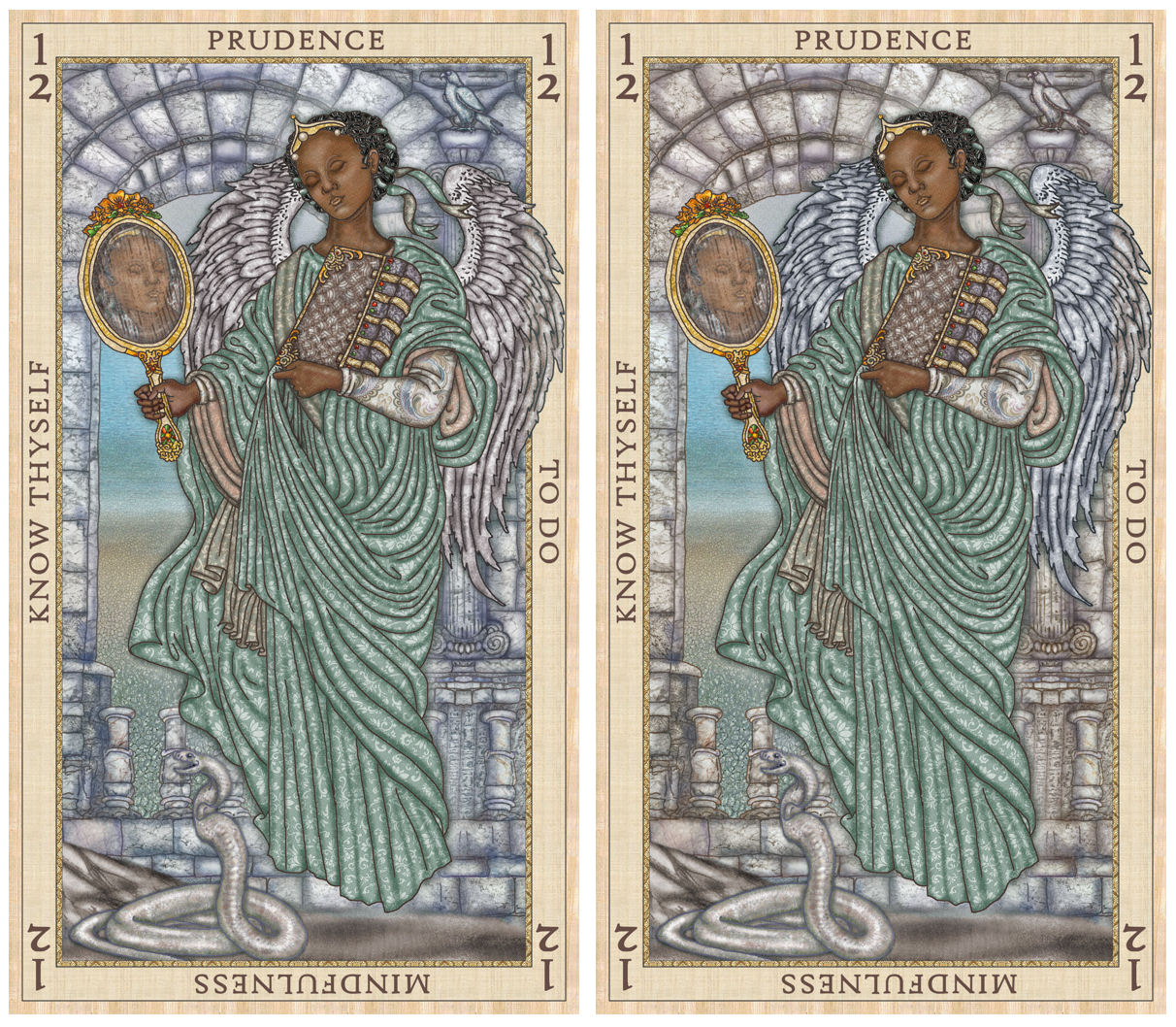
POLL #2: Which version of Prudence do you prefer in the above? Left or right? Or the coloring difference is so negligible that you don’t care?
I kinda like how the archways connect the three illustrations, but I dunno. I might go back and re-draft the background for Prudence. We’ll see.

Okay, so why am I getting all superstitious and making sure I am leaving a happy card incomplete? So… for every single card I’ve drawn in this deck, while drawing that card, real life events have been echoing whatever the textbook energies are of the card. (This happened with the SKT too, btw.) I’m not going to try to give a woo conclusion. You’ll believe whatever you’ll believe. But for myself, I want the Ace of Cups energy to continue from now until whenever I return to this project. =)
[Yeah, re-using the Ark of the Covenant I drew from the SKT Revelation for the reversed position of the Ace of Cups, b/c in the French editions, the keyword and referene associated with this card is the Ten Commandments, or to be even more specific, the original tablets that the Ten Commandments were written on by the Finger of God. Which, according to lore, are stored in the Ark.]


Poll #1 – Cups. I agree it just flows better! Poll #2 – I prefer the illustration on the right because the coloring of the stone of the archway looks more….real, somehow. I still wish that her eyes were OPEN in the mirror reflection, though. What is it that you *really* “see”?
LikeLiked by 1 person
Thank you!! ❤ Haha funny enough– I took your advice and tried it with the mirror reflection Prudence having her eyes open. Gotta admit– it creeped me out! =) It had a haunting vibe to it. And I want this to have a totally chill, calm-vibes feel. 😀
LikeLiked by 1 person
Lol – it would be a bit of woo woo fun to randomly hide a spare eyes open cards in some decks – that would reeeeally creep people who get those decks out!!! 😳😅😅😅🤔 (Personally I’d love it hehehe)
Enjoy the manuscript writing as a break
LikeLike
Poll #1 – Cups
Prudence – Right
Cannot wait for this deck!! Positive vibes sent your way for your book! Love and light! 💫
LikeLike
Poll #1: Cups.
Poll #2: Right. The figure pops more against that color background, and the image seems to have better lighting and depth.
Exciting work!
LikeLike
Poll #1: I agree that Cups rolls off the tongue better, but I like Chalices – it sounds more ritualistic/sacred. Cups are what I use to drink tea; a more mundane, everyday use. In the end, it probably depends which word better fits the deck’s energy.
Poll #2: I’m looking at the image on my phone, and at that size, the left looks better; there’s better definition of the elements. If I enlarge the image, the right looks better, less dark. So the final card size, for me, would dictate which colouring works.
LikeLike
I’ve been having a vibe with vessels, but cups is cool. Prudence’s coloring both cards are beautiful, blue gray stone with silver wings or gray stone with blue wings, hmm hard call. Definitely like the eyes wide shut.
LikeLike
Poll 1: Chalices. What a great word–the sounds! I agree with Starlight that it sounds more sacred and ritualistic.
Poll 2: the illustration/card on the right.
I love that you’re place holding with the Ace of Chalices!
LikeLiked by 1 person
1) chalices – yes, that’s more sacred. And who says that you couldn’t call it “cups” in colloquial everyday use, anyways?
2) left – the right one looks more realistic, but I like the dreamlike atmosphere of the left one with the blueish stone and reddish wings.
I don’t find it strange to rather stick with a happy card, btw. When creating art you dive into its vibe – and no matter whether that’s just a psychological effect, synchronicity or true magic, it does what it does to your emotions and overall well being. So, it’s better to stay on the safe side.
LikeLike
Poll 1, chalices is more traditional in the Etteilla, so I’d prefer that. People can still call them cups if they prefer. I do that in most decks that change the suit names already.
Poll 2, hard to decide, as both look lovely.
I can hardly wait for this deck to be available as I have just recently gotten into Etteilla and I know your accompanying book will be most helpful in the learning process.
LikeLike
First thing, these cards are gorgeous!
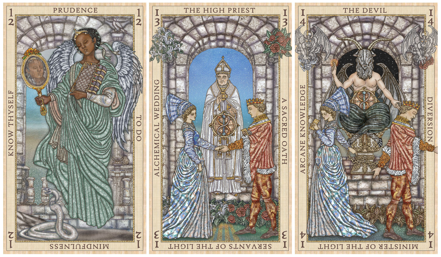
Next, I love the arches – maybe change the one for the High Priest or the Devil so the link of the arches becomes something similar but not exactly the same.
#1 Cups – because “chalice” is the vessel used in the Christian Eucharistic sacrament.
#2 Left – because the color of the wings is warmer.
LikeLike
I like the right Prudence. And I’m falling for this deck. At first I was like ok but now…. And my altar space for my tarot decks is full lol.
LikeLike
if the poll is still going
#1 chalice
helps more with the occult mindset i try to get myself into, though its really not that big a deal
#2 the right
again not that big a deal but slightly more pleasing to the eye
LikeLike
Goblets. 😁
Right.
LikeLike
Poll 1 – the Chalice is my preference it seems a more elegant word to suit the style of the art. Poll 2 – the left version is my preference.
LikeLike
Absolutely stunning work so far!
My vote:
Chalices definitely
Right
LikeLike
Poll #1 I actually love chalices but cups does flow easier and poll #2 I like the one on the right the most. The little bit if color in her wings is just beautiful. I have to agree it would be kind of fun of her eyes were open in the mirror.
LikeLike
1: Chalices
2: It’s really hard for me to pick honestly. I’d go with the one that matches the archway colors of the others. Probably the one on the right. The warmth in the back makes her figure pop in the front.
These cards are absolutely beautiful and I cannot wait to see what more you create.
LikeLike
Pingback: Etteilla Cups: Ace, Two, and Three – benebell wen
Poll 1 : Chalices. I tend to prefer Chalice as opposed to Cups. When I hear the word cup(s), I think a mug or glass. But the images to me look like Chalices or even Goblets.
Poll 2: I like how the archways connect with the other images. To me, that’s the way it should look. Because to me they tell a story.
LikeLike
Pingback: My last Etteilla deck update started with an incomplete Ace of Cups. - Professional