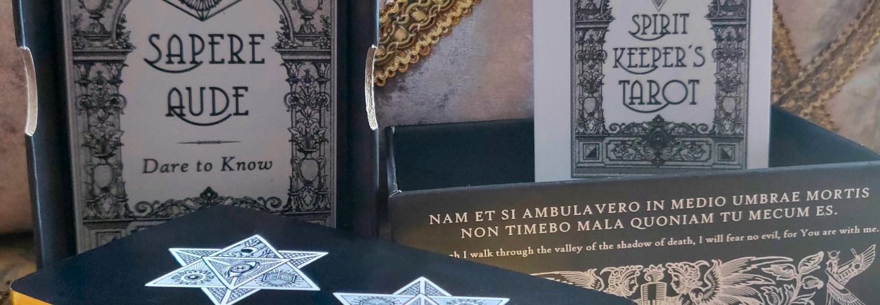

To quell any confusion, yes, I’m at work on a third edition of the Spirit Keeper’s Tarot. No, not a new deck, but a new edition of an already existing one, the SKT.
I have not yet arrived at a decision on coloring. Do I want it in sepia? Grayscale with accents of colors? Full color via digital applications? I don’t have any answers. I’m going to give all of the above options a few tries, compare, and see which path is right for SKT the Third.
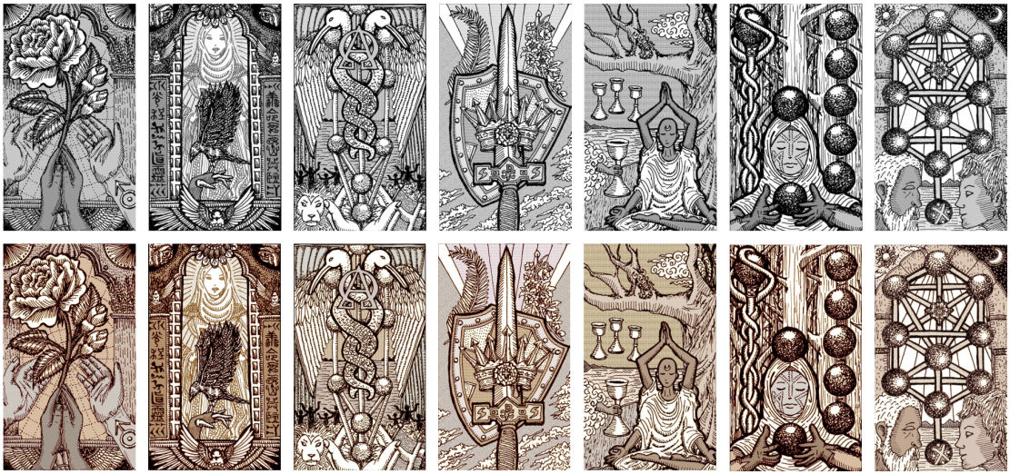
The images in this post are sepia-toned only because my first order of business is to produce both a black-and-white and also a sepia-toned set of base images to work from. That way I can tinker with both and see which I want to work with when creating the full deck.
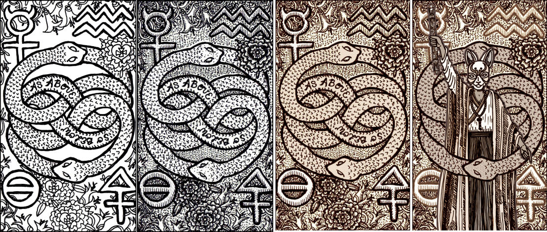
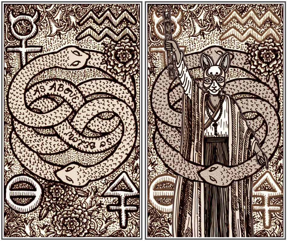
Above is Key 1: The Magus (Magician) card. Left to right: First, the line drawing of the key that’s provided as part of the free download of the Major Arcanas. Next to its right is the 2018 First Edition black-and-white version. Then it’s the 2019 Vitruvian version. And the right-most image is what I’ve been playing around with in 2020.
With the whole coloring-the-deck thing that was the free Majors and SKT First Edition, the idea was a foot path and giving you a map. Then I was hands-off. You gotta go do what you gotta do to get to where you want to go.
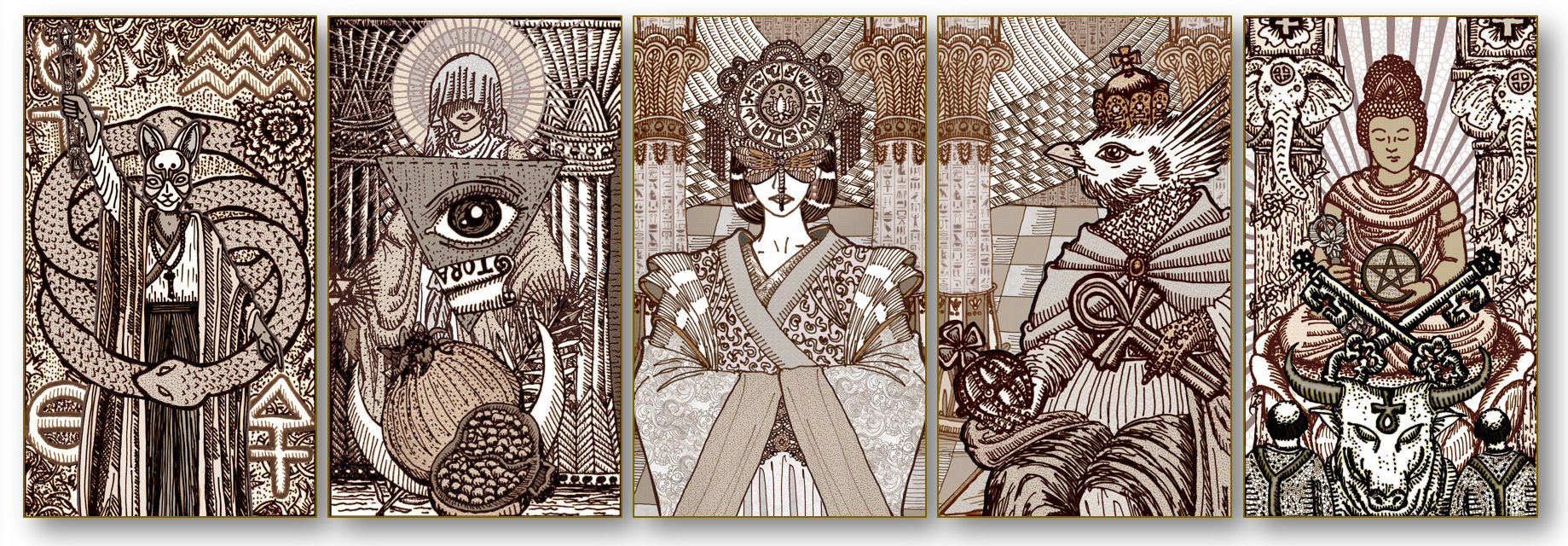
I’ve got very different plans, intentions, and ambitions for SKT #3. The first order of business was to reduce abstraction and transform many of those abstractions into personifications.
Here in Key 1, where the Vitruvian Edition (above left) featured the words, “As above, so below,” I transformed the words into a Shinto priest wielding a wand crafted as Eliphas Levi described it in Transcendental Magic, wearing a kitsune (fox spirit) mask, with body language conveying “As above, so below.”
The triple goddess insignia from the Vitruvian Edition has transformed into the veiled priestess wielding twin merkabah stars.
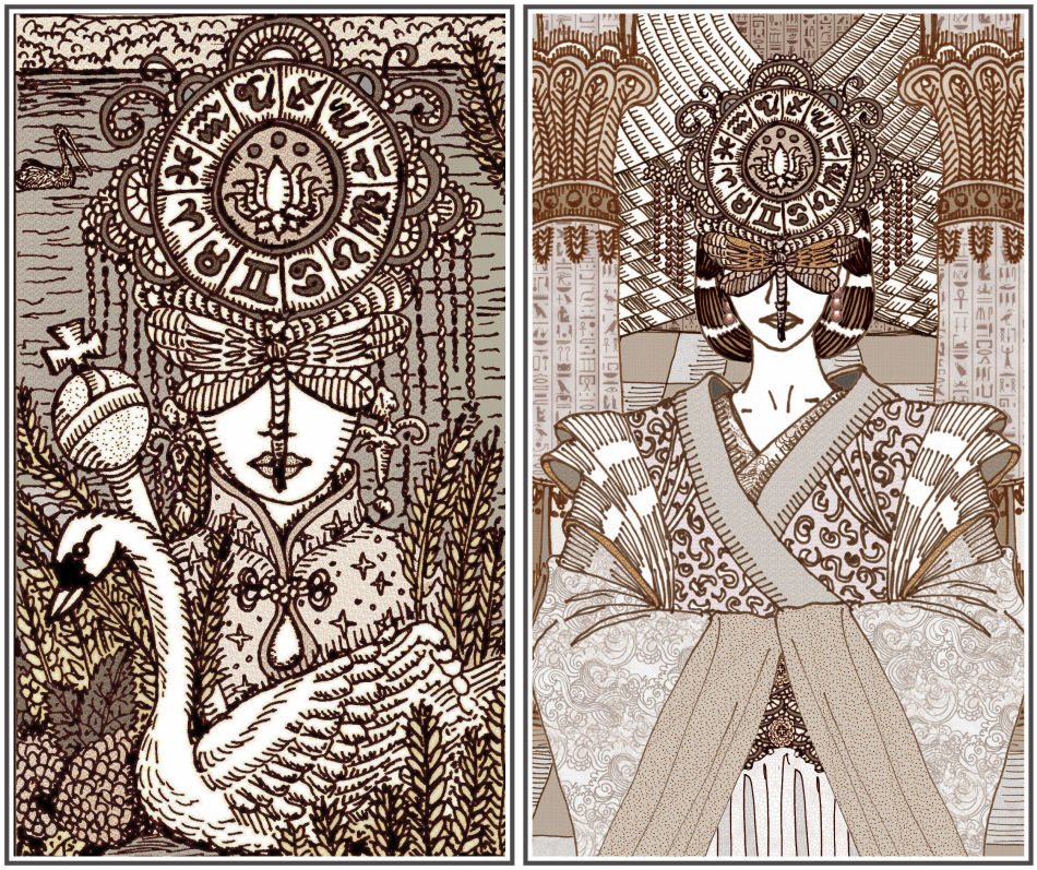
I wanted to zoom out from the frame of the Empress in the Vitruvian SKT (above left) and also shift setting. This year I bought a drawing pad and I am now teaching myself digital or new media art. Digital techniques have completely opened up my possibilities.
The black and white 2018 First Edition was hand-drawn in pen and ink on white cardstock, then scanned in, cropped to tarot size, and that’s it. There was minimal digital tweaking– maybe cleaning up a couple of stray pencil lines I didn’t fully erase here and there, but you were basically getting the original drawings.
For the sepia-toned 2019 Vitruvian Edition, I went back into the original works of art with different size pen tips to add more depth and visual interest, like more cross-hatching, filling in, etc., and then re-scanned, then digitally converted from black and white to sepia tones.
This still-unnamed SKT the Third will be incorporating more new media art techniques, though I’m still keeping it minimal, to “as needed only.”
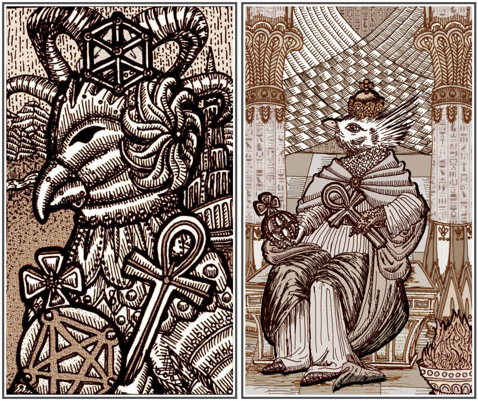
You can ignore this redrawing for The Emperor. I need to try again. This isn’t it.
Left up top: Vitruvian version of Key 4. Right up top: Nothing. I’ll be scrapping that and starting over. Not sure what I was thinking.

I was going for an eagle headed Emperor, but what I actually ended up drawing was that penguin from Happy Feet, which, no, was not my intention.
And… now you can’t unsee it, can you.
I’ll be trying my hand at redrawing The Emperor card again, so for now, just chuckle and enjoy the silliness of that doodle.
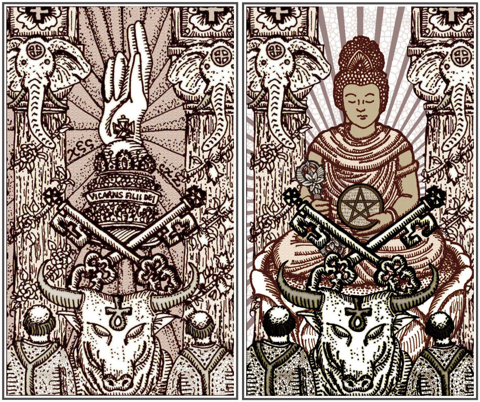
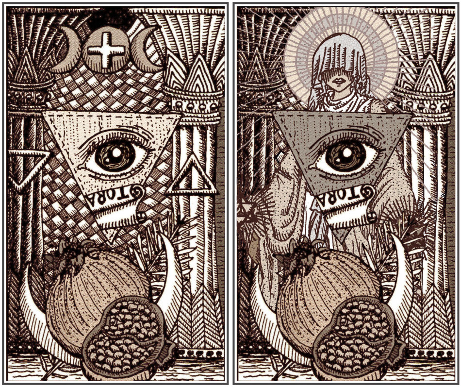
In The Hierophant, the Sign of the Benediction along with the papal tiara have transformed into a bodhisattva holding a vajra in the right hand and a pentacle in the left. I’m also going to be changing the card title from The Holy See (First and Vitruvian Editions) back to the classic Hierophant. Maybe. No, you know what, don’t quote me on that. I don’t know yet.
I’ve also been tinkering a bit with color. Coloring is tricky, because I want to preserve that Old World aesthetic. When you use digital media to color, it looks too modern.
When you study colored medieval and Renaissance illustration (I’m not talking about fine arts, e.g., oil paint; illustration vs. fine arts here), it’s splotchy, doesn’t quite have the sophistication of shading that artists today tend to work with, so I have to be very thoughtful about the way I apply coloring. Realism isn’t the objective.
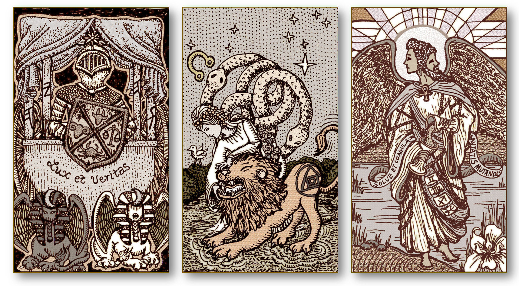
James does not like my revision of Temperance at all and finds my new version super creepy (he says), but I’m digging it. What do you think?
Personally, I think the double-headed Temperance angel is so much more meaningful.
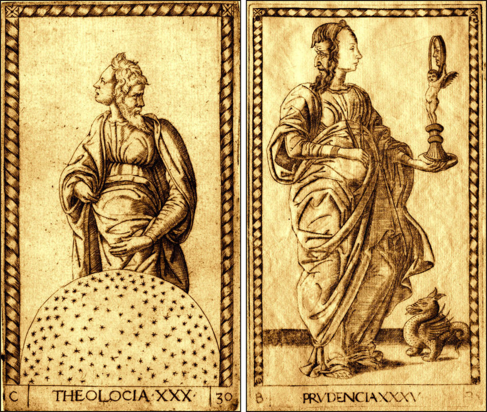
Theologia and Prudencia from the Tarot Mantegna inspired my Temperance head change.
Is this revised image of Temperance (titled The Angel in the SKT) a little unsettling? Yeah, probably. But I love the symbolism and duality of the young maiden and old man facing opposite directions but sharing the same body to represent the Holy Guardian Angel.
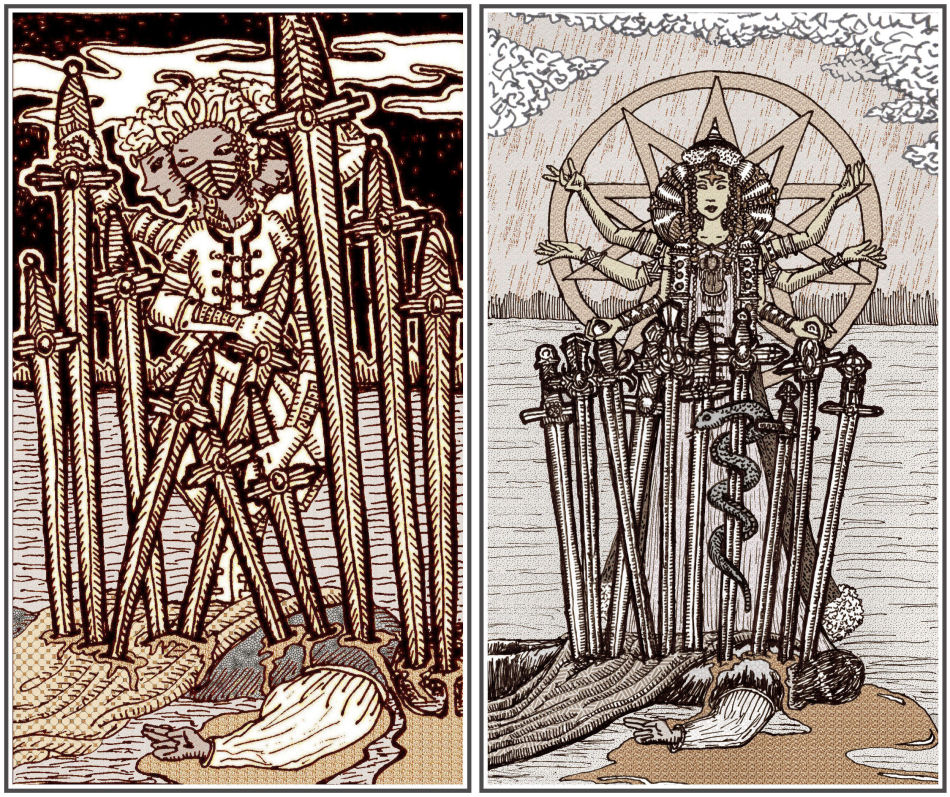
Above to the right is my work-in-progress redrawing of the Ten of Swords. I shared some progress images on my Instagram feed here.
If you’re familiar with acupuncture/acupressure, the medicine snake is coiled around the sword pierced into the adrenal point, which is the chakra of physical vitality. It’s also known as the Shu Mansion, connected to how awake or fatigued you are, your immunity, blood pressure, and metabolism.
The Mongolian sorceress is performing a Taoist ritual of invoking a many-armed goddess. I’m depicting the formation of her magic-induced qi life force as a decagram, or star with ten points.
And if you recognize the hand mudra formed in the right hand of our slain figure, you’ll recognize it as the sword mudra, which means this figure was a magus or sorcerer himself. Though in the original RWS Ten of Swords, the fallen guy’s hand gesture was probably supposed to be the benediction sign, not a Taoist magician’s hand mudra. It’s just kinda cool that it happens to be both! =)
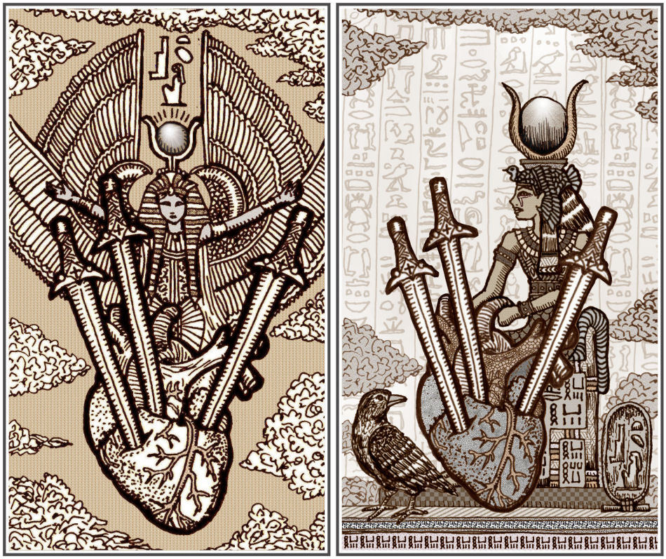
Both the previous version of the Three of Swords and my redrawing (above right) tell the story of Isis and Osiris, and by extension, the birth of Horus. So this is the Isis, Osiris, Horus trinity. I shared my pencil and ink sketches here.
In my redrawing I added a raven as a spirit messenger to guide the querent out of their Three of Swords moment.
The background wallpaper is my own rather shoddy attempt at copying, by hand, excerpts from the Egyptian Book of the Dead, as the passages were inscribed on the walls of a royal priest’s tomb in Saqqara. On the walls of Isis’s throne are variations of the magical power word hekau.
I merged the above sketch with the pierced heart from the original SKT Three of Swords. I arranged the features so that the card is both a classical Three of Swords tarot card, but you’ll also think you see The Chariot. =) I think when we’re experiencing a Three of Swords moment in the present, seeing the possibility of The Chariot will motivate us to do something about our Three of Swords moment.
So the SKT is still a fluffy tarot deck. 😉
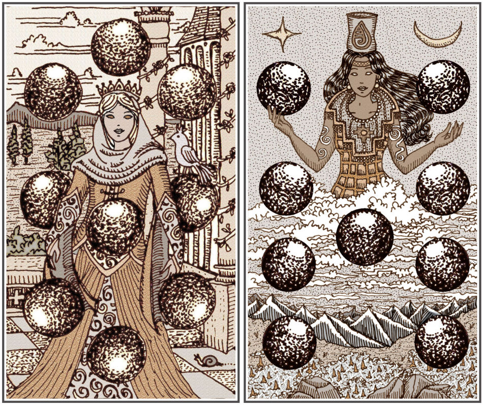
Above is the Nine of Orbs (that’s the suit of Coins in the TdM, Pentacles in the Golden Dawn tradition and per the RWS, and Disks in Crowley’s Thoth). This revision is deeply meaningful to me for so many more reasons than I care to share. I hope when you see this card, you’ll feel the depths of its sentimentality. =)
Let’s just talk about the illustration. I’ve tried my hand at illustrating the Inca goddess Ch’aska, who is Venus as the Morning Star. (The decan rulership over the Nine of Pentacles/Disks is Venus in Virgo.) She’s associated with maidens, princesses, fertility, abundance, dawn, and morning dew. Ch’aska is why flowers and fruits grow aplenty.
You’ll also see the Andes mountains, and in the foreground, the magic flower of the Incas, the cantua buxifolia, which is the national flower of Peru. Ch’aska’s crown and royal jewelry designs were inspired by archaeological artifacts. The spiral tattoos were symbols carved into ancient Inca temples near Cusco. On her right arm is the symbol for the Origin of Life, picturing the union of male and female to create a new being. The one on her left arm means the Creation of the Cosmos, or the evolution of life from the Milky Way.
Here are my early pencil and ink sketches of Ch’aska.
To clarify any lingering confusion, I am not creating a new tarot deck.
I’m making a few changes to produce a third edition of the SKT because I still want to work within the framework and the architecture of the SKT.
If I were to create a new tarot deck, then I would want to design an entirely different framework from what the SKT is. Otherwise, what’s the point? A new tarot deck would need to be thematically different from SKT, and right now, I’m still working within the SKT universe.
Just so interested parties have a sense of the time frame I’m projecting, this deck won’t be done until 2021. I haven’t yet decided whether to produce and therefore sell the deck in 2021 or 2022, so I could very well push pre-order and sales to 2022. But 2020 is out of the question, especially since I still have so much learning to do.
My goal for 2020 is to learn how to use my drawing tablet. I find myself still relying on drawing by hand. I don’t like how the stylus feels and I think I’m too old of a dog to learn new tricks, because I can’t get used to the tablet screen either. Learning how to work with multiple layers and figuring out how to select colors from the color wheel to apply shading has been quite a challenge for me.
So right now my short-term goals are to finalize the line drawings for the third edition, which includes redrawing several keys, and having both grayscale and sepia-toned sets of those images before I tinker with color.
Will the third edition be in color? Right now, I have no idea. I can tell you I’m having a ton of trouble working with color. Digitally applied color makes the cards look way too modern (at my current proficiency level with the tablet, at least) and detracts from that occulty aesthetic. =) So we shall see. =)

I want to pre order
🤓🤓🤓🤓🤓🤓🤓🤓
Enviado do meu iPhone
LikeLiked by 1 person
OMG. This version is going to be AMAZING. Cannot wait.
LikeLike
I’m laughing at you thinking you’re too old to learn new tricks. I’m learning Adobe Illustrator and Photoshop as I learn comic book lettering as I write comics too. This after I fought with Photoshop for 20 years because it wouldn’t do what I wanted, how I wanted it done. Gods bless you, the fluffy penguin/eagle made me smile. You do realise I will need to have this third deck. I already told my best friend this isn’t an option and if push comes to shove- this is THE gift they will have to get for me. It’s been noted already and they’re like, “You chose such unusual stuff, we love you.” Yeah…today has started out much better than yesterday. Big Zen Hugs, Benebell.
LikeLiked by 1 person
“since I still have so much learning to do.” Benewell Wen.
Learned today: cantua buxifolia, the national flower of Peru. Beauty.
the term nice-washing
So many reasons to welcome a new day.
LikeLike
I like to preorder!!😄😄😄😄😄😄😄
LikeLike
This is exciting news! I love reading about the thought process behind the card designs as well. I will keep my eyes open for further updates. All the best with the digital art side of things. :thumbsup:
LikeLike
The archetypes in your cards are maturing beautifully . A vote for color and a pre-order here . Inspiring work Benbell .
LikeLike
Wow! I love the new ideas! The cards are simpler, less cluttered and easier to visually connect to traditional decks. Yet, they are still so esoteric and Benebell. Love it!
I missed out on the earlier editions. Couldn’t decide if I could really relate to them because there was just so much there. Waited too long to decide.
I’m really looking forward to seeing how this edition develops. Your ideas are beautiful and make the deck so much more inviting to me! I do like the shading and sepia the best. I’m excited that I may have a chance to actually own the SKT again! You are amazing in so many ways!
LikeLike
I’m getting so excited for this and can’t wait. Your work is gorgeous as always! I’m keeping my eye out for that preorder page.
LikeLike
I agree with James on Temperance (The Angel) LOL So whatever you go with I hope he knows I had his back when he ships mine out to me LOL because this deck is an auto buy for me! The images look fantastic, even Happy Feet and Creepy 2 faced Angel. I like both the black and white 1st edition, the sepia Vitruvian edition and I’ll love this one how ever you decide to render it.
LikeLike
Pingback: Drafting & Tinkering for SKT #3 – Indie News
HOLY CANNELONI!
I am definitely going to have to get this version when it arises (almost makes me less sorry I didn’t grab the Vitruvian when I had a chance … almost).
As for the Emperor Card, it looks more like Loplop (Max Ernst’s bird-headed alter-ego) to me.
And I would STRONGLY recommend keeping the double-faced Temperance – it is just perfect!
In fact, everything I see here looks dynamic and astonishing to me.
LikeLike
Just love how each of your decks thus far have very unique energies. Looking at the renewed images, they are showing more movement for me and I love the changes you are making! I must admit the two faced Temperance had me do a double take, seemed a bit creepy at first but then drew me in (maybe a shadow worker?). I love how the 3 of swords appears to have an aqua tone for shading which seems to soften the image. Hopeful a tad of colour such as this will make it for this 3rd edition. All the best!
LikeLike
I need to pre order this asap!!!!!
In love with your work 💗
LikeLike
Would you mind sharing which drawing pad you have? Do you think it’s an advantage over an iPad? Thanks! Your work is beautiful.
LikeLike
I would love to see a colour edition and your interpretation of the Golden Dawn’s colour correspondences. This would add a different dimension to the two existing very occult decks and at the same time compliment them. The previous editions feel very different, with the 1st edition being very personal and focused on inner work and development. The Vitruvian edition feels more open and not as tight as the first. A deck that can be used to read for others.
I’d love a colour edition for path working and your vast knowledge of the GD’s colour correspondences would make this a stunning deck.
LikeLike
Can we please sign up to get on a list to indicate interest in buying this version. I don”t want to miss my chances like I did on the first two.
LikeLike
Another pre-order here!!! I love each and every card so far. Whatever form the final deck is, it will be brilliant and I will love it like my other 2
LikeLike
Benebell, as always, I am in awe of your work! Absolutely out of this world and a must have deck. I wasn’t sure about the two headed Temperance for about 3 seconds then totally “got it!” Your attention to detail and knowledge of different beliefs just blows me away. Well done gorgeous. You are a very special gift to those of us who love our tarot. Bless you. xx
LikeLike
Love the two headed Temperance – such a beautiful interpretation. I love seeing the progression of the changes you are making in each new interpretation.
LikeLike
Full color! I love my Vitruvian, but if I could have full color, I would buy that too!! Linda
LikeLike
I would love to be added to your pre-order list! ❤️ I will keep my eyes open. I do not want to miss….I am in awe of your work/art and dedication!
LikeLike
I really like the idea of making the cards less abstract, by adding people in the iconography, and love, LOVE, the Mongolian witch! 😀
LikeLike
You always amaze me with the work that you do. I have the other two versions and will be sure to pick up this one as well too. I’m hoping you can find a way to incorporate color into it but with accents or maybe a wash of analogous or monochromatic color to convey the suits?
LikeLike
I stand with James regarding the Temperance card. It’s… Odd 😬 However I’m liking all the other designs a lot. I have the Vitruvian SKT and while reading this I keep telling myself I do not need another SKT, right? RIGHT? O.O
Regarding color, have you ever seen the Arcana Iris Sacra deck by Labyrinthos? (She also created the Golden Thread and Seventh Sphere decks). Her take on Iris Sacra was limiting her palette to a few colors, each of them representing something, so the color symbolism would be at play when reading the cards. I think they look cool in this semi-antique style. So, dunno, maybe take a look for inspiration? 🙂
Thanks for the Happy Feet card, makes the Emperor less intimidating XD
(*mutters to herself* I do not need another SKT, I do not need another SKT…)
LikeLike
haha fair enough re: Temperance card. I totally downplayed how much James hates my revision haha. ❤ In real life he was far more… expressive.. shall we say, of his dislike of it. 😀
Omigosh Tina Gong? I LOVE her work! She is AMAZING omg.
LikeLike
Hahahaha, well, glad to see that you have a partner so, honest, in his feedback. XD I mean I get the why, but I would definitely keep my Vitruvian HGA as is thank you very much haha.
YESSS, Tina Gong is great! It’s thanks to her amazing website and blog that I got my “proper introduction” to tarot and decided to give it a go. And thanks to her I could see a link between reading Lenormand and my degree in Linguistics. XD (syntax, anyone?)
She is amazing indeed. ♥️ This community is filled with amazing people.
LikeLike
Yay, so happy to hear there’s going to be a third edition, if for no other reason than to have a spare set I can use on others. I use the one SKT deck I have for myself alone, and I cherish the clarity it provides. I would love to have another deck so others can benefit from that same insight.
Question: do you have any intentions of releasing this deck in different sizes? The one comment I consistently hear from others handling tarot cards is “wow they’re so big,” probably because everyone has developed a kinesthetic memory for handling playing cards.
Thank you for continuing to share your creative journey with us!
LikeLike
I really love the deities and detail to faces you’re adding in, as much as I love seeing animal symbolism, I have plenty of decks that plonk a swan in the Empress card because, symbolism. The temperance card is lovely, it echoes those ideas of Art perfectly, and I think the slight creepiness only adds to it!
The Buddhist and Taoist figures you are adding in really draw me.
I’ll be keen to pre order, having missed the first 2 runs but enjoying the free SKT. I coloured mine in a limited palette (limited to a set of brush felt pens I had) and it definitely made the deck flatter. I also keep a mini version in my purse and use them in my journal and for talismans.
LikeLike
So excited!!! I am loving the new drawings for the third version. Keep up the beautiful work and imagery.
LikeLike
SKT…3D!
The thought made me chuckle. Has anyone ever printed a tarot deck with 3D effects? Packaged with 3D glasses? 😆
I’m here for a new SKT edition in any color scheme. This news made my day.
LikeLike
Gorgeous work!!!
LikeLike
Hi Benbell,
I have seen and fallen in love with your first edition and I would like to pre-order your new version for 2020-2021. Is that possibe and how do I do that?
Thank you,
Dawn
LikeLike
In the SKT 3s, you mention that a pelican appears on each 3…I can’t for the life of me find a pelican (or bird of any kind) on the existing 3 of Swords. Am I just blind? LOL And is the pelican theme being dropped in SKT III since a raven has been added? Inquiring minds…. 🙂
LikeLike
I already feel a connection with your beautiful designs! I love the sharp contrasts and subtle patterns! I’m broke af but I’ll sure try to save money for this beauty! My eyes find these remakes easier to read while being in awe with all the details. I love how much meanings and love you put in each card! And I personnally agree with you about the Temperance card, plus it adds more personality/uniqueness to this arcana in comparison with other decks on the markets imo. I get the concern about coloring, given the colors importance in Tarot but I’m also in love with the sepia version, which is a pure treat for the eyes so I won’t be of much help about this one ^^’! Honestly I wouldn’t have guessed you were lacking in digital drawing skills just looking at those cards. Plus you blended really well traditional and digital styles. You truly are an amazing artist! I wish you a wonderful journey in the creation of this deck!
LikeLike