

I’m one of the contributors for the Tarot Pink charity deck. Tarot Pink is a collaborative deck where 65 or so artists came together to create art for a tarot deck keyed toward healing, wellness, and compassion. It was a volunteer effort on everyone’s part and all proceeds raised from sales of the deck go toward breast cancer research. You can now order your copy of Tarot Pink through GameCrafter, here.

I talked a bit about the conception process for the card I was assigned, the Two of Wands here. Now I have the deck in my hands and debated whether to do a review. For starters, I’m sure I’ll be biased in favor of the deck, since I contributed to it. Just look at the “little white booklet” (LWB) in the photo above. Just beautiful. However, I will do what I can to be objective. No matter what I might have to say, or what anyone has to say for that matter, please do support the charitable cause and order your copy today. A smartphone app is also forthcoming, so keep your eyes open for that.
The full deck name, Tarot Pink for Cancer, would not have been my first choice. “Tarot Pink for Cancer” sounds like we support cancer, rather than support a cure for cancer, or funding research for cancer, etc. I don’t know, maybe it’s just me, but it doesn’t sound auspicious and superstitious me would have gone for a more auspicious name, one that unambiguously supports a cure, and healing. So henceforth I will be calling the deck Tarot Pink only, leaving off the “for Cancer” part.

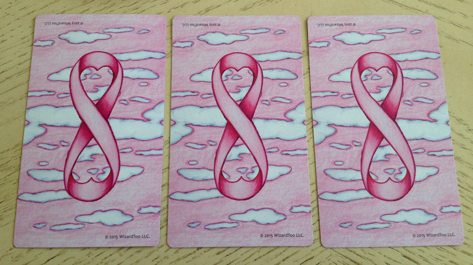
I adore the card back art. It’s quite beautiful. The lemniscate that looks like the pink ribbon for breast cancer awareness and the heart shape detailing is creative, really brilliant, and perfect in every way. I love the clouds and pink sky backdrop. I love that the card back is reversible. I really, really love the card back here. The cards come with a gray drawstring bag, though the cards don’t fit into the bag. Oh well. Also, see below for size comparison. The Tarot Pink cards are a typical tarot size, about 2.75″ x 4.75″.
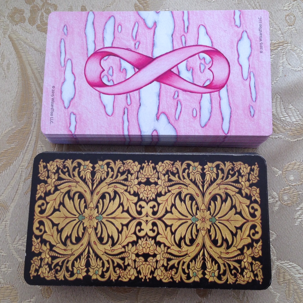
The above photo compares the deck to a standard Lo Scarabeo deck, the Golden Universal Tarot. The cardstock is a bit on the flimsier side, again, very similar to typical Lo Scarabeo decks. It doesn’t bother me too much, but I do prefer thicker, higher quality cardstock for my decks.
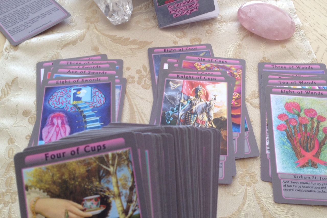
The cards do not come ordered, which was amusing to me. I didn’t mind sorting through them, but this must be a daunting task for a tarot beginner. Imagine someone who doesn’t work regularly with tarot receiving this deck as their very first impression of tarot. I remember during the pitch phase when I first heard about this deck, the proposed target audience included those who might not be all that familiar with tarot but are interested in holistic healing and spiritual wellness. If you are gifting this deck to such a person and you happen to be knowledgeable in tarot, may I strongly urge you to open the bag and order the deck for your friend or loved one!
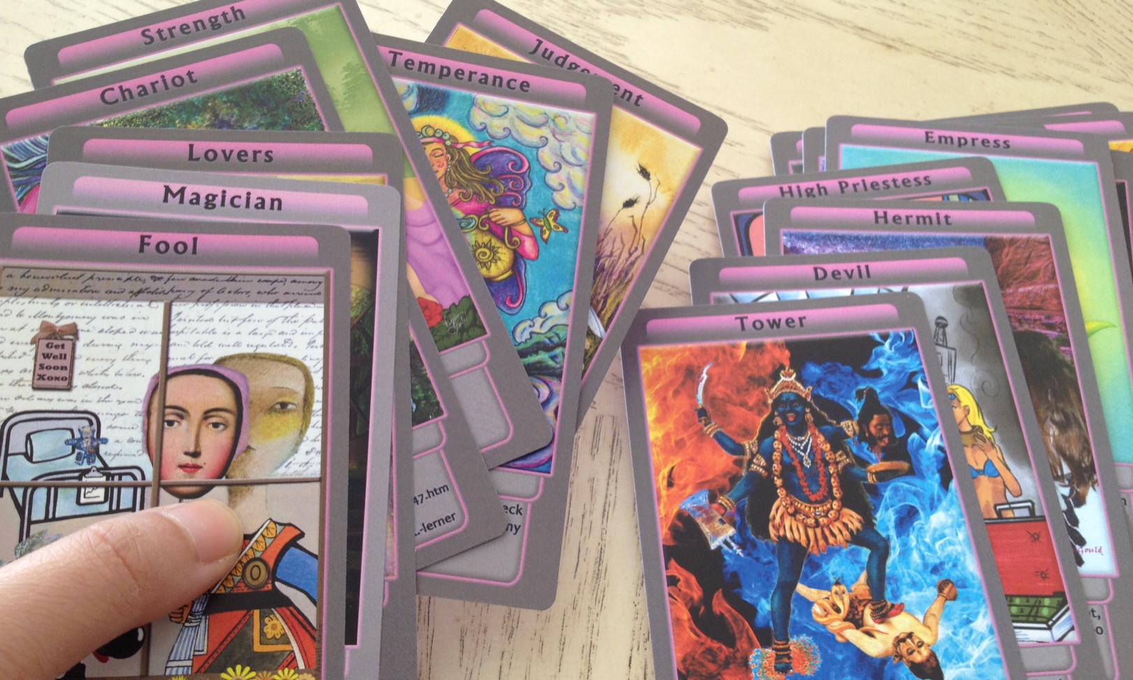
Note also that the Majors are unnumbered. That might also add to the difficulty for one who isn’t a veteran at tarot. However, personally I liked that they weren’t numbered. It means, for starters, I get to choose whether Strength is Key 8 or Key 11. Oh, but quirky little mishap in the LWB:
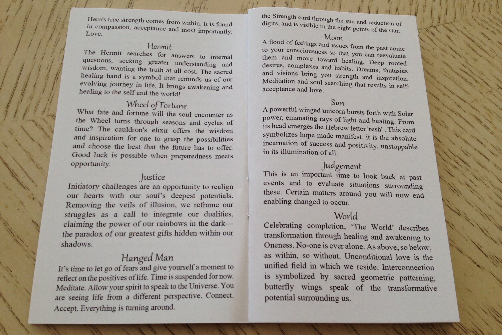
After Key 12, The Hanged Man is… The Moon?
Then I realized what happened. Turn the page. The pages got flip flopped. The page of info for Moon through World should be behind the above pictured page for Transition (Key 13, Death) through Star. Oops. Anyway, not a huge deal. Now let’s get to the deck.
What makes Tarot Pink such a must-have collector’s deck is the art.
Omigosh, the art.
I love that I’m holding a breathtaking art exhibition in my hands, one keyed to the tarot no less, one formulated for healing, health, and well-being. I ask those who have already purchased the deck and those who will be purchasing it to sit quietly, hold it in your hands, close your eyes, and just feel. You will feel the healing light that has been collectively infused into this deck.
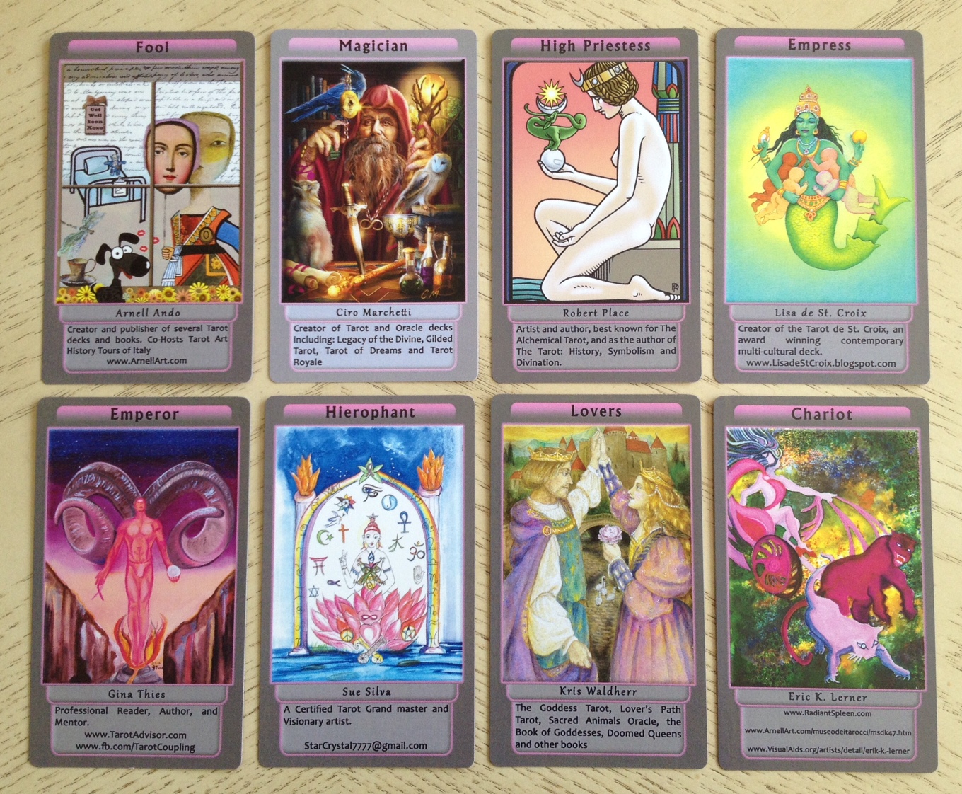
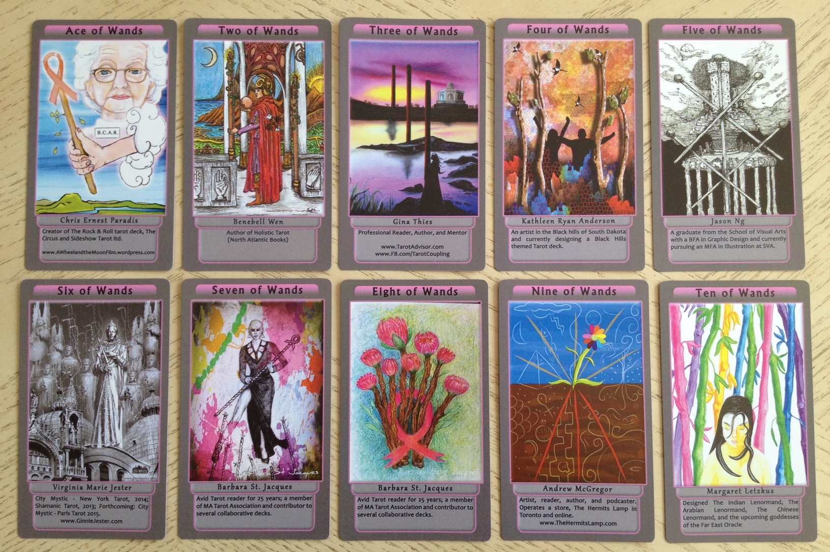
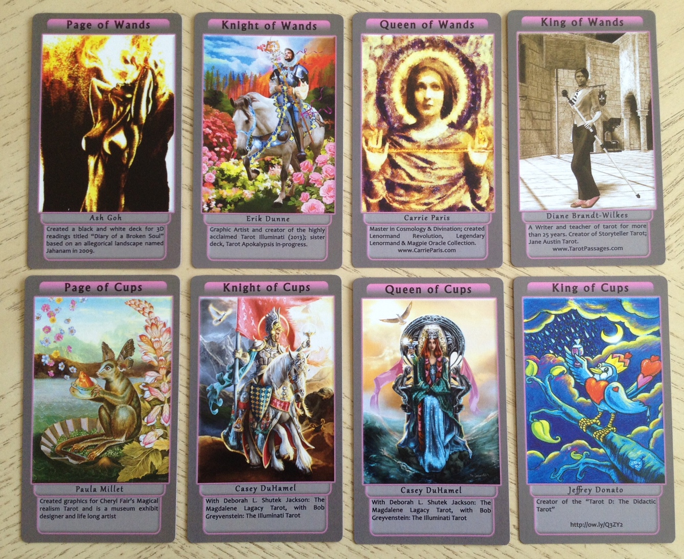
There’s everything in here. Arnell Ando’s digital collage for The Fool begins our journey. Ciro Marchetti’s Magician is just fantabulous. That is one of my favorite Magician cards ever. I didn’t need to look at the credit line to know that the High Priestess was drawn by Robert Place. I’m a huge fan of Lisa de St. Croix’s art, and you can see why I’m a fan here in her rendering of the Empress. Gina Thies gives us a powerful Thoth-esque Emperor. This Hierophant by Sue Silva is way more all-encompassing than our traditional Hierophants. Kris Waldherr (of Goddess Tarot fame, among other decks) has given us an artful Lovers card and Eric Lerner’s Chariot is provocative.

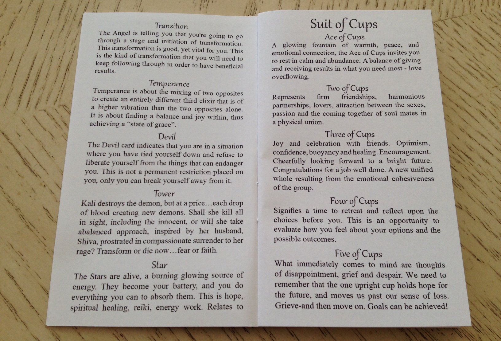
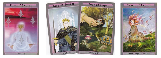
Pamela Steele’s Strength card fully expresses what Tarot Pink is all about. It is absolutely the poster image for the deck. I love everything about Steele’s rendering of Strength here. Here in the second septenary of the Majors, you see such a diversity of artistic styles. There’s the digital photo collage in Csikos-Gould’s Hermit, colored pencil in the Wheel of Fortune, postmodern photography in Lucia’s Justice, and mixed media in Chanel Bayless’s Hanged Man. J. R. Rivera did an amazing job with the illustration of Death, renamed to Transition here. This looks like ink and marker here, though I’m not sure. I cannot praise Roxi Sim’s Temperance enough. I love this card, I just love it.
I’ll talk about the text box and captions issue again later in this review, but I do want to say now that I’m not a fan. I don’t understand the information that’s being included. Website URLs should have been banned. How awfully tacky to have website URLs on tarot cards meant for healing and spiritual wellness. Also, if we were to include captions to highlight the artists, then the information that should have been included is the artist name and the medium that the art is rendered in, i.e., watercolor, acrylics, photography, ink and colored pencil, etc. That’s it. Maybe identifying one single published work that the contributor is known for, but no more than that! Omigosh! Seriously, the captions are just awful.
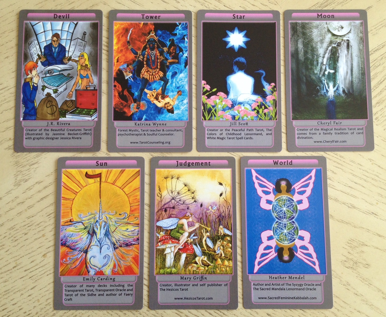
We continue on to the final septenary and really, I admire Rivera for tackling the two harder cards in the Majors, Death and the Devil. The Devil card here is really well done. Katrina Wynne’s digital collage incorporating Eastern culture is so cool. I love the layers of symbolism here. Jill Scott’s The Star has such balance, harmony, and beauty to it. Cheryl Fair’s The Moon is captivating. Again, if any information was to be included on such cards, it should have been the medium that each work is rendered in. For a project run by a group of supposed professional artists, I have to say I’m really surprised no one thought of that. It’s such basic art exhibition info. Instead, all that random bio nonsense is taking up so much space. To me, it just gives the production value an amateur feel.
I am also not a fan of the dark gray. It’s true that gray can help with depression, grief, and energetic grounding, but for healing purposes, I would have gone with a lighter, more joyous color, a color that invigorates, or at the very least, a much lighter gray. I would have preferred plain white, to be honest. While gray and pink together as a color combination works well, the dominance of dark gray throughout the deck brought down the tone and energy, making the deck feel a little lifeless. Energetically, it almost felt like the gray worked against the healing energy that many of the artists probably tried to infuse into the art. Again, that’s just me. Per my own very subjective approach to energy work, the gray felt counterproductive. White, on the other hand, or even borderless, would have been neutral, and would have let the originally intended energy of each artist and contributor emanate through.
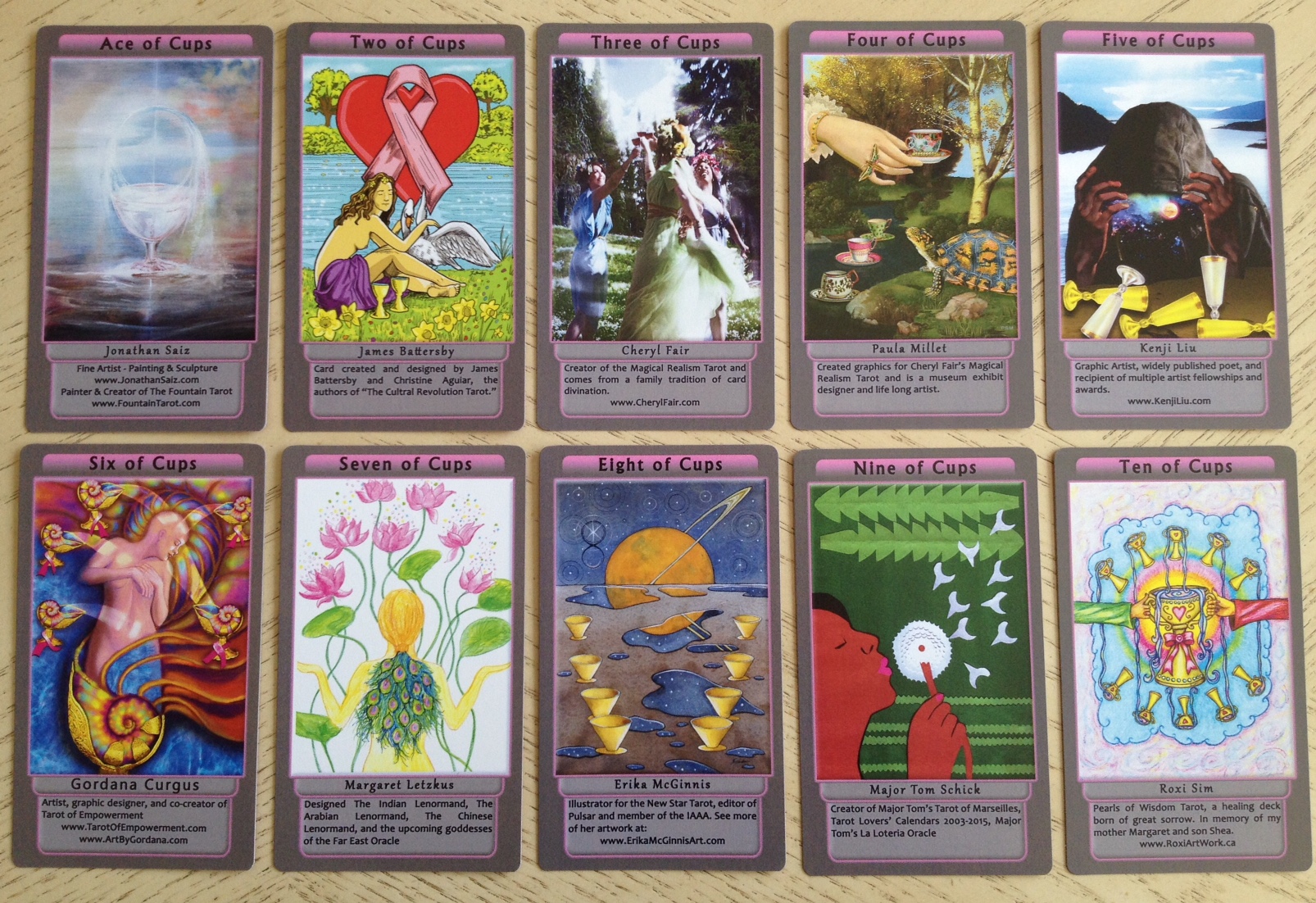
Who else saw that Ace of Cups and right away knew it came from the artist behind the Fountain Tarot? I love James Battersby’s Two of Cups, too. Cheryl Fair’s rendition of the Three of Cups via digital photograph is right on. I have to say, I now realize I’m a fan of Paula Millet’s art. Gordana Curgus’s Six of Cups and Major Tom Shick’s Nine of Cups are so innovative! Really, it’s just getting tedious for me to go on and on about every single artist. I love every work here. I love the diversity. All of it comes together so well. There is nothing disjointed about the collection of art here.
Okay, I have to talk about the text boxes again. The intent behind the large caption space to advertise each artist is sweet, and quite thoughtful, though I hope I am speaking for all of the contributors in saying this: we didn’t need it! We’re cool with donating our time and artwork and not needing front and center attention or credit for what we’ve contributed! We’re totally cool with the deck being about the art, about healing, and about the seeker who is using this deck for healing purposes. Having text boxes occupy over 20% of the card is disconcerting.

On the other hand, a caption with a few keywords about the card’s meaning would not have bothered me quite as much, given the understanding that many of the users of the deck might not be seasoned card readers. So if the caption space at the bottom of each card included key interpretive phrases, a mantra, affirmation, or something more directly related to healing, that would have been really cool, and better targeted at the intended audience for the deck.
Or let’s say we really do want to celebrate the artists. Okay, fine. Then the information to include would be–again– the medium of the work of art, information about the art itself, maybe the artist’s intent or point of view for interpreting that card, or a very, very short artist statement. Instead, the information as presented–oh I am so, so sorry to say this–kind of makes me assume that these artists aren’t professionals. What professional artist with exhibition experience would not have known better? Thus, the information given accomplishes nothing. No one wins here.
I must confess that I did not find the overall layout design appealing. The bright pink borders remind me of neon signs. The slight bevel of the text boxes don’t look right and the gradient fill feels a bit like an outdated design technique. Something about the whole layout feels out of its time, not of 21st century aesthetic sensibilities. The choice of font doesn’t work in harmony with the layout or with any of the art. It’s too harsh. The spacing within the cell margins is insufficient. Boxes serve as frames, and our eyes want to focus in on what’s framed, and in this layout, everything is framed in a box, which means as a viewer, I have no idea where to look. Which means the text and negative space overpowers the actual tarot art. I don’t know, but the layout does not vibe with this Libra Sun.
I’m not a graphic designer. I’m not even an artist, really, just a doodler. I did the below layout mockups, not to scale but sorta there, in MS Paint with a few clicks of the mouse, so I’m sure an artist with sophisticated software would do way better. But here (I’m using my own art for example because it’s the only one I have rights to), the layout represents a compromise of including the artist/contributor bio and text. The center one is even gray, keeping with the decided upon color palette of pink and gray. On the right you get the borderless look, which I would contend the majority of tarot readers these days prefer, but you can still work with the set dimensions of the card size and place all the info you want in the bottom space. There is even a soft pink divider line to bring in the Tarot Pink theme.
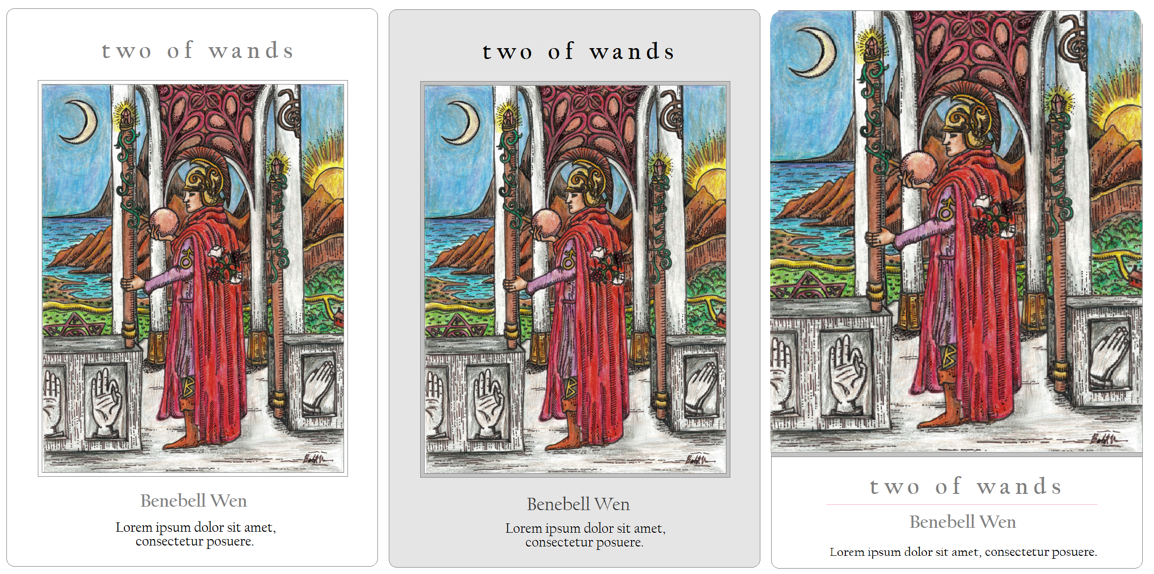
I would have preferred a card layout that lets the art shine, and not a layout that feels like it is swallowing up the art. Also, since it was a collaborative deck and every contributor would be submitting copy at different character lengths, by not using a text box, different bio lengths won’t look as weird. Instead, the fixed size text box with varying text length means some cards have a ton of negative space in the text box while others are overstuffed with text. Neither looks good. The spacing of the text, too, is not balanced. Way in the beginning, I did offer up my opinion on the layout, but no one liked my ideas, which is fine.
In terms of the deck being “collaborative,” it was a collaborative deck in the sense that many artists contributed their work. However, I must confess that in the production and planning process, I did feel–and perhaps I am wrong and it was all in my head with no bearing on what actually went down–that agreeable opinions were held up and dissenting opinions were dismissed. I watched it happen to me and I watched it happen to a few others. Honestly, I didn’t feel like my opinions were valued–unless I was agreeing with the majority, and then it was certainly valued– and so toward the end, I simply stopped offering any dissenting opinions.
That being said, you have to understand that collaborative tarot decks, as a project, are insanely difficult to pull off. Artists are hotly opinionated and whether a design looks good or doesn’t is subjective. That I prefer a white or light gray background with smaller font for the captions with no text boxes is 100% subjective and personal, so I get that others might not have thought that my idea was good. No unanimous agreement can be reached when it comes to creative projects and so those in charge have to make executive decisions that will leave many displeased. They need to make decisions toward a greater collective good, and cannot accommodate every individual sentiment. It is what it is. I understand that and so ultimately I didn’t mind that my opinions were kind of tossed aside. After all, I’m not an artist, and so I did want to defer to the artists.
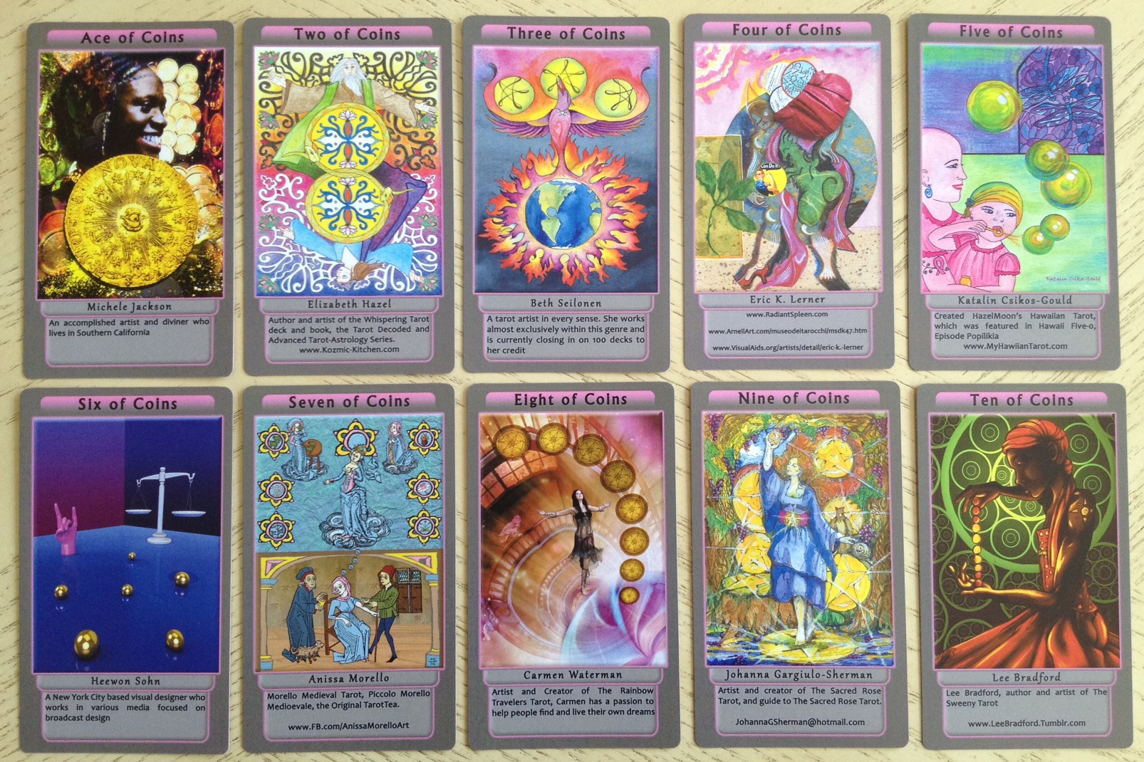
Speaking of artists, look at the two works by Casey Duhamel! How impressive is that art! And Carrie Paris has such a distinctive style, as does Erik Dunne. Without looking at the bylines, I could identify both artists by their work. The artwork in this deck truly will outweigh everything else. The might and power of healing here is potent.

If the publisher produces a second edition of the deck, one without captions or revised to allow the artwork to shine, I will buy a second deck, and third, and give away liberally as gifts. The layout as it stands is almost a tragedy, overpowering even some of the most powerful works of art in this deck.
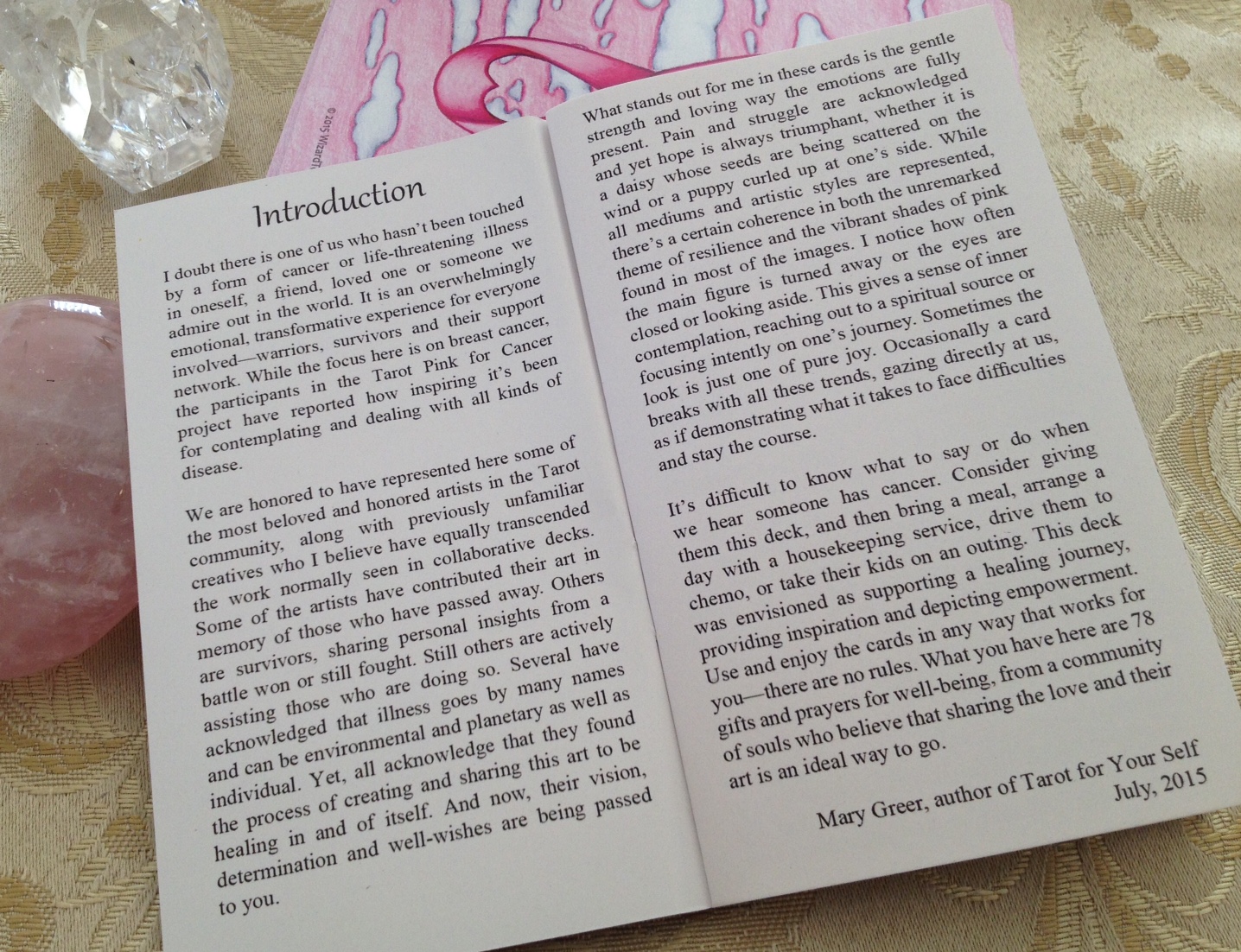
In the end, the devotion, healing magic, and compassion of the 65 artists trump all. Rest assured that the organizers’ efforts are entirely sincere. The charitable cause hit way too close to home for many of us contributors and so the passion for contributing to the funding of cancer research is heartfelt. Any collaborative art project involving more than one artist (even when it involves only one artist…) is like herding cats and frankly, the chaos that resulted was caused by various artsy kitties wandering off the range. But everyone came together in the end, despite differing opinions, to love and support one another. That, I’m sure, only adds to all that devotion, healing magic, and compassion of Tarot Pink. Check out Mary Greer’s moving Introduction in the LWB. It sums up why this deck has been brought into existence. It sums up why Tarot Pink matters.
The success of Tarot Pink is important for many reasons. To the best of my knowledge, there have not been all that many non-profit collaborative tarot undertakings in the past, and many who might be interested in such an undertaking in the future are looking to Tarot Pink as a precedent. Thus, your support for the project not only ensures the success of Tarot Pink, but ensures the success of future non-profit collaborative tarot projects. Your support also demonstrates how tarot readers can set their differences and personal opinions aside to come together for a charitable cause. So please help spread the word about the deck!

Remember the three face-down cards I showed earlier? Here they are again, turned over.
Per the LWB, if you chose the Three of Wands:
Don’t know where you are or where you’re going? Use your inner compass. The prognostication: good results and blessings to come.
The Ten of Swords:
A battle has been waged, but the pain and suffering is coming to an end. It is a difficult victory, but a victory nonetheless.
And Temperance:
Bring together opposites to create an entirely different third elixir. The prognostication: a state of grace to come.
The deck reads very well and the LWB will be helpful. I believe a much longer and more extensive companion book for the deck is forthcoming, downloadable as a PDF to those who purchase the deck. Keep your feelers out for that! I’m under the impression it will be free and comes with every purchase but don’t quote me on that!
You can order the deck at Gamecrafter right now. If you will be gifting it to another, one who might not know a whole lot about tarot, I ask that you consider ordering the deck for your loved one, and maybe even cleansing and consecrating it for healing.
October 7, 2015 UPDATE
Donnalee of Laughing Dakini Tarot was gracious enough to send in scans of what her trimmed version of the Tarot Pink deck looks like:
If the bottom edges are rounded out to mirror the top edges, with a corner cutter, I think this looks pretty good! I don’t know how the card backs will look after trimming, but given that I really do love the card back art and the reversible nature of them, I’ve opted to not trim the deck and keep with the original intent of the organizers. After some more use of the deck in readings, I have found that I can overlook the captions. The art here truly is magnificent.

I agree with you 100%. Such a pity they didn’t take time to take on board the valid points you were making. However, I will still buy the deck if only for the donation to such a worthy cause. Well said young lady.
LikeLike
I agree with the majority of your comments and really personally love so much of the art myself. Again I solved my perceived problem with the spamtastic abominations on the bottom by trimming them off: for real, to me it made them look like individual business cards and not a real deck at all. YMMV. I love the look of them without. I’ll see if I can include a photo of a few trimmed cards here, but may need your help if I get stuck!
Make that: I don’t know how to upload a visual as a comment here. Is it possible? Thanks–
LikeLike
Oh that would be neat! Email or FB msg me a few pics and I will post in the entry with full credits!
LikeLike
Let’s see if this works: please let me know.
http://www.laughingdakinitarot.com
“Since everything is but an apparition, perfect in being what it is, having nothing to do with good or bad, acceptance or rejection, one may well burst into laughter.” –Longchenpa
LikeLike
Nah, that didn’t work: I sent you a reply email with attached single photo, and it isn’t the site of mine below. Maybe you could send me an email address at the email you have for me, and I’ll send the photo to you there…? Thanks.
LikeLike
You are not alone in deciding to trim off the aberrations at the bottom of the cards. Many have decided that a smaller and odd dimension to the cards is far better then the promos being there. they will now fit into the plastic bag too!
LikeLike
Yup, sadly, they seemed to me like small webpages with spam across the bottom of each, and just as I don’t want to see that online and use firefox and adblockers because I find that intrusive in my personal email, for example, I simply did not find them appropriate for personal tarot contemplation and reading, so off they went. I have no personal feelings about this or that person or politics involved, except to appreciate the efforts of all the artists and everyone who worked on it. To me, cutting off the bits was a way for me to avoid any drama or politics that might be provoked in me. I love taking the peaceful harmonious way out! ahahaha!
LikeLike
I preordered this deck months ago to support the campaign and your card looks gorgeous Benebell! actually I like all the artists cards I have seen, I am just sad about the lack of majors numbering and awful text at the bottom! I hope I will be able to use it when it arrives across the world to here. The artwork should have been full card, everything else could go in the booklet 🙂 thanks for your review!
LikeLiked by 1 person
I couldn’t agree more! Everything you say is spot on. I was so disappointed with the text box blurb on the front of the cards that I’m considering cutting it off. This info should have been included in the LWB. Instead of a healing tool, this deck just looks like a tacky marketing tool for the contributors (which I’m sure was not the intention) however, Mary K Greer goes some way to make it all better when she said ‘this is a deck of 78 prayers. All of the images that have been created are simply gorgeous and you can really feel the healing energy exuding from them – it’s just such a terrible shame that they’ve been relegated to second place.
LikeLike
What a detailed review! And with so many pictures! I’m surprised how you openly state your opinions about this deck even if you have personally invest in its creation. And please, you are an artist, this Two of Wands is exactly your art. Also, I think art is not about the tools you use but how you use them to express.
LikeLike
Hi YX! Thank you so much for your kind words.
I felt very strongly about what I said, and so I said it. However, please make no mistake or misinterpret– I *LOVE* this tarot deck and cannot speak of the art highly enough. I also praise the organizer, Ron Leong, quite highly and have nothing but good words to say about his work, his dedication, and everything that everyone put into this project. What I had to say was 100% subject based on my own aesthetic tastes. 🙂
– bell
LikeLike
Argh, I have to look up what “aesthetic” means. Really want to punch you in the face and tell you to write “just my two cents”.
I agree with what you said about the dark gray and pink outline. It could have been so much better. But indeed this is a work of love, and I can’t imagine what hard work was needed to make such a large team work.
LikeLike
Re: “Argh, I have to look up what ‘aesthetic’ means. Really want to punch you in the face and tell you to write ‘just my two cents.'”
Wow. That sounds violent.
LikeLike
It’s a joke intended to sound playful. But if it feels violent, you have my apologies.
LikeLike
Oh no worries! I just didn’t understand the slang. But all cool! By the way, you have a super awesome blog. Love all the write-ups of cards in 500 words! ❤
LikeLike
Thank you, thank you. I put a lot of effort into my blog so I really appreciate that you like it. Btw, your new theme rocks.
LikeLike
Thanks for layout out the cards in order. This is very helpful. An awesome collaborative work indeed.
LikeLike
One thing to add from the perspective of a new reader (about 6 months): A collaborative deck is going to be a little more difficult to read with, anyway, just because the artwork won’t have a cohesive feel (even though it is stunning). Adding the large amount of artist information just increases that lack of cohesion. I would have liked to have all of the artist info – but maybe in the LWB instead of on the cards themselves?
After one pass through of this deck, I stuck it into the back of a drawer, assuming I would never read with it. I was glad to have contributed to a good cause, but was disappointed in the deck itself, for basically all the reasons you mentioned.
After seeing Donnalee’s trimmed deck, I will be doing the same to mine. That might make it readable for me.
LikeLike
I loved your review of Tarot Pink, Bebebell. I was one of the first contributors, and have been very excited about this project. I was surprised and disappointed to receive word in August (?) that the project never received full funding and several cut-backs had to be made, including scapping the gilded edging, nicer packaging and larger card size. I actually yelled “Yes!” out loud when the deck was delivered, and then groaned when I saw the dark gray boxed areas on the cards. Alas… I, too, will re-purchase this deck if it is re-released with a fresher format. I must say, however, that the artwork and love in Tarot Pink is gorgeous! The second time I went through the deck was even better, as I was able to SEE more!
LikeLike
Benebell… sorry about the typo
LikeLike
Miss Benebell, you are spot on with the title. I believe in a universal matrix that has a morbid sense of humor. Besides the title making me think it was a cheap used car salesman asking me if I wanted to purchase some cancer the design for the backs made me think another seemingly industry truth. Infinity. We will always suffer from the specter of cancer! I suspect if we continue to blindly follow the industry we will actually and have more.
I applaud our tact and gentleness. I can rea exactly how it translates and I have been on the sidelines laughing my ass off at how Lunchmeat almost completely ruined this project. You are correct in saying the artists are the value. I am sorry and sad for all those who poured their hears I to their work.
Blessings be upon the peacemakers.
-Barabbas
LikeLike
Pingback: My Response to Arwen’s #tarottag15 – benebell wen
Pingback: Mystical Medleys: A Vintage Cartoon Tarot by Gary Hall – benebell wen
The second edition is looking a lot better and no more text boxes. Folks who may have been put off and take a look at site. I’m considering getting it 😁
LikeLike
Oh if Benebell you could update your deck review with second edition photos, it may help raise more sales for the great cause. I see there are no reviews on the site, could means there wasn’t many purchases. Look forward to seeing the update 😄
LikeLike