
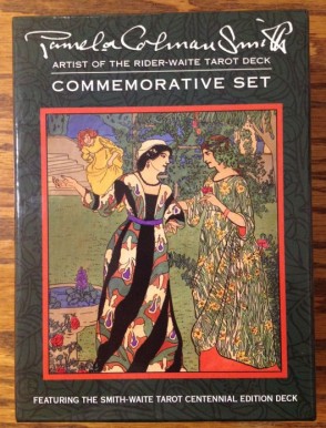
If you’re a Rider-Waite-Smith reader and you can still get your hands on the Pamela Colman Smith Commemorative Set produced by U.S. Games, then do so. I believe it came out in 2009. It’s an incredible set with two books, postcards and prints of Smith’s artwork, and an RWS replica called the Smith-Waite Tarot Centennial Edition deck. It is just a beautiful, beautiful deck. Get it.

I’m not going to show all the cards because, um, I am pretty sure I don’t have to. You all know what the cards look like, I’m presuming. So let’s just talk about this amazing set.

It was recommended to me, I looked into it, and immediately ordered one. I’ve been looking for a professional reading deck, since my Golden Universal is getting worn down as are my other two RWS replicas, which I had been using as public reading decks. I bought many contemporary clones and wasn’t happy with any of them. So then I heard about this deck and thought it’d be perfect. Now I’m not so sure–because I want to keep it all to myself! No–actually, it’s a perfect workhorse deck.

The box set opens like a book and on the left side, you have two amazing texts, The Artwork & Times of Pamela Colman Smith, Artist of the Rider-Waite Tarot Deck by Stuart Kaplan and the classic The Pictorial Key to the Tarot by A. E. Waite.


The Pictorial Key book doesn’t include the original prints of the Rider-Waite-Smith tarot deck and I’ve heard many other reviewers complaining about that. Personally, I speculate that the omission of the original prints was intentional, and may have been done so for legal reasons that I don’t care too much to get into. Interesting, though. However, the text itself is still great to have in such a beautiful book form.
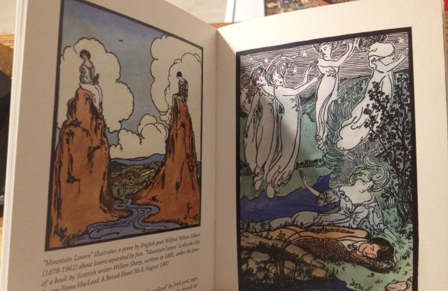
The Kaplan book is in full color and is stunning. I wouldn’t exactly call myself a die-hard fan of Smith’s artwork, but I do love how iconic her style has become, especially to the tarot world. There’s also more esoteric symbolism in her art than you might realize upon first glance, and so I really could gaze at her work for hours on end.
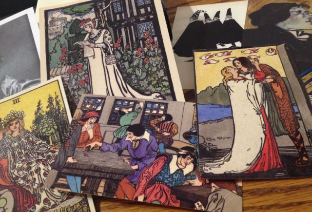
The set comes with six 3.5″ x 5.5″ postcards and four 5″ x 7″ glossy, good quality prints of Smith’s artwork, including her portrait. I’ll be buying frames to hang up some of these prints in the house.
There was also a fold-out sheet with several tarot spreads. The only one that held my interest was the Woven Spread, which is described as “a variation of the Celtic Cross pattern.”

The right side of the box holds the Smith-Waite Centennial deck and a blue mesh drawstring bag not worth mentioning (the mesh drawstring bag, I mean, is not worth mentioning; the deck…omg…love).
The card backs on the Centennial deck are lovely. It’s the five-petaled Rosicrucian Rose as rendered by Smith and as you see it on the black banner in the Death card, along with Smith’s signature. The card backs are not reversible exactly, but if you don’t pay close attention, then you won’t notice.

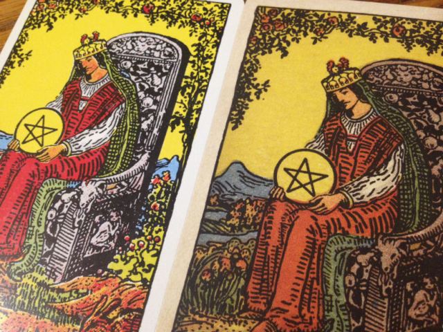
Above on the left is one of my old “workhorse” tried and true go-to RWS replica decks. This one is the Rider Tarot Deck published by U.S. Games in 1971. You know, the one in the bright yellow box and the trademarked blue weave on the card backs.
Personally I have a very set way of wrapping my cards, as you can see above. Anyway, in the subsequent photographs, the deck on the left will be from the 1971 Rider Tarot replica and the deck on the right is the Smith-Waite Centennial replica.

As you can see by the thickness comparison, the Centennial deck is made of a higher quality cardstock. There’s also an intentional discoloration in the deck, which I love. One thing I have not liked about contemporary RWS replicas is how bright and garish the colors can be. The Centennial deck is subdued, and although the difference is very subtle, the impact on my senses is substantial.
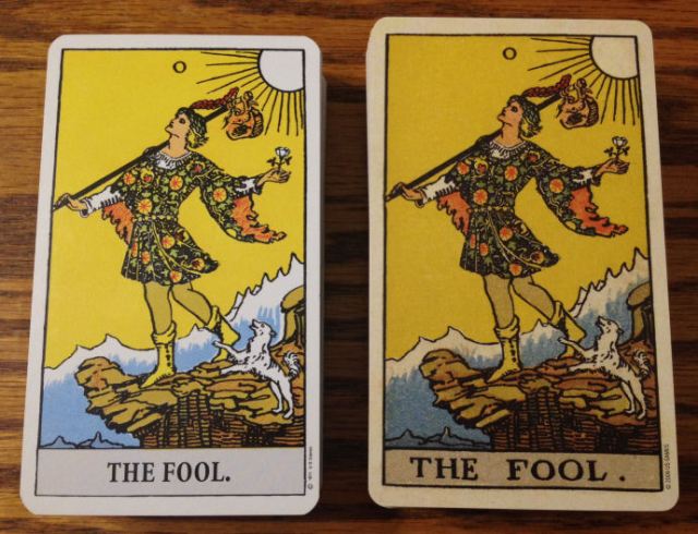
It’s also just a touch larger. You’ll also note that, since the Centennial is a replica of the original, the captions at the bottoms of each card are based on the original by Smith, not the subsequent font added by U.S. Games as seen on the right.

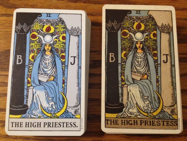
I love the Centennial deck so much more than the 1971 Rider Tarot replica that now I don’t know what to do. The Centennial deck has a matte finish to it, unlike the 1971 Rider Tarot, which is a bit glossy (though a lot of that gloss on my deck has worn away due to many hands handling it).

For those who otherwise find the RWS imagery difficult to work with, it could be because of the version of the replica you’re using. This Centennial deck is subtle and there’s something about it that renders the art a lot more palatable than some of the contemporary printings.

The Waite-Smith Centennial deck is just beautiful and a great deck to work with. The Pictorial Key is a text that every RWS reader should have and Kaplan’s book on Smith is packed with cool information.
For example, I didn’t know that Smith’s artwork was influenced by Japanese ukiyo-e woodblock prints, which were stylistically flat with bold colors and sharp lines…just like Smith’s art.
Or that she converted to Roman Catholicism in 1911, which incidentally, according to the numerology of her date of birth, was Smith’s Decisive Age (age 33). (That latter part about Smith’s Decisive Age wasn’t in Kaplan’s book; that was my own calculation.)
If you’re a fan of the Rider-Waite-Smith deck, then this Centennial deck replica is worth getting.

Nice to see that you liked this set. My only surprise is that you didn’t get it sooner!
Will you be marking this one with symbols and numbers now?
Could you talk about how you wrap your deck(s), perhaps in a blog post if you feel like it? I have decks that don’t come with usable boxes or bags, and I need something to store them in. I have yet to find or create a good origami box (which would be too thin for protection anyway), and I’m not a fan of pouches. Which I would have to order online, as the local shop sells cheap (and “incensed” haha) bags.
LikeLike
I don’t think I have the heart to mark this one up! It’s so pretty the way it is! =)
I use a linen handkerchief or silk scarf (whichever one I happen to have on hand) to wrap the decks in. After you roll it up, you have the two flaps that you use to tie, right? I loop once on one side and then flip the deck over and tie the actual ends of the scarf on the other side, so in the end, there are two knots– one knot on each side of the deck. For me, it’s just an economical way to keep my cards protected. My preference, though, would be drawstring tarot bags. But oh man– if I bought a tarot bag for every deck I own? Yikes.
LikeLike
I think you need some lovely tarot bags … watch for them! 🙂
LikeLiked by 1 person
Awesome! Thank you so much!
LikeLike
Ahhhh, yes another introduction to a beautiful deck and another I must put on my wish list! OMG! I commented on the way you wrapped the silk scarf about the deck only to see another reader asked the same question! Wow. (I may need a diagram, though.) Thanks!
LikeLiked by 1 person
Ooh, I just might do some sort of tutorial on that!
LikeLike
Yessssss! Please do! And sources for cotton linen scarves! 🙂
LikeLiked by 1 person
OMG! Amazon just delivered my own Pamela Colman Smith commemorative set! Such joy! 🙂
LikeLike
Isn’t it a stunning set? I love it! The centennial deck is currently my go-to workhorse deck.
LikeLike
I love mine! For a working RWS I use a deck called ‘The Original RWS’ stands up to a great deal of use, over and over. I do not like the computer generated lettering on the Universal. I keep my Commemorative Deck in my collection, pristine.
LikeLike
My Universal Waite has the handwritten font like my older rider deck from 1970-1975 and another deck that is 1975-1980. It is not the computer font that is on the New Rider Decks.
LikeLike
Very nice deck.
As the article was written about 10 weeks ago, which one do you prefer now, this one or the yellow box?
LikeLike
Hi Serge! Oh, gosh, it’s not even up for debate for me. Definitely this Waite-Smith Centennial version over the 1971 yellow box one! I prefer the matte finish on the Centennial (vs. glossy on the yellow box one) and the sepia tones are easier on the eyes (for me) than the bright-bold colors on the yellow box version.
LikeLike
Hi Serge,
Between giving them away and using them as a working deck here’s the one I use http://www.amazon.com/Original-Rider-Waite-Tarot-Pack/dp/0880796863/ref=sr_1_1?ie=UTF8&qid=1428606735&sr=8-1&keywords=the+original+rider+waite+tarot
Bright Blessings,
Aeneas
LikeLike
At Aeneas: How funny– this is the one I’ve more frequently gifted away to tarot beginners, too!
LikeLike
Dear Benebell,
Thanks for writing this review. I was wondering between this and the original RW since I got advice from my friend that I should own an original RW in order to learn tarot easier at the beginning. Now I can make my decision.
A little out of this topic, I’m new to tarot and I also got your book before I found your website. As a beginner to tarot I think my feelings are the same to everyone who just approaches to tarot: excited, curious, confused, lost, etc. Just a few days ago, I lost. I didn’t know where to start or what I have done was correct or not. But what I found in your book’s introduction said that everyone has their own way to approach to tarot, I gain my confidence. I also like about letting your imagination reaches to your unconscious which means (to me) there is a foundation of every card but what you build up is unique. So I just literally want to say thanks. I’m looking forward to your next book/article.
Btw, Pamela Colman Smith commemorative set will be delivered to me tomorrow. 🙂
LikeLike
Pingback: A moment of lucidity with a tarot card – Present Day Tarot Blog