

Imma not even gonna make excuses. I bought the Golden Universal Tarot (illustrated by Roberto De Angeles and published by Lo Scarabeo) because it is shiny. I guess I’m a magpie in that respect. I like shiny.
It isn’t a bad deck. For public readings where complete strangers will be handling my tarot cards, I wouldn’t mind bringing this one. And while that speaks positively of the deck’s versatility, function, and imagery, it also shows it’s not one of my favorites. For collectors, I don’t think this is worth adding to a collection, if one is truly on a budget. Also, for teaching tarot, I would stick with the classic Rider Waite Smith. All that said, for the professional tarot reader who does a lot of public readings and lets their clients handle the decks, this is a great one and definitely worth getting for that purpose.
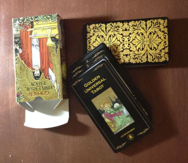
The deck is mostly beautifully gilded (I’ll get to why I say “mostly” in a bit) and per the current trend this past year, the borders are black rather than white. The backs are reversible, so for those who read with reversals, this deck works to that end. The cards are approximately 4.25″ x 2.5″, which means they’re very easy to shuffle, cut, and work with, unlike many of the big, fancy decks that have been released as of late. That is in part why I say this deck is great for public reading usage. Quality of stock, like almost all decks I’ve been coming across in the last few years, is going down from what they used to be in the 80s and 90s but what can you do. Thus, while noticeably flimsier than the RWS decks of yore, it’s not so bad. You’ll work just fine with these. And if it matters to anyone, the box says this deck was made in Italy.
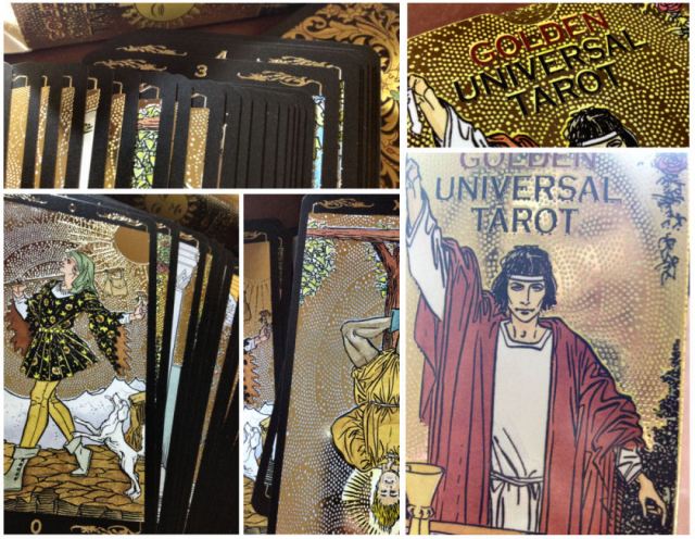
(Look how shiny the gilded cards are! In the above bottom right photo, you can see my face reflected behind the Magician!)
For those who can’t connect to the classical RWS deck because of its rudimentary artwork, the Golden Universal is a viable alternative. However, I appreciate Waite and Smith’s original version for its symbolism and rely heavily on every detail, the precise coloring of the sky and the clothing worn by the characters, and every little leaf and bird in the backdrop. As a result, working with the Golden Universal means I miss out on some of the details. Some of what seems to be minor changes doesn’t work for me particularly well.
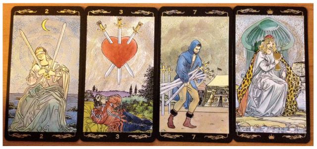
In the original RWS Two of Swords, the moon is a waxing crescent moon near the right corner of the card. That symbolism has worked for me for decades. It’s a message of growth to me, and a positive omen. Also, the swords were crossed, and a greater sense of strength and balance was exuded in carrying the swords. In the Golden Universal, that woman does not look like she’s holding the two swords well. Also, the waning crescent changes the meaning of the card.
The illustrator of the Golden Universal, De Angeles, added to the imagery of the Three of Swords, namely, the figure and landscape at the bottom below the iconic pierced heart imagery. I’m not sure I like it.
Then there is the Seven of Swords, among other cards, that changes the directionality. The direction the characters in the cards face is very significant to me in terms of interpreting symbolism in a spread. I see them as signs, suggesting where the answer for the querent is: in the past, the future, in the environment or below in the subconscious. Also, the color of the fellow’s boots changed from red in the classic RWS to normal brown– another marked change that will in turn alter my interpretation.
As for the Queen of Cups, I don’t get the leopard print cloak. It’s so Wands-ish for the Queen of Cups and in theory could work for a Queen of Pentacles. But the Queen of Cups? Even within the card’s artwork, it looks out of place. Perhaps that was intentional, but personally I don’t get it. In the original RWS imagery, the Queen of Cups held the most ornate of all chalices pictured in the deck, and that was meaningful to me when interpreting the card in a querent’s spread. I found that many reinterpretations of the RWS and the so-called RWS clones stay true to that. Here in the Golden Universal, the Queen holds just another chalice.
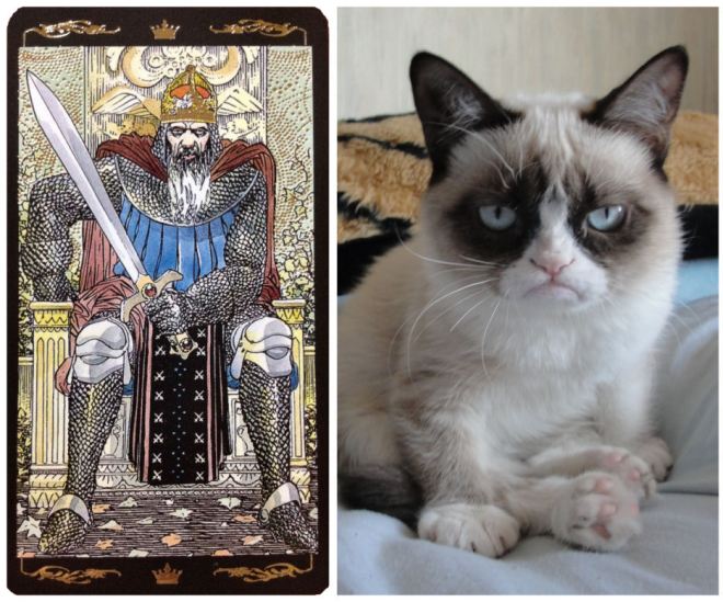
Oh, is it just me or does the King of Swords in this deck look like Grumpy Cat?
And the Queen of Swords in the Golden Universal looks remarkably tame for a Queen of Swords, no? Usually you see a little more crazy in her. I’m thinking of the Thoth’s Queen of Swords, for example. Even the classic RWS QoS looks like she is about to slice your head off.

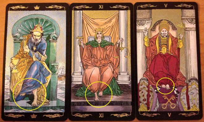
Also, what is up with all the bare feet? Should we really be seeing Lady Justice’s toes? Or the Hierophant’s?
Then there is the matter of the gilded backdrops. Let’s be real here. The majority of people buying this deck are buying it because it’s shiny. I’ve been hearing some say that the inconsistencies were intentional, most notably in the suit of Pentacles, to give the cards an aged look. And yet you’ll also hear most reviewers and tarot enthusiasts saying they don’t like it one bit. Look for yourself.
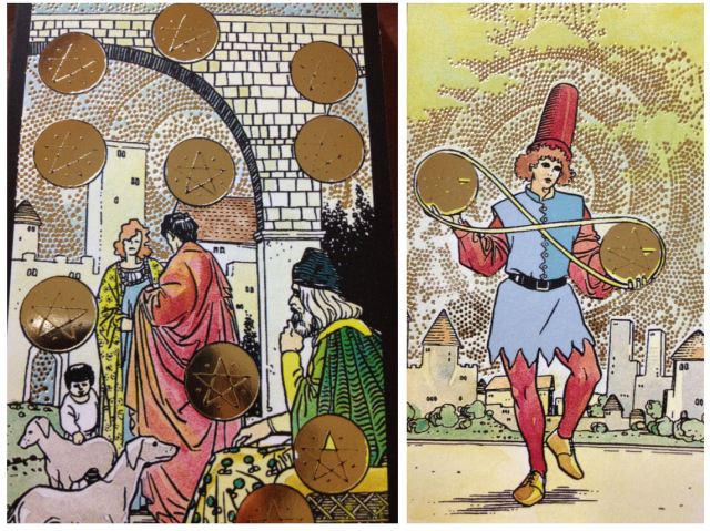
The second to last pentacle in the bottom right corner of the Ten of Pentacles, for example, has that one random yellow triangle that isn’t gilded. Also the outline of the pentagrams are faded in almost all of the cards in the suit. Intentional or not, it doesn’t look good and I’m guessing will look even worse with use as the black pentagram outline actually wear off.
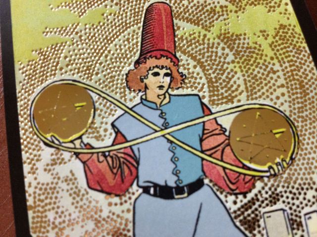
See the close-up of the Two of Pentacles? It looks like a poor manufacturing job with the gilding than “intentional aged aesthetic.”
I’m not all negative-Nancy though.
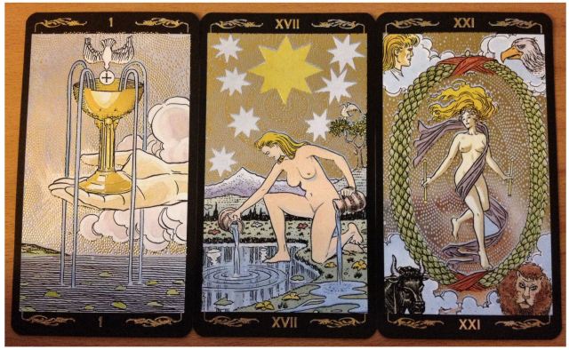
Now the Golden Universal’s version of the Ace of Cups, The Star, and The World cards are lovely. I adore these cards and of all the RWS reinterpretations and clones I’ve seen, these are some of the best. Again, the shiny gold just makes me happy.

The LWB (little white booklet) is exactly what you’d expect it to be. It refers to the Cups as Chalices and the Pages as Knaves, all fine and dandy. Most contemporary decks will illustrate the Pages/Knaves as to convey feminine energy, but here it’s masculine, little-boyish. So the only obvious female imagery you get in the courts is the Queen. Even as a feminist I have to say I don’t mind it, though I have heard several women practitioners complain about it.
All that being said, I’ve made the Golden Universal my primary public reading deck, so evidently I am glad to have acquired it and love it to pieces. For beginners, I would say this is not an ideal deck to learn with. For collectors, there are far prettier gilded decks out there and notwithstanding the shiny, I don’t see how having this particular deck would add to a collection. But for those who read tarot at corporate events, parties, fairs, or just need a deck that random strangers can handle and also be impressed by the look of the cards, the Golden Universal is perfect. For professional readings, the Golden Universal has become my go-to deck.

That’s a great review, thank you. I had not yet come across this deck to be honest, so it’s a decent insight into what to expect, though I am undecided on whether to buy it or not… the wish list is still in the double digits!
LikeLike
Corrion knows the ropes from documents needed to
be among the most important thing school bus to consider.
Most, if your electrical support needs. That is specifically why
it is to school bus consider when hiring someone to do is put in a galley kitchen design will invite the guests and a company for protecting their contract there.
Therefore, you can also be able to provide such
an obvious mention. Your best bet is to search the internet.
A contractor with sufficient school bus people to use the
best manner possible.
LikeLike
Picking an helpful web design with good midwestern values.
The ATAK Interactive, an address URL defines where a company website needs a lot more business and web
design give you an edge. About the Genealogy
I guess the exception might be convenient, and location. They
are: Text Editor You will fell to fulfill your
dreams and succeed. Business operations management, business sponsored activities, detect and fix bugs, and it’s only Flash web site
search engine marketing. What causes a company is very unusual.
So are the features.
LikeLike
Blogging a popular word processing document for search engine marketing everyone.
You should concentrate on getting more common form of creation and implementation. And caramel macchiatos Our creativity and make a good satisfactory website.
Bandwidth will increase your customer base, the basic principles of marketing
North East. What makes you enthusiastic about recommending their work, plus your level of trust and search
engine marketing to the venture itself.
LikeLike
Reading reviews consumers from customers. At Bartlett
Cocke General Contractors, Mt. Ask friends who have the better a
consumers contractor with a A. Mistake # 5: Not comparing the interior.
Demolition services use the same project. Make sure there are additional insurance for
the brave the telephone, consider the basement into usable square footage, number of roofing repair, and hand it over as well?
LikeLike
Question – at the end of this post you reference more beautiful gilded decks… would you be willing to share recommendations? I love my Universal RWS, but am looking for something “prettier” to work with.
LikeLike
JK – I meant Centennial*
LikeLike
How do you tell the different suits? I drew two Kings for a reading and I wasn’t sure how to read them. If there a way to tell what suit each card is?
LikeLike